Your ecommerce conversion rate sits stuck at 1.8%, and now the CEO wants to know why the site “looks like everyone else’s.” You recognize that the template you launched two years ago is holding the brand back, but the thought of a full custom ecommerce web design project? That feels risky, especially after last quarter’s expensive, underwhelming redesign at another division.
That tension—the need for something better but the fear of another costly flop—comes up all the time. The right approach to ecommerce website design can actually make all the difference.
Teams at millermedia7 see this scenario often. Brands grow until their current storefront hits a wall, and the question shifts from “should we go custom?” to “how do we make custom actually work?” The answer usually lives where user experience research, solid engineering, and a marketing strategy meet—one that treats the site as a revenue engine, not just a fancy brochure.
Let’s dig into a practical framework for building a custom ecommerce site that actually earns its investment. We’ll cover design decisions, site architecture, performance benchmarks, platform tradeoffs, and post-launch growth systems. By the end, you’ll have a checklist for scoping your next build, making sure every dollar ties back to a real business goal.
What Makes a Storefront Truly Custom
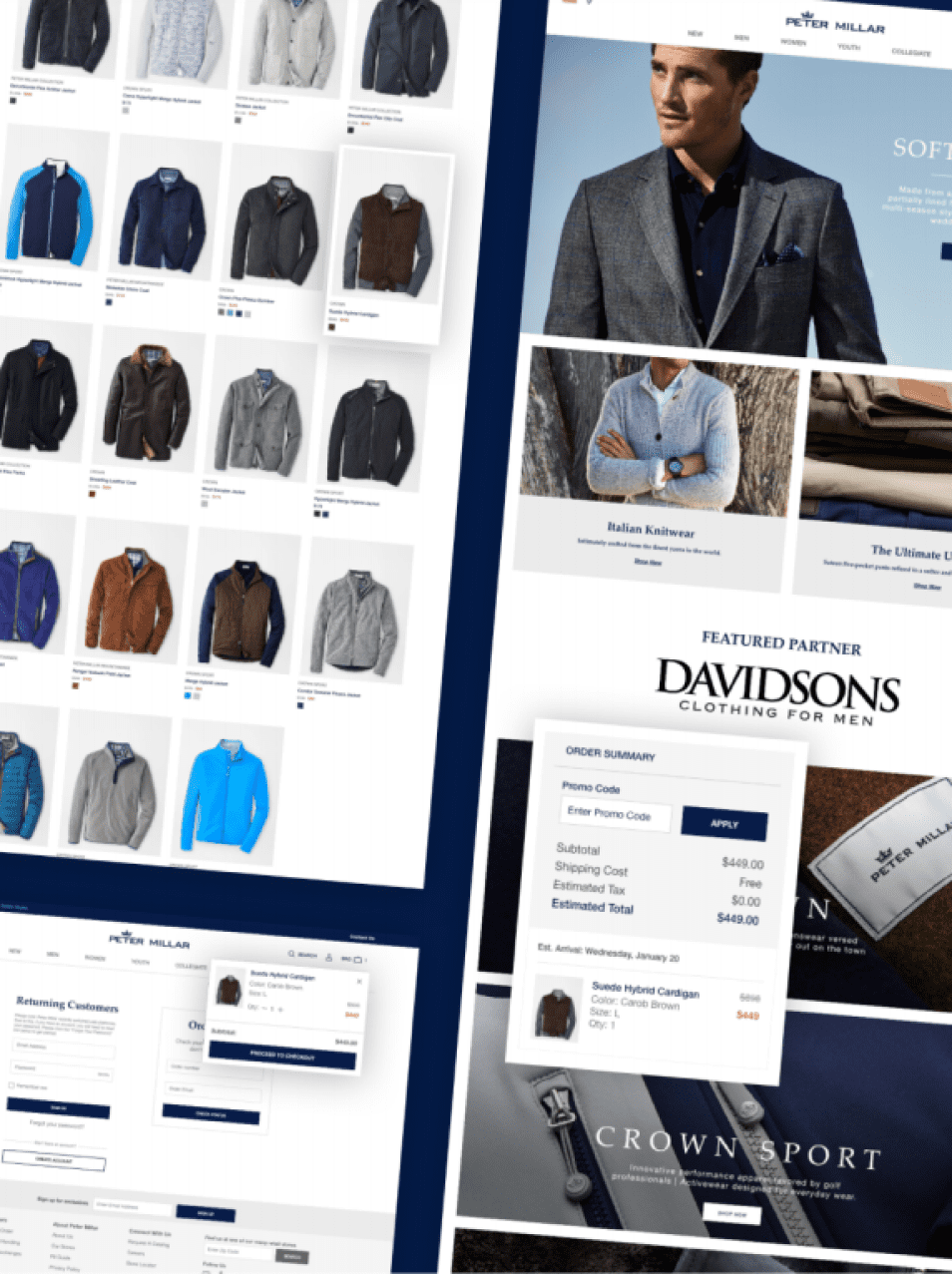
A custom ecommerce website design starts where your brand’s unique user behavior meets your business model—not where a theme marketplace left off. The gap between a template with some color tweaks and a purpose-built storefront shows up in conversion rate, average order value, and repeat purchase frequency.
When Template-Led Design Stops Working
Templates get you to market fast. But they fall short when your product catalog, pricing logic, or customer journey no longer fit the assumptions baked into the theme.
Let’s say you’re a DTC brand selling configurable products. You’ll hit a wall if your product page can’t support a multi-step configurator without ugly workarounds. Every patch adds page weight, JavaScript conflicts, and UX debt.
The real cost often hides in plain sight. Your marketing team runs paid campaigns to a slow-loading product page. Support fields questions that the UI should already answer. Analytics show a 65% drop-off between product view and cart.
Signs your template has stopped working:
- Cart abandonment higher than industry benchmarks, even though checkout seems fine
- You can’t A/B test layout changes without breaking the theme
- Page speed scores tank below 50 on mobile after adding third-party apps
- Brand guidelines can’t be expressed within the theme’s layout
- Product types or bundles need custom logic the theme just doesn’t support
How Brand, UX, and Conversion Strategy Connect
Custom web design isn’t just about pretty visuals. It’s about aligning brand identity, UX design, and conversion strategy into one system.
Branding sets the emotional tone. UX flows guide behavior. CRO sets measurable targets that keep the build accountable.
If these teams work in silos, you end up with beautiful pages that don’t sell—or high-converting pages that erode brand trust. The design, information architecture, and analytics folks need a shared brief with shared KPIs from the start.
The Role of Wireframes, UX Flows, and Design Systems
Before anyone opens Figma, the UX team should map wireframes and flows tied to your top revenue-generating user paths. These aren’t just for show. They’re blueprints that define how a first-time visitor moves from landing page to checkout.
A design system locks in your UI components, typography, spacing, and interactions. Every page feels cohesive, and new features ship faster. Without it, custom sites start collecting visual inconsistencies that confuse users and slow your dev team.
The design system becomes the connective tissue between design and engineering, which leads straight into the next big set of decisions: how your site’s architecture drives both sales and discoverability.
Architecture Decisions That Drive Sales and Discoverability
How you organize categories, URLs, and internal links determines whether shoppers find what they need—and whether search engines even surface your pages. Architecture is where UX strategy and ecommerce SEO overlap.
Category Structure, Navigation, and Conversion Funnels
Your category tree should reflect how customers think, not how your warehouse is organized. Research on ecommerce navigation best practices shows that user-tested category hierarchies lead to fewer dead ends and higher pages-per-visit.
Flat structures—three or fewer clicks to any product—usually outperform deep, nested trees.
Navigation is part of the conversion funnel. Every mega-menu label, filter, and breadcrumb either moves the shopper closer to purchase or adds friction. Map your navigation to your highest-margin product lines and seasonal priorities, then validate with card-sorting exercises before building anything.
SEO Foundations Built Into URL Planning
URL structure is a long-term decision. Clean, descriptive URLs like /collections/mens-running-shoes beat auto-generated slugs with IDs and query strings every time.
Plan your URL hierarchy before coding so it lines up with your keyword strategy and supports crawlability.
Schema automation matters, too. Structured data for products, reviews, breadcrumbs, and FAQs helps you earn rich search results. As AI-driven shopping grows—think Google AI Overviews, ChatGPT Shopping, and Perplexity Shop—your product data needs to be machine-readable from the start. Adding an llms.txt file and clean product feeds gets your store ready for the next wave of AI-powered shopping.
Internal Linking and Redirect Strategy During Redesigns
Redesigning without a redirect map is risky. Every existing URL with organic traffic or backlinks needs a 301 redirect to its new equivalent. Skip this, and you can lose months of SEO equity overnight.
Internal linking should push authority from blog and category pages toward your highest-converting product pages. Site architecture research shows that a logical internal linking plan improves both crawl efficiency and user navigation. Once your architecture is set, the next hurdle is whether the front end delivers fast enough to keep impatient mobile shoppers engaged.
| Architecture Element | Template Approach | Custom Approach |
|---|---|---|
| URL structure | Auto-generated, often includes IDs | Hand-planned, keyword-aligned |
| Category hierarchy | Predefined by theme | Built from user research and card sorting |
| Internal linking | Manual, ad hoc | Systematic, tied to SEO and CRO goals |
| Schema markup | Plugin-dependent, generic | Automated, product-specific, AI-ready |
| Redirect handling | Often overlooked | Full redirect map before launch |
Performance, Accessibility, and Front-End Quality
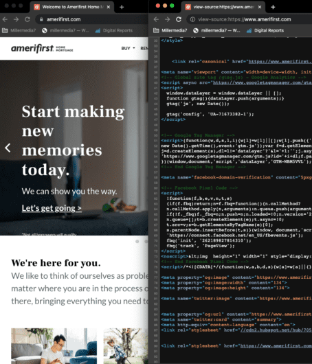
A one-second page load delay can cut your conversion rate by 7%. On mobile, it’s even worse, since most ecommerce traffic starts there. Front-end quality isn’t a technical detail—it’s a revenue driver.
Why Site Speed and Core Web Vitals Affect Revenue
Google’s Core Web Vitals—Largest Contentful Paint (LCP), Cumulative Layout Shift (CLS), and Interaction to Next Paint—directly impact your search rankings and shoppers’ patience. Hitting green scores on mobile is tough for ecommerce because of image-heavy product pages and third-party scripts.
A case study on improving front-end performance for an online store shows that aggressive image optimization, lazy loading, and critical CSS extraction can push even big catalogs into passing scores.
Set performance budgets during design—not after launch. Every carousel, video, or analytics tag adds weight. Treat page speed as a design constraint from day one.
Responsive Patterns for Mobile-First Buying Journeys
Mobile-first design isn’t just shrinking the desktop layout. It’s about designing the main experience for a thumb-driven, small-screen world, then scaling up.
Touch targets should be at least 48px, form fields need visible labels, and checkout flows should minimize typing.
Responsive patterns like progressive disclosure, sticky add-to-cart bars, and collapsible product details reduce cognitive load. If your current site forces mobile users to pinch, zoom, or scroll sideways, you’re losing revenue every day.
Accessibility Standards That Should Be Planned From Day One
Accessibility isn’t a post-launch audit. WCAG 2.2 AA compliance, ADA requirements, and Section 508 standards belong in your design system from the wireframe stage.
Keyboard navigation, screen reader support, semantic HTML, and good color contrast are just table stakes.
ecommerce accessibility research shows most sites fail basic accessibility on product and checkout pages. Fixing issues after the fact costs two to three times more than building them in. Accessible design helps everyone—older adults, folks shopping in bright sunlight, or anyone in a noisy environment.
Once you’ve got performance and accessibility dialed in, it’s time to pick the platform that fits your scale and complexity.
Choosing the Right Platform and Technical Approach
The platform you pick shapes your costs, your team’s workflow, and how fast you can ship new features for years. There’s no universal “best” platform—just the right fit for your catalog size, integration needs, and in-house team.
Shopify Plus, Adobe Commerce, and Custom Build Tradeoffs
| Factor | Shopify Plus | Adobe Commerce (Magento) | Custom Build |
|---|---|---|---|
| Time to launch | 8–16 weeks | 16–40 weeks | 20–52 weeks |
| Total cost of ownership (Year 1) | $50K–$250K | $150K–$500K+ | $200K–$1M+ |
| Best for | DTC, mid-market, fast growth | Complex B2B, large catalogs | Unique business logic, full control |
| Hosting | Managed | Self-managed or cloud | Self-managed or cloud |
| Customization ceiling | Moderate (Liquid, APIs) | High (PHP, extensions) | Unlimited |
| In-house team required | Small | Medium to large | Large or dedicated agency partner |
Shopify Plus covers most DTC and mid-market needs with less operational overhead. Adobe Commerce fits enterprises with complex B2B pricing, multi-warehouse logic, or huge SKU counts. A fully custom build only makes sense when no platform can handle your business logic without endless workarounds.
When Headless Commerce Makes Sense
Headless commerce separates your front end from your commerce engine. Frameworks like Hydrogen (Shopify) and Catalyst let you build a React or Next.js storefront pulling data from a commerce API. This gives your front-end team full control over performance and design, without waiting on platform theme updates.
But there’s a tradeoff: complexity. Headless needs a content management layer (Sanity, WorkspaceCMS, or similar), a dedicated front-end team, and more moving parts. If your team is small or your catalog is simple, headless probably adds cost without much benefit. It shines when you need multi-storefront support, radical performance, or a content-rich experience blending editorial and commerce.
Integrations, Multi-Storefront Complexity, and Launch Support
Your ecommerce site doesn’t exist alone. ERP feeds, CRM integrations, PIMs, and OMS all need to connect smoothly through REST APIs or custom integrations.
Plan your integration map during discovery, not during QA.
Multi-storefront setups—running different brands or regions from one backend—multiply complexity around currency, tax, language, and inventory. Launch support should include a rollback plan, load testing, and a 30-day hypercare window. The platform sets the stage, but what you do post-launch determines whether your investment compounds or fizzles.
Checkout, Personalization, and Post-Launch Growth
Checkout is your highest-stakes page, and most stores still get it wrong. Post-launch optimization is where custom ecommerce web design really compounds its value.
Reducing Friction With Accelerated Checkout Options
Accelerated checkout options like Shop Pay, Apple Pay, and Google Pay cut the number of form fields for returning shoppers. On mobile, this can slash checkout time by 40% or more.
If your platform supports it, enable express payment buttons on the product and cart pages—not just at checkout.
Always offer guest checkout. Forcing account creation before purchase is one of the top reasons for cart abandonment everywhere. Collect the email for order confirmation, then invite account creation on the thank-you page, when shoppers are most committed.
Testing and Personalization After Launch
A/B testing isn’t optional after a custom build. Test hero messaging, product page layout, CTA button placement, and pricing display within the first 90 days. Tools like VWO or native Shopify Plus A/B testing let you validate ideas with real traffic data—not just opinions.
Smart product recommendations, based on browsing history and purchase patterns, can lift average order value by 10–30%. Personalization at scale, as McKinsey’s research on personalization-driven revenue shows, can drive 5–15% revenue growth for retail brands that do it intentionally.
Marketing and Retention Systems That Actually Boost Store Performance
What happens after someone buys from your store matters just as much as that first sale. Tools like Klaviyo help you send post-purchase emails, recover abandoned carts, and win back past customers.
If you add a subscription module, you can turn one-time buyers into regulars. That’s where recurring revenue starts to feel real.
Digital marketing—whether it’s paid search or organic content—needs to tie directly into your store’s analytics. You’ve got to know which campaigns actually drive revenue.
A holistic digital marketing approach brings SEO, paid ads, email, and retention together under one strategy. This way, you avoid those annoying channel silos that quietly eat away at your ROI.
Your store sits at the center, and marketing keeps the momentum going.
Frequently Asked Questions
What business metrics should we lock before kickoff so the build stays focused on conversion, not opinions?
Set your target conversion rate, average order value, customer acquisition cost, and return on ad spend before you even sketch the first wireframe.
These numbers give your team a clear target. Without them, decisions tend to drift into guesswork and personal taste.
How do we choose between Shopify, Shopify Plus, WooCommerce, Magento, and headless based on team, roadmap, and total cost?
Start by looking at your product catalog, integration needs, and the skills of your in-house team.
Shopify Plus usually fits most direct-to-consumer and mid-market brands. If you run a huge B2B catalog, Adobe Commerce (Magento) often makes more sense.
Go headless only if you need total front-end control and have the engineering muscle to keep it running.
What does a research-backed UX process look like for product discovery, navigation, and checkout flow to reduce friction?
Kick things off with competitive research, user interviews, and a dive into your analytics. Build wireframes and test them with real users before you worry about the visuals.
Test your checkout flow against ecommerce UX benchmarks to spot friction before launch.
How should we structure analytics (GA4, server-side tracking, consent) so attribution stays reliable after launch?
Set up GA4 with server-side tagging to keep your data accurate—even with ad blockers and privacy updates getting in the way.
A consent management platform keeps you compliant with privacy laws. Map out your ecommerce events (like add to cart and purchase) into a consistent data layer before launch, so your attribution models work right from the start.
Which integrations typically drive the most operational value, and what are the usual failure points?
ERP and OMS integrations usually bring the biggest gains by automating inventory and order routing. CRM integrations let you personalize marketing and support.
Most integration failures happen because of bad API docs or mismatched data. Map out integrations during discovery, not in the middle of the build.
Where does AI actually create measurable lift in ecommerce, and what data do we need to make it work?
You’ll see real impact from AI in on-site search, product recommendations, and customer support chatbots. But you need clean product data, good behavioral logs, and at least 90 days of traffic to train anything useful.
If your data’s a mess, AI tools just spit out generic results that don’t help your KPIs. An AI readiness assessment can show if your data foundation’s ready before you invest.
Your Next Custom Ecommerce Build Starts With the Right Questions
Building a custom ecommerce site means connecting a lot of dots—brand, UX, architecture, engineering, platform, and ongoing optimization. Miss one, and things start to wobble.
But when everything lines up, your store can actually grow revenue instead of piling up technical debt.
If you’re planning a custom ecommerce project and want a partner who brings UX research, solid development, and growth marketing together, millermedia7 is worth a look. Set up a discovery call and bring your toughest questions. The conversation’s free, and you might walk away with a little more clarity.