Your SaaS site pulls in traffic, but sign-ups just won’t budge. Marketing brings in visitors who look like a great fit, yet trial starts, and demo requests lag far behind expectations. Usually that gap between traffic and engagement comes down to SaaS web design, not just whether people land on the page. When conversion stalls while acquisition looks healthy, it is time to look hard at the design itself.
Teams that blend UX research, front-end engineering, and data-driven marketing services spot where layout, messaging, or interaction patterns quietly drain your pipeline. That cross-functional view shapes how we build and redesign B2B SaaS websites at millermedia7. Every page element gets a job to do, backed by research, deliberate UX, and clean code.
Let’s break down a practical framework for evaluating and improving your SaaS website design across six areas: hero messaging, page structure, trust signals, design systems, competitive patterns, and pre-redesign audits. By the end, you’ll know which pages and components need work before you spend a dime on changes.
What High-Intent Buyers Need to Understand in Seconds
B2B buyers make snap decisions about your SaaS product. Research on web credibility shows that a typical new visitor decides whether to stay or leave in the first few seconds. If they are comparing several SaaS tools, that window shrinks even more.
Lead With a Clear Value Proposition in the Hero Section
The hero section is prime real estate. A strong value proposition answers three things right away: what your product does, who it is for, and why it matters now. Vague lines like “Empower your teams” leave visitors guessing, and most won’t stick around to find out.
Spell out the value as a concrete outcome buyers recognize. If your product helps finance teams automate expense reconciliation, just say so. Add a supporting line with a real result, like “Cut monthly close time by 40%.” The goal is simple: visitors should immediately think, “That’s my problem.”
Use Clear Messaging, Hero Text, and Visual Hierarchy to Reduce Friction
Clear messaging means every part of the page tells the same story. Visual hierarchy leads the eye from headline to supporting text to CTA, without distractions. When three buttons, an autoplay video, a carousel, and a customer logo bar all compete for attention in the hero, friction goes up.
Pick one focal point in the hero. Use type size, weight, and spacing to guide the reader from top to bottom, left to right. The experience should feel easy, never overwhelming. Clean hierarchy lowers cognitive load and makes the next step obvious.
Match the Primary Call to Action to Buyer Intent
Not every visitor lands at the same stage. Someone from an interactive demo ad might want to start a trial right away. A VP of Engineering may look for a video walkthrough or a live demo. Tailor your primary CTA to the main intent of your traffic.
Try two CTAs in the hero: one for self-serve trials and one for demo requests. Make the main button stand out, and style the secondary as a text link or ghost button. This respects different buyer paths without overwhelming people with choices. Once someone clicks, does the rest of the page help them move forward?
The Page Structure That Moves Visitors Toward Conversion
Navigation and layout shape whether visitors can learn what they need and convert, or just give up. Structure is not about pretty visuals. It is about information architecture.
Build Navigation Around Features, Use Cases, and Documentation
SaaS buyers think in terms of their own use cases, not your internal product map. Organize your navigation so prospects can search by role, problem, or integration need. A developer-focused product should highlight docs and API references. A no-code platform should lead with use-case templates and support resources.
- Features dropdown: Group features buyers actually look for, like “Reporting,” “Integrations,” or “Automation.”
- Use cases section: Map pages to roles or industries so visitors can pick what fits them.
- Documentation link: Put docs in the main nav for technical audiences.
- Resources hub: Gather content, courses, and marketplace listings in one place.
Guidance on site structure and navigation backs this up: organize around the user’s mental model, not your org chart.
Design Pricing Pages That Remove Hesitation
The pricing page is where momentum either builds or fizzles. Benchmarks on SaaS pricing page UX show that most sites trip up users with confusing plan matrices, which drives abandonment. Transparent pricing builds trust; hiding prices makes buyers nervous.
| Pricing Approach | Best For | Watch Out For |
|---|---|---|
| Tiered plans (3-4 tiers) | Mid-market products with clear personas | Overloaded comparison tables |
| Usage-based pricing | API-driven or developer tools | Unclear costs that stall buyers |
| Free plan + paid upgrade | Product-led growth | Free tier cannibalizing paid sign-ups |
| Custom / “Contact Us” | Enterprise sales with compliance needs | Losing self-serve buyers who want clear pricing |
Keep plan options easy to scan. Highlight the recommended tier. Spell out what each tier includes in plain language. If you offer a free plan, make upgrading simple and clear.
Support Different Decision Paths With Focused Landing Pages
Visitors from a blog post about workflow automation arrive with a different mindset than those clicking a “best project management software” ad. Each funnel entry deserves a landing page matched to its intent. Strip away extra navigation and focus on one conversion goal per page.
Build dedicated landing pages for your top content topics, paid campaigns, and marketplace listings. Marketing and engineering need to team up here, so the process stays repeatable and template-driven and you can iterate quickly. Structure sets the stage, but only trust and clarity actually convert.
Trust Signals That Make a Product Feel Credible
Buyers start judging your product’s credibility long before they think about starting a trial. Social proof, real product visuals, and measurable results all chip away at perceived risk as people scroll.
Place Social Proof Early and Close to Decision Points
Put customer logos, testimonials, and case studies near the top of the page or right below the hero section. Add more social proof near each big CTA, especially on pricing and demo booking forms. Research on building user trust in digital experiences shows that consistent design and trust elements shape user confidence.
Testimonials work best when you include the person’s name, title, company, and a specific result. “Reduced onboarding time by 60%” beats “Great product, love it” every time. Where you place these quotes matters just as much as what they say.
Use Product Visuals to Prove the Experience
Dashboard screenshots and product demos let buyers picture themselves using your product. Show real interface screens, highlight key workflows, and make it easy for visitors to answer, “Will this work for my team?”
Skip generic stock illustrations. Invest in sharp product screenshots, quick demo videos, and interactive demos that let people click through features without signing up. These visuals prove your product works; they are not decoration. The UI and UX design behind those visuals should match what buyers will actually see after sign-up.
Turn Customer Evidence Into Measurable Buying Confidence
Case studies work best when they follow a problem-result story. Name the challenge, show what changed, and put numbers on the outcome. Link to full case studies from summary cards across the site, not just in a hidden library. Your UX design case studies should be easy to reach from any spot where a buyer is weighing a decision.
Trust signals only matter if your design system stays consistent. Messy typography, broken layouts on mobile, or clunky animations can undo all the good your testimonials do.
Design Systems, Responsiveness, and Usability That Hold Up at Scale
A design system keeps your SaaS site looking sharp as the product grows, the team gets busier, and new pages get added. Without one, things get messy fast.
Prioritize Responsive Design, Accessibility, and Readability
Responsive design is not optional anymore. Over half of B2B research happens on mobile, and if your site breaks on a phone, people will assume your product is unreliable. Accessibility matters too: it opens your site to more visitors and lowers legal risk.
Test every template on mobile, tablet, laptop, and desktop. Make sure forms, CTAs, and pricing tables work at every size. Readability comes down to enough line spacing, a base font of at least 16px, and solid contrast that meets WCAG AA standards.
Use Typography, Brand Identity, and Motion With Restraint
Typography carries your brand throughout the site. Pick a primary font that is easy to read and works with your product’s interface. One display font and one body font are plenty for most SaaS brands. When it comes to branding technical products, less is more.
Motion graphics and parallax scrolling can add polish, but they also add complexity. Use motion to highlight important changes, like toggling plans or expanding comparisons, not just as decoration. A well-built design system speeds up design and development, but only when teams use components consistently.
Validate Decisions Through A/B Testing and Ongoing Iteration
Looking at other SaaS sites can spark ideas, but don’t just copy. Test your own layouts and messaging with real users. Run A/B tests on one thing at a time: headline, CTA color, pricing layout, or testimonial placement.
Use an experimentation tool like Optimizely to run controlled tests. Measure results by actual conversion rates, not just clicks or bounce rates. Tie every design update to a specific hypothesis. This habit separates sites that keep improving from those that just get a new coat of paint. So what patterns do the top SaaS brands actually follow?
Common Patterns From Strong SaaS Brands
The best SaaS sites share smart structural patterns that go beyond looks. Studying these patterns reveals repeatable choices you can bring to your own site.
How Product-Led Sites Balance Simplicity and Depth
Product-led teams keep their homepages visually clean, but just beneath the surface there is a lot to explore.
Up top, you spot a single, clear CTA (“Get Started Free” shows up a lot), paired with a crisp product screenshot. Scroll down, and you find use cases, integrations, and social proof, all tucked into modular sections that appear as you need them.
Many product-led sites follow the same rhythm: a sparse hero, then a product tour, followed by customer logos and role-specific use cases. The layouts feel light, but there is a lot packed in. The strongest examples push this further, letting product analytics and developer docs shape the site just as much as the marketing copy does.
What Developer-Focused and Enterprise Journeys Do Differently
Developer-first sites put documentation, code samples, and API references front and center instead of leading with marketing. Enterprise-oriented products add navigation by persona, ROI calculators, and gated resources designed for buying committees juggling multiple stakeholders.
Products with several audiences often organize their site into tours by business size or role. Others let visitors poke around template marketplaces before they ever sign up. Across the board, navigation and content structure reflect how users actually think about their problems.
Which Design Tools and Platforms Commonly Support Modern Builds
Your build stack shapes how quickly you can tweak and improve your site after launch. Here are the platforms you see most often behind today’s SaaS sites:
- Webflow: Visual development with a CMS, great for marketing-driven teams.
- Figma: The go-to for UX design and prototyping; plays nicely with most dev workflows.
- Custom React or Next.js builds: Full flexibility for engineering-heavy teams that need SSO, dynamic content, or complex integrations.
It comes down to how fast your team needs to move, how complex your product is, and your long-term design systems for product-led growth. Spotting the right patterns is one thing, but you have to be honest about where your current site stands before you start borrowing ideas.
How to Evaluate Your SaaS Web Design Before You Commit Budget
The costliest redesign mistake is solving the wrong problem. Before you spend, take a hard look at what you have, review your tech stack, and decide what success actually means, preferably in numbers you can track.
Audit Messaging, Conversion Paths, and Page-Level Friction
Start by reviewing your highest-traffic pages. Walk through each as if you have never seen them before. Where do you get stuck? Where does the path forward feel unclear? When we audit SaaS sites, the most common drain is a hero that wins the click but buries the value proposition three scrolls down, so a motivated visitor still leaves unsure what the product does. A focused UX audit for conversion gaps will highlight friction you might miss simply because you are too close to the site.
Make sure every page points to a clear primary CTA. Check whether the messaging fits the source of your traffic. Find pages with lots of visitors but few conversions; those are your best bets for redesign impact. Sound advice on redesign scope is to set a primary goal and document current performance before you start any design work.
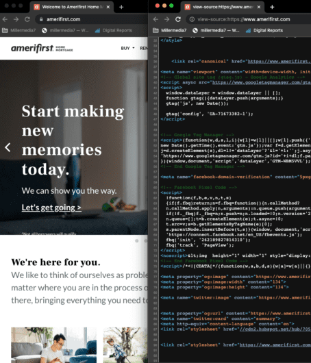
Review the Build Stack for Scalability and Governance
Your stack should let marketing publish content or landing pages without waiting on engineering. At the same time, the setup needs to handle responsive design, accessibility, and solid performance scores.
| Stack Consideration | Questions to Ask |
|---|---|
| CMS flexibility | Can marketers create pages without engineering tickets? |
| Component governance | Is there a design system with documented, reusable components? |
| Performance | Does the site score above 80 on Core Web Vitals? |
| Accessibility | Does the site meet WCAG AA standards? |
| Analytics integration | Are conversion events tracked at the page and component level? |
If your stack slows you down, consider including a platform migration in your redesign scope.
Set Success Metrics Before Design Work Starts
Set your goals before you touch a single wireframe. Tie each design change to a metric: trial starts, demo bookings, pricing page engagement, or time-to-CTA. Without clear baselines, you will never know if you actually moved the needle or just changed the look.
Keep an eye on organic traffic per page so you can catch SEO drops early. Track conversion-focused UX design metrics weekly for the first 90 days after launch, then switch to monthly. Treat your redesign as the kickoff for ongoing improvements, not a one-and-done project.
Frequently Asked Questions
What Should the Homepage Communicate in the First 10 Seconds to Reduce Friction and Drive Trial Sign-Ups?
Your homepage hero needs to answer what the product is, who it is for, and what outcome it delivers, fast. Pair that with a single, clear CTA to start a free trial. A product screenshot and a quick line of social proof can back up your claims without cluttering things up.
How Do We Choose Between a Custom Build and a Template Without Boxing Ourselves in Later?
Look at how quickly you need to update the site and how complex your tech needs are. Template platforms like Webflow work well if marketing owns the site and updates happen often. Custom React or Next.js builds are better when you need dynamic content, SSO, or integrations that templates cannot handle well.
Which Pages and Components Reliably Increase Demo Bookings for a Mid-Market Product?
Dedicated demo landing pages with messaging tailored to specific personas, embedded walkthroughs, and a short form tend to outperform generic “Contact Us” pages. Place social proof and a customer quote with a real outcome right above the form to help visitors feel more confident.
What Navigation and Information Architecture Patterns Work Best When the Product Has Multiple Personas and Use Cases?
Try a mega-menu or segmented dropdown that organizes navigation by role, use case, or industry. Let visitors pick their own path instead of forcing everyone through the same funnel. Add a “Solutions” section next to “Features,” so both technical and business buyers can quickly find what matters to them.
How Should Pricing and Packaging Be Presented to Build Trust and Prevent Support-Heavy Confusion?
Show transparent pricing in a plan matrix that highlights the recommended tier. Use plain-language feature descriptions and ditch the internal jargon. If you have usage-based pricing, add a cost estimator or calculator so buyers can figure out their spend in advance.
What Should We Track in Analytics to Link Design Changes to Measurable Conversion Lift and Pipeline Impact?
At a minimum, track trial starts, demo bookings, pricing page scroll depth, CTA clicks, and form abandonment. Set baselines before launching the new design and compare weekly for 90 days. Connect your site analytics to your CRM so you can see which page or design changes actually lead to closed revenue.
The Fastest Path From SaaS Traffic to Pipeline
Your SaaS site either turns visitors into trials and demos or quietly loses them along the way. This framework helps you assess messaging, page structure, trust signals, design systems, and industry patterns before you commit to a redesign.
If any of these friction points sound familiar, you are not alone. See how millermedia7 approaches SaaS UX and product design for teams facing similar challenges, and reach out if you want to talk through your specific conversion goals.