UX for lead generation is where most growth either happens—or quietly dies. You can drive all the traffic you want, but if the experience breaks, users leave before converting. The problem usually isn’t traffic. It’s what happens after the click.
At Millermedia7, UX for lead generation is treated as a system that connects behavior, design, and conversion. When friction is removed and intent is matched, users move forward instead of dropping off. That’s how small UX changes turn into measurable growth.
In this article, we’ll break down where good traffic gets lost—from weak messaging to form friction and slow mobile experiences. You’ll see how to fix each point and turn more visits into real, qualified leads.
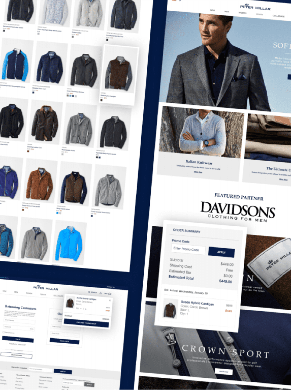
Clarify The Value Proposition In The Hero Section
The hero section does a ton of heavy lifting. It should answer three things right away: what you offer, who it’s for, and what happens if someone clicks.
A strong hero uses a direct headline, a punchy supporting line, and a big, bold call-to-action button. Make that headline short—under ten words is best. Skip vague stuff like “solutions for your business.” Say exactly what they’ll get.
Visual hierarchy really matters. Use size, color, and contrast to pull eyes straight to the CTA, not away from it.
Match Messaging To Visitor Intent
People don’t all land on your page the same way. Someone clicking a paid ad for a “free UX audit” expects something different than a blog reader.
If your landing page message matches what brought them there, conversions go up. This “message match” makes it easy for visitors to know they’re in the right spot.
Adjust your headline and subheadline to fit the intent behind each traffic source. Don’t just copy-paste—make it feel personal.
Focus Each Page On One Primary Action
Pages fall apart when they try to do too much. Every extra call-to-action competes for attention and tanks your main conversion.
Pick one primary action for each page. You can add a secondary option, like a chat bubble or a softer CTA, but keep it small and out of the way. A focused page gently pushes users toward one outcome, not a dozen.
Design Clear Paths That Reduce Friction
Friction is anything that slows people down or makes them want to bail. Good UX clears those obstacles using smart navigation, layout, and clear visuals.
Streamline Navigation And Menu Labels
Navigation should feel invisible. People should find what they need without stopping to figure out a weird menu label.
Stick to plain labels like “Pricing,” “Services,” or “Contact.” Don’t get cute or use jargon that needs explanation. Drop-downs with too many levels only make things harder.
Keep your main navigation to five or six items max. Make sure every label matches what’s actually on the page.
Use Layout And Visual Design To Guide Attention
A smart layout doesn’t expect people to read every word. It uses contrast, whitespace, and type to point eyes where you want them.
Put your most important stuff in the upper-left area. That’s where most people start reading. Whitespace separates sections and keeps things from looking messy. Make CTAs pop with strong contrast. Use a clean font and good line spacing for easy reading.
Little touches, like buttons that change color on hover, help users know what’s clickable. You don’t need a manual for that.
Remove Distractions That Compete With Conversion
Every element should support your conversion goal or get out of the way. Pop-ups, auto-play videos, and too many links drag attention from your main CTA.
On high-intent landing pages, try removing the main site navigation. This keeps visitors focused on one choice. Accessibility matters too. Meeting WCAG standards for keyboard navigation and contrast makes your site usable for more people, which boosts lead gen.
Build Forms People Actually Finish
Form design can make or break your lead gen. The difference between a form that gets ignored and one that gets filled out? It often comes down to length, layout, and those tiny details around each field.
Form Friction Is One of the Biggest Conversion Killers
UX for lead generation often breaks at the form stage. According to the Baymard Institute, unnecessary form fields and unclear inputs significantly increase abandonment rates. Even small friction points can push users to quit before completing a submission.
Reducing fields, improving layout, and adding helpful microcopy can dramatically increase completion rates. When forms feel fast and easy, users are far more likely to finish what they started.
Decide When Shorter Forms Help And When They Hurt
Short forms cut friction and usually get more submissions. For a top-of-funnel offer, just ask for a name and email. But sometimes, longer forms help. If you want qualified leads, a few extra fields can filter out the tire-kickers. You’ll get fewer submissions, but they’ll be of better quality.
Think about where the visitor is in your funnel. Match form length to what you’re offering and what you can reasonably ask for at that stage.
Improve Completion With Multi-Step Flows
If your form needs lots of info, break it into steps. Multi-step forms with progress bars feel less overwhelming. Start easy—name and email first—then get more specific. This “progressive profiling” builds commitment. Once someone starts, they’re more likely to finish.
A simple progress bar can lower form abandonment rates by a lot.
Use Microcopy And Validation To Lower Hesitation
Tiny bits of text around your form fields really matter. A note like “We never sell your data” near the email field, or “Takes less than 2 minutes” above the button, reduces hesitation.
Inline validation tells users if their info is right as they type. This stops the annoyance of fixing errors after submitting. Autofill speeds things up for mobile users. All these little touches add up to a smoother experience.
Earn Trust Before You Ask For Details
People won’t hand over their info to a site they don’t trust. You’ve got to build trust with design and content before you ask for anything.
Place Social Proof Near High-Intent Actions
Put testimonials or reviews right next to your CTA or form. That’s the decision moment, and a real customer quote can be the nudge someone needs.
Social proof at the point of conversion lowers hesitation more than if you stick it somewhere random. Think about what visitors worry about before filling out your form, and put proof that addresses those fears right there.
Use Trust Signals That Reassure Without Clutter
Security badges, privacy notes, and SSL icons tell people their info’s safe. Put them near the submit button so they’re visible at the decision point.
Don’t overdo it. Too many badges—especially ones nobody knows—can backfire. Stick to seals people recognize, and clear language like “Your data is never shared.” Skip generic icons that don’t mean much.
For B2B, certifications like SOC 2 or platform badges like G2 really help with credibility.
Show Proof With Testimonials, Logos, And Case Studies
A logo bar with familiar brands builds trust fast. Short, specific testimonials with a name, photo, and job title feel real—anonymous quotes don’t.
Case studies go even further. Show measurable results. A line like “Generated 3,200 leads in six months” beats a generic “Great service!” Even a quick case study summary, without a download wall, can give skeptical visitors enough confidence to convert.
Win The Mobile Visit And Fix Speed Bottlenecks
Most web traffic is mobile now. If your site’s slow or clunky on phones, you lose leads before they even see your form.
Prioritize Mobile-First Layouts And Touch Targets
Start with the smallest screen and build up. This keeps things simple and forces you to focus on what matters.
Make buttons big enough—at least 44×44 pixels—so people can tap without zooming or hitting the wrong thing. Your main CTA should be visible without tons of scrolling. Collapse complex menus into something thumb-friendly for better usability and higher mobile conversions.
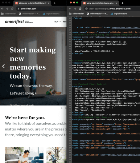
Improve Core Web Vitals That Affect Conversion
Core Web Vitals measure real-world speed and stability. Largest Contentful Paint (LCP) shows how fast your main content loads. If LCP is slow, people leave before converting.
Check your scores with Google PageSpeed Insights. Aim for LCP under 2.5 seconds. Cumulative Layout Shift (CLS) tracks if stuff jumps around as the page loads. Unstable layouts annoy users and kill trust. Fixing these metrics helps both search ranking and lead gen.
Cut Load Time With Smarter Assets And Infrastructure
Big image files slow pages down. Convert images to WebP and compress them without losing quality. Use lazy loading for images below the fold so browsers only load them when needed.
Trim third-party scripts. Analytics, chat widgets, and ad pixels all add to load time. Load them asynchronously or after your main content. A CDN puts your assets closer to visitors, cutting latency without a big infrastructure overhaul.
Measure Behavior And Keep Improving
UX for lead gen isn’t one-and-done. Every page has spots where people drop off or get stuck, but you won’t see them until you look at real user behavior.
Track The Metrics That Reveal Drop-Offs
Set up Google Analytics to watch your conversion funnel at each step. Bounce rate shows if people leave without engaging. Scroll depth reveals if they reach your CTA. Form abandonment tells you if they start but don’t finish.
These numbers show where things break, not just that they break. Use them to decide what to fix first for the biggest boost in conversions.
Use Heatmaps And Session Replays To Find Friction
Tools like Hotjar or Microsoft Clarity let you see where users click, how far they scroll, and where they get stuck. Rage clicks—lots of quick clicks on something that doesn’t work—signal design problems.
Session recordings let you watch real visits and spot friction in context. If someone fills out three fields and bails, that tells you more than just a bounce rate. Pair hard data with these recordings for a full picture of what’s happening on your pages.
Turning clicks into leads is part art, part science. It’s about clarity, trust, and constant tweaking. No page is perfect out of the gate, but every improvement brings you closer to a lead gen machine that works while you sleep.
Keep your value obvious, your paths clear, and your forms easy. Sweat the details, watch your data, and never stop looking for friction. That’s how you turn traffic into real, qualified leads—one click at a time.
Run A/B Tests That Improve Conversion Over Time
A/B testing helps you make choices based on real data, not just guesses. Try changing one thing at a time—like your CTA copy, button color, headline, or even the length of your form. Run each test until you know you’ve got enough results to trust what you’re seeing.
With testing, you’ll see improvements stack up. Maybe you tweak a landing page and boost conversions by 5%. That might seem minor, but add a few more small wins and suddenly, your lead volume jumps in a big way. Make testing a regular habit in your UX work. Don’t treat it as a one-off project—keep it going, and watch the results build over time.
Conversions Improve When The Experience Stops Getting In The Way
UX for lead generation is about removing every obstacle between intent and action. When messaging is clear, paths are simple, and friction is low, users don’t hesitate—they convert. That’s how better UX turns traffic into real business results.
At millermedia7, UX for lead generation is built around identifying where users drop off and fixing it with precision. From messaging to forms to mobile performance, every improvement is tied to measurable impact. That’s how conversion rates grow without increasing traffic.
If your site gets traffic but not enough leads, the issue isn’t visibility—it’s experience. Work with us to uncover friction, optimize your flow, and turn more clicks into qualified leads.
Frequently Asked Questions
What is UX for lead generation?
UX for lead generation focuses on optimizing the user experience to increase conversions. It removes friction, improves clarity, and guides users toward completing actions. The goal is to turn visitors into leads.
Why is UX important for lead generation?
UX is important because poor experiences cause users to leave before converting. Clear messaging, simple navigation, and fast performance improve engagement. Better UX directly increases lead volume.
What are common UX mistakes that reduce conversions?
Common mistakes include unclear value propositions, too many form fields, slow load times, and confusing navigation. These issues create friction and cause drop-offs. Fixing them improves conversion rates.
How can I improve UX for lead generation?
Start by simplifying your messaging and focusing each page on one goal. Reduce friction in forms and improve mobile performance. Test regularly to identify and fix weak points.