fbpx Skip to main content
Category

Onboarding

Streamline your onboarding process with millermedia7. Get expert tips and solutions to enhance employee experiences and boost productivity. Discover more!

Conversational Interfaces

By AI, Onboarding, User Experience, User Interface

You may have heard that “conversational interfaces” (interfaces that mimics chatting with a real human) are the new hot trend in digital product design. Several factors are contributing to this phenomenon:

  • With the advent of WhatsApp, Slack or Facebook Messenger the way we exchange information changed irreversibly. According to Business Insider, we are now spending more time in messaging apps than on social networks.
  • Artificial intelligence and natural language processing technology are progressing rapidly. Major technology players including Apple, Google, Microsoft and Amazon placed huge bets on this type of interfaces, leveraging big data and machine learning to get as close to human intelligence as possible.

This represents an interesting shift in how we think about user experiences and interactions, more as a text/voice based ‘conversation’ that helps us to achieve our goals. In this article, we’ll examine all major aspects of conversational interfaces in the context of chatbots.

5 Basic Principles of Conversational Interfaces

1. Be specific about chatbot purpose

Unless you develop a bot like Facebook M, it’s always better to deploy a specialized, purpose-driven bot to engage your target audience. Don’t try to design your chatbot to do everything all at once. Instead, identify the core use cases for your chatbot based on user’s goals and focus on achieving domain mastery.
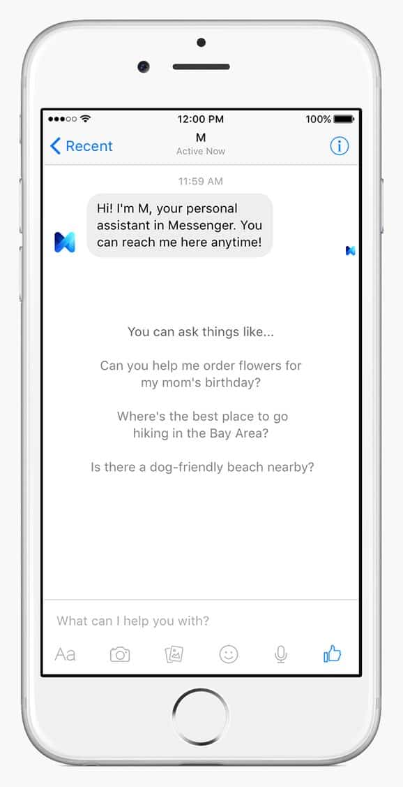
Faceboom M

2. Mimic natural conversation

Keep in mind that when the conversation is the interface, experience design is all about crafting the right words: bots must use and understand natural language. A vocabulary that’s limited to only a handful of generic answers will immediately destroy an illusion of real conversation and leave users feeling frustrated. Nobody want to participate in chats muffed by pre-determined answers.
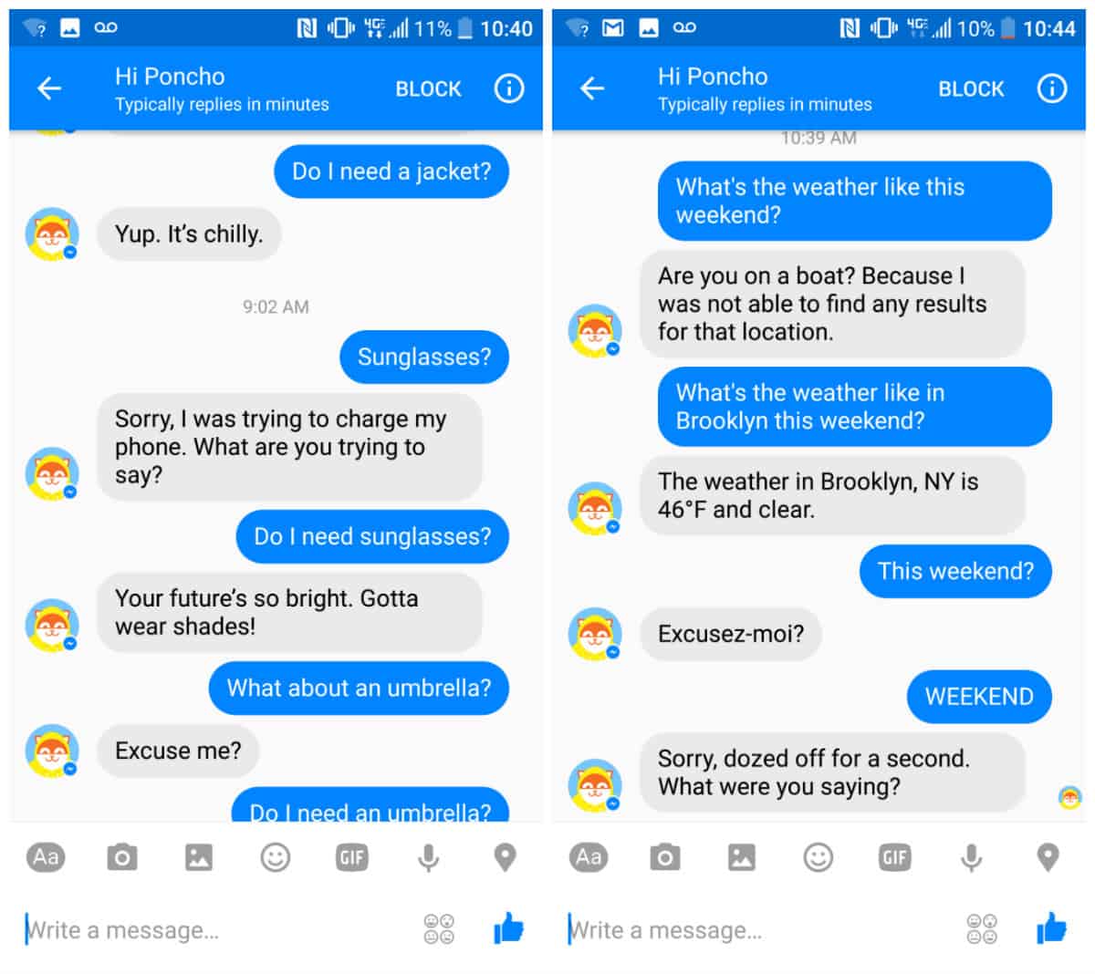
Conversation flow with Hi Poncho chatboat
An early version of the weather chatbot Hi Poncho struggled to provide any meaningful information due to a limited understanding of natural language. Image credit: Gizmodo

3. Make it clear what options are available for user

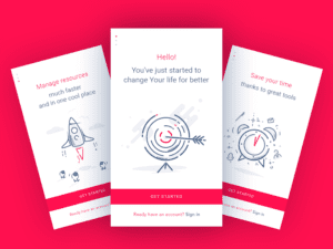
In traditional GUIs, what you see is what you get. However, with conversational interfaces, the paths that the user can take are virtually infinite. For conversational interfaces, users should know what paths are available for them. If you app is complex and has a few main routes, you can use an onboarding process to show the users what’s available.
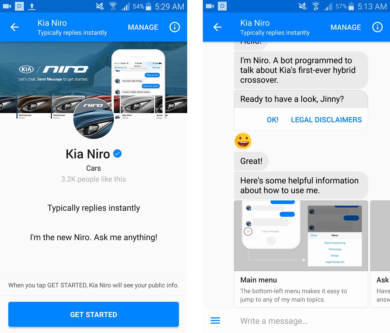
Onboarding experience in Kia Niro
Kia Niro using the carousel to explain how to use a chatbot. Image credit: Sabre Labs

4. Avoid lengthy messages

Lengthy messages look like text paragraphs. People don’t speak in paragraphs, we speak using single sentences. You should plan for no more than 90 characters per message (around three lines on mobile). Anything more than three lines of text seemed to activate the tl;dr (too long; didn’t read) response in users.
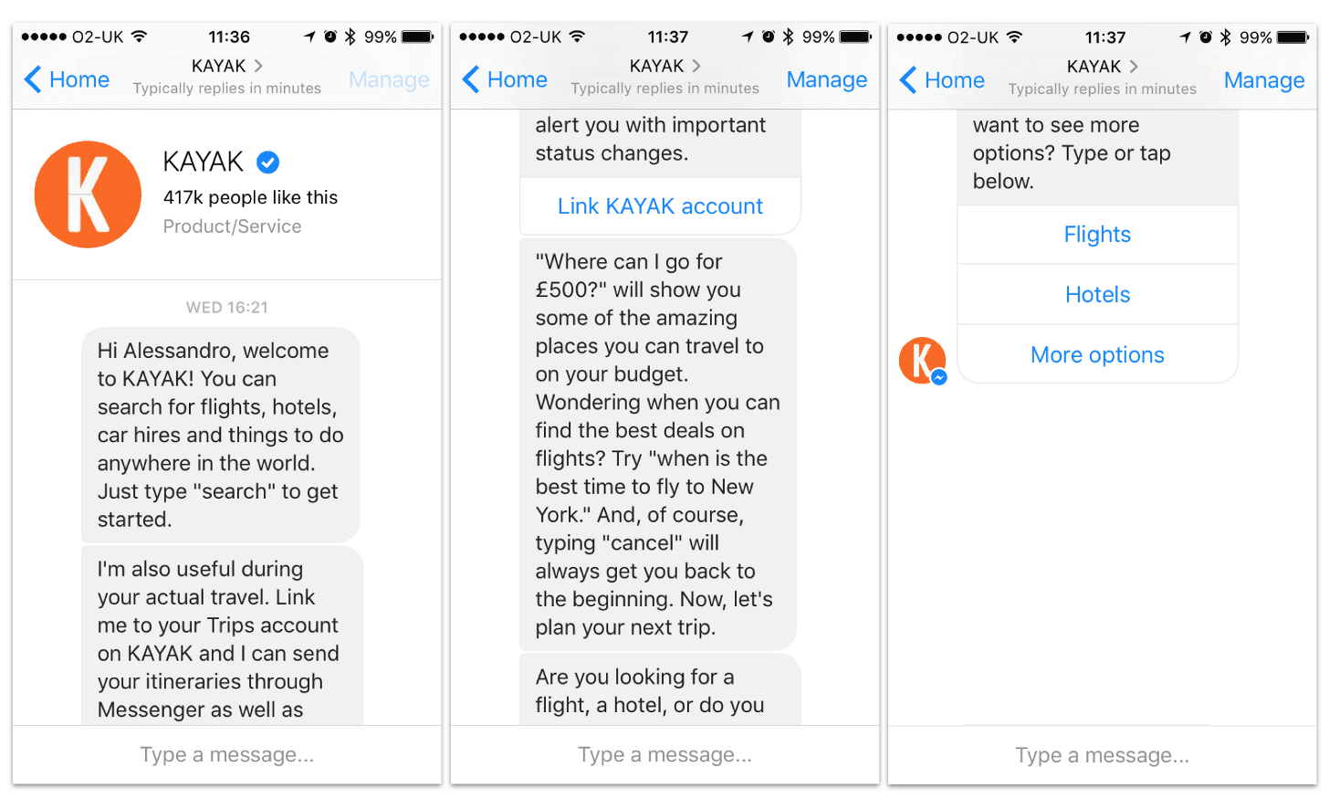
Too long sentences in KAYAK
Kayak chatbot hits the users with 4 opening messages, totaling nearly 750 characters. Most users glazed right over when they saw the wall of opening messages.

5. Animating the conversation

Animation can take the chatbot user experience to the next level, making the interactions more natural and pleasurable for user. Simple typing indicators can be used as an equivalent to phatic expression in speaking, making the conversation flow smooth.
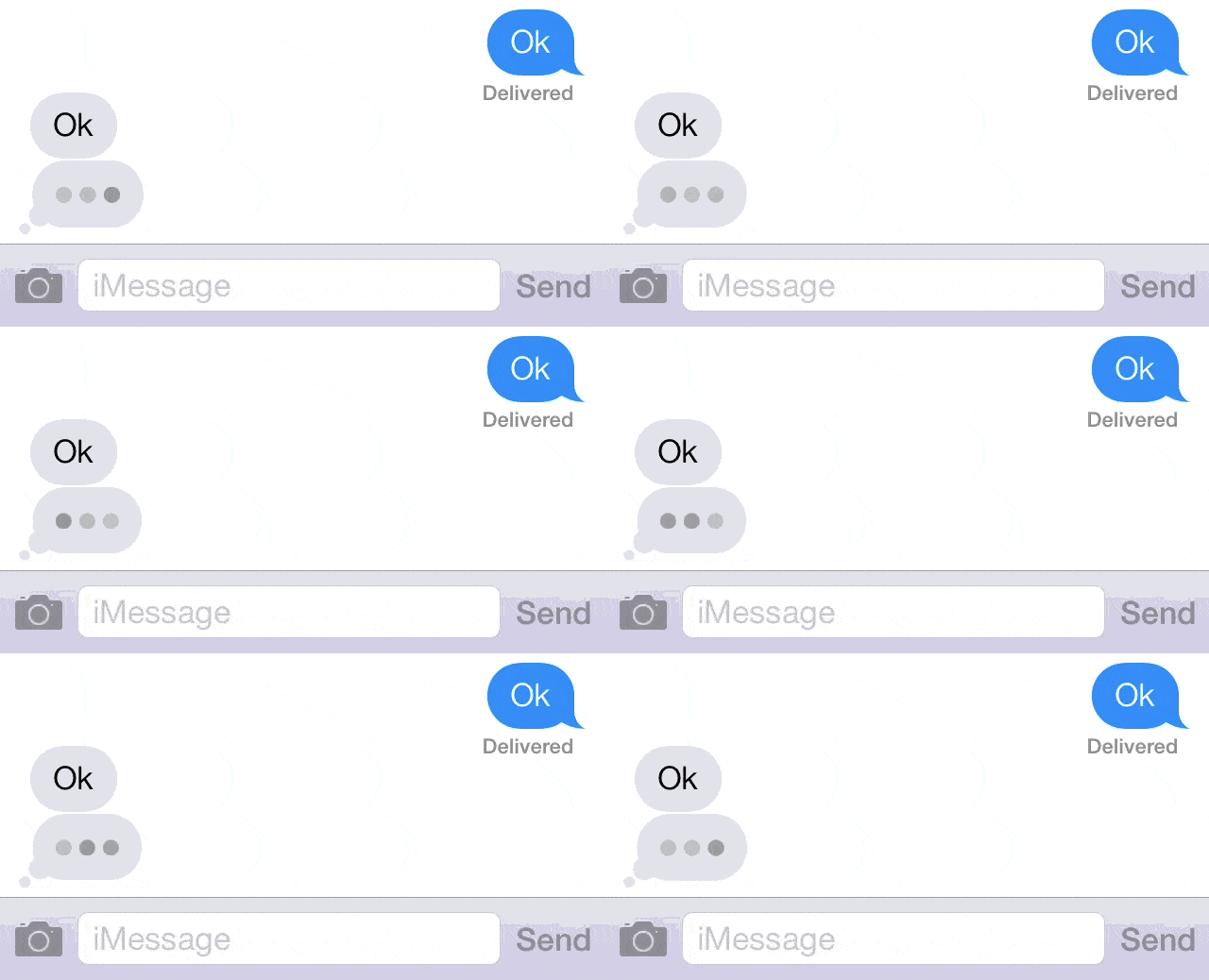
Chatbot and animation
Typing animation via Buzzfeed

Best of the Best

Conversational interfaces open lots of new possibilities how you can interact with users. Below are two popular apps that successfully embraced the new paradigm of conversational UX:

Domino’s Pizza

Domino’s pizza allows “conversational ordering” via Facebook Messenger. Customers add Domino’s pizza as a friend via Facebook, set up the basics of their account, and can then “reorder their favorites” or ask for the latest deals.
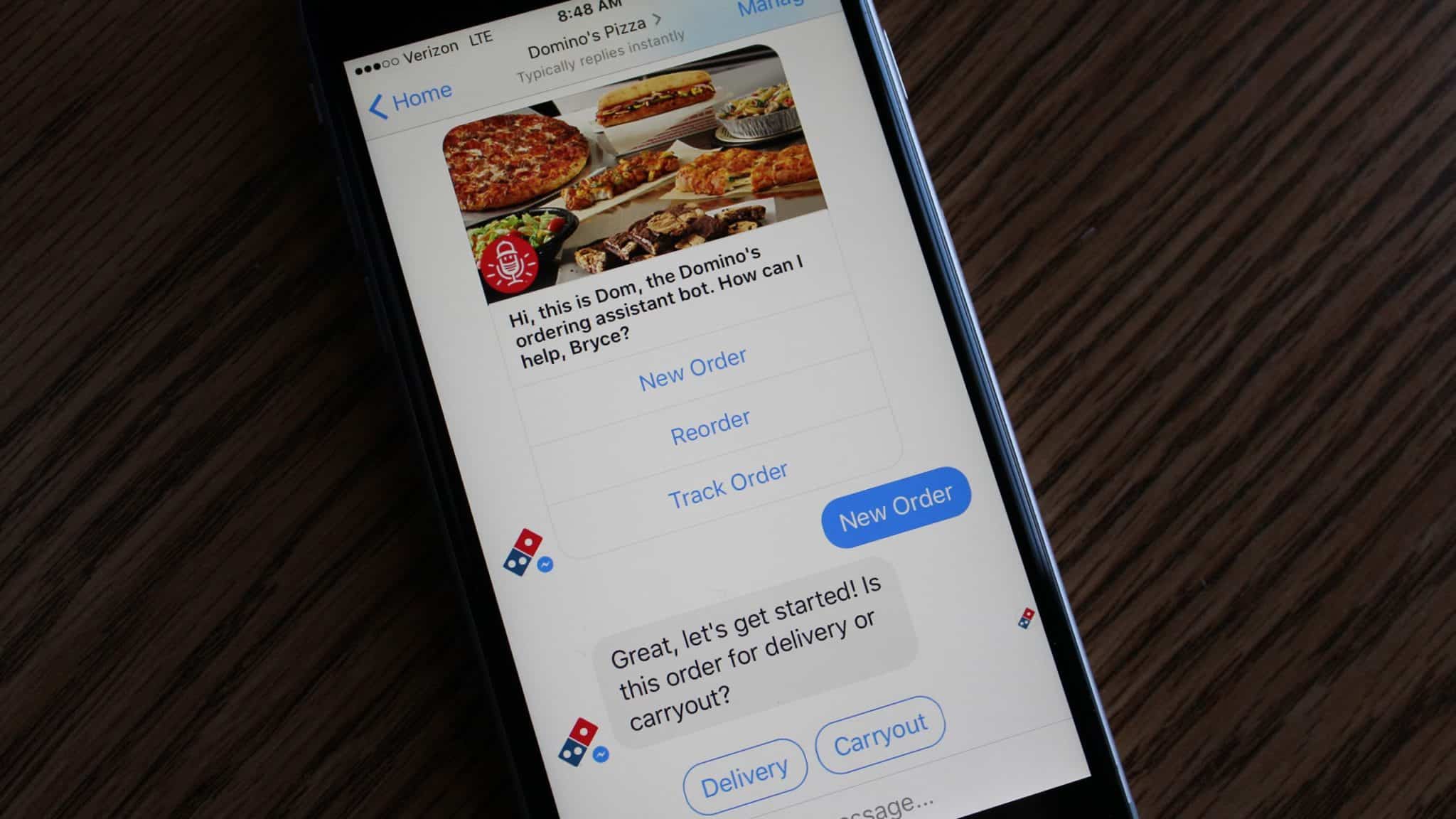
Domino's pizza chatbot
Domino’s Pizza via Techcrunch

Duolingo

Duolingo is a language learning platform which uses gamification and personalization to make learning a new language effective. Last year Duolingo introduced Bots. This feature allows users to practice language skills by texting with a ‘Bot,’ which takes on different topics as a way to explore a range of conversations, such as going to a restaurant, going through border checks, or ordering a taxi.
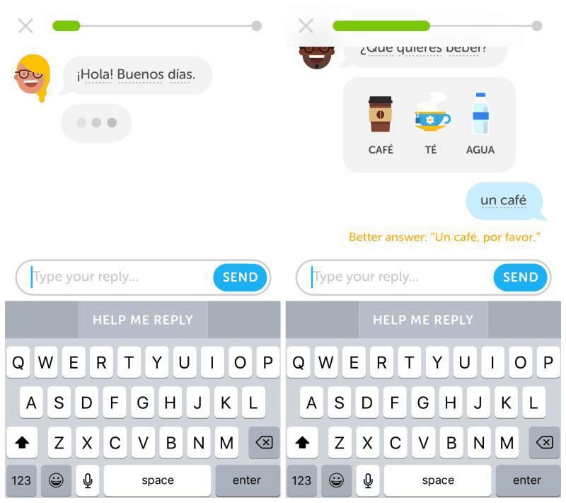
Domino's pizza chatbot

Conclusion

Whether you love them or hate them, conversational interfaces have started making a significant impact in communication. Of course, most of them today have certain limitations and they don’t have human-like conversations perfectly that’s why it’s so important to follow basic principles of conversational interfaces  mentioned above. But in the near future, continuous advancement in machine learning and artificial intelligence technologies will fill this gap and we will see AI-powered chatbots which will have human-like conversation.

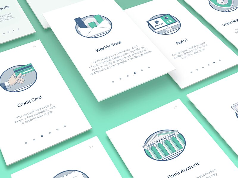
Designing a Great Onboarding Experience

By Onboarding, User Experience

If you’re running a new (or not so successful) business, you probably know that attracting new customers is your biggest challenge. In order to deal with it, you need to follow emerging trends; and to employ modern tools and methods which empower your users to use content in an efficient manner.

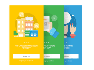
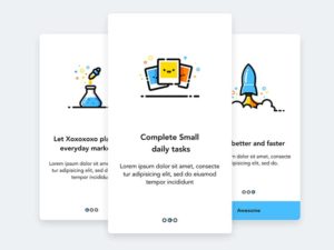
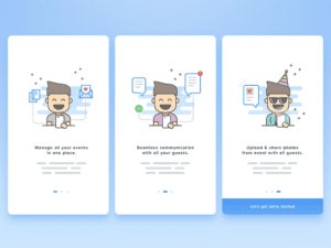
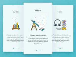
Onboarding is a process of transforming newly registered users into loyal customers. This process consists of your brand’s values, product’s features; and the guidelines you provide to your users. It is not rare for the overall success of your app to depend solemnly on great onboarding design.


UX


Well-executed onboarding can help you provide better experience; lower your maintenance costs; and increase your profit. Furthermore, onboarding is a process which helps users to familiarize with your product; and to navigate the app in an intuitive manner. It is essential to provide them clear directions and to inspire them to engage as much as possible.


Onboarding’s Ultimate Objective


AB Testing


The main purpose of the onboarding procedure is to create a wonderful first impression, providing all essential information in almost no time. Such efficiency will convince users to spend more time on the app; and to explore whatever is offered to their attention.


Best onboarding experience has the purpose of making people feel comfortable on your app. You also need to present your product in an easily acceptable way, which will use almost no time to create necessity and urgency for them to buy it.


ui


Why is this so important? Because it assures you that even if users leave without a purchase, they will eventually come back! The decision of signing up or making a purchase is a difficult decision even on the simplest apps. Trust is the most expensive gift users could give to you, so make sure to convince them you deserve it.

Many designers fail to comply with this requirement, as they consider onboarding to be just a breakthrough step for accessing the rest of the content. Sometimes, it means they are destroying the connection with the users; and they send them away even before explaining the benefits of that app.


Onboarding – Definition and Importance


4


Even if most of the brands appreciate the importance of attracting users, they make the mistake of thinking their work is done once users are on board. If you ask us, that’s just the beginning-you have to help users navigate your site; and you have to make it easy to use. At the beginning, it is essential to support users and to give them the attention they deserve.

Take a second and think about yourself as a user-wouldn’t you feel absolutely lost and confused on an app which doesn’t instruct you what to do?


5


Remember that there will be users who heard about your app; or found a link which redirected them to it, and they are arriving with faith and expectations. As a welcoming host, you have the duty of ‘shaking their hand’ and ‘walking’ them through your website/app. Consider onboarding as the first encounter with your user-you need to do your best to appear charming and interesting. Remember you’ll have nothing more than a couple of seconds to send a powerful message which can make users like you.


Why is the onboarding process even necessary?


6


Let us clarify your doubts on whether you need an onboarding process or not: Imagine you’re launching a website/app which has different performance that the ones your users experienced before. It is not an uncommon situation-you may be introducing a completely new product and you’ll need ‘hidden items’ to make it more interesting.


The Process Itself


7


Have in mind there will be no second chance to design a perfect onboard experience-the process happens only once, right after users decide to engage and to explore the content of the app. Therefore, onboarding is a designer’s unique opportunity to orchestrate an introduction which can inform users, and entertain them at the same time. With a good onboarding process, even the most complicated products can seem attractive.

Another important benefit is the temporary ‘hiding’ of the product’s real value-price comes only after a user is truly engaged, and he believes your product is absolutely necessary to satisfy his needs.


ui pattern


He will most probably look at different forums or social networks to examine quality and to compare price, but what will count is the urgency and necessity you’ve created from the very first moment. As simple as it sounds, your success will depend only upon the easiness and speed of your onboarding process.

Welcome your users into a secure environment, totally consistent with common perceptions and expectations. Failing to do that would disappoint them and you would probably never restore their confidence.


UI


In addition, make sure you replicate the success of your onboard design on all other pages and elements-you need to preserve the same trust levels until the very end of your users’ session. Examine users’ behavior in every phase of their visit and show them you’re ready to respond to all of their requests. However, don’t exaggerate because you would seem pushy or heavy-handed. Your directions could be welcomed in certain cases, but there will also be occasions where users want to explore independently, without your interference.

Decided to create a great onboarding process? Focus on the following goals:


  • Remember that you have only one chance to produce excellent onboarding experience, so make it as easy and entertaining as you can.
  • Make your product necessary and desired. It is an asset to count on in future, rather than closing every communication once the order is done.
  • Restrict the usage of text; and use actions and indications to show users how to use your products.


During onboarding, you’re enabling users to make the most of their experience on your app. We collected a list of recommendable practices you could apply, depending on the type of product/s you’re offering.


  1. Avoid tricky concepts

What may work perfectly for most apps could have detrimental effects for you. Keep things simple and apply only such concepts that match your style and your needs. If something appears complicated, or causes unnecessary delays, feel absolutely free to remove it.


  1. Stay opportunistic

Onboarding is your chance to involve users, and to make the most of your users’ first impression. Use it, and make sure you won’t miss any opportunity in future.


  1. The more entertaining, the better

What does a great first encounter mean? It means that users will be ‘in’ for a second one whenever you call them. It also means they’ll share the positive experience with their friends; and they will drive new users to your website or app. How do you achieve that? Make it as entertaining as possible!


  1. Inspire action

Even the best-executed among onboarding experiences will be incomplete if it doesn’t inspire action. Challenge your users, but make sure you’ve shown them that exploring your content and reacting to your demands is not a waste of their time.


  1. Keep it simple

The clearer, the better. Your onboarding process deserves to be cleared from any clutter and mess; so that users will not be distracted from the product and the benefits you’re trying to explain them.

Try and be creative when you require users to sign up: avoid the classic set of elements (names, last name, address or passwords) and if possible, reduce their number. Sign-up simplicity is something users appreciate, and you have to use it in order to increase your conversion rates.


Final Thoughts


10


There is no standardized rule for designing the perfect onboard process-you need to be creative, easily adaptive to all changes and modifications, and focused on the needs of your business. Looking at outstanding examples is a good idea, but replicating somebody else’s idea will never generate the same results.

The main reason why onboard processes are so important is that they take place at a very critical moment of your users’ experience-it is the very beginning, when you’re supposed to grab their attention and to expose the most important facts and benefits from your brand and your product. Therefore, forget about your own preferences and think about what users are expecting from you.

Don’t lose focus from your users-analyze their behavior and try to predict their reactions to each product/service. The more data you gather, the smoother your onboard flow will become.