Mastering technology branding is key to standing out in today’s market. Discover how to simplify complex features, build trust, and connect with your audience effectively.
Mastering technology branding is key to standing out in today’s market. Discover how to simplify complex features, build trust, and connect with your audience effectively.
Bridging the gap between user needs and executive vision in the world of UX design.

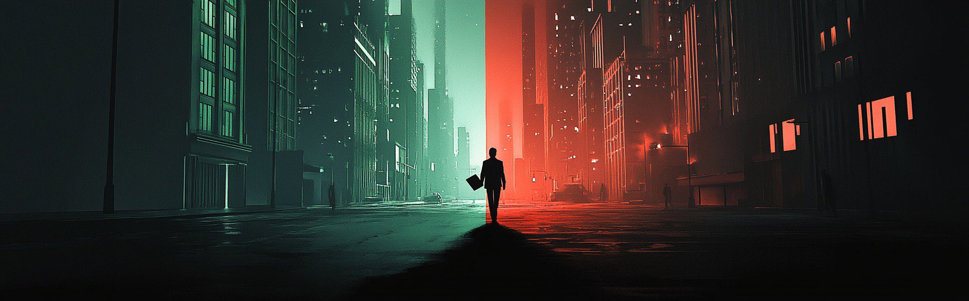
In the world of UX design, aligning the needs of users with the broader goals of the business can feel a bit like a covert mission. The UX designer is often the double agent, walking the line between user feedback and executive vision — two opposing forces that don’t always play nice. While executives are focused on strategic goals, profitability, and operational efficiency, users are simply looking for seamless, intuitive experiences. How can we, the UX designers, help these two factions see eye to eye? Welcome to the art of negotiation — and espionage.
The UX Designer: The Double Agent
Imagine the UX designer as a secret agent, caught between two worlds. On one hand, we have executives: sharp, strategic, and results-driven. On the other, we have the users, the everyday heroes who engage with products in real, human ways. As the designer, we must navigate these often-conflicting forces, gathering intelligence from users through research and translating it into actionable insights that align with the company’s objectives.

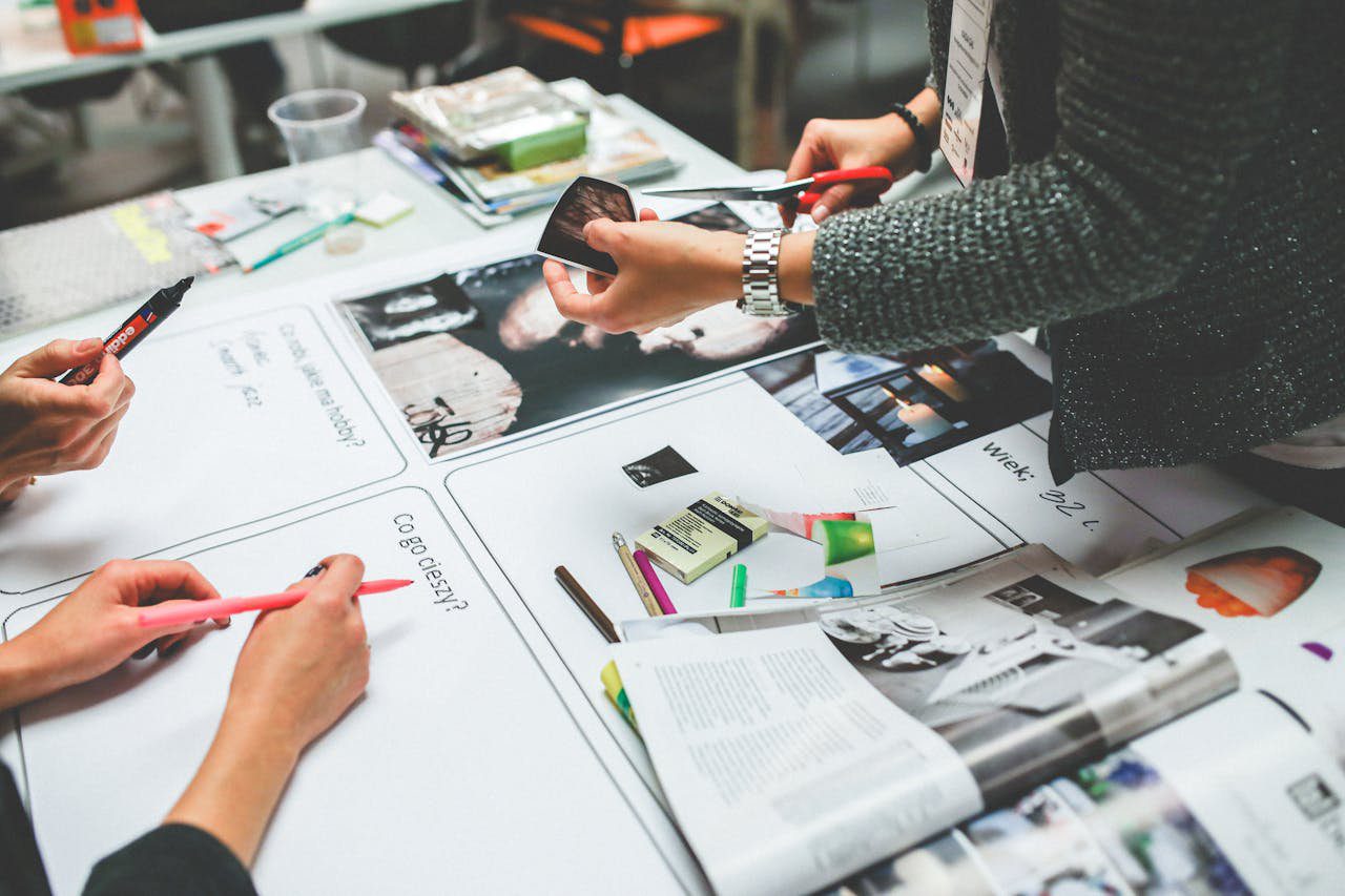
The UX designer on a covert mission, navigating between the needs of users and executives.
Much like a secret agent sneaking through enemy lines, the UX designer must gather insights without tipping off the execs or users, ensuring their needs are met while protecting the overall integrity of the project.
First, understand the strategic vision of your company. What are the high-level goals? Is it to boost sales, cut costs, or maybe both? Think of this as the North Star guiding your design decisions. As Steve Jobs once said,
“You’ve got to start with the customer experience and work back toward the technology — not the other way around.”
The Tug-of-War Between Business Goals and User Needs
The tug-of-war between executive expectations and user needs is not just an abstract challenge — it’s a real balancing act that many UX designers face daily. On one end, business goals pull the designer toward financial metrics, efficiency, and ROI. On the other, user needs demand a seamless, intuitive experience that meets their expectations without compromise. The designer is left holding the rope, trying to keep both sides from snapping out of control.

Negotiating Alignment: Finding Common Ground
When we’re pulled too far in one direction — either toward the needs of the business or the wants of the user — we risk creating a product that’s either too rigid or too chaotic. The key to success lies in finding a delicate balance between the two, where neither side dominates but both are sufficiently addressed. The UX designer’s role here is that of a referee in a high-stakes game, ensuring no one is left behind.
Identify the critical success factors (CSF) your company must address to achieve its goals. These are the non-negotiable elements driving success, like enhancing customer satisfaction, improving product quality, or increasing market share. Picture these as the sturdy legs of a table holding up your business objectives.
Set clear usability criteria to measure your success. These metrics could be task completion rates, user satisfaction scores, or the frequency of help desk calls. These indicators will help you assess whether your designs are hitting the mark. Remember,
“What gets measured, gets managed” — Peter Drucker.
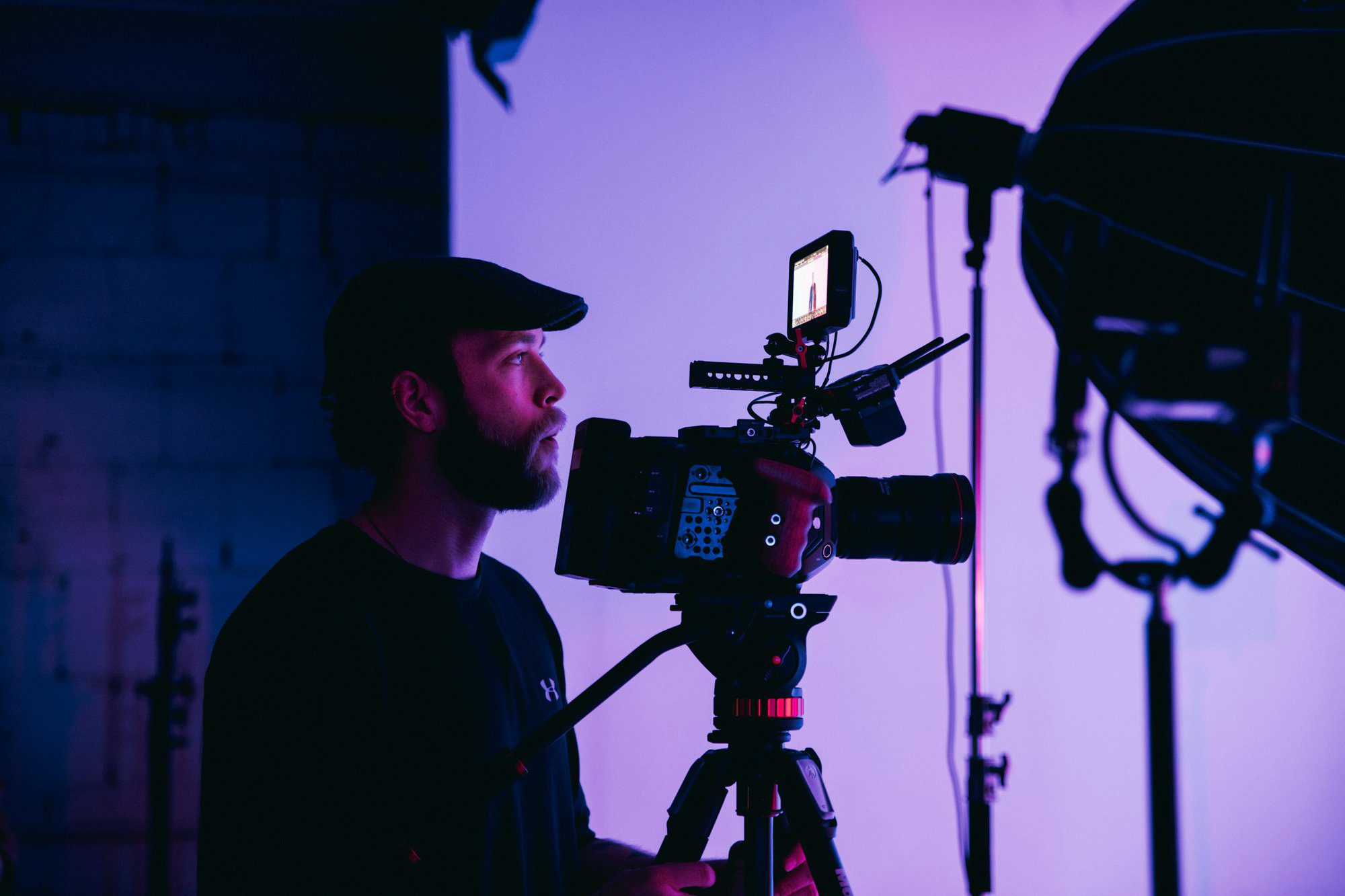
Tools and Techniques for Aligning User and Business Goals
The UX designer, like any good secret agent, is equipped with an arsenal of tools. From user research to wireframing to usability testing, these are the “gadgets” that help us gather intel and solve complex problems. But just as a spy relies on subtlety and strategy, the UX designer must use these tools with precision, gathering just the right amount of information at the right time.

The UX designer’s secret toolkit — combining user insights and business objectives to align both sides in the mission.
These tools allow the designer to monitor the terrain — to understand what users are struggling with, where they’re succeeding, and how their interactions can be improved. But they also help the designer track executive goals, ensuring that every insight can be tied back to measurable business objectives. With the right techniques, we can build a product that satisfies both parties, creating a smooth journey toward success.
Integrating usability goals with business objectives isn’t just beneficial — it’s essential. A user-centered approach can reduce hidden costs and support broader business goals. Here’s some examples of how:
Imagine designing a product so intuitive that even your grandma could use it without a manual. That’s the power of good UX.
Quantifying the benefits of a user-centered design is crucial. The HFI ROI Calculators can help. It demonstrates how usability improvements translate into financial gains. According to HFI, even small enhancements in user efficiency can lead to significant productivity boosts across large user bases.
For instance, a 1% increase in user efficiency might seem trivial, but if you have 10,000 users, that’s a lot of extra hours for innovation rather than frustration. It’s like discovering a hidden stash of productivity gold.
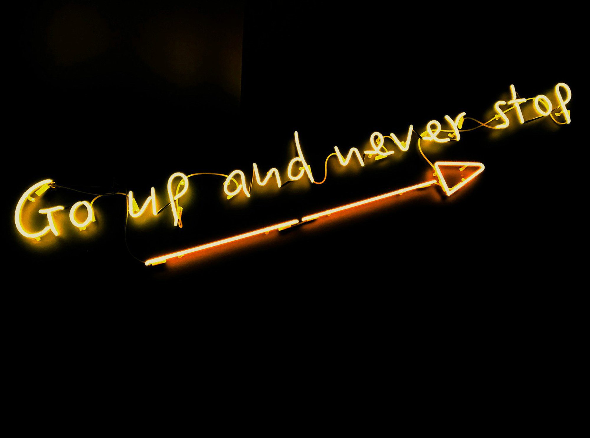
Conclusion: Mission Accomplished
In the end, the successful alignment of user goals with executive vision feels like a mission accomplished. When the UX designer has successfully navigated the complexities of business objectives and user needs, the result is a product that performs in the real world while satisfying the stakeholders who built it.

Achieving success by aligning user goals with the executive vision.
Like any good spy, the UX designer operates in the shadows, ensuring that both user and executive needs are seamlessly integrated. But in the end, it’s all about the payoff: a user-friendly, profitable product that aligns with the overarching goals of the business.
When pitching your design ideas, frame them in terms of executive intent. Instead of saying, “Users want this feature,” explain how the feature will help achieve strategic goals like increasing sales or reducing costs. This approach speaks directly to executives’ priorities and can help secure their support.
By aligning your design goals with executive intent, you not only create better user experiences but also drive the business forward. So, next time you’re in a meeting, think big picture, and design with both users and executives in mind.
As Thomas Watson, the founder of IBM, put it,
“Good design is good business.”
This piece was written by Shane P Williams.
Shane is a Design Systems Advocate. At the intersection of Brand, UX & UI. Passionate about design, tech and digital. Founding Editor at www.DesignSystemsCollective.com
You can also follow him here. https://blog.shanepwilliams.com/
In an era where consumers face daily information overload, digital brand storytelling emerges as a powerful tool for brands to stand out. This article delves into crafting compelling narratives, engaging audiences across various platforms, and leveraging emerging technologies like AI and AR for immersive experiences. Discover how authenticity, emotional connections, and consistent messaging can transform your brand’s digital presence. Explore successful case studies from Nike to Coca-Cola and learn how data-driven insights can refine your storytelling strategies for maximum impact. Embrace the future of digital brand storytelling to build lasting connections with your audience.
This article explores the top growth marketing trends shaping 2025, highlighting emerging technologies, evolving consumer behaviors, and innovative tactics
Discover how AI in design transforms systems by enhancing UX, automating workflows, and improving collaboration. Explore the future of AI-driven design today!
Discover how AI-driven personalization is transforming marketing. Learn about the latest trends and strategies for creating tailored customer experiences.
Discover the future of preventative healthcare with AI, wearables, and data analytics. Learn how these innovations enable early detection, personalized care, and better health outcomes.
This article explores how generative AI is reshaping B2B customer experience strategies for maintaining authenticity and the future of businesses that embrace AI while remaining human-centric.
Explore the top 10 video marketing trends for 2025, from short-form videos and live streaming to AI personalization and cutting-edge tech like AR and shoppable videos.
Let’s discover how AI is shaping UX design. Learn how to balance automation with human-centered design in 2025 and beyond. Explore ethical concerns and key studies.
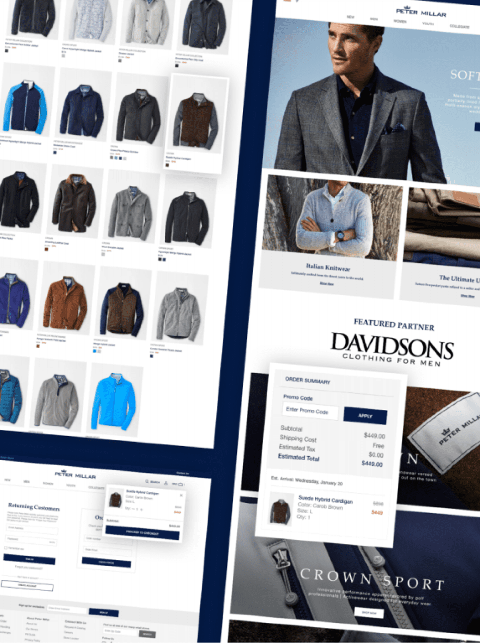
Brand identity tells the story of how an organization or product owner values details. Let’s focus on these details collaboratively, using data, empathy, veteran creative experience, brand standards, and industry best practices to execute on your production needs. Utilize our team as a creative-arm to your marketing team, or compliment our development, user experience, user interface expertise, or digital advertising managed services.
Stakeholder interviews
Lead stakeholder interviews to ensure that the business objectives are understood documented and aligned.
Prototype development
Use prototyping tool to develop a clickable prototype for user testing.
Persona development
Use personas to define a list of typical user tasks/stories.
User testing
Validate current experience and create a process to user test new features prior to development.
Service map
A map visualization of the architecture of features that comprise the entire (digital) product experience.
Wireframes/Visual design
UX wireframes based on initial research and stakeholder feedback.
When it comes to software development, we follow the Scrum methodology. Our small team assembles at the beginning of each sprint cycle to plan and distribute the work they’ll undertake during that cycle in accordance with the priorities of the client. Each day the team meets to communicate progress and plan the day’s tasks. The progress of the team is visualized on the task board.
At the end of each sprint we will demo the working increment of software, taking the opportunity to gather feedback and discuss upcoming priorities.
We involve our clients heavily in the process. We believe that developing in a silo doesn’t work. Therefore, we expect that the client will assign one person to act as Product Owner, who will be available for planning sessions, manage the priority of the items in the product backlog, answer questions and provide feedback.