fbpx Skip to main content
Category

User Interface

Craft intuitive user interfaces that captivate audiences with millermedia7. Discover insights and best practices to create seamless UI designs.

No-code vs. Custom Code: What is a Better Fit for User-centered Design?

No-code vs. Custom Code: What is a Better Fit for User-centered Design?

By AI, Application Development, Digital Transformation, Innovation, User Experience, User Interface, UX

Ever-evolving software technologies and no-code or low-code tools are transforming a traditional way of creating digital products. In the last few years, creating software can be done faster, simpler, and with a lower barrier of entry than ever before. One of the reasons is that user-centered design has come to the forefront of most software development processes. At the same time, the need for the software creator to code is being replaced with drag-and-drop interfaces, freeing up space for creativity, rapid prototyping, and continuous testing.

But does this trend mean that custom coding will completely vanish in the next few years? Or, can these two approaches exist in parallel, complementing each other?

This article will explain the concept of no-code and low-code development in the context of building user-centered design. Ideally, you’ll find out whether you’ll benefit more from a low-code development approach, or if custom coding is what you need for your projects.

What “low-code” and “no-code” actually mean

As the name suggests, low-code or no-code development is a practice of building digital products with little or no coding. It’s made possible by platforms allowing users to create software solutions by just dragging and dropping necessary elements, or features, into the relevant fields. The main goal of these platforms isn’t limited to visualizing product designers’ ideas like in Sketch or InVision. They let you build an actual interface with functioning features on it, as opposed to creating a UX/UI mockup.

The low-code/no-code approach reflects recent changes in the development process and business requirements. Today, the main focus is shifted from the product functionality to the product presentation.

development process
Image credit: zapier.com

Modern businesses understand that the strong orientation towards users has become a ‘gold standard’ in the digital world. Naturally, as technology develops, design decisions play a more critical role than it did before. These factors create a demand for quicker prototyping and frequent user feedback collection. The birth and rise of low-code/no-code development is a technology response to this global trend.

Benefits of no-code development

office people

The potential benefits of the low-code/no-code development approach goes far beyond speed and simplicity. This practice can significantly reduce the gap from the ideation and execution stages of app development – drastically changing the way businesses embrace innovation. Here are the key advantages of using low-code/no-code development platforms.

Rapid delivery for the supreme time-to-value

Rapid delivery is probably the most obvious benefit of the low/no-code approach. With low-code/no-code automation tools, you can build a web or mobile application really quickly, even if you can’t code. The accelerated development speed can help startups that plan to launch a product or service in a highly competitive market gain a considerable competitive advantage.

For mature enterprises, rapid delivery is also beneficial as it allows for improved flexibility and adjustability. Besides, the fast time to market enabled by low-code/no-code solutions can help businesses of any size iterate more often and create products with truly user-centered design.

Driving force behind digital transformation

Low-code and no-code tools facilitate a digital transformation process and lower the barrier of entry to innovation. In practice, it allows business professionals with no or minimum technical background to bring their ideas to life without the necessity to wait until developers will do the work. This practice is called civil development, and it helps enterprises resolve IT challenges faster and more effectively.

For example, an HR or marketing department may need quick internal transformations to improve its efficiency. In these scenarios, low-code can be a great solution as it doesn’t require a lot of time and money from an enterprise.

Additionally, low-code and no-code development create more favorable conditions for building user-centered design for business applications. It is because the people who need the software solutions are the ones who actually build them, as opposed to delegating the task to the IT department.

Simplified prototyping and usability testing

To create an outstanding UX design, a development team should test a product on its potential users before the release. The more iterations take place, the higher the chances are for a successful product launch. Basically, this is the foundation of most agile development methodologies.

With low-code/no-code tools, programmers can quickly and easily build a product and test its every core feature. As a result, they can generate enough knowledge to tailor a user experience to the needs and wants of a target audience. Besides, low-code/no-code development enables the implementation of the Lean UX approach. This Lean UX method prioritizes rapid iterations and puts an even greater focus on collecting user feedback.

Benefits of custom coding

coding

Low-code/no-code options cannot fully replace custom development. Writing code from scratch also has many advantages that are essential for solving certain business challenges. Let’s take a closer look at them.

Uniqueness and specialized interactivity

With low-code and no-code development, you can create a good design. However, this approach won’t allow you to build a unique solution. In other words, if you need an application with specialized interactivity, custom coding will be a better fit for you.

This slightly more traditional approach to product development usually requires more resources, but it also gives you a higher level of freedom and expertise. Basically, developers can implement any product idea you have. Whereas, if you select low-code/no-code development, your choice of features and UX design elements will be limited to options offered by a tool vendor.

Complex functionality and state-of-the-art technologies

Complex functionality and sophisticated data models can only be implemented with custom coding. It means that low-code/no-code solutions won’t be of help for businesses that need an enterprise-wide application. Similarly, when it comes to making use of innovative technologies such as AI, virtual and augmented reality, blockchain, etc, there is no alternative to custom code development.

Low-code/no-code vs custom code: what to choose for your business

Both approaches can benefit most businesses —  each addressing different needs. However, in order to help you decide what type of development to select for a specific project here are some hints that will help.

Choose low-code/no-code development for:

  • simple tools for automating simple business operations
  • basic solutions for eliminating bottlenecks in specific work-flows
  • new digital products that require extensive and/or regular user feedback to be built properly
  • new digital products that have to be released quickly (e.g., to outrun the competition)
  • idea validation, if you’re not sure whether people need certain functionality (ideal for startups)

Choose custom code for:

  • complex feature-rich solutions
  • products based on AI, VR, AR, or any other innovative technology
  • long-term development projects with uncertain requirements
  • unique products that cannot be developed with low-code/no-code tools
  • larger digital products that will reach a large user-base to ensure solidity at scale

However, it is possible for you to use both approaches in one project. For example, you may be able to build a high-fidelity prototype with low-code/no-code tools to test key assumptions and then proceed with custom coding to create a full-fledged product.

Conclusion

In the no-code vs. custom code battle, there is no single winner. Low-code/no-code development can be a great solution for building simple applications, usability testing,  prototyping, and experimenting. The wide adoption of this practice can drive innovation across different industries and cultivate creativity in product development.

However, the low-code/no-code approach cannot compete when it comes to the scale and unique features possible through custom development. Writing code remains vital when it comes to the development of unique and complex software solutions.

Want to develop a software product but not sure what approach to choose? Contact us!

Why UX in Healthcare Technology Matters and Where It’s Going | 2020

Why UX in Healthcare Technology Matters and Where It’s Going

By Branding, Interaction Design, User Experience, User Interface, UX

New challenges in the healthcare industry accelerate the development of healthcare innovation. Striving to improve patient care, hospitals and clinics seek ways to digitize medical services and internal administrative processes. But while a lot of attention is focused on functionality, the role of a user experience design in healthcare software often remains undervalued.

In this article, we’ll outline key trends in medical technologies. We’ll also explain how quality UX design can help healthcare providers deliver better patient experience.

Telemedicine

With the help of telemedicine, physicians can consult, diagnose and treat patients remotely using telecommunication technology. A typical telemedicine appointment looks like a traditional visit to a doctor’s office. The only difference is that the patient and doctor communicate online. Video conferencing solutions and remote health monitoring apps are the most popular tools that medical organizations use for delivering clinical services from a distance. But the concept is constantly evolving so there is a lot of room for new ideas.

telemedicine
Image source: dribbble
Image credit: Alexander Plyuto

Potential telemedicine solution users aren’t a homogeneous group. In other words, UX design of this software must be created with different categories of patients in mind. In particular, to build an inclusive telemedicine application, UX designers should take into account such characteristics as users’ age, mental states, and tech skills.

Ideally, a telemedicine appointment should resemble a face-to-face visit as closely as possible. So when working with this healthcare technology, designers have to recapture the feeling of real-life experience for patients and doctors. This is obviously vital with this current COVID-19 pandemic.

Health wearables

Smartwatches and fitness trackers became mainstream soon after they appeared on the market. And their popularity continues to soar. For example, one study shows that the number of wearable devices is forecast to hit 1.1 billion by 2022. But the growth isn’t just in quantity. Technological developments allow app creators to expand and enhance the functionality of wearables, turning them into useful healthcare technology tools.

health wearables
Image source: melmagazine.com

Most regular smartwatches and fitness trackers can monitor basic metrics like the person’s heart rate, steps, and sleep patterns. Medical devices are much more advanced and can also detect different deviations in users’ health conditions. For instance, they can identify atrial fibrillation by tracking the person’s heart rhythms.

To build a successful UX design for a health wearable, designers should properly prioritize information. A device must be simple and intuitive so users don’t feel confused when they need to quickly find necessary data or functions.

Healthcare chatbots

In healthcare, the chatbot technology is still in the early stage of implementation. Yet, it has the potential to become the industry standard in the next few years. Today, hospitals and clinics use chatbots mostly for experience optimization. For example, there are chatbots that help patients book appointments, connect patients with doctors, or collect feedback after a consultation.

But it’s expected that digital assistants will eventually become the first line of primary care. In particular, they’ll be able to analyze health information provided by a user and offer responses with personalized instructions.

If powered by artificial intelligence, healthcare chatbots can help medical organizations deliver patient-centric services while reducing workload for doctors. It’s important to remember that people who seek medical advice need to feel cared for even if they talk to a machine. So the main task of UX designers is to make an interaction with a bot very similar to chatting with a real person.

Medical virtual reality

Virtual reality opens doors to a variety of new opportunities for the healthcare industry. First of all, this technology improves training methods for doctors. It also allows them to master professional skills without risking the health and life of real patients. Research shows that surgeons who used the VR platform for simulating operations enhanced their performance by 230 percent compared with doctors who used traditional training techniques.

medical vr
Image source: healthiar.com

Another use case of virtual reality in healthcare is the reduction of pain and discomfort during unpleasant treatment procedures. For instance, VR healthcare technology comes in handy when a patient needs to sit for hours to undergo lengthy chemotherapy. VR can also help people with amputated limbs get accustomed to prosthetics.

Building a UX design for a VR-based healthcare solution is an extremely encompassing task. Designers working on such projects need to clearly outline the needs of a target audience and make accuracy their top priority.

Electronic health records

EHR solutions aren’t a new thing for medical organizations. Hospitals and clinics have been using this type of software for a long time. The purpose of EHR is to digitize medical charts and records while reducing the amount of paperwork needed. While this healthcare technology is widely adopted, its usability, in general, remains at a questionable level. As a result, nurses and physicians cannot fully rely on the system, as it may lead to errors and patient safety risks.

EHR system
Image source: sapristic-biion.com

Before creating a UX design for EHR software, designers need to study how medical staff will interact with a system. What is a user’s typical sequence of actions? Which fields are mandatory and which of them can be left blank? Is there something a user can forget to do after inserting information in a chart? Conducting extensive UX research will be very helpful during the early stages of development. But designers must also perform user testing and quality assurance at a later phase to ensure that a solution is user-friendly and effective.

UX and healthcare technology in a snapshot

Medical technologies aim to improve the efficiency of healthcare, enhance the patient experience, and make the doctors’ hard work a little bit easier. The UX design plays an important role in whether a particular health app meets these goals or not.

When deciding to develop a medical solution, healthcare providers must pay attention not only to its functionality but also to the user experience. At the same time, designers engaged in such projects must understand the specifics of the medical sector and be ready to deal with great responsibility that comes with tasks.

Looking for the right team of UX designers for your healthcare development project? Drop us a line!

The State of UX for 2020

The State of UX for 2020

By Customer Experience, Design, Digital Transformation, Interaction Design, User Experience, User Interface

We expect 2020 to be a momentous year in the space of UX design. New technology and user experience trends during the last decade have made competition across most modern industries tougher than ever before. Naturally, this motivates businesses to put even a greater focus on the user experience.

Today, the challenge in sensing customers’ needs and wants is no longer enough to stand out and be successful. Companies that want to win a higher market share must also be a step ahead of the herd and anticipate future UX trends.

To give you a leg up, we’ve collected the latest trends of the digital world which, we believe, will shape user experience in 2020. Give them a look and make strategic decisions before your rivals do.

Even more personalized experience

Personalization has been an essential part of experience optimization for a while already. However, as technologies continue to evolve businesses become better able to precisely tailor their offers to different users.

Besides using cookies that store only basic information about a user, website and app owners may now take advantage of the Internet of Things (IoT), Artificial Intelligence (AI) and related technologies (e.g. advanced data analytics, machine and deep learning). They open doors to a whole bunch of new UX-related opportunities and experiences.

A great example is Netflix. This well-known video-streaming service applies machine learning algorithms to provide every user with relevant content by personalizing recommendations, push notifications, and search results.

netflix screenshot

Starbucks goes even further. It combines AI with geolocation technology to deliver a truly futuristic experience. In particular, users of its famous location-aware app receive highly personalized promo messages at the time when they are in a specific place, i.e. near the Starbucks shop.

startbucks screenshot
Image source: Build Fire

In 2020 there won’t even be a question whether to make your app user-centric or not. The key differentiator will be the extent to which you’re ready to personalize your product.

Voice user interfaces are getting to their peak

In today’s fast-paced world time is money, and its value is high. Voice User Interfaces (VUIs) and virtual assistants help users navigate through an app faster while the handsfree capabilities allow users to multitask. No wonder voice user interface interaction has been on the top of UX trends for the last several years. The question is; what will happen with Voice User Interfaces (VUI) in 2020?

Well, VUI will continue to strengthen its position as the second most popular type of app navigation after graphical user interface (GUI). Is there a chance it’ll leapfrog GUI on the list?

We don’t see that happening next year. But voice-assisted UI will definitely continue getting closer to the first position in the ranking. There is even a quite promising prediction made by ComScore in 2016 that nearly half of searches will be voice searches in 2020.

Voice search by 2020
Image source: Milestone Insights Voice Search Report

We still expect a significant shift in the quality of VUIs. As natural language processing (NLP) technology is evolving, voice interactions and voice assistants become more effective in finding accurate answers. Besides, our interaction with them will also become more natural. It’ll resemble more human-to-human communication rather than a conversation with a robot.

Alexa chatting
Image source: SnapTravel

On top of that, the array of tasks we can perform with a voice command will probably increase in 2020. For instance, Google Duplex, a new project by Google, has already enabled setting up appointments over the phone without any interaction with a person on the other end from a user’s side.

Google Duplex
Image source: Google

Introduction of a Chief Experience Officer position

Creating a user experience that is both holistic and consistent is crucial for enhancing the usability of a product and making a brand memorable. Traditionally, UX professionals or a designer together with a marketing team has been responsible for ensuring this part of the development. But the situation is quite different now.

The list of platforms today’s organizations use to maintain their digital presence is not limited to a website and mobile app. Wearables and smart devices are growing in popularity, the number of social media channels is increasing and becoming more complex. In general, markets are becoming ever more dynamic. Ensuring a positive customer experience is now a much more complex activity than it used to be. This is why a new C-level executive position is necessary.

As of the end of 2019, not many businesses introduced the position of CXO. Introducing this position to your business will give you a significant competitive advantage for your company in the coming year. In particular, a chief experience officer will help you perform a comprehensive visual audit and build a holistic UX design system.

The rise of VR & AR in fashion and e-commerce

In 2020, Virtual Reality (VR) and Artificial Reality or Augmented Reality (AR) technologies will continue blurring the borders between the real and digital worlds. The success which such pioneers as Ikea, Toyota, LEGO, and Zara reached with their VR/AR-powered apps has inspired many other businesses to take a fresh look at the way they promote and sell products.

LEGO ar app
Image source: kidscreen.com

The development of applications containing virtual reality or augmented reality elements has also become more accessible in terms of costs and availability of specialists. All these factors lay the groundwork for a boom in VR/AR that can happen any year now. Of course, not all business areas will adopt these technologies equally fast. But such sectors as interior design, e-commerce, and fashion will likely become dependent on this type of interaction design in the near future.

For instance, at the beginning of this year, Gucci launched its AR-based app that allows users to try on sneakers by pointing a smartphone camera at their feet.

Gucci AR app
Image source: designboom.com

In May, Nike released its own mobile app that uses augmented reality technology to help customers accurately define their size.

Since online shopping is an active and ever-growing niche (e.g. about 60 percent of millennials prefer it over traditional shopping), we have all reason to believe that similar functionality will become industry standard quite soon.

3D design is taking over the app world

In our 2019 State of UX article, we were writing about Memoji which had been introduced with the release of iOS12. In the last twelve months, designers have started to use both static and dynamic 3D elements more frequently. The trend of 3D design has become vivid and noticeable.

Besides being eye-catching, a 3D presentation of interfaces helps to deliver a truly realistic user experience. A study shows that modern people are online for nearly 7 hours per day. This means that we spend an enormous amount of time in a virtual environment.

A 3D view makes our stay there more natural and comfortable. That’s why leveraging the power of 3D will be a great idea for all app creators and website owners in 2020.

3d design app
Image credit: Chris Frank

In case you’re not sure if 3D elements will suit the overall visual identity of your brand, you can perform a site design audit before introducing any changes. Doing so will make it easier for you to get to grips with the big picture and make informed decisions.

Adaptability to the new foldable phones

The year of 2019 has been an important milestone for phone manufacturers all over the world. The long-awaited foldable displays finally became a reality. Practically all market leaders either expressed their interest in developing such a device or unveiled their prototypes capable of being folded in numerous different ways.

Realizing that stakes were high, Samsung tried to outrun its competitors. In April, the company pre-released its Galaxy Fold, the world’s first foldable smartphone.

Galaxy Fold
Image source: Samsung

Although the device was exposed to a number of quality concerns and Samsung had to delay its release, we have all reason to expect that foldable displays will enter the global mass market in 2020. This will naturally bring a lot of changes to user experience, for example:

  • A grip will depend on whether a person is holding a folded and unfolded device. The main task of UX designers is to make it convenient for both cases.
  • A user will have to be able to switch between different forms of a device seamlessly. That’s why app creators must ensure the continuity of an application, meaning that a person should have an opportunity to continue using it when upgrading to a new device.
  • Unfolded devices will allow users to have multiple active apps on their screens. So to create a truly outstanding user experience, designers will need to keep this multitasking capability in mind.
Galaxy Fold
Image source: Samsung

Versatile UX for device-neutral apps

Ever since the IoT technology came on the scene, the discussions about platform-agnostic applications have never left the tech community. Nowadays, our personal digital ecosystem is much richer than five, three, or even two years ago. We use mobile phones, PC, and laptops interchangeably on a daily basis but also wearables, smart home appliances (like Google home), and car dashboards (like the one Tesla offers).

For many years, responsiveness has been the main requirement of web solutions. However, responsive design is no longer optional, it’s the default. Today’s users will unlikely to tolerate an application that doesn’t adjust to screen size or platform.

responsive design
Image source: giphy.com

But, on top of that, they expect to receive an integrated experience. This means that information must be consistent across all the systems. And the process should be continuous, allowing a user to pick it up at any point on any device.

That’s why we foresee that device integration and synchronization will get to the forefront next year. Logically, creating a versatile UX design will become a huge new challenge for designers in 2020.

User control over the content

The interactive experience is another ‘big thing’ that has a huge potential to become a major UX trend in 2020. To be precise, some forward-thinking marketers had been trying to promote products with the help of interactive videos before. But this type of content, where the user interacts directly with the content, only managed to generate massive interest after Bandersnatch, a Black Mirror’s interactive episode, was released on 28 December 2018.

Bandersnatch
Image source: meg.onemega.com

As it turned out, fashion brands and e-commerce stores became the first adopters of interactive videos. This is because such videos not only offer an immersive experience but they also are an efficient money-catching tool. By watching them, users can shop while still consuming the content. This allows them to act on their desire to buy a product when the desire is at its highest point.

interactive shopping video
Image source: cdn.trendhunterstatic.com

Besides making online shopping easier and faster, interactive videos are also more enjoyable and captivating than ordinary videos. If you want to create a stunning visual design with a great user experience that will allow you to win over the competition in the coming year, then giving users better control over the content is definitely the right thing to start with.

Expansion of interface animations

Adding motion to button, tabs, menus and other visual elements is not a brand new thing in UI/UX design. We’ve seen it this year and it’ll continue being popular in 2020. However, as animations seem to still be in the process of gaining momentum, we’ll probably see even more animated interfaces on our screens in the next twelve months. Just like 3D design, moving objects help UX designers grab users’ attention as well as make their experience more realistic and engaging.

interface animations
Image source: tubikstudio.com

Yet, it’s important to remember that every animation you implement into the app interface should serve a purpose. In other words, you don’t have to animate everything on a page. If you do so, a user will be distracted by visual noise – which is no doubt not the outcome you’re aiming at.

Instead, you may create a feedback animation that will make app navigation easier. Specifically, it’ll show users that they’re on the right path after an action is taken.

feedback animation
Image credit: tubikstudio.com

Animated progress indicators are also a nice idea for most mobile apps. They help users understand that there aren’t any problems with the application, it just needs more time to perform a certain task.

Animated progress indicator
Image source: Dribbble

If you have doubts about whether you need to add more animated elements to the interface or not, we recommend you to conduct a design audit first.

Typography will still matter a lot

When it comes to conveying messages, companies have a wide array of formats to choose from. But while videos and images are considered the most captivating, text content remains the main and the most effective method of communication in the online world. That’s why typography never loses its relevance and, of course, it will still be in the spotlight in 2020.

What major change may we expect in the year to come? As a rule, a user gets a meaningful and memorable experience only when the design is well-balanced and consistent. Since we’ll probably see more 3D elements and animations in the interfaces, typography will have to reflect these effects too.

typography animated
Image source: andreirobu.com

Of course, this doesn’t mean that San-Serif fonts, which are now widely used in the digital space, will completely disappear during the next year. But UI/UX designers will become more creative with the way text is presented on a page. Chaotic typography with mixed sizes and patterns (e.g. filled and outlined letters), as well as experiments with text directions, will likely be quite common in 2020.

Chaotic typography
Image source: Dribbble (by Oleh Gvozdetskyi)

The obsession with dark themes

Dark Mode became the most noticeable visual change brought by iOS13 in September 2019. The feature provides the option of replacing the bright colors of an interface with black and dark grey, making it more pleasant for eyes in a poorly lit environment. During the month that followed this release, dark modes were also introduced by Instagram, Gmail, and Facebook (partially). So we can make confident predictions about the dark mode ‘fever’ that will likely expand in 2020.

iOS 13 dark mode
Image source: techradar.com

Besides aesthetic value, dark themes also improve the readability of text and are perceived as less harsh if a person uses a device at night. Whether to enable it or not is a matter of personal preference. But if you implement such a mode for your app, your users will for sure appreciate it.

Custom illustrations will fill up the interfaces

In 2020, designers will have to cooperate with digital illustrators more frequently as bespoke interface illustrations are another emerging UI/UX trend. Stock photos that have been quite popular for many years now are no longer acceptable. Stock photos simply don’t offer the level of uniqueness most brands and users seek. At the same time, digital art is much more flexible in terms of styles, shapes, compositions, and characters.

But catchiness isn’t the only reason why illustrations are so powerful. The correct illustrations in combination with other elements on a web page can help you make the right emphasis and draw visitors’ attention to the CTAs. They also make an interface more emotionally appealing and help to create the right tone and mood.

web page illustration
Image source: Dribbble (by Tubik)

Speaking about mobile development, custom illustrations have always been less popular in this sector. However, such a situation is going to change as they’re getting more and more common – not only on the onboarding screens but also at other touchpoints (e.g. error notifications).

mobile interface illustration
Image source: Dribble (by Icons8 team)

The final word

We want to give you a comprehensive review of the trends which will likely define the UX design space of 2020. We made our conclusions based on our professional experience and the latest information about technological advancements. Yet, the digital world is hyperdynamic and a lot may change in a blink of an eye.

Some innovative solutions may appear completely unexpectedly and change the rules of the game across several industries. But don’t worry. We’ll keep track of UX best practices of 2020 and let you know about all important trends.

Want to build your next product with us? Reach out!

The State of UX for 2019

The State of UX for 2019

By Design, Interaction Design, Omnichannel, User Experience, User Interface, Voice

Keeping up with the current trends is important for any area, not to mention the UX design which directly influences the way your digital product is positioned and perceived by the users. In this article, we’ll take a brief look at what happened with 2018 UX trends and try to anticipate the emerging tendencies that have potential to become real big things in the coming year.

Read More

How to Conduct a Design Audit to Strengthen your Brand

By Design, User Experience, User Interface

A design audit might sound a little intimidating, after all, the word audit doesn’t exactly scream fun. But, it’s actually a very beneficial exercise. A design audit is merely an analysis of the design elements and branding guidelines in use by a company. Its main purpose is to make sure that the branding is consistent across all channels and outlets. When we say branding we do mostly mean visual design elements, however, branding is also the written and verbal communication as well as the user experience.

A good design audit will also take those into consideration, to make sure that’s consistent as well. The truth is that the need for a design audit is a sign of good things. It means a company has grown a lot and now simply needs to re-align its design efforts. Briefly, let’s discuss the benefits of design audit for companies and then let’s get right into how to conduct one.

Benefits of a design audit

No matter if you run a smaller company or a large corporation, a design audit might be in order if your company is growing and evolving. It’s a great idea because it will help you manage your visual design material and written message. In turn, this will lead to a well-defined identity and brand.


When inconsistencies in either visual style or messaging start shining through, a brand is weakened. It no longer has a solid foundation, and it starts diverging into different directions. Consistency is key, and by conducting an audit you are creating a chance to once again strengthen your brand. Think of a design audit as an opportunity to check the quality of the designs, the products, the user experience, and the overall strength of your company’s brand.

The visual branding audit

First thing first, it’s time to gather all the design assets. And we’re serious when we say all of it. Gather all the ads, the social media posts, the website and its desktop and mobile versions, the mobile apps, the letterheads, and the business cards. Include lead magnets, content upgrades, master classes or webinar slides. Include any pitch decks too. Anything that is a touchpoint for a customer. Yes, we do mean everything.

What you want to do here is to study the different collaterals to the notice patterns and their deviations. For example, you may notice that the social media ads are using the wrong logo file, or the quality of the graphics is just not what it needs to be. You may notice that you have many functionally similar sections throughout your website, but they are all designed differently.

As a result, you’re now aware of the issues. Meaning that you can now provide the people who run your Twitter and Facebook ads with the correct logo file and render final ad images in higher quality. You also now know that you will need to sit down and make sure that the footer is the same on every page, or that the custom made graphics for Leadpages use the correct brand colors.


Additionally, this might give you ideas on how you and the design team might want to update the branding going forward. Maybe you have too many or too few colors to perfectly depict the vibe your company is going for.

Tone, voice, and message branding elements

While you’re taking a look at all the visual elements, you should also consider the content itself. In the previous example, the only thing we didn’t mention was audio/radio ads because it’s the only thing that inherently doesn’t automatically come with a visual aspect too, as opposed to video.

Once again, it’s important to evaluate the actual content when performing your design audit. Read everything, listen to everything. Again notice what patterns you see, or should see but don’t. Just like with the visuals, you’re looking out to make sure that the tone, voice, and message is correct and consistent. As with all your marketing materials, it’s important to keep meticulous notes.


Pay attention to what no longer sounds like the company or any evolving patterns that just don’t seem right fit anymore. You might find that your company needs to have a more authoritative voice, be more playful, or use a softer vocabulary. Maybe you and your team realize that you can improve the overall tone, voice, and message of the company to be even stronger, better and relevant to the target audience.

The heuristics for usability and accessibility

Another thing a good design audit will include is a heuristic evaluation. This one focuses on the design process, examining usability and accessibility of a website or app. Usability and accessibility are crucial for a good user experience as these are the touch points between yourself and your customers. Those also help make your company and brand shine. Usability problems will affect people’s perception of your company too. They can be something simple, like a broken link, or complicated, like a confusing online order form. Accessibility problems, like missing alt tags, or low contrast between text and background, also mater.

Nielsen created a thorough heuristic evaluation guide – a standards manual if you like – back in 1994 that is still popular and reliable today. We recommend that you check out Nielsen’s heuristic evaluation guide here.

Next, you go through your website, web app, or mobile app, and little by little make a note of where the experience falls shorts of these heuristics.

For the best possible results of a heuristic evaluation, it’s best to have at least 10 people (ideally some of them should be web designers) who objectively evaluate your designs.

Utilize a design system

You can tie all of this together into a design audit system. Once you’re done with the audit it’s important to regroup. From there you can figure out what needs to go, what stays and what needs to be updated. When it comes to the visual design and brand messaging, consider implementing a design system. We’ve written a couple great pieces on how to build a design system to scale and what best to include in one. Keeping your styles in a design system will ensure ongoing consistency so that you don’t have to do a design audit every few months.

The value of a well-performed design audit

As you can see, a design audit can be extremely helpful. It will boost consistency for your company’s branding and improve the user experience. Don’t forget, the truth is that a design audit is a branding recalibration, which means that your company and brand are growing. With a professional design audit, you now know what you must do in order to tighten up your brand’s visuals and message.

Have you done a design audit before? Did you find it helpful for your company? Share any tips you might have for us in the comments!

How to Design an Outstanding and All Inclusive Design System

By Design, User Interface, UX

A design system is there to help a team keep the visual, written and even coded designs of its brand consistent throughout. A proper design system is much larger and more in-depth than a typical style guide. In this post, I’ll explain the different elements that go into creating an outstanding and all inclusive design system that will serve your team’s needs. Let’s go!

The anatomy of a design system

A design system must explain what elements can be used, when those elements can be used, and how they should be used.  The “what” is the introduction of the actual design elements, such as a button, along with its properties like size, colour, and font. , The “how” dictates the particular usage of each design element. For example, links can never be red, CTA buttons must have a specific size and colour. The “when” describes the relationship of the design elements to others, including their hierarchy. It’s when to use a CTA specific button, versus a normal button, or a link. For example, you only use a normal button with a contact form but you must use only the CTA button for all the lead magnet email forms.

The structure of a design system

The actual structure of your design system will vary depending on the needs of your company. To give you an example, Atlassian’s design system is divided into three parts, Brand, Marketing, and Product. Under each section, you can find design elements and guidelines that are relevant to that specific area. Logos in a web app might have different requirements and restrictions than a logo on a Facebook ad or a free download file.


Shopify, on the other hand, has guides for their apps and for their admin designs as well as general design principles that apply to both. They have their design system include rules and instructions for Visuals, Components, Patterns, and Content. That’s right, a design system isn’t strictly visual. You should also consider including guidelines on tone, voice, and message, as the language is also part of the brand. MailChimp had a whole design system dedicated to tone and voice alone.


Basic design elements to include

Each design system will have to cover key basic design elements such as colours or typography. That’s a given. Additional elements like layout or illustrations will vary depending on your company needs. Below I am going over the most common design elements you should consider including in your design system.

Typography

For typography, you must include the typefaces in use and downloadable files. For sizes, whether you’re using pixels, pts, or rems, include the specific number and show the size of the text next to it. But, only include sizes that are allowed to be used. Include typographic treatments and design styles such as font weights. Additional properties to consider adding include line heights, line lengths, mobile breaking points if your typography is responsive, and whether or not headlines and links are sentence or title case.

At the very least, include the individual text styles starting with p, em, strong, and H1-6 to whatever else is in your designs, like subtitles. Include the relationship of padding, line height and margins between H1 and p, H1 and H2 and so on.


Use IBM’s Carbon design system typography section for inspiration. It’s very thorough.

Colors

When it comes to colors include every color that is allowed to be used. If ones are for special circumstances make a note. Explain how to use the colors in relationship to one another such as text on a background, and keep in mind accessibility as well. If there are specific color combinations or pallets to be used, explain them too. Provide both, HEX and RGB values as well as code variables for developers. Add CMYK if you ever print anything too.

Check out how Salesforce is handling colors in their design system documentation.

Icons, graphics, and images

When it comes to icons, graphics, and images you must include sizes such as minimum and maximum restrictions. If you’re running a blog, include specifications for author’s and commenters’ avatars. For inline images, you can include alt tag best practices, size recommendations, as well as recommendations on the image’s content. For example, you might want to use only photographs, no images with text, or to never use dark or cluttered pictures but only ones with natural light or with pink backgrounds. Provide actual examples of good and bad photographs for better clarification.

Atlassian goes into extensive detail in the marketing section of their design system for both illustrations and iconography.


Additionally, Estonia’s design system has a fantastic section for imagery where they meticulously talk about the quality of photographs and their content as well. They include information on lighting, colours, post-production, and compositions. This makes sure that the images used within their designs are the right essence for the brand. This is exactly what an outstanding design system ought to do!

Motion

I’m using motion as an umbrella term. It can also refer to animations, transitions, mobile gestures or other movable behaviors and feedbacks. Motion can be complex to express; it’s got a lot of different but important properties. It’s a good idea to explain when it’s appropriate to use motion, what specific choreographies are okay, and how are they best to be used. Speed, sequencing and movements need to be addressed too.


A great example of motion can be found in Google’s Material Design system. It goes into a detailed overview of how motion can and should be used within Material Design. It also provides many dos-and-don’ts, with short videos snippets to better understand the intention.

Layout and grids

Layout and grids are important for web pages, mobile apps, and responsive designs.  Think of layout as common patterns to arrange the different contents within a screen. It can include information about what patterns to avoid and how to arrange the content within your layouts in an acceptable manner. You could get a little bit more specific and address how to use the larger design elements like the card designs that we especially see in web apps or mobile apps (commonly associated with Material Design). You’re welcome to provide a standard screen layout as the base.

Shopify’s design system has a great example of how they approach layout in their web app. It’s filled with recommendations, and it talks about many variables such as screen types and small-scale layouts too.

With grids, talk about the size of the columns and gutters, include pixels or % (if they are fluid), and mobile breakpoints.


From a coding perspective, go ahead and include the different class codes for the gird, and whether or not it can only be used on divs or other elements like images too. If there is a clearfix class, explain how and when to use it or whether or not the grid uses border-box or content-box box model. Consider including a vertical grid if you have one.

Take a look at Mapbox’s grid section – it’s comprehensive. Buzzfeed’s design system includes a whole section on flexbox too.

UI elements

No design system would be complete without explaining the various UI elements out there such as inputs, button, and forms, errors, lists and tables.


MailChimp is doing a great job with these. They have a Form Elements section in their design system that details buttons, selects, inputs, field help, radio buttons, and checkboxes. One by one, they include the styles and code for each element and their variation. For example, they have 8 different button example from a typical button to a combo button. For each, there is a description to explain how to best use it within a design. Consider including how the messages should be phrased in addition to how they should look.

Errors and feedback

MailChimp additionally has a designated Feedback section which talks about how to provide feedback to a user who is using their app. This section does include errors, but also other forms of feedback such as callout tips or small badges for inline feedback and labels.


Don’t forget, an input error is not the only thing that can go wrong. Errors can also include the 404 page or the 503 page and that’s exactly what Heroku includes in their error section too.

More design elements to consider

At this point, I think you have a pretty good idea of what goes into a well-defined, outstanding and an all-inclusive design system. However, I wanted to put together a quick list of additional ideas for you to consider as there really is a lot you can do here.

Conversations

HelpScout has a section for both Conversation Lists and Conversation Threads. Their product is conversation based so it makes sense they’d detail this part of their designs as well.

Navigations

Ant Design includes a section for navigations. It contains more than just the top nav we see on every web page. Here they define navigation as anything that tells a user where they are and it includes tabs, breadcrumbs, and pagination.


Lexicon categorizes navigation in a similar way. They have sections under navigation which include the typical primary and secondary navigation. They also include breadcrumbs, nav bar, and vertical navigation there too.

Logo

No design system would be complete without the logo section either. Louder Than Ten has their logo ready to download atop the page. Next, they mention good and bad sizing and cropping, as well as padding and sample applications.

Accessibility

I’ve briefly mentioned accessibility before. But let discuss it in greater detail right now. You can have a designated Accessibility section in your design system the same way Quickbooks does. Under the Accessibility section, they cover a wide range of topics including alt texts, readability, colours, and contrasts. They also have a list of additional resources for anyone interested in learning more about the topic.


Because accessibility is so important, it wouldn’t hurt to have the content be redundant in multiple places. Include the contrast content in both typography and colour sections. But, on top of that, have a separate accessibility section as well just like Quickbooks.

Putting it all together

Now that you understand the autonomy of an outstanding design system it’s time to go and make your own. You can do them in a couple of different ways. All of the linked examples you’ve seen in this article today have been made by large teams who put time aside to create these custom design systems and publish them live. If your team has the time and the resources go ahead and make a custom one for yourself too.


However, there are a couple of apps out there that will also help do it for you. It’s a perfect solution for smaller teams or smaller design systems. UXPin has a design system feature that you can utilize to create one of your own. It’s both designer and developer friendly. Additionally, InVision has a similar app that comes with a Sketch plugin.

Conclusion

Design systems don’t have to be complicated beasts. They are informative platforms that make sure your teammates continue to use a consistent design style within your company’s brand. Design systems don’t have to be lengthy or over complicated; they just have to let everyone know what can be used, when and how. If you have made a design system, with this article’s help or not, share a link in the comments below. We’d love to check it out!


10 priming techniques Pro UX Designers should use

By Design, User Experience, User Interface

When it comes to UX design, the looks are not the most important thing even though it may appear that way. There was a really annoying trend in the beginning of 2000s, when every website tried to look as extravagant as possible. Flash player was used as much as it could be. The result was that websites looked fantastic and had beautifully animated UI. Yet, it soon became apparent that people hated using such websites. Sure, they looked pretty, but they were horrible to use. Designers got smarter and instead started focusing on function.

The UX designers of today are very different than a decade or two ago. We were still in the nascent stages of UX back then. Now we know that UX can make or break an application or a website. Look at the uproar that is created if Facebook, Instagram, or Snapchat make a change to their UX. There are cries about how the app is now ruined and people want the old thing back. That is why the experience is the number one thing that pro designers focus on. However, the true top level designers aren’t trying to just make things easy to do – they are trying to influence the actions of the user.

This is something which salespeople have been using for a long time and designers are finally getting comfortable with. It is called priming, and it will change the way you think about UX.

Understanding Priming and Its Power

Before we get into how you can use Priming to make people do what you want, let’s focus on what it is. Priming is a term you may be aware of – it means something that is used to make an action happen. Priming, in psychology, can be understood as the act of subconsciously making a person behave in a way you want.

Basically, in the context of UX, it means designing user experience in such a way that it helps the users to complete actions you wish them to take. Note that priming isn’t about telling people what to do. If you see a sign that says ‘Caution – Wet Floor’, you are being told what to do. Priming is subconscious, it means you guide people the right way by giving their minds little hints which they can subtly pick up.

If you have ever played video games you will know priming. Ever played Doom or the countless games inspired by it? Ammo and guns were hard to find. However sometimes you would enter an area full of guns, ammo, and health. You weren’t happy – because you knew that this meant you will have to fight a huge monster now. It worked so well that you would dread it every time the game gave you some ammo and health. They primed you into understanding when you need to put up a serious fight. There were no signs, no videos, no captions – just elements that spoke to your subconsciousness.

The real power of priming is seen when people go against priming – because then you can see why priming is important. Imagine a shop had an exit sign and an entry sign, like many shops do. Now, imagine if the exit sign was green and the entry sign was red. This would cause everyone to do a double-take. Even though it still says Exit and Entry it feels wrong without priming. Our brains are primed to ‘’red means stop’’ and ‘’green means go’’, and these colors are used in this manner everywhere.

Why Priming is Important for Companies

Priming is important because of the impact it makes. Priming is based on the science behind how our minds work. We like to think that we are rational beings that make decisions based on facts, but we all know that we are beings of perception. What matters to us isn’t what is in front of us but how we perceive it, and the perception is based on observation. We often do things because we have been primed to do so, without even realizing it.

Priming has been used in brick and mortar stores for a long time. You may have noticed that the things you need to buy the most in grocery stores – things such as bread, milk, eggs – are almost always places in the back of the store. You may be annoyed by it – why don’t they place the most bought items near the counter, decreasing the time you need to spend in the store? The answer is simple. They have intentionally placed the goods people want the most far away, so they have to walk past everything else in the process. Most of us end up picking something else along with the necessities, such as a juice or a snack.

Priming is also very commonly seen in museums. You may have seen the ‘’Exit through the gift shop’’ sign in many museums. Museums literally build gift shops that need to be crossed to go to the exit. Now, you don’t need to buy anything from the gift shop, and you will have probably not even checked out the gift shop. By making you go through it they increase the chances of you liking something and buying it.

Priming in UX

In the context of UX priming means designing an interface which guides the customer, subconsciously, towards a certain action. It means giving a person the signals that subtly influence them into making a purchase, signing up for a service, or any other action you may desire.

The reason these 10 priming techniques should be taken seriously is simple – they come from cognitive psychology. These techniques are based on scientific findings of trailblazing scientists trying to get a better picture of how the mind works. Each priming technique has been tested and proven multiple times.

Before we begin – The Ethics of Priming

It is important to understand that priming is very different from manipulation. Manipulating a customer into doing something is definitely unethical but that is not what priming is about. Priming means helping the customer make the right choice without explicit instruction. When you use priming correctly you do not end up fooling people into buying your products. Priming is used to make the user experience intuitive so you do not have to give instructions, which leads to people falling in love with the experience on your website or application.

We all go through this problem. When you sign up for a new service there is confusion in the beginning. It is the first time you are using the website; it makes sense that you will not know what option is where. If you use priming correctly you can guide people to do the right thing without them even knowing it.

One of our favorite examples of priming in real life is by Apple. There were a lot of complaints about the way the wireless Mighty mouse is charged. The charging cable connects to a port on the bottom of the mouse, making the mouse unavailable for use when being charged:

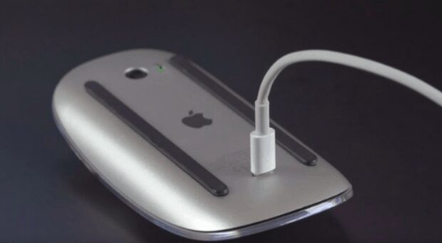
Now, when you look at it you can see that it looks very stupid. You may be wondering how Apple could make a design decision this bad. Well, they didn’t. The Mighty Mouse 2 is intentionally designed this way to prevent people from leaving it wired. Apple knew that people would just attach the charging cable and leave it attached, then be annoyed by it, which will lead to a dissatisfying experience. The mouse can go up to a month without being charged. Charging it for 2 minutes gives you enough battery for 9 hours. Leaving it on charge is also bad for it, since the battery used deteriorates if the mouse is needlessly left connected to the charger.

Apple didn’t write a warning on the mouse to not use it while it is being charged. They didn’t write it in the instruction manual – there are no warnings. They just made the design decision to make it inconvenient to leave the mouse on charge. The result? Everyone only remembers the great wireless experience and is never annoyed by the wire.

There are no ethical considerations here because the customer isn’t being defrauded or manipulated in any way. Yet the perfect user experience is maintained without giving any instructions. That is the ultimate aim of priming.


Priming technique 1 – Availability heuristic

Availability heuristic refers to our brain’s tendency to weigh easily and recently available information, more than old information. The memory that is the most easily available will be the most affective. We assume that the thing we thought of first may be the most important. For example, if you see a news story about an accident you start driving a bit more carefully. The chances of you being in an accident haven’t actually increased, but the memory of the news story of the accident is easily accessible in your brain, and it thus becomes important information.

Remind a user of a problem they face, and they’ll consider it a problem worth solving. Try these two things to keep their problem easily available to their mind and thought process:

  1. Designing a website make sure you will talk about the problems your product solves, not what it does. “Get wireframes build faster” is better than “Wireframes build online.”
  2. Manage users expectations, giving them a feedback when they solve a problem, and remind them what it was. “Congrats— only two questions left” is better than just “Congrats!”

Priming technique 2 – Attentional bias

Our thoughts aren’t as free as they seem – they are controlled by the other things we may be thinking about at the time. Attentional bias means that the recurring thoughts in our brains change how we perceive reality. You may have noticed that usually the person who hates something is the first one to notice it. The person most bothered by cockroaches will be the first one to see one. This happens because they consider cockroaches a threat and thus their brain is on the lookout for such things.

You need to look at what makes people think of the wrong thing and remove any mentions of it. For instance, do not talk about how you will not send a customer spam when they sign up for an email. Now you’ve planted the idea of you sending spam in their mind, and they perceive it as a threat and will not sign up.

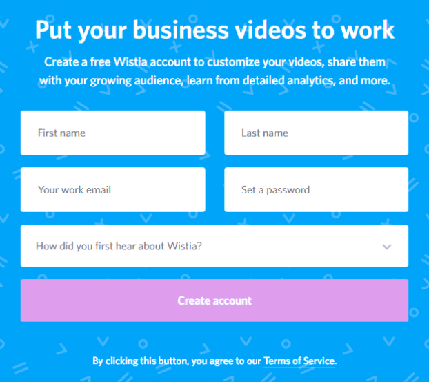
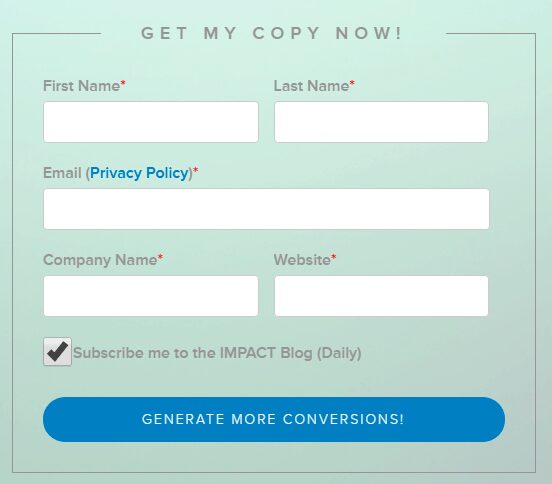
Look at the difference between these two landing forms. Impact mentions the privacy policy, while the Wistia knows that mentioning it will make people think about it, and omits it. The same privacy policy applies to both, but Wistia knows there’s no need to bring attention to it:

On the other hand, Impact adds a special link to the privacy policy on the text box to enter your email address. This immediately brings you attention to the fact that giving them your email is different than giving them the rest of the info and makes you feel slightly uneasy. It makes you think about what they could do with your email.

Priming technique 3 – Illusory truth effect

The illusory truth effect is, quite frankly, a bit too powerful. The illusory truth effect is that a statement is considered the truth if it is repeated often – regardless of whether it is actually true or not. For instance most people will say that their country is the best. This isn’t dependent of their country actually being the best – it is just what they have heard repeated around them, and they believe it simply because everyone says it.

Using this for your UX is dead simple. You need to repeat the good things said about your company. If you keep calling your product ‘’The city’s favorite product’’ enough times, people will eventually just accept that it is. Simply saying something again and again makes it true in the minds of people.

Look at how Microsoft is using this technique to make people shift from Chrome to Edge. If you use Windows 10 on a laptop you may have seen the following notification:

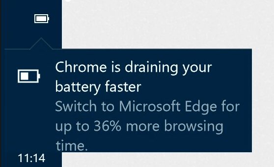
They keep repeating it and you know what happens? One day you wonder if it is really true and try it. You find it to be good enough – note that you don’t actually measure the battery usage yourself. Yet, since Microsoft knows Edge is a good enough product if people try it, just getting you to try it is a victory for them.


Priming technique 4 – Mere exposure effect

The mere exposure effect is very important for UX. The mere exposure effect is a cognitive bias where we favor things which are familiar, even over a better alternative. People like what they like not because they have assessed it in any way but simply because it is familiar. UX can employ this priming technique in great ways. You can make your UX similar to UX with which people are already familiar, and they will love using your UI.

This is already how we do it, subconsciously. Most websites use a similar pattern, with menus on top or left and content in the center. Here’s something to ponder: imagine that you can rework the whole philosophy of web design and come up with a new template. As far as you can see, the new template you have come up with makes actions faster because one has to jump through fewer hoops to accomplish them. You make people try this system out and they will hate it and will accomplish the task in a much longer time. Why? Because as long as the design is familiar, their brain already knows what to do and how to do it, even if this is their first visit. Without that mental key, things are not going to be easy for them.

Priming technique 5 – Context effect

Everything is relative to us. The human brain doesn’t keep things in isolation – all pieces of information are stored in relation to each other. This means that simply by changing the relation you can change the way a thing is perceived. For example, you can have a great romantic dinner date at a restaurant which provides the right context. The seats are comfortable, the aroma is great, the service is good, and the food tastes fantastic as well. This will make you like the person you are on a date with more, because you are meeting them in the right context.

You can go on a date with the same person but in a bad context. Maybe it was too hot and both of you are sweaty now. Maybe the restaurant isn’t that good. You are on a date with the same person, but because the context isn’t as good, you may not like that person as much. This is why some of our best memories of our loved ones are from holidays or adventures.

Context matters a lot when it comes to UX as well. Want people to feel happy about something? Put up graphics of balloons, confetti, and cakes and people will feel good about it. Want people to be afraid of something? Add a few pictures and warning signs. Note that you do not even need to relate the things directly to what you want them to dislike – simply placing it in the right context will do the job.

Here is a mistake people often make: they give negative feedback to the users. We have all experienced this when filling out forms on the internet. You are choosing a username and the box goes red because you used the wrong character, or the password box goes red because your password appears to be too simple. Do not make customers feel punished. If they keep getting similar feedback from your form it quickly becomes frustrating. Instead of a harsh red go with a soothing orange which turns to green when corrected. Make it feel like you are guiding people, not correcting their wrongs.

Priming technique 6 – Cue-dependent forgetting

We have talked about how our memory works – it is all relative. Memories aren’t stored as individual objects, but as connections and relationships. You may have a tough time remembering an outing. Your friends will be talking about when you went to a club, and you won’t be able to remember anything. Then someone says ‘’Remember, we also ran into Dan outside the club?’’ You remember meeting Dan and suddenly all the memories of the club, which you couldn’t access a minute ago, come rushing into your head.

You can make people remember the things you want them to remember by giving cues. Does your client sell anniversary gifts? Add a lot of wedding cues, make the users remember the day they get married and feel the same way again. You just have to provide a cue and memories start rushing in.

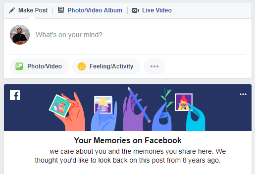
Look at how Facebook now reminds you of specific days and events – it gives you cues which take you back to when you were a more active user of Facebook.

If you use Google Photos you get the same option. Often you are told to ‘Revisit’ a day. You are shown all the pictures you took at an outing. It creates a very positive emotional experience which in turn makes people more ardent users of Google Photos.

Priming technique 7 – Mood-congruent memory bias

Your mood affects how you perceive and remember things, much more than you may think. Our brains can be primed into feeling a certain way depending on factors and memories we may not even be aware of. For example, if something bad happens to you on a holiday, then every time the holiday comes back you will remember the bad thing. Eventually, everything that reminds you of the holiday will result in a bad mood, simply because of the connection that has been built in your brain. When you are enamored with someone new, they look like the most beautiful person in the world. When you think of them the feelings you get are positive.

If you break up with the same person in a few months, your memories of them will be very different. The same memories which resulted in a good mood will now result in a bad mood. It works the other way around too. When we are in a good mood our memories seem better. The same memory can seem worse if our mood is worse.

Thus, UX designers need to set the right mood. You need to pick a mood that goes well with the website you are designing. If you are designing a sports website you need to make it look frenetic and active. If you are making a spa website, you need to make it look comfortable. Set the right mood and capture people’s minds.

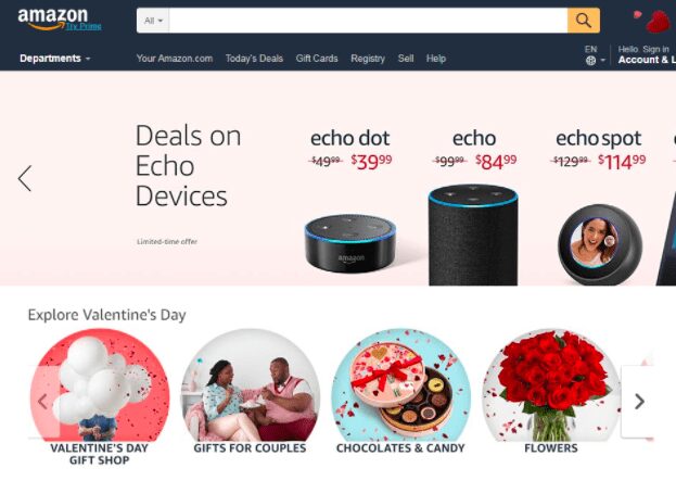
Look at Amazon during the 2 weeks before Valentine’s Day. Instead of highlighting specific products, they are highlighting general items and situations related to Valentine’s Day. They are putting user into the right mood, they are connecting to your positive emotions. In this moment, instead of rationally thinking about your budget you are thinking about your loved one. This eliminates the discomfort you feel about going over your budget.

Priming technique 8 – Frequency illusion / Baader-Meinhof Phenomenon

Have you ever noticed that once you read a new word and learn its meaning you end up seeing it used everywhere? It may be a word you have never heard before but once you read about it you start hearing it again and again. This is called the Baader-Meinhof Phenomenon, where something appears to be happening more frequently once you learn about it.

The reason this happens is very simple – our brain works at recognizing patterns. It picks up things it deems useful and ignores the rest. The word isn’t being used more often around you – it is being used as much as it was before. However, since you have learned about it only recently it remains a fresh mark on your brain. Thus every time your brain detects the pattern it highlights it to you.

You can use this to make people think the way you want. You can really get into the heads of users with this one. Introduce your product to them by highlighting the problem it solves. Every time they encounter the problem in real life, they will now think of your solution. It may be a problem they may have never even noticed, but you talked to them about it, and now they can’t help but notice it. In UX you can do great things by introducing new iconography or symbols and employing them in similar ways again and again.

This is especially important for SaaS providers. When you are a SaaS provider you cannot list your features – you need to convince people that your product is useful. Sure, you may have terabytes of storage and an unbelievable amount of computing power, but that doesn’t excite the user or tell them how you will be useful to them.

Priming technique 9 – Empathy gap

The empathy gap refers to our inability to understand how many factors affect our decision making. Sometimes when you are in a bad mood you do things which you regret once your mood is fine. You keep thinking ‘’Why did I do that?!’’, and there is no answer. This is because your brain in a good mood cannot empathize with your brain in a bad mood, and vice versa.

This is very important in priming. You can change the way people act by priming them with the right feeling. This is why politicians give such bombastic speeches. They get the people riled up and angry and then start talking about the opposition. In a similar vein, making a person feel better will make them more compliant. So, if your UX has elements that improve the mood of a person, it will result in them being more receptive to your marketing and content. You can use mood music, you can use pictures, or even soothing colors. You can also get people riled up when it comes to sports and other such events. You can make people feel the hype simply through visual cues.

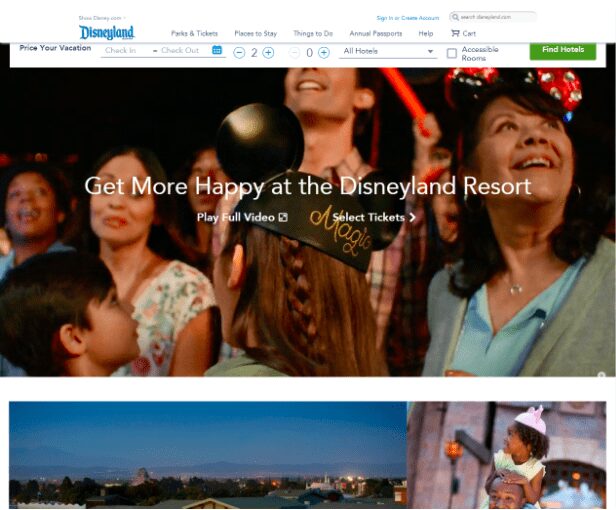
Disneyland’s website is a masterclass in this. Now, their aim is to convince people to go to Disneyland. That is only happening if the customer is in the right frame of mind. That is why their website does everything to create the right mood. They did not build a functional website that easily lets you book a Disney vacation – if we were purely logical thinkers the functionality is rather poor. The functional parts of the website, which allow you to buy tickets and make reservations are all located in a small bar.

The rest of the page is designed to overload you with Disney magic. There is a video playing right on the main page which shows you the spectacle of Disneyland. Right below it is a picture of a father with his son on his shoulders, both happy. Each and every picture makes you feel the same way – my kids will love it when I take them here. Disney knows that Disneyland vacations are fueled by parents deriving happiness from giving the joy of Disneyland to their children. This is how you prime people. You don’t give them discounts, don’t write a 1000 word essay telling them you much fun they will have. You show it to them, you make them feel that way, and you make them imagine how much their kid will love going to Disneyland.  

Priming technique 10 – Base rate fallacy

When given general information and specific information people tend to value specific information even more, even when it gives the wrong answer. Here is an easy way to think about this – there is a competition going on where you win prizes hidden inside chocolates. You know that 10% of all chocolates have prizes in them, this is the base rate. Your friend comes to you later in the day and tells you that he bought 10 chocolates and 5 out of them had prizes in them.

Now, how much of a chance do you think you have of winning a prize if you bought 10 chocolates? Even though you know the base rate, you will assume that you will get better odds like your friend did. Even in the presence of actual facts, an anecdote can change the way you think.

The base rate fallacy is a great way of dealing with any bad statistics or press. All you need to do is provide them with a slice of information which suggests otherwise. You can tell the story of a customer who had great luck with your products – better than average. You don’t mislead people at all; you tell them the actual odds, and then tell them of a customer that beat the odds. You are telling people how much a chance there is that the same will happen to them but they won’t care. They will consider the anecdote to be a better barometer of how things will turn out instead of the base rate.


Conclusion

Priming techniques are a good way of understanding the full breadth of your users. And while they’re not the only techniques a designer should use in his/her toolbox, priming is a meaningful way to drill down into the microlevel of what makes users tick in regards to visual communication and design.


What You Should Know About VR

By User Experience, User Interface

In the last few years, we’ve witnessed an explosion in virtual reality (VR) devices and apps for them. VR is emerging as a new medium with the potential of having as strong an impact as radio or television did in the past century. According to the Heather Bellini of Goldman Sachs:
“We expect virtual and augmented reality to become an $80 billion market by 2025, roughly the size of the desktop PC market today”

Oculus Rift
Oculus Rift is the first high-end virtual reality headset sold on the retail market.

With the increasing popularity of VR, a design is evolving to incorporate its requirements and new capabilities.

Where Can We Use VR

VR is giving birth to an entirely new arena for entertainment, education, collaboration, communication and marketing. The following are some general categories that will merge with VR:

Gaming

All types of entertainment activities can be amplified with the integration of VR. VR makes it possible to put your users into a 100% designed space with predetermined tasks while giving the user total control of moving, exploring and learning within this space.
VR for gaming

Learning

VR can have tremendous implications for education — education can be both more engaging and effective. VR can be used for educational classes, labs and demonstrations. To make education experience truly immersive, designers should consider how users may interact with objects.

VR for learning
Microsoft Hololens for medical education

Training

Using VR, training simulations for professionals like drivers, pilots, doctors and police officers can become more accurate, complex and cost-effective.

VR for training
Image credit: Wareable

Big companies like Toyota see the educational potential of VR. The latest training simulator from Toyota – TeenDrive365 system – is focussed on teaching new drivers about the risks associated with distracted driving.

VR for training
Toyota driving simulator.The driver is in a fully immersive virtual environment – and that includes passengers, traffic, buildings and roadway obstacles.

Prototyping

VR can greatly enhance prototyping and testing phases for engineers, with all types of projects from a handstick design to new car designs.

VR for training
The hologram and the object on the screen are synchronized and this makes spatial application part of the production pipeline, not just an isolated island. Image credit: Solidsmack

Communication

Communicating will drastically change with the help of VR. VR makes it possible to create a brand new experience for video conferencing services, such as Skype.

VR for communication
Remote collaboration using avatars.

Shopping

VR makes it possible to blend the online and offline shopping together. Instead of looking at a 2D image of an object online, shoppers in VR will have the ability to pick up an object and look at it in detail. Alibaba Group, Asia’s biggest e-commerce company, divided into virtual reality later last year.

VR for training
Alibaba’s VR shopping. Buy+ technology allows customers to browse 3D images of products and make real-time payment in a virtual mall as if they were shopping in the real store.

Creating VR Experience

Creating a VR experience is much more complex than traditional 2D experiences, which presents designers with a whole new set of challenges. There are currently 4 core considerations for the design of virtual reality experiences:

1. Make Sure Users Don’t Get Motion Sickness

The most important quality to creating any successful UX design is ensuring that users are comfortable throughout the experience. This is especially true in the context of VR experience. Motion sickness (when physical and visual motion cues give a user adverse information) is one of the most common problems of VR experiences. Humans evolved to be very sensitive to vestibular ocular disparities (disparity between the movement and what we’re seeing). So reducing motion sickness is very important for VR systems. The keys to preventing users from getting motion sick while using VR are

  • Always maintain head tracking. VR software should constantly track the user’s head and eye movements, allowing the images to change with every new perspective.
  • Prevent performance degradation. If the system freezes even for a split second that’s going to trigger a lot of motion sickness.

2. Develop Easy-To-Use Controls And Menus

Same as for traditional UI interfaces navigational menus and other controls should be easily accessible and user-friendly. Unfortunately, there’s no universally accepted way to designing menus for VR interfaces. This is a challenge that designers are still working on. However, this doesn’t mean that we can’t transfer existing (2D) practices to 3D. It’s absolutely possible to place the menus on the user’s VR hands. One of such menu interfaces is Hovercast. All menu actions – including navigation between levels – are controlled by simple hand movements and reliable gestures.

VR navigation menu
Hovercast is 2D menu interface for VR environment. Hovercast radiates from the palm of your hand and you can interact with menu items using the index finger of your opposite hand.

3. Ensure Text Is Readable

All text elements should be clear and easily legible, preventing eye strain. The resolution of the VR headset is pretty bad. Because of the display’s resolution, all UI elements in VR will look pixelated. This means that text will be difficult to read. But you can avoid this by using big text blocks.

VR text
Consider the readability for different text section in this VR game. Instructions are almost unreadable. Image credit: Mozilla

4. Use Sound To Create Immersive Experience

As designers, we often don’t think about sound and audio. When we do that we miss an opportunity to communicate more information through a different set of senses. When we have audio sources attached to the objects we create much more realistic environment — if you’re telling a brain that it can see the object and it can hear the object then the object must be real. Try to build a mental image of the environment via sound:

  • Introducing the user to the environment via soundscapes. The audio can be used to give the user the illusion of being in the middle of a particular environment.
  • Guiding the user with sound. By applying positional audio and 3D audio effects to VR, the user will know the direction in which certain sounds originated in relation to where they are.
VR sound
Music and high-quality sound effects are a pivotal feature to encourage experience immersion. Image credit: Google

Conclusion

The possibilities for VR are endless. Soon, all types of companies will be seeking to extend their brand presences into this space. I hope I’ve made the VR space a bit less scary with this article and inspired you to start designing for VR your project.

Things To Remember When Designing For Augmented Reality

By AR, Design, User Experience, User Interface

Augmented Reality (AR) is changing how we interact with the world around us. Over the past several years, AR technology established a strong foundation in media, marketing, education, games and many other industries. This happened because computing hardware has finally advanced to the point where it’s become capable for AR platform. Today, AR prompting many brands to explore this strange new world for the first time.

What is AR?

AR technology incorporates real-time inputs from the existing world to create an output that combines both real-world data and some computer-generated elements which are based on those real-world inputs.

The concept of AR is not a new one. The term was first introduced in 1992 by researcher Tom Caudell to describe a digital display used by aircraft electricians that blended virtual graphics onto a physical reality. And AR isn’t rare. A frequently overlooked, yet widespread example of AR is the automobile parking assistance system.

Rear parking assist with the rear-facing camera.
Rear parking assist with the rear-facing camera. The vehicle’s computer calculates the vehicle’s distance from surrounding obstacles, and, based on the steering wheel’s position, determines the vehicle’s trajectory.

However, only after popular apps PokemonGO and SnapChat were released and adopted by users the term “augmented reality” got into the spotlight.

PokemonGo.
PokemonGo

How AR Will Change Brand Experiences

There is a distinct advantage for AR to be accepted sooner and on a wider basis than VR, particularly in the commercial sector. While Virtual Reality (VR) gets a lot of talk because of how cool this technology for entertainment, AR is going to truly impact the way we work and live. AR forecasted to be a $150 billion dollar industry by 2020.

[Tweet “AR creates an opportunity for brands to build new digital pathways to tell stories and engage with users”] in a way that’s never before been possible. Here are 3 ways that businesses will be able exploit AR and its associated technologies in the near future.

Guidance

Even the most capable professional can run into situations where they need a helping hand from someone, and it’s here that AR technology could come in handy. For example, AR app makes it possible for doctors to navigate the innards of the patient to effectively and efficiently complete the surgery.

The surgeons used the augmented reality app through an iPad

Design Visualization

In terms of design visualisation, AR is creating some breathtaking possibilities. It merges the virtual and the real world — adding virtual overlays directly into the view of headset-wearers, or inserting these digital add-ons into video captured on a phone screen. As AR technologies become more refined, users will be able to preview their designs and experiences in real-world spaces. One such example is this spatial AR setup used by Volkswagen, in which virtual layouts of a car interior are projected onto a full-size model of a car dashboard.

spatial AR setup used by Volkswagen
Spatial AR setup used by Volkswagen

Training and Education

When it comes to training and education, AR has a lot of promise. Unlike a real-world training scenario, a trainee can play through an AR situation as many times as they need to understand a concept or a procedure. This will create deeper learning opportunities where students are in the flow of learning.

Training using AR
Image credit: Columbia University

How to Design For AR?

Since there are no established UX best practices for AR yet, I’d like to share my own personal approach to UX in AR apps.

1. AR use-case needs to be evaluated

The concept of “measure twice, cut once” is especially important in building AR apps. Before diving in, it’s important to ask yourself why you want to pursue this type of medium and what outcome would you like to have. Keep in mind following moments:

  • AR experiences are powerful, but they should tie back to clear business objectives. AR shouldn’t be added on top of a planned app just because it’s trendy technology — that’s almost a sure way to create a poor UX. Rather, the desired functionality needs to be evaluated to fit with the experience that the AR display medium can offer.
  • If you’re going to design an AR experience, you should invest heavily in user research. Spend some time really getting your target audience and not just how that you would perform a specific task using a software, get to know how they’ll do something in real-world without any kind of devices.

2. Consider the environment in which the product will be used

Since AR apps are grounded in reality, the environment affects AR design significantly. For example, in private environment (home, work) you can count on long user sessions and complex interaction model – the whole body can be involved in the interaction, as well as specific devices (such as head mounted display) can be used for manipulation (see Microsoft Hololens example below).
Microsoft Hololens
But in public environments (e.g. outdoors), it’s important to focus on short user sessions. Because regardless of how much people might enjoy AR experience, they won’t want to walk around with their hands up, holding a device for an extended period of time.

AR using iPad
Thus, when designing augmented reality apps, you first need to research environmental conditions in which the service will be used and how it effects on the user:

  • Identify interaction scenarios upfront even before specifying technical requirements for the project.
  • Collect all the details of the physical environment to be augmented.The more environmental conditions you’ll test before building a product, the better.

3. Make the interaction with AR app simple

In order for AR to be usable, it must be quick and simple. AR is really about designing layers of added value that reduce the time to complete simple tasks. Keep in mind that people are seeking out experiences, not technologies and they’ll technology that isn’t friendly to use. No one will use AR apps or tools if they take just as long or longer than the conventional way of doing something. Thus, when design your AR solution I recommend the following approach:
Go to the context of the area that you’re going to be performing the task (e.g. a specific room, a real-world device, etc)
Think through the each step that you use to accomplish the task.
Record each of those steps down
This information will help you conduct a task analysis. This analysis will help you make things more natural for the users.

Google Translate and AR
Google Translate app uses the phone’s built-in camera to translates the captured text into another language. This example perfectly illustrates the value that AR technology can provide.

Conclusion

AR has seen massive success in recent years and as more technologies take advantage of this growing trend, AR will grow to encompass much more than it does now. The most important things to consider when designing AR experience is users’ goals and contexts of use. AR apps should be easy to use and shouldn’t hinder users.

Conversational Interfaces

By AI, Onboarding, User Experience, User Interface

You may have heard that “conversational interfaces” (interfaces that mimics chatting with a real human) are the new hot trend in digital product design. Several factors are contributing to this phenomenon:

  • With the advent of WhatsApp, Slack or Facebook Messenger the way we exchange information changed irreversibly. According to Business Insider, we are now spending more time in messaging apps than on social networks.
  • Artificial intelligence and natural language processing technology are progressing rapidly. Major technology players including Apple, Google, Microsoft and Amazon placed huge bets on this type of interfaces, leveraging big data and machine learning to get as close to human intelligence as possible.

This represents an interesting shift in how we think about user experiences and interactions, more as a text/voice based ‘conversation’ that helps us to achieve our goals. In this article, we’ll examine all major aspects of conversational interfaces in the context of chatbots.

5 Basic Principles of Conversational Interfaces

1. Be specific about chatbot purpose

Unless you develop a bot like Facebook M, it’s always better to deploy a specialized, purpose-driven bot to engage your target audience. Don’t try to design your chatbot to do everything all at once. Instead, identify the core use cases for your chatbot based on user’s goals and focus on achieving domain mastery.
Faceboom M

2. Mimic natural conversation

Keep in mind that when the conversation is the interface, experience design is all about crafting the right words: bots must use and understand natural language. A vocabulary that’s limited to only a handful of generic answers will immediately destroy an illusion of real conversation and leave users feeling frustrated. Nobody want to participate in chats muffed by pre-determined answers.
Conversation flow with Hi Poncho chatboat
An early version of the weather chatbot Hi Poncho struggled to provide any meaningful information due to a limited understanding of natural language. Image credit: Gizmodo

3. Make it clear what options are available for user

In traditional GUIs, what you see is what you get. However, with conversational interfaces, the paths that the user can take are virtually infinite. For conversational interfaces, users should know what paths are available for them. If you app is complex and has a few main routes, you can use an onboarding process to show the users what’s available.
Onboarding experience in Kia Niro
Kia Niro using the carousel to explain how to use a chatbot. Image credit: Sabre Labs

4. Avoid lengthy messages

Lengthy messages look like text paragraphs. People don’t speak in paragraphs, we speak using single sentences. You should plan for no more than 90 characters per message (around three lines on mobile). Anything more than three lines of text seemed to activate the tl;dr (too long; didn’t read) response in users.
Too long sentences in KAYAK
Kayak chatbot hits the users with 4 opening messages, totaling nearly 750 characters. Most users glazed right over when they saw the wall of opening messages.

5. Animating the conversation

Animation can take the chatbot user experience to the next level, making the interactions more natural and pleasurable for user. Simple typing indicators can be used as an equivalent to phatic expression in speaking, making the conversation flow smooth.
Chatbot and animation
Typing animation via Buzzfeed

Best of the Best

Conversational interfaces open lots of new possibilities how you can interact with users. Below are two popular apps that successfully embraced the new paradigm of conversational UX:

Domino’s Pizza

Domino’s pizza allows “conversational ordering” via Facebook Messenger. Customers add Domino’s pizza as a friend via Facebook, set up the basics of their account, and can then “reorder their favorites” or ask for the latest deals.
Domino's pizza chatbot
Domino’s Pizza via Techcrunch

Duolingo

Duolingo is a language learning platform which uses gamification and personalization to make learning a new language effective. Last year Duolingo introduced Bots. This feature allows users to practice language skills by texting with a ‘Bot,’ which takes on different topics as a way to explore a range of conversations, such as going to a restaurant, going through border checks, or ordering a taxi.
Domino's pizza chatbot

Conclusion

Whether you love them or hate them, conversational interfaces have started making a significant impact in communication. Of course, most of them today have certain limitations and they don’t have human-like conversations perfectly that’s why it’s so important to follow basic principles of conversational interfaces  mentioned above. But in the near future, continuous advancement in machine learning and artificial intelligence technologies will fill this gap and we will see AI-powered chatbots which will have human-like conversation.