fbpx Skip to main content
Category

Design

Level up your design skills with millermedia7. Dive into our handpicked design resources, seek inspiration, and gain expert advice to unleash your limitless creative potential. Embark on your design journey today!

The State of UX for 2020

The State of UX for 2020

By Customer Experience, Design, Digital Transformation, Interaction Design, User Experience, User Interface

We expect 2020 to be a momentous year in the space of UX design. New technology and user experience trends during the last decade have made competition across most modern industries tougher than ever before. Naturally, this motivates businesses to put even a greater focus on the user experience.

Today, the challenge in sensing customers’ needs and wants is no longer enough to stand out and be successful. Companies that want to win a higher market share must also be a step ahead of the herd and anticipate future UX trends.

To give you a leg up, we’ve collected the latest trends of the digital world which, we believe, will shape user experience in 2020. Give them a look and make strategic decisions before your rivals do.

Even more personalized experience

Personalization has been an essential part of experience optimization for a while already. However, as technologies continue to evolve businesses become better able to precisely tailor their offers to different users.

Besides using cookies that store only basic information about a user, website and app owners may now take advantage of the Internet of Things (IoT), Artificial Intelligence (AI) and related technologies (e.g. advanced data analytics, machine and deep learning). They open doors to a whole bunch of new UX-related opportunities and experiences.

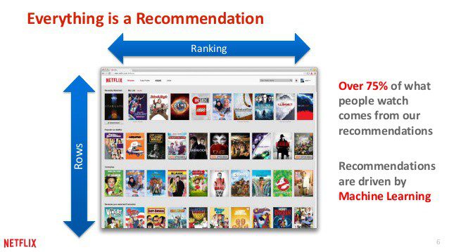
A great example is Netflix. This well-known video-streaming service applies machine learning algorithms to provide every user with relevant content by personalizing recommendations, push notifications, and search results.

netflix screenshot

Starbucks goes even further. It combines AI with geolocation technology to deliver a truly futuristic experience. In particular, users of its famous location-aware app receive highly personalized promo messages at the time when they are in a specific place, i.e. near the Starbucks shop.

startbucks screenshot
Image source: Build Fire

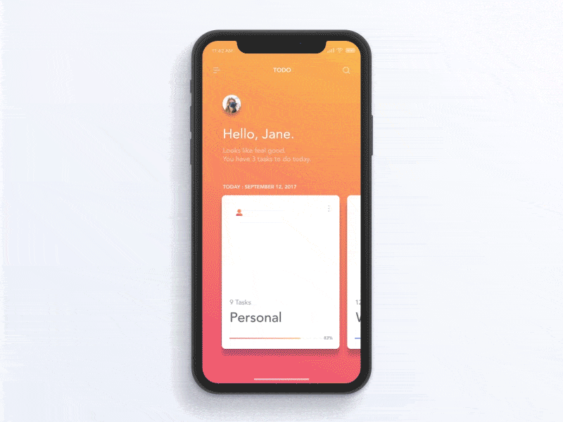
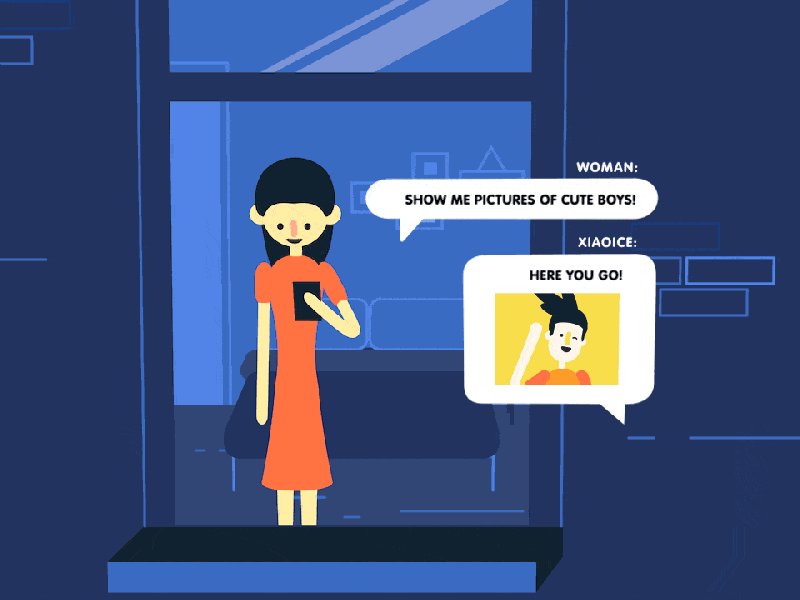
In 2020 there won’t even be a question whether to make your app user-centric or not. The key differentiator will be the extent to which you’re ready to personalize your product.

Voice user interfaces are getting to their peak

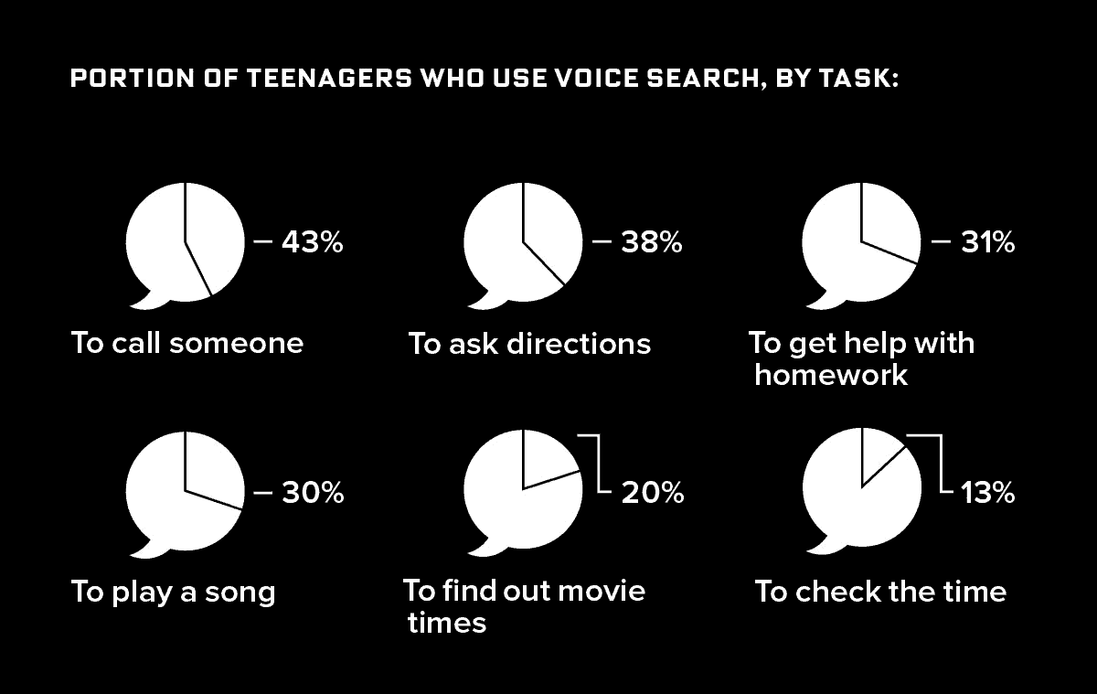
In today’s fast-paced world time is money, and its value is high. Voice User Interfaces (VUIs) and virtual assistants help users navigate through an app faster while the handsfree capabilities allow users to multitask. No wonder voice user interface interaction has been on the top of UX trends for the last several years. The question is; what will happen with Voice User Interfaces (VUI) in 2020?

Well, VUI will continue to strengthen its position as the second most popular type of app navigation after graphical user interface (GUI). Is there a chance it’ll leapfrog GUI on the list?

We don’t see that happening next year. But voice-assisted UI will definitely continue getting closer to the first position in the ranking. There is even a quite promising prediction made by ComScore in 2016 that nearly half of searches will be voice searches in 2020.

Voice search by 2020
Image source: Milestone Insights Voice Search Report

We still expect a significant shift in the quality of VUIs. As natural language processing (NLP) technology is evolving, voice interactions and voice assistants become more effective in finding accurate answers. Besides, our interaction with them will also become more natural. It’ll resemble more human-to-human communication rather than a conversation with a robot.

Alexa chatting
Image source: SnapTravel

On top of that, the array of tasks we can perform with a voice command will probably increase in 2020. For instance, Google Duplex, a new project by Google, has already enabled setting up appointments over the phone without any interaction with a person on the other end from a user’s side.

Google Duplex
Image source: Google

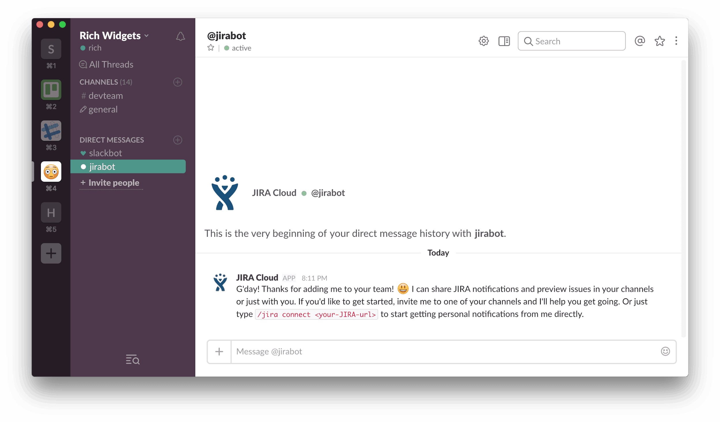
Introduction of a Chief Experience Officer position

Creating a user experience that is both holistic and consistent is crucial for enhancing the usability of a product and making a brand memorable. Traditionally, UX professionals or a designer together with a marketing team has been responsible for ensuring this part of the development. But the situation is quite different now.

The list of platforms today’s organizations use to maintain their digital presence is not limited to a website and mobile app. Wearables and smart devices are growing in popularity, the number of social media channels is increasing and becoming more complex. In general, markets are becoming ever more dynamic. Ensuring a positive customer experience is now a much more complex activity than it used to be. This is why a new C-level executive position is necessary.

As of the end of 2019, not many businesses introduced the position of CXO. Introducing this position to your business will give you a significant competitive advantage for your company in the coming year. In particular, a chief experience officer will help you perform a comprehensive visual audit and build a holistic UX design system.

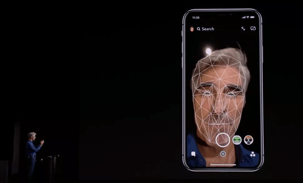
The rise of VR & AR in fashion and e-commerce

In 2020, Virtual Reality (VR) and Artificial Reality or Augmented Reality (AR) technologies will continue blurring the borders between the real and digital worlds. The success which such pioneers as Ikea, Toyota, LEGO, and Zara reached with their VR/AR-powered apps has inspired many other businesses to take a fresh look at the way they promote and sell products.

LEGO ar app
Image source: kidscreen.com

The development of applications containing virtual reality or augmented reality elements has also become more accessible in terms of costs and availability of specialists. All these factors lay the groundwork for a boom in VR/AR that can happen any year now. Of course, not all business areas will adopt these technologies equally fast. But such sectors as interior design, e-commerce, and fashion will likely become dependent on this type of interaction design in the near future.

For instance, at the beginning of this year, Gucci launched its AR-based app that allows users to try on sneakers by pointing a smartphone camera at their feet.

Gucci AR app
Image source: designboom.com

In May, Nike released its own mobile app that uses augmented reality technology to help customers accurately define their size.

Since online shopping is an active and ever-growing niche (e.g. about 60 percent of millennials prefer it over traditional shopping), we have all reason to believe that similar functionality will become industry standard quite soon.

3D design is taking over the app world

In our 2019 State of UX article, we were writing about Memoji which had been introduced with the release of iOS12. In the last twelve months, designers have started to use both static and dynamic 3D elements more frequently. The trend of 3D design has become vivid and noticeable.

Besides being eye-catching, a 3D presentation of interfaces helps to deliver a truly realistic user experience. A study shows that modern people are online for nearly 7 hours per day. This means that we spend an enormous amount of time in a virtual environment.

A 3D view makes our stay there more natural and comfortable. That’s why leveraging the power of 3D will be a great idea for all app creators and website owners in 2020.

3d design app
Image credit: Chris Frank

In case you’re not sure if 3D elements will suit the overall visual identity of your brand, you can perform a site design audit before introducing any changes. Doing so will make it easier for you to get to grips with the big picture and make informed decisions.

Adaptability to the new foldable phones

The year of 2019 has been an important milestone for phone manufacturers all over the world. The long-awaited foldable displays finally became a reality. Practically all market leaders either expressed their interest in developing such a device or unveiled their prototypes capable of being folded in numerous different ways.

Realizing that stakes were high, Samsung tried to outrun its competitors. In April, the company pre-released its Galaxy Fold, the world’s first foldable smartphone.

Galaxy Fold
Image source: Samsung

Although the device was exposed to a number of quality concerns and Samsung had to delay its release, we have all reason to expect that foldable displays will enter the global mass market in 2020. This will naturally bring a lot of changes to user experience, for example:

  • A grip will depend on whether a person is holding a folded and unfolded device. The main task of UX designers is to make it convenient for both cases.
  • A user will have to be able to switch between different forms of a device seamlessly. That’s why app creators must ensure the continuity of an application, meaning that a person should have an opportunity to continue using it when upgrading to a new device.
  • Unfolded devices will allow users to have multiple active apps on their screens. So to create a truly outstanding user experience, designers will need to keep this multitasking capability in mind.
Galaxy Fold
Image source: Samsung

Versatile UX for device-neutral apps

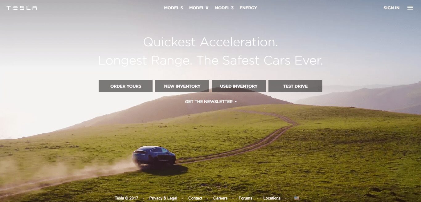
Ever since the IoT technology came on the scene, the discussions about platform-agnostic applications have never left the tech community. Nowadays, our personal digital ecosystem is much richer than five, three, or even two years ago. We use mobile phones, PC, and laptops interchangeably on a daily basis but also wearables, smart home appliances (like Google home), and car dashboards (like the one Tesla offers).

For many years, responsiveness has been the main requirement of web solutions. However, responsive design is no longer optional, it’s the default. Today’s users will unlikely to tolerate an application that doesn’t adjust to screen size or platform.

responsive design
Image source: giphy.com

But, on top of that, they expect to receive an integrated experience. This means that information must be consistent across all the systems. And the process should be continuous, allowing a user to pick it up at any point on any device.

That’s why we foresee that device integration and synchronization will get to the forefront next year. Logically, creating a versatile UX design will become a huge new challenge for designers in 2020.

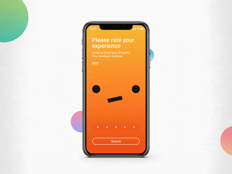
User control over the content

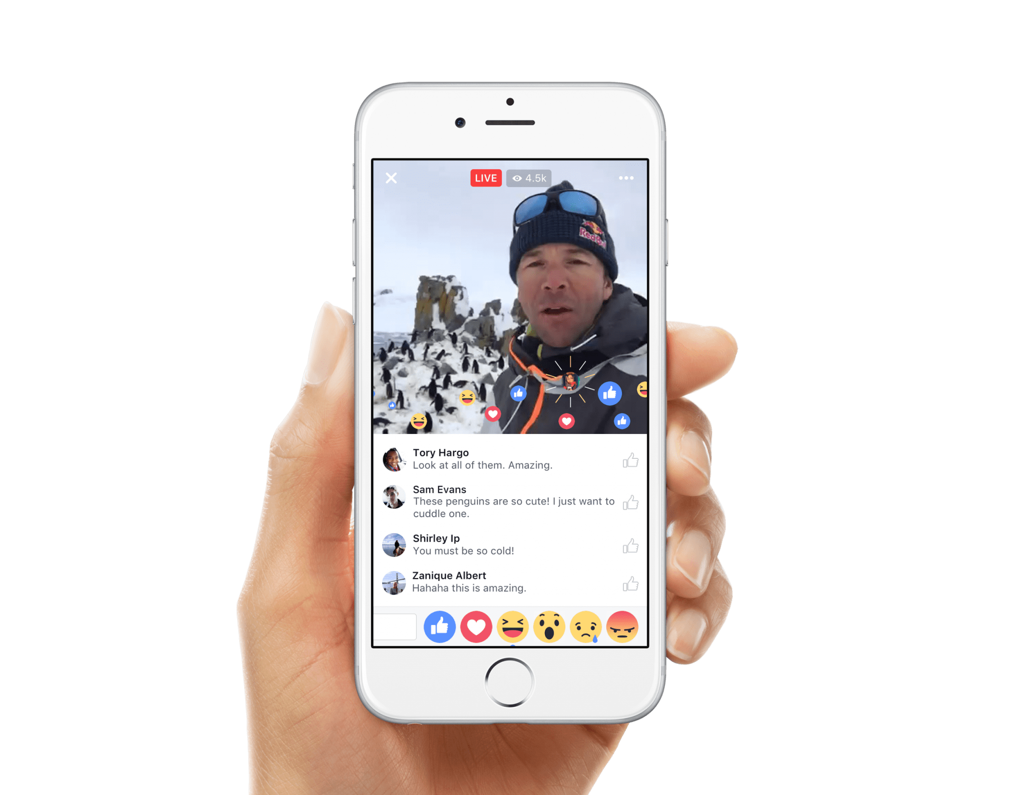
The interactive experience is another ‘big thing’ that has a huge potential to become a major UX trend in 2020. To be precise, some forward-thinking marketers had been trying to promote products with the help of interactive videos before. But this type of content, where the user interacts directly with the content, only managed to generate massive interest after Bandersnatch, a Black Mirror’s interactive episode, was released on 28 December 2018.

Bandersnatch
Image source: meg.onemega.com

As it turned out, fashion brands and e-commerce stores became the first adopters of interactive videos. This is because such videos not only offer an immersive experience but they also are an efficient money-catching tool. By watching them, users can shop while still consuming the content. This allows them to act on their desire to buy a product when the desire is at its highest point.

interactive shopping video
Image source: cdn.trendhunterstatic.com

Besides making online shopping easier and faster, interactive videos are also more enjoyable and captivating than ordinary videos. If you want to create a stunning visual design with a great user experience that will allow you to win over the competition in the coming year, then giving users better control over the content is definitely the right thing to start with.

Expansion of interface animations

Adding motion to button, tabs, menus and other visual elements is not a brand new thing in UI/UX design. We’ve seen it this year and it’ll continue being popular in 2020. However, as animations seem to still be in the process of gaining momentum, we’ll probably see even more animated interfaces on our screens in the next twelve months. Just like 3D design, moving objects help UX designers grab users’ attention as well as make their experience more realistic and engaging.

interface animations
Image source: tubikstudio.com

Yet, it’s important to remember that every animation you implement into the app interface should serve a purpose. In other words, you don’t have to animate everything on a page. If you do so, a user will be distracted by visual noise – which is no doubt not the outcome you’re aiming at.

Instead, you may create a feedback animation that will make app navigation easier. Specifically, it’ll show users that they’re on the right path after an action is taken.

feedback animation
Image credit: tubikstudio.com

Animated progress indicators are also a nice idea for most mobile apps. They help users understand that there aren’t any problems with the application, it just needs more time to perform a certain task.

Animated progress indicator
Image source: Dribbble

If you have doubts about whether you need to add more animated elements to the interface or not, we recommend you to conduct a design audit first.

Typography will still matter a lot

When it comes to conveying messages, companies have a wide array of formats to choose from. But while videos and images are considered the most captivating, text content remains the main and the most effective method of communication in the online world. That’s why typography never loses its relevance and, of course, it will still be in the spotlight in 2020.

What major change may we expect in the year to come? As a rule, a user gets a meaningful and memorable experience only when the design is well-balanced and consistent. Since we’ll probably see more 3D elements and animations in the interfaces, typography will have to reflect these effects too.

typography animated
Image source: andreirobu.com

Of course, this doesn’t mean that San-Serif fonts, which are now widely used in the digital space, will completely disappear during the next year. But UI/UX designers will become more creative with the way text is presented on a page. Chaotic typography with mixed sizes and patterns (e.g. filled and outlined letters), as well as experiments with text directions, will likely be quite common in 2020.

Chaotic typography
Image source: Dribbble (by Oleh Gvozdetskyi)

The obsession with dark themes

Dark Mode became the most noticeable visual change brought by iOS13 in September 2019. The feature provides the option of replacing the bright colors of an interface with black and dark grey, making it more pleasant for eyes in a poorly lit environment. During the month that followed this release, dark modes were also introduced by Instagram, Gmail, and Facebook (partially). So we can make confident predictions about the dark mode ‘fever’ that will likely expand in 2020.

iOS 13 dark mode
Image source: techradar.com

Besides aesthetic value, dark themes also improve the readability of text and are perceived as less harsh if a person uses a device at night. Whether to enable it or not is a matter of personal preference. But if you implement such a mode for your app, your users will for sure appreciate it.

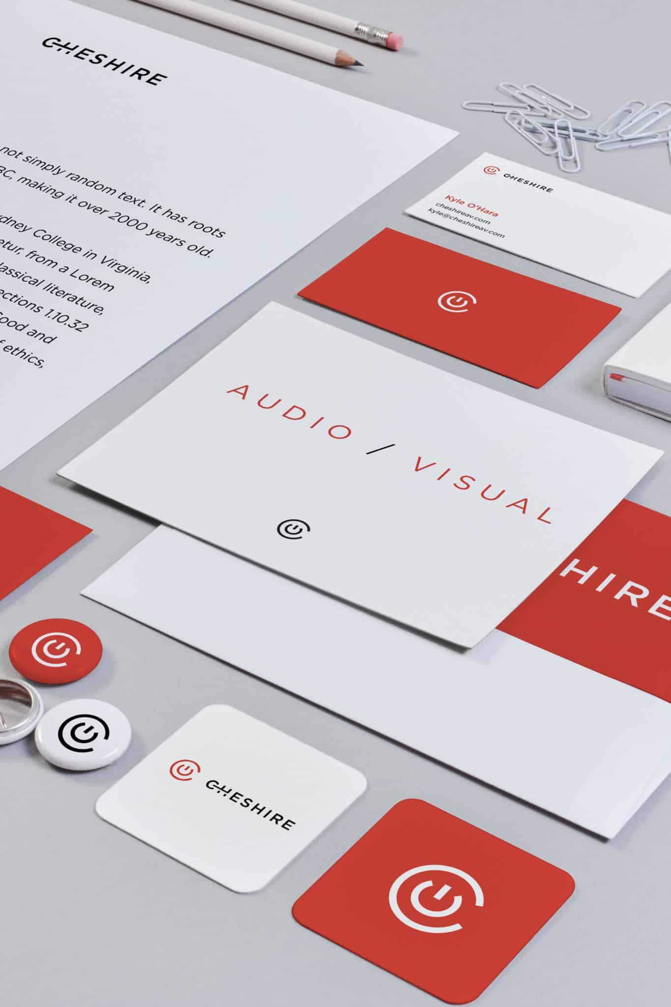
Custom illustrations will fill up the interfaces

In 2020, designers will have to cooperate with digital illustrators more frequently as bespoke interface illustrations are another emerging UI/UX trend. Stock photos that have been quite popular for many years now are no longer acceptable. Stock photos simply don’t offer the level of uniqueness most brands and users seek. At the same time, digital art is much more flexible in terms of styles, shapes, compositions, and characters.

But catchiness isn’t the only reason why illustrations are so powerful. The correct illustrations in combination with other elements on a web page can help you make the right emphasis and draw visitors’ attention to the CTAs. They also make an interface more emotionally appealing and help to create the right tone and mood.

web page illustration
Image source: Dribbble (by Tubik)

Speaking about mobile development, custom illustrations have always been less popular in this sector. However, such a situation is going to change as they’re getting more and more common – not only on the onboarding screens but also at other touchpoints (e.g. error notifications).

mobile interface illustration
Image source: Dribble (by Icons8 team)

The final word

We want to give you a comprehensive review of the trends which will likely define the UX design space of 2020. We made our conclusions based on our professional experience and the latest information about technological advancements. Yet, the digital world is hyperdynamic and a lot may change in a blink of an eye.

Some innovative solutions may appear completely unexpectedly and change the rules of the game across several industries. But don’t worry. We’ll keep track of UX best practices of 2020 and let you know about all important trends.

Want to build your next product with us? Reach out!

Hottest IoT-based Solutions Transforming the World

By Customer Experience, Design, IoT, Omnichannel

With the emergence of smart home devices like Google Home, Amazon Alexa, and more, everybody is going nuts about connectivity. Wearables such as smartwatches and fitness bands are no longer something rare or unique – a lot of us have and use them on a daily basis. This is also the case with remote-controlled home appliances that are connected to the internet, industrial assets and transportation systems. It’s no wonder that the IoT market size is expected to grow to $457.29 billion by 2020.

The concept of connected devices, more commonly called the Internet of Things (IoT), is not brand new – it was introduced in the early 80s. However, tech experts and ordinary people alike are still excited to see where this is all going.

As professional designers and developers, we also keep track of the current IoT trends. In this article, we’ll take a look at some of the new IoT services and solutions which have the potential to become an integral part of our everyday lives in the near future.

Even more smart stores

It’s only been a year since Amazon opened its first no-checkout Amazon Go store to the public in Seattle. This automation solution has been made possible by the leaps in machine learning and IoT data processing. However, rumor has it that the company already plans its international expansion. As of today, the chain consists of nine smart stores located in the US but we can expect to have the first cashier-less store in the U.K in the nearest future. And, according to Bloomberg, Amazon will open about 3,000 other smart supermarkets by 2021.

Shopping in Amazon Go gif
Image source: giphy.com

The idea of doing shopping by just entering the store, grabbing the groceries and leaving without being checked out still sounds futuristic to a lot of people. Yet, Amazon is not the only company trying to take advantage of advanced shopping technology. Microsoft is already treading on its heels.

Recently, the company announced its partnership with Kroger, a large chain of US supermarkets. And many of the innovative solutions they created are based on IoT technology. Digital shelves, personalized ads and automatic alerts notifying store staff of low inventories are already redefining the way we think about supermarkets.

Reportedly, other retailers around the world will also have an opportunity to buy this solution. In other words, it’s just a matter of time before the smart store like Amazon Go will become an industry standard.

Smart fridges and the smart way of shopping for groceries

Smart grocery management is another category of IoT solutions which are going to take customer shopping experience to the next level. The main idea behind it is simple, yet genius. It is to make smart home products help us do grocery shopping in an easy and time-effective way.

The most famous smart device of this kind that already exists is Samsung Family Hub. Simply put, it’s a smart fridge that, among other things, can take photos of products stored in it. Users then can view such photos via their smartphones as they shop. On top of that, the fridge can mirror a TV, synchronize with calendars, share notes and messages. It can even help its owners control smart lighting, oven, front door video doorbells or security cameras etc. remotely.

Samsung Family Hub gif
Image source: Samsung.com

The smart home hub

Speaking about front door cameras, they’ll become smart too. At CES 2019, an IoT product called Door View Cam was announced by Ring company. The camera can be used as a regular glass peephole. But besides that, it can stream video to your smartphone and let you talk to anyone standing at your front door.

doors with Door View Cam
Image source: USA TODAY

As a side note, the smart home niche is expected to grow significantly in the near future (see the chart below). In short, the smart home niche can potentially become a gold mine for businesses that are ready to invest in IoT and new technologies. Among the many new products, you’ll find: the smart thermostat, smart speaker, smart plug, smart locks, and more.

Smart Home technology expected growth

Fairytales can come true with smart mirrors

Remember that episode from the fairytale about Snow White when she asks the magic mirror:  ‘Mirror, mirror on the wall, who is the fairest of them all?’ ? Well, it no longer sounds like a fairytale because a ‘magic’ mirror can actually answer that question. A smart mirror by Capstone Connected Home was introduced at CES 2019 and it’s expected to be released later this year.

a girl in front of a smart mirror
Image source: Capstone Connected Home

At first glance, this smart mirror looks like a regular mirror and can be used as such. But that is far from all it can do. Besides working as a mirror, this gadget also has Google Assistant built-in, so it can practically do all the things the latter does. For instance, you can check the emails while brushing your teeth, access social media, stream YouTube videos or even play games.

Another cool thing about Capstone Smart Mirror is that you’ll still be able to see yourself through the content shown on the mirror ‘screen’, so it’s not just a huge tablet. We believe that the idea behind this device is very promising and that smart mirrors will make our mornings more pleasant and productive very soon.

IoT provides the future of healthcare

Unlike the previous two types of IoT solutions which aim to make our lives easier, the Internet of Healthcare Things (or IoHT) also helps people feel better and be healthier. It even has the potential to save lives.

The list of ways you can implement this technology in practice is virtually endless. For instance, there are solutions that gather information about the patient’s health and send a notification to a doctor if something is wrong. Other apps help monitor user’s medication schedules, activities and sleep cycles. Some IoT devices can also automatically identify any glitches in medical hardware so they can be fixed in a timely manner.

E-Alert by Philips is a great example of the latter type of IoHT solution. This tool measures key parameters of magnetic resonance imaging and alerts if something in the system doesn’t work properly.

e-Alert by Philips chart
Image source: philips.com.au

Moreover, there are also IoT devices that help doctors train without the risk of doing any harm to bodies or patients. For instance, Osso VR is a training gadget for surgeons that combines IoT and VR technologies and allows doctors to perform realistic operations in a risk-free virtual reality space. The product was released a few years ago but is still actively discussed on different professional platforms, such as this year’s CES conference.

a surgeon using OSSO VR
Image source: Osso VR

Although some smart medical devices already exist, we expect even more are in development already. And the IoT technology is versatile and flexible enough to satisfy the needs of any medical organization or hospital.

Pets will live better too

Human beings are not the only creatures who can benefit from the innovative solutions you can create with IoT. With the help of IoT technology, the life of our four-legged friends can be more pleasant and safer as well.

Different pet trackers that utilize GPS technology appeared a few years ago and have already won the hearts of animal owners. You can attach a small sensor to a pets’ collars or embed the sensor into them. This makes it possible to easily find the location of your cat or dog via a smartphone.

People often treat their cats, dogs, hamsters, parrots etc. as family members. That’s why they seek out pet care products that will make their pets happier. One of the most innovative solutions in this regard is a smart bed such as Petrics Smart Pet Bed introduced at CES 2018. Besides controlling the key health parameters (weight, sleep time etc.), it allows for the remote thermostatic control to maintain the temperature that is optimal for a specific breed.

Dog on Petrics Smart Pet Bed

Another popular IoT product that has the potential to become a must-have for any pet parent is a smart feeder. This type of device remotely controls food supply for cats and dogs (portion sizes, feeding schedule etc.). Some also have a camera, allowing the pet owner to check in on the pet remotely.

Cat eating from smart feeder
Image source: HomeCrux

It’s worth mentioning that quite a few smart feeders have already been created. Yet, the niche is ever-growing so there’s plenty of room for new pet-caring products with more advanced features.

Hyperconnected businesses and IoT manufacturing

One can hardly find a business that will not benefit from IoT-fueled solutions. No matter what your company produces and sells there are always processes that can be automated and done faster and more efficiently.

As of today, a lot of businesses, especially in the manufacturing industry, are successfully harnessing the power of IoT technology. For instance, at the Siemens plants in Germany, 75 percent of the production process is automated. The figure is quite significant, however, Siemens is planning on taking it further by creating a smart plant that is entirely automated.

And Siemens is not alone with its intentions. According to Juniper Research, the number of industrial IoT connections is going to grow to 46 billion in the next four years. This means that all businesses must consider investing in IoT solutions to stay competitive.

IoT is revolutionizing our personal and professional lives

Many IoT solutions may seem revolutionary or even unbelievable to us. However, we have to come to terms with the thought that most aspects of our lives will include IoT devices in the very near future. At the same time, the Internet of Things provides fantastic potential for innovation for businesses. So if you have a brilliant idea for an IoT-based product that will either allow people to handle their routine tasks more easily or help you optimize your business activity, it’s the perfect time to turn it into reality.

Looking for a development team for your next IoT project? Just contact us!


The State of UX for 2019

The State of UX for 2019

By Design, Interaction Design, Omnichannel, User Experience, User Interface, Voice

Keeping up with the current trends is important for any area, not to mention the UX design which directly influences the way your digital product is positioned and perceived by the users. In this article, we’ll take a brief look at what happened with 2018 UX trends and try to anticipate the emerging tendencies that have potential to become real big things in the coming year.

Read More

How to Conduct a Design Audit to Strengthen your Brand

By Design, User Experience, User Interface

A design audit might sound a little intimidating, after all, the word audit doesn’t exactly scream fun. But, it’s actually a very beneficial exercise. A design audit is merely an analysis of the design elements and branding guidelines in use by a company. Its main purpose is to make sure that the branding is consistent across all channels and outlets. When we say branding we do mostly mean visual design elements, however, branding is also the written and verbal communication as well as the user experience.

A good design audit will also take those into consideration, to make sure that’s consistent as well. The truth is that the need for a design audit is a sign of good things. It means a company has grown a lot and now simply needs to re-align its design efforts. Briefly, let’s discuss the benefits of design audit for companies and then let’s get right into how to conduct one.

Benefits of a design audit

No matter if you run a smaller company or a large corporation, a design audit might be in order if your company is growing and evolving. It’s a great idea because it will help you manage your visual design material and written message. In turn, this will lead to a well-defined identity and brand.


When inconsistencies in either visual style or messaging start shining through, a brand is weakened. It no longer has a solid foundation, and it starts diverging into different directions. Consistency is key, and by conducting an audit you are creating a chance to once again strengthen your brand. Think of a design audit as an opportunity to check the quality of the designs, the products, the user experience, and the overall strength of your company’s brand.

The visual branding audit

First thing first, it’s time to gather all the design assets. And we’re serious when we say all of it. Gather all the ads, the social media posts, the website and its desktop and mobile versions, the mobile apps, the letterheads, and the business cards. Include lead magnets, content upgrades, master classes or webinar slides. Include any pitch decks too. Anything that is a touchpoint for a customer. Yes, we do mean everything.

What you want to do here is to study the different collaterals to the notice patterns and their deviations. For example, you may notice that the social media ads are using the wrong logo file, or the quality of the graphics is just not what it needs to be. You may notice that you have many functionally similar sections throughout your website, but they are all designed differently.

As a result, you’re now aware of the issues. Meaning that you can now provide the people who run your Twitter and Facebook ads with the correct logo file and render final ad images in higher quality. You also now know that you will need to sit down and make sure that the footer is the same on every page, or that the custom made graphics for Leadpages use the correct brand colors.


Additionally, this might give you ideas on how you and the design team might want to update the branding going forward. Maybe you have too many or too few colors to perfectly depict the vibe your company is going for.

Tone, voice, and message branding elements

While you’re taking a look at all the visual elements, you should also consider the content itself. In the previous example, the only thing we didn’t mention was audio/radio ads because it’s the only thing that inherently doesn’t automatically come with a visual aspect too, as opposed to video.

Once again, it’s important to evaluate the actual content when performing your design audit. Read everything, listen to everything. Again notice what patterns you see, or should see but don’t. Just like with the visuals, you’re looking out to make sure that the tone, voice, and message is correct and consistent. As with all your marketing materials, it’s important to keep meticulous notes.


Pay attention to what no longer sounds like the company or any evolving patterns that just don’t seem right fit anymore. You might find that your company needs to have a more authoritative voice, be more playful, or use a softer vocabulary. Maybe you and your team realize that you can improve the overall tone, voice, and message of the company to be even stronger, better and relevant to the target audience.

The heuristics for usability and accessibility

Another thing a good design audit will include is a heuristic evaluation. This one focuses on the design process, examining usability and accessibility of a website or app. Usability and accessibility are crucial for a good user experience as these are the touch points between yourself and your customers. Those also help make your company and brand shine. Usability problems will affect people’s perception of your company too. They can be something simple, like a broken link, or complicated, like a confusing online order form. Accessibility problems, like missing alt tags, or low contrast between text and background, also mater.

Nielsen created a thorough heuristic evaluation guide – a standards manual if you like – back in 1994 that is still popular and reliable today. We recommend that you check out Nielsen’s heuristic evaluation guide here.

Next, you go through your website, web app, or mobile app, and little by little make a note of where the experience falls shorts of these heuristics.

For the best possible results of a heuristic evaluation, it’s best to have at least 10 people (ideally some of them should be web designers) who objectively evaluate your designs.

Utilize a design system

You can tie all of this together into a design audit system. Once you’re done with the audit it’s important to regroup. From there you can figure out what needs to go, what stays and what needs to be updated. When it comes to the visual design and brand messaging, consider implementing a design system. We’ve written a couple great pieces on how to build a design system to scale and what best to include in one. Keeping your styles in a design system will ensure ongoing consistency so that you don’t have to do a design audit every few months.

The value of a well-performed design audit

As you can see, a design audit can be extremely helpful. It will boost consistency for your company’s branding and improve the user experience. Don’t forget, the truth is that a design audit is a branding recalibration, which means that your company and brand are growing. With a professional design audit, you now know what you must do in order to tighten up your brand’s visuals and message.

Have you done a design audit before? Did you find it helpful for your company? Share any tips you might have for us in the comments!

How to Design an Outstanding and All Inclusive Design System

By Design, User Interface, UX

A design system is there to help a team keep the visual, written and even coded designs of its brand consistent throughout. A proper design system is much larger and more in-depth than a typical style guide. In this post, I’ll explain the different elements that go into creating an outstanding and all inclusive design system that will serve your team’s needs. Let’s go!

The anatomy of a design system

A design system must explain what elements can be used, when those elements can be used, and how they should be used.  The “what” is the introduction of the actual design elements, such as a button, along with its properties like size, colour, and font. , The “how” dictates the particular usage of each design element. For example, links can never be red, CTA buttons must have a specific size and colour. The “when” describes the relationship of the design elements to others, including their hierarchy. It’s when to use a CTA specific button, versus a normal button, or a link. For example, you only use a normal button with a contact form but you must use only the CTA button for all the lead magnet email forms.

The structure of a design system

The actual structure of your design system will vary depending on the needs of your company. To give you an example, Atlassian’s design system is divided into three parts, Brand, Marketing, and Product. Under each section, you can find design elements and guidelines that are relevant to that specific area. Logos in a web app might have different requirements and restrictions than a logo on a Facebook ad or a free download file.


Shopify, on the other hand, has guides for their apps and for their admin designs as well as general design principles that apply to both. They have their design system include rules and instructions for Visuals, Components, Patterns, and Content. That’s right, a design system isn’t strictly visual. You should also consider including guidelines on tone, voice, and message, as the language is also part of the brand. MailChimp had a whole design system dedicated to tone and voice alone.


Basic design elements to include

Each design system will have to cover key basic design elements such as colours or typography. That’s a given. Additional elements like layout or illustrations will vary depending on your company needs. Below I am going over the most common design elements you should consider including in your design system.

Typography

For typography, you must include the typefaces in use and downloadable files. For sizes, whether you’re using pixels, pts, or rems, include the specific number and show the size of the text next to it. But, only include sizes that are allowed to be used. Include typographic treatments and design styles such as font weights. Additional properties to consider adding include line heights, line lengths, mobile breaking points if your typography is responsive, and whether or not headlines and links are sentence or title case.

At the very least, include the individual text styles starting with p, em, strong, and H1-6 to whatever else is in your designs, like subtitles. Include the relationship of padding, line height and margins between H1 and p, H1 and H2 and so on.


Use IBM’s Carbon design system typography section for inspiration. It’s very thorough.

Colors

When it comes to colors include every color that is allowed to be used. If ones are for special circumstances make a note. Explain how to use the colors in relationship to one another such as text on a background, and keep in mind accessibility as well. If there are specific color combinations or pallets to be used, explain them too. Provide both, HEX and RGB values as well as code variables for developers. Add CMYK if you ever print anything too.

Check out how Salesforce is handling colors in their design system documentation.

Icons, graphics, and images

When it comes to icons, graphics, and images you must include sizes such as minimum and maximum restrictions. If you’re running a blog, include specifications for author’s and commenters’ avatars. For inline images, you can include alt tag best practices, size recommendations, as well as recommendations on the image’s content. For example, you might want to use only photographs, no images with text, or to never use dark or cluttered pictures but only ones with natural light or with pink backgrounds. Provide actual examples of good and bad photographs for better clarification.

Atlassian goes into extensive detail in the marketing section of their design system for both illustrations and iconography.


Additionally, Estonia’s design system has a fantastic section for imagery where they meticulously talk about the quality of photographs and their content as well. They include information on lighting, colours, post-production, and compositions. This makes sure that the images used within their designs are the right essence for the brand. This is exactly what an outstanding design system ought to do!

Motion

I’m using motion as an umbrella term. It can also refer to animations, transitions, mobile gestures or other movable behaviors and feedbacks. Motion can be complex to express; it’s got a lot of different but important properties. It’s a good idea to explain when it’s appropriate to use motion, what specific choreographies are okay, and how are they best to be used. Speed, sequencing and movements need to be addressed too.


A great example of motion can be found in Google’s Material Design system. It goes into a detailed overview of how motion can and should be used within Material Design. It also provides many dos-and-don’ts, with short videos snippets to better understand the intention.

Layout and grids

Layout and grids are important for web pages, mobile apps, and responsive designs.  Think of layout as common patterns to arrange the different contents within a screen. It can include information about what patterns to avoid and how to arrange the content within your layouts in an acceptable manner. You could get a little bit more specific and address how to use the larger design elements like the card designs that we especially see in web apps or mobile apps (commonly associated with Material Design). You’re welcome to provide a standard screen layout as the base.

Shopify’s design system has a great example of how they approach layout in their web app. It’s filled with recommendations, and it talks about many variables such as screen types and small-scale layouts too.

With grids, talk about the size of the columns and gutters, include pixels or % (if they are fluid), and mobile breakpoints.


From a coding perspective, go ahead and include the different class codes for the gird, and whether or not it can only be used on divs or other elements like images too. If there is a clearfix class, explain how and when to use it or whether or not the grid uses border-box or content-box box model. Consider including a vertical grid if you have one.

Take a look at Mapbox’s grid section – it’s comprehensive. Buzzfeed’s design system includes a whole section on flexbox too.

UI elements

No design system would be complete without explaining the various UI elements out there such as inputs, button, and forms, errors, lists and tables.


MailChimp is doing a great job with these. They have a Form Elements section in their design system that details buttons, selects, inputs, field help, radio buttons, and checkboxes. One by one, they include the styles and code for each element and their variation. For example, they have 8 different button example from a typical button to a combo button. For each, there is a description to explain how to best use it within a design. Consider including how the messages should be phrased in addition to how they should look.

Errors and feedback

MailChimp additionally has a designated Feedback section which talks about how to provide feedback to a user who is using their app. This section does include errors, but also other forms of feedback such as callout tips or small badges for inline feedback and labels.


Don’t forget, an input error is not the only thing that can go wrong. Errors can also include the 404 page or the 503 page and that’s exactly what Heroku includes in their error section too.

More design elements to consider

At this point, I think you have a pretty good idea of what goes into a well-defined, outstanding and an all-inclusive design system. However, I wanted to put together a quick list of additional ideas for you to consider as there really is a lot you can do here.

Conversations

HelpScout has a section for both Conversation Lists and Conversation Threads. Their product is conversation based so it makes sense they’d detail this part of their designs as well.

Navigations

Ant Design includes a section for navigations. It contains more than just the top nav we see on every web page. Here they define navigation as anything that tells a user where they are and it includes tabs, breadcrumbs, and pagination.


Lexicon categorizes navigation in a similar way. They have sections under navigation which include the typical primary and secondary navigation. They also include breadcrumbs, nav bar, and vertical navigation there too.

Logo

No design system would be complete without the logo section either. Louder Than Ten has their logo ready to download atop the page. Next, they mention good and bad sizing and cropping, as well as padding and sample applications.

Accessibility

I’ve briefly mentioned accessibility before. But let discuss it in greater detail right now. You can have a designated Accessibility section in your design system the same way Quickbooks does. Under the Accessibility section, they cover a wide range of topics including alt texts, readability, colours, and contrasts. They also have a list of additional resources for anyone interested in learning more about the topic.


Because accessibility is so important, it wouldn’t hurt to have the content be redundant in multiple places. Include the contrast content in both typography and colour sections. But, on top of that, have a separate accessibility section as well just like Quickbooks.

Putting it all together

Now that you understand the autonomy of an outstanding design system it’s time to go and make your own. You can do them in a couple of different ways. All of the linked examples you’ve seen in this article today have been made by large teams who put time aside to create these custom design systems and publish them live. If your team has the time and the resources go ahead and make a custom one for yourself too.


However, there are a couple of apps out there that will also help do it for you. It’s a perfect solution for smaller teams or smaller design systems. UXPin has a design system feature that you can utilize to create one of your own. It’s both designer and developer friendly. Additionally, InVision has a similar app that comes with a Sketch plugin.

Conclusion

Design systems don’t have to be complicated beasts. They are informative platforms that make sure your teammates continue to use a consistent design style within your company’s brand. Design systems don’t have to be lengthy or over complicated; they just have to let everyone know what can be used, when and how. If you have made a design system, with this article’s help or not, share a link in the comments below. We’d love to check it out!


How to build Design Systems to Scale

By AI, Design, User Experience

In our ever-growing tech world, we need the design to scale as fast as other aspects of that world do. But design doesn’t scale easily since it’s a mixture of art and science, form and content. So how to achieve this?

Design Systems can be the answer.

Let’s dive deeper into this and see what they are and how they can help scale design.

Anyone who has ever played with Lego can understand what a design system is. It’s basically a Lego-like method+process that product teams need to make design and development more consistent. In fact, a lot of folks have already come to the idea that they need design systems. 69% of enterprise companies either use a design system or are currently working on one.

The core benefit of design systems is that they help establish consistency between the design and development processes and eliminate repetitive work. In a design system, everything starting with design patterns and ending with code references for each little bit of design are being documented. As a result, design and development go hand in hand.

If this still sounds unfamiliar to you and you still cannot grasp the idea of design systems, just take a look at Google, Spotify, Atlassian or any other big brand. They have got their very own design systems.

When Spotify’s Design Director Stanley Wood joined the design team in 2012, he was shocked at the lack of consistency between Spotify’s products and features from the design perspective. And since a redesign didn’t solve the problem, he decided to find a better solution. He knew that a team of distributed designers that is spread across different time zones should have a chance to work together to create a coherent experience.

So, in 2014 GLUE (a Global Language for a Unified Experience) came into life as Spotify’s Design Language System. It is available throughout the company and it has helped align design across all design teams within the company.

Spotify guidelines graphic

Version 1 of Spotify’s Guidelines | Stanley Wood

Google’s Material Design is another successful design system. Note that it evolved over the last few years to become what it is today. And it’s still evolving. Do you remember how in 2011, Gmail was redesigned with flatter buttons? Then in 2012, Google Now introduced layered “cards.” These elements are now all formalized under Material design but those design upgrades back then were a part of a larger, very purposeful and deliberate process.

What has been most impressive is Google’s ambition to unify the design across a set of varied products. Hence, Material Design can serve as proof that design is POSSIBLE to scale.

Material Design introduction graphic

https://material.io/guidelines/#introduction-principles

But how?

Well, there are a few steps you would want to take to be able to build a design system to scale. Here you go:

  1. Check if you really need a design system

There is always the possibility that you might be carried away by the trends, the hype. A lot of us often start looking for solutions for non-existent problems. Yes, this does happen. But then, it turns out that we have not checked the problem yet. So, if a simple redesign will work for you, then there is most probably no need for coming up with a design system.

The idea is that you should really do your homework and see if your company needs it or not. Building a design system or outsourcing it to a design and development company will take time and money. Estimate your needs properly before allocating resources to building a design system.

  1. Make sure your people know what to expect

Not everyone understands the value that design systems provide. So, your responsibility will be to teach your team what a design system is and how it can help make work easier. Be the influencer, the trend-maker in your company. Call it whatever you want.

If you have decided to build a design system, the company is going to pay for it. So you might want to make sure all the stakeholders are positive about the idea. With this in mind, maybe it’s worth involving someone from your team who has done this before or has helped someone earlier to build a design system? Think about it!

  1. Develop a game plan

Remember the famous quote? “By failing to plan, you are planning to fail.” It seems obvious that you need a game plan but a lot of people don’t plan the work in advance and then they get into trouble due to unexpected circumstance or force majeure. Of course, you cannot foresee a force majeure but you can at least have plan B if it happens.

So, basically, the idea is that you need to define your mission or goal or a set of values and go for them. Each company has got its own industry-specific challenges, so take your time to evaluate the situation, explore the opportunities, the pain points for your team and customer in order to build the right system for your needs. And most importantly, focus on creating a design system that is consistent and scalable.

  1. Review and adopt best practices

Don’t start from scratch, it might take too much time and resources. Review existing design systems and see which one is closer to your vision. Many companies have made their design systems publicly available. So, why not take a look at them?

  1. Conduct a UX/UI audit

You are conducting a UX/UI audit to know what you are working with. This whole thing is pretty much about documenting what exists. This can be time-consuming, but the game is worth the candle since through a UX/UI audit you will discover:

  • Why conversions are low
  • How to improve onboarding
  • Why retention rates might be low

In other words, you will get a clearer understanding of who is using your product and what problems they are facing. After the audit, you will come up with improvement strategy based on the things you have learned.

Material menu active states demonstration

  1.  Do it little by little

A design system is not a project, it’s more of a product. Hence, it needs to evolve and become more refined. It’s a living document. Make sure your design system has got a roadmap and all product-related stuff. Take it through a few iterations, talk to your team to clarify what’s coming next, and then set a new list of problems that you will be solving. Iterate as much as possible until you come up with something that makes sense.

Because even miracles take a little time animated gif

  1.  Stay organized

Creative people love the chaos but it should not be the case here. Document everything! Sounds simple, right? But it’s sometimes really hard to do things the “neat and clean” way rather than the “quick and messy” way. Staying organized reduces clutter in email or Slack and helps keep the team sane and happy. Otherwise, you might end up where you started – chaotic styles everywhere!

Most importantly, know where you will be storing all your creations and how you are going to make them accessible to your team members.

Conclusion

As soon as you feel the need to have a design system for your company, you will want to jump into building one. If you are going to do that in-house, then make sure you communicate with your peer designers and take into account the above steps to build the best possible design product ever. And if you are thinking about delegating the work to another company, then make sure to choose a team that knows how to do it right.

10 priming techniques Pro UX Designers should use

By Design, User Experience, User Interface

When it comes to UX design, the looks are not the most important thing even though it may appear that way. There was a really annoying trend in the beginning of 2000s, when every website tried to look as extravagant as possible. Flash player was used as much as it could be. The result was that websites looked fantastic and had beautifully animated UI. Yet, it soon became apparent that people hated using such websites. Sure, they looked pretty, but they were horrible to use. Designers got smarter and instead started focusing on function.

The UX designers of today are very different than a decade or two ago. We were still in the nascent stages of UX back then. Now we know that UX can make or break an application or a website. Look at the uproar that is created if Facebook, Instagram, or Snapchat make a change to their UX. There are cries about how the app is now ruined and people want the old thing back. That is why the experience is the number one thing that pro designers focus on. However, the true top level designers aren’t trying to just make things easy to do – they are trying to influence the actions of the user.

This is something which salespeople have been using for a long time and designers are finally getting comfortable with. It is called priming, and it will change the way you think about UX.

Understanding Priming and Its Power

Before we get into how you can use Priming to make people do what you want, let’s focus on what it is. Priming is a term you may be aware of – it means something that is used to make an action happen. Priming, in psychology, can be understood as the act of subconsciously making a person behave in a way you want.

Basically, in the context of UX, it means designing user experience in such a way that it helps the users to complete actions you wish them to take. Note that priming isn’t about telling people what to do. If you see a sign that says ‘Caution – Wet Floor’, you are being told what to do. Priming is subconscious, it means you guide people the right way by giving their minds little hints which they can subtly pick up.

If you have ever played video games you will know priming. Ever played Doom or the countless games inspired by it? Ammo and guns were hard to find. However sometimes you would enter an area full of guns, ammo, and health. You weren’t happy – because you knew that this meant you will have to fight a huge monster now. It worked so well that you would dread it every time the game gave you some ammo and health. They primed you into understanding when you need to put up a serious fight. There were no signs, no videos, no captions – just elements that spoke to your subconsciousness.

The real power of priming is seen when people go against priming – because then you can see why priming is important. Imagine a shop had an exit sign and an entry sign, like many shops do. Now, imagine if the exit sign was green and the entry sign was red. This would cause everyone to do a double-take. Even though it still says Exit and Entry it feels wrong without priming. Our brains are primed to ‘’red means stop’’ and ‘’green means go’’, and these colors are used in this manner everywhere.

Why Priming is Important for Companies

Priming is important because of the impact it makes. Priming is based on the science behind how our minds work. We like to think that we are rational beings that make decisions based on facts, but we all know that we are beings of perception. What matters to us isn’t what is in front of us but how we perceive it, and the perception is based on observation. We often do things because we have been primed to do so, without even realizing it.

Priming has been used in brick and mortar stores for a long time. You may have noticed that the things you need to buy the most in grocery stores – things such as bread, milk, eggs – are almost always places in the back of the store. You may be annoyed by it – why don’t they place the most bought items near the counter, decreasing the time you need to spend in the store? The answer is simple. They have intentionally placed the goods people want the most far away, so they have to walk past everything else in the process. Most of us end up picking something else along with the necessities, such as a juice or a snack.

Priming is also very commonly seen in museums. You may have seen the ‘’Exit through the gift shop’’ sign in many museums. Museums literally build gift shops that need to be crossed to go to the exit. Now, you don’t need to buy anything from the gift shop, and you will have probably not even checked out the gift shop. By making you go through it they increase the chances of you liking something and buying it.

Priming in UX

In the context of UX priming means designing an interface which guides the customer, subconsciously, towards a certain action. It means giving a person the signals that subtly influence them into making a purchase, signing up for a service, or any other action you may desire.

The reason these 10 priming techniques should be taken seriously is simple – they come from cognitive psychology. These techniques are based on scientific findings of trailblazing scientists trying to get a better picture of how the mind works. Each priming technique has been tested and proven multiple times.

Before we begin – The Ethics of Priming

It is important to understand that priming is very different from manipulation. Manipulating a customer into doing something is definitely unethical but that is not what priming is about. Priming means helping the customer make the right choice without explicit instruction. When you use priming correctly you do not end up fooling people into buying your products. Priming is used to make the user experience intuitive so you do not have to give instructions, which leads to people falling in love with the experience on your website or application.

We all go through this problem. When you sign up for a new service there is confusion in the beginning. It is the first time you are using the website; it makes sense that you will not know what option is where. If you use priming correctly you can guide people to do the right thing without them even knowing it.

One of our favorite examples of priming in real life is by Apple. There were a lot of complaints about the way the wireless Mighty mouse is charged. The charging cable connects to a port on the bottom of the mouse, making the mouse unavailable for use when being charged:

Now, when you look at it you can see that it looks very stupid. You may be wondering how Apple could make a design decision this bad. Well, they didn’t. The Mighty Mouse 2 is intentionally designed this way to prevent people from leaving it wired. Apple knew that people would just attach the charging cable and leave it attached, then be annoyed by it, which will lead to a dissatisfying experience. The mouse can go up to a month without being charged. Charging it for 2 minutes gives you enough battery for 9 hours. Leaving it on charge is also bad for it, since the battery used deteriorates if the mouse is needlessly left connected to the charger.

Apple didn’t write a warning on the mouse to not use it while it is being charged. They didn’t write it in the instruction manual – there are no warnings. They just made the design decision to make it inconvenient to leave the mouse on charge. The result? Everyone only remembers the great wireless experience and is never annoyed by the wire.

There are no ethical considerations here because the customer isn’t being defrauded or manipulated in any way. Yet the perfect user experience is maintained without giving any instructions. That is the ultimate aim of priming.


Priming technique 1 – Availability heuristic

Availability heuristic refers to our brain’s tendency to weigh easily and recently available information, more than old information. The memory that is the most easily available will be the most affective. We assume that the thing we thought of first may be the most important. For example, if you see a news story about an accident you start driving a bit more carefully. The chances of you being in an accident haven’t actually increased, but the memory of the news story of the accident is easily accessible in your brain, and it thus becomes important information.

Remind a user of a problem they face, and they’ll consider it a problem worth solving. Try these two things to keep their problem easily available to their mind and thought process:

  1. Designing a website make sure you will talk about the problems your product solves, not what it does. “Get wireframes build faster” is better than “Wireframes build online.”
  2. Manage users expectations, giving them a feedback when they solve a problem, and remind them what it was. “Congrats— only two questions left” is better than just “Congrats!”

Priming technique 2 – Attentional bias

Our thoughts aren’t as free as they seem – they are controlled by the other things we may be thinking about at the time. Attentional bias means that the recurring thoughts in our brains change how we perceive reality. You may have noticed that usually the person who hates something is the first one to notice it. The person most bothered by cockroaches will be the first one to see one. This happens because they consider cockroaches a threat and thus their brain is on the lookout for such things.

You need to look at what makes people think of the wrong thing and remove any mentions of it. For instance, do not talk about how you will not send a customer spam when they sign up for an email. Now you’ve planted the idea of you sending spam in their mind, and they perceive it as a threat and will not sign up.

Look at the difference between these two landing forms. Impact mentions the privacy policy, while the Wistia knows that mentioning it will make people think about it, and omits it. The same privacy policy applies to both, but Wistia knows there’s no need to bring attention to it:

On the other hand, Impact adds a special link to the privacy policy on the text box to enter your email address. This immediately brings you attention to the fact that giving them your email is different than giving them the rest of the info and makes you feel slightly uneasy. It makes you think about what they could do with your email.

Priming technique 3 – Illusory truth effect

The illusory truth effect is, quite frankly, a bit too powerful. The illusory truth effect is that a statement is considered the truth if it is repeated often – regardless of whether it is actually true or not. For instance most people will say that their country is the best. This isn’t dependent of their country actually being the best – it is just what they have heard repeated around them, and they believe it simply because everyone says it.

Using this for your UX is dead simple. You need to repeat the good things said about your company. If you keep calling your product ‘’The city’s favorite product’’ enough times, people will eventually just accept that it is. Simply saying something again and again makes it true in the minds of people.

Look at how Microsoft is using this technique to make people shift from Chrome to Edge. If you use Windows 10 on a laptop you may have seen the following notification:

They keep repeating it and you know what happens? One day you wonder if it is really true and try it. You find it to be good enough – note that you don’t actually measure the battery usage yourself. Yet, since Microsoft knows Edge is a good enough product if people try it, just getting you to try it is a victory for them.


Priming technique 4 – Mere exposure effect

The mere exposure effect is very important for UX. The mere exposure effect is a cognitive bias where we favor things which are familiar, even over a better alternative. People like what they like not because they have assessed it in any way but simply because it is familiar. UX can employ this priming technique in great ways. You can make your UX similar to UX with which people are already familiar, and they will love using your UI.

This is already how we do it, subconsciously. Most websites use a similar pattern, with menus on top or left and content in the center. Here’s something to ponder: imagine that you can rework the whole philosophy of web design and come up with a new template. As far as you can see, the new template you have come up with makes actions faster because one has to jump through fewer hoops to accomplish them. You make people try this system out and they will hate it and will accomplish the task in a much longer time. Why? Because as long as the design is familiar, their brain already knows what to do and how to do it, even if this is their first visit. Without that mental key, things are not going to be easy for them.

Priming technique 5 – Context effect

Everything is relative to us. The human brain doesn’t keep things in isolation – all pieces of information are stored in relation to each other. This means that simply by changing the relation you can change the way a thing is perceived. For example, you can have a great romantic dinner date at a restaurant which provides the right context. The seats are comfortable, the aroma is great, the service is good, and the food tastes fantastic as well. This will make you like the person you are on a date with more, because you are meeting them in the right context.

You can go on a date with the same person but in a bad context. Maybe it was too hot and both of you are sweaty now. Maybe the restaurant isn’t that good. You are on a date with the same person, but because the context isn’t as good, you may not like that person as much. This is why some of our best memories of our loved ones are from holidays or adventures.

Context matters a lot when it comes to UX as well. Want people to feel happy about something? Put up graphics of balloons, confetti, and cakes and people will feel good about it. Want people to be afraid of something? Add a few pictures and warning signs. Note that you do not even need to relate the things directly to what you want them to dislike – simply placing it in the right context will do the job.

Here is a mistake people often make: they give negative feedback to the users. We have all experienced this when filling out forms on the internet. You are choosing a username and the box goes red because you used the wrong character, or the password box goes red because your password appears to be too simple. Do not make customers feel punished. If they keep getting similar feedback from your form it quickly becomes frustrating. Instead of a harsh red go with a soothing orange which turns to green when corrected. Make it feel like you are guiding people, not correcting their wrongs.

Priming technique 6 – Cue-dependent forgetting

We have talked about how our memory works – it is all relative. Memories aren’t stored as individual objects, but as connections and relationships. You may have a tough time remembering an outing. Your friends will be talking about when you went to a club, and you won’t be able to remember anything. Then someone says ‘’Remember, we also ran into Dan outside the club?’’ You remember meeting Dan and suddenly all the memories of the club, which you couldn’t access a minute ago, come rushing into your head.

You can make people remember the things you want them to remember by giving cues. Does your client sell anniversary gifts? Add a lot of wedding cues, make the users remember the day they get married and feel the same way again. You just have to provide a cue and memories start rushing in.

Look at how Facebook now reminds you of specific days and events – it gives you cues which take you back to when you were a more active user of Facebook.

If you use Google Photos you get the same option. Often you are told to ‘Revisit’ a day. You are shown all the pictures you took at an outing. It creates a very positive emotional experience which in turn makes people more ardent users of Google Photos.

Priming technique 7 – Mood-congruent memory bias

Your mood affects how you perceive and remember things, much more than you may think. Our brains can be primed into feeling a certain way depending on factors and memories we may not even be aware of. For example, if something bad happens to you on a holiday, then every time the holiday comes back you will remember the bad thing. Eventually, everything that reminds you of the holiday will result in a bad mood, simply because of the connection that has been built in your brain. When you are enamored with someone new, they look like the most beautiful person in the world. When you think of them the feelings you get are positive.

If you break up with the same person in a few months, your memories of them will be very different. The same memories which resulted in a good mood will now result in a bad mood. It works the other way around too. When we are in a good mood our memories seem better. The same memory can seem worse if our mood is worse.

Thus, UX designers need to set the right mood. You need to pick a mood that goes well with the website you are designing. If you are designing a sports website you need to make it look frenetic and active. If you are making a spa website, you need to make it look comfortable. Set the right mood and capture people’s minds.

Look at Amazon during the 2 weeks before Valentine’s Day. Instead of highlighting specific products, they are highlighting general items and situations related to Valentine’s Day. They are putting user into the right mood, they are connecting to your positive emotions. In this moment, instead of rationally thinking about your budget you are thinking about your loved one. This eliminates the discomfort you feel about going over your budget.

Priming technique 8 – Frequency illusion / Baader-Meinhof Phenomenon

Have you ever noticed that once you read a new word and learn its meaning you end up seeing it used everywhere? It may be a word you have never heard before but once you read about it you start hearing it again and again. This is called the Baader-Meinhof Phenomenon, where something appears to be happening more frequently once you learn about it.

The reason this happens is very simple – our brain works at recognizing patterns. It picks up things it deems useful and ignores the rest. The word isn’t being used more often around you – it is being used as much as it was before. However, since you have learned about it only recently it remains a fresh mark on your brain. Thus every time your brain detects the pattern it highlights it to you.

You can use this to make people think the way you want. You can really get into the heads of users with this one. Introduce your product to them by highlighting the problem it solves. Every time they encounter the problem in real life, they will now think of your solution. It may be a problem they may have never even noticed, but you talked to them about it, and now they can’t help but notice it. In UX you can do great things by introducing new iconography or symbols and employing them in similar ways again and again.

This is especially important for SaaS providers. When you are a SaaS provider you cannot list your features – you need to convince people that your product is useful. Sure, you may have terabytes of storage and an unbelievable amount of computing power, but that doesn’t excite the user or tell them how you will be useful to them.

Priming technique 9 – Empathy gap

The empathy gap refers to our inability to understand how many factors affect our decision making. Sometimes when you are in a bad mood you do things which you regret once your mood is fine. You keep thinking ‘’Why did I do that?!’’, and there is no answer. This is because your brain in a good mood cannot empathize with your brain in a bad mood, and vice versa.

This is very important in priming. You can change the way people act by priming them with the right feeling. This is why politicians give such bombastic speeches. They get the people riled up and angry and then start talking about the opposition. In a similar vein, making a person feel better will make them more compliant. So, if your UX has elements that improve the mood of a person, it will result in them being more receptive to your marketing and content. You can use mood music, you can use pictures, or even soothing colors. You can also get people riled up when it comes to sports and other such events. You can make people feel the hype simply through visual cues.

Disneyland’s website is a masterclass in this. Now, their aim is to convince people to go to Disneyland. That is only happening if the customer is in the right frame of mind. That is why their website does everything to create the right mood. They did not build a functional website that easily lets you book a Disney vacation – if we were purely logical thinkers the functionality is rather poor. The functional parts of the website, which allow you to buy tickets and make reservations are all located in a small bar.

The rest of the page is designed to overload you with Disney magic. There is a video playing right on the main page which shows you the spectacle of Disneyland. Right below it is a picture of a father with his son on his shoulders, both happy. Each and every picture makes you feel the same way – my kids will love it when I take them here. Disney knows that Disneyland vacations are fueled by parents deriving happiness from giving the joy of Disneyland to their children. This is how you prime people. You don’t give them discounts, don’t write a 1000 word essay telling them you much fun they will have. You show it to them, you make them feel that way, and you make them imagine how much their kid will love going to Disneyland.  

Priming technique 10 – Base rate fallacy

When given general information and specific information people tend to value specific information even more, even when it gives the wrong answer. Here is an easy way to think about this – there is a competition going on where you win prizes hidden inside chocolates. You know that 10% of all chocolates have prizes in them, this is the base rate. Your friend comes to you later in the day and tells you that he bought 10 chocolates and 5 out of them had prizes in them.

Now, how much of a chance do you think you have of winning a prize if you bought 10 chocolates? Even though you know the base rate, you will assume that you will get better odds like your friend did. Even in the presence of actual facts, an anecdote can change the way you think.

The base rate fallacy is a great way of dealing with any bad statistics or press. All you need to do is provide them with a slice of information which suggests otherwise. You can tell the story of a customer who had great luck with your products – better than average. You don’t mislead people at all; you tell them the actual odds, and then tell them of a customer that beat the odds. You are telling people how much a chance there is that the same will happen to them but they won’t care. They will consider the anecdote to be a better barometer of how things will turn out instead of the base rate.


Conclusion

Priming techniques are a good way of understanding the full breadth of your users. And while they’re not the only techniques a designer should use in his/her toolbox, priming is a meaningful way to drill down into the microlevel of what makes users tick in regards to visual communication and design.


The State of UX for 2018

By Design

When 2017 is almost over it’s time to look ahead and predict how the digital experience will evolve over the next 12 months.

In this article, I’ll overview the most significant changes in the digital world which we saw during 2017 and the trends we should be aware of to stay ahead of the curve in design and development in 2018.

1. Simpler Navigation

Navigation experience was a hot topic among many designers during 2017. Designers strive to create an effortless experience and navigation plays a key role in that.

Linear Navigation

In the attempt to simplify navigation experience many apps and website focus on creating linear (or step-by-step) navigation experience. Apps and services which utilize this type of navigation put users in linear user flow when each next step looks like a logical continuation of the previous one. This type of navigation is especially good for goal-driven apps (such as Uber) and e-commerce websites (e.g., Amazon, Best Buy) where users have a goal they want to accomplish.

Voice User Interfaces

Voice user interfaces (VUIs) become a good alternative to graphical users interfaces. Significant improvement of natural language process made it possible to use voice commands for different purposes.

A significant percentage of young generation use voice commands to interact with interfaces

In coming year voice interfaces will be used not only in mobile devices but as a way of interaction with IoT and Smart Home systems. Soon we’ll have even more advanced speech recognition patterns that will improve our interactions with systems.

2. Decluttering and Improving Comprehension

Removing visual clutter and improving comprehension is a popular goal among many UX designers today. Designers remove irrelevant information (noise) and prioritize relevant information (signal) by putting content first and elaborating clear visual language.

Content First

Content first design approach is directly related to minimalism in design. In the attempt to create more with fewer designers remove all unnecessary elements of the interface and focus on what’s really important — content and functionality. Interfaces have more whitespace between different elements and limited numbers of decorative items. The downside of this approach is that interfaces sometimes look too neutral.

Instagram for iOS (2015 vs. 2017)

Clear Visual Language

We all know that strong visual hierarchy makes it easier for users to interact with a product. In the context of websites and mobile apps, strong visual hierarchy means clear viewing order for the visual elements on a screen. Strong visual signifiers (such as contrasting colors for call-to-action buttons) combined with minimalist layouts can create a really easy-to-use experience.

Submit button has a contrasting color. Image credits: Airbnb

Large Headlines

Large headlines is a lot more whitespace and large typography for headers. Large headlines provide two major benefits for users: they make text both easier to notice and easier to read.

Apple uses bold headlines in iOS 11.

3. Using Animation For Different Purposes

Animation is quickly becoming a natural part of user interfaces. There are two particular types of animation that play a significant role in UX design — functional and delightful animations.

Functional Animation

Functional animation is a type of animation that brings clarity to the user interface. This type of animation is used to simplify the process of interaction with products. With the release of iPhone X and it’s gesture-driven interactions animation will be used to describe complex transitions and spatial relationships.

Functional animation can make complex transitions easy to follow for users. Image credits: Jae-seong, Jeong

Delightful Animation

In the attempt to create a more human experience, many app creators incorporated delightful details into user flow. Such elements don’t have any functional purpose; they are used to create an emotional connection with users.

Using animation to rate the experience. Image credits: Andy Orsow

4. The Dominance Of Videos

2017 saw a surge in the popularity of video as a content marketing format. According to Hubspot, 78% of people watch videos online every week, and 55% watch videos online every day.

Video Content For Short Attention Span

The average human attention span had fallen from 12 seconds in 2000, or around the time the mobile revolution began, to eight seconds. Marketers are adapting all content (including videos) for short attention span — formats like 360-degree videos and Facebook Live were created as a result of such adaptation.

Video As Welcome Message On Homepage

Video has an opportunity to engage users right from the start. That’s why so many websites using video as a welcome message. Companies like Tesla not just introduce the visitors to a product, they tell a story about the product with the use of video. This will help to create a more memorable experience.

5. Emotionally Intelligent Design

The human-machine relationship was always more emotional than rational. We are happy when technology helps us achieve our goal and quickly become angry with our computers when something goes wrong.

In 2017 we saw a turn towards emotionally intelligent design. Emotional design is focussed on cultivating positive emotion by understanding how users interact with technology and what feelings they have.

Failure Mapping

For a long time, designers create experience only for the ideal user journey. In 2017 many designers realized that creating an experience for the non-ideal user journey is equally important.

Failure mapping is about finding situations when users might interact with the product in a way that causes a negative outcome. Designers try to build a better understanding of situations where a user may try to use something ‘wrong.’ By building an understanding of scenarios that can cause failure, designers attempt to design for ‘graceful failure.’ This allows to deliver a humanized response to an otherwise awkward moment for any user.

One great example of failure mapping can be found in Slack. If you’ve half-written a message in a channel and leave, you’ll get a little pencil icon telling you that you’re not quite finished.

Pencil icon means you started typing a message but left the channel before sending it.

More Microinteractions In Mobile Apps

Microinteractions on mobile devices are quickly becoming a lot more device-specific. They are used to increase simplicity in digital experiences. Paired with simple gestures and subtle, visual feedback they become part of the natural way we interact with our products and services.

Visual feedback in Instagram Stories

Conversational interfaces

Chatbots and conversational user interfaces (CUI) became trendy in 2016. The rise of chatbots and smart assistants will continue to grow. One important difference between CUI and traditional GUIs is the way users feel about interacting with product — conversational interfaces make interaction feel more human. That’s why conversational bots such as Zo and Xiaoice are so popular among users.

Image credits: EJ Hassenfratz

6. Content Is Even More Important Than Ever

Content is king. Content is the reason why people use our apps and visit our sites. During 2017 we saw two major trends that are directly related to the way we interact with content.

Facebook Become a Destination For Content

In 2017, Facebook became one of the most important services for the consumption of content. It’s no longer just a jump-off point; it’s a powerful hub for the news and information.

Big Companies Will Help Us With Content Credibility

Content credibility is a serious problem today. Millions of pieces of content are created every minute and it usually hard to tell the difference between facts and fiction. According to a study by Stanford University, a high percentage of users cannot distinguish truth from lie on their newsfeeds. The problem of content credibility was especially noticeable during the 2016 presidential election campaign in the US, which proved that lies spread faster than the truth.

Fortunately, big companies like Google and Facebook realize this problem and have already begun testing fact-checking features that help users discern fact from fiction.

7. Wearables As Replacement For Mobile Phones

With the release of Apple Watch Series 3 with Cellular, a lot of people see the beginning of the new era for connected devices. Finally, it’s possible to use smartwatch as a replacement for a mobile phone. Why would you need to carry a heavy brick in your pocket if you can have a powerful computer on your wrist? It’s clear that we see a new segment of devices that after a while will have its own target audience.

Image credits: Engaged

8. Simpler Authentication

The combination of login and password (also known as “credentials”) is de-facto standard information required by apps and devices for a sign-in procedure. We all know how outdated it is. Hopefully, we see significant progress in this field during previous years. In the coming year, we’ll have a few notable changes.

Using Smart Ways Of Authentication

When people forget passwords in most cases, they try to reset them. While reset option is a mandatory requirement for good sign in form, it still has one significant problem — users will need to do a lot of extra actions in order to log in into account (e.g. click “Reset password” link, check inbox for a message with reset link, click the link and create a new password). In the attempt to simplify the process, many apps and websites incorporated creative ways of login — such as temporary passwords ( the one-time password that will be sent to you):

Ebay texting one-time password on the phone number assigned to your account.

Or even replace the login/password combination altogether:

Medium and it’s “magic link”

Biometric Authentication

A lot of devices today use different ways of biometric authentication as a replacement for passwords. In 2018 we’ll see a more exciting way of login to our devices and apps. We’ll use one most the most protected and at the same time easy to use object — our faces. Face ID which became available for iPhone X users has the opportunity to become the most natural way of authentication in the coming year.

Craig Federighi demonstrates Face ID during WWDC 2017

Two-Factor Authentication

The rise of cyber attacks that are focussed on collecting user data force companies to think about security in their apps. 2-factor authentication (or 2FA) is quickly becoming the default way authentication for many services. It adds an extra layer of protection that can significantly reduce the probability of the data theft from user devices.

Image credit: MIT

9. More Personalization

More and more companies incorporate techniques and technologies that allow them to deliver personalized content for their uses. According to Gartner, smart personalization engines used to recognize customer intent will enable digital businesses to increase their profits by up to 15%.

Machine Learning

Significant progress in the field of machine learning made it possible for many companies to utilize the algorithms in their apps and services to deliver content tailored to the needs and wants of their users. The best examples of personalization can be found on Amazon, Spotify and Netflix services.

Netflix analyses the user’s interest to recommend the series that might be interesting for them

Netflix shares the details of machine learning technologies that it uses to provide personalized content.

Location Awareness For Mobile Apps

Since mobile devices are travel with users, the apps installed on the devices can use location data to provide a content which is relevant to user’s location. This make services more responsive to the environments around them. Some apps like Uber have already utilized this property to reduce the number of actions required from the user’s side. In 2018 we’ll see more apps use those capabilities to make the experience better.

UberEat service

10. The Rise Of Cashless Payments

Cashless payments become a trend, and the number of people who use this method of payment almost doubled in 2017. According to a report by Juniper Research, the number of Apple Pay and Android Pay users will be 86 and 24 million by the end of the year, respectively.

In comparison with credit cards, both Android Pay and Apple Pay are the much safer payment option for payment proceeding. No wonder why people prefer to use them.

Image credits: Daily Express

What does it mean for designers and developers? This means that in 2018 we’ll have to provide Apple Pay/Android Pay as a default option for our products (both offline and online).

Using Android Pay for online payment

11. Augmented Reality Is a New Big Thing

2018 will be a year of augmented reality. A lot of people will use their mobile phone or tablet as a lens into a virtual world.

Google Lens

Google Lens is an AR app that available in Google Assistant on both Pixel and Pixel 2 phones which allows users to point a camera at the world and get answers. The good news is that you no longer have to fire up Google Photos if you want to use Lens to glean information from the world around you. You can tap a camera button while using the AI helper and it’ll perform a search when you take a photo.

Google Lens is designed to bringing up relevant information using visual analysis. Image credits: Engadget

More AR Apps Which Solves Real-Life Problems

Unlike VR which still is a prerogative of enthusiast and early adopters, AR is fastly becoming a technology that delivers real value for people who use it. This year we saw a few great apps such as Ikea AR app that helps you redesign your living room:

By being able to place virtual objects next to physical objects, you open up a world of possibilities to their customers

Or AR Measure which makes it possible to measure the real-world objects without a traditional physical measurement tape:

Create Apps Will Be Easier With AR Kits from Apple and Google

2017 was a Both Apple and Google released their mobile AR platforms – AR Kit and AR Core. These platforms are high-level APIs which provide a simple interface to a robust set of features. And the great thing is that platforms are supported by millions of existing devices.

Mobile AR platforms allow seamlessly integrate virtual objects in physical reality.

12. VR Is Still a Fad

A lot of people say that VR is going to be the next big thing. Unfortunately, 2018 won’t be a year when we’ll have VR in every house. The platform should fight a lot of challenges before it is widely available for people. Despite that, in 2018 we’ll see a few significant change that will bring VR a bit closer.

VR Devices Will Be More Affordable

Making the VR devices more affordable for people is the #1 goal for many hardware developers. Just a few months ago, both Oculus Rift and HTC Vive significantly reduced the price of VR devices. The rise of low-budget devices such as Google Daydream will introduce the technology for a mass segment of users.

VR and Unity 3D

In coming year VR is still will be used primarily for entertainment. This means that creators will utilize the Unity’s 3D game development platform when crafting stimulating experience for intense gamers. We can expect the significant progress of this platform for VR developers – we can expect more tools like Unity’s VR Editor in 2018.

VR in a Browser

Mozilla’s WebVR has the opportunity to become the next big thing in the field of VR. There are some reasons for that. First, it’s the most affordable technology (uses with Google Cardboard and GearVR can use it). Second, developers can use the same programming languages to create the apps for WebVR (no need to learn a new language, you can create VR apps using JavaScript). Last but not least, WebVR to use the apps and services without installation, you simply open the link and you’re in VR.

A-Painter allows you to paint in VR in your browser

Bonus: Changes In The Way We Design Products In 2018

Today designers and developers use modern methodologies such as Agile and Lean UX design which allow them to iterate fast and create products that satisfy the needs and wants of their users. In 2018 we’ll see a few significant changes in product design.

From MVP to MLP

Today a lot of companies are focussed on creating MVP (or Minimum Viable Product) to prove the concept they work on. It’s clear that MVP won’t be enough for 2018. Tomorrow’s designs will embrace an MLP — Minimum Loveable Product — experience the combines both great usability and perfect user experience needed to convert visitors into customers. MLP allows much easier to convey stakeholders and first-time users to accept the product.

Image credits: Laurence McCahill

Merging of UX and service design

There’s a huge probability that UX Design and Service Design will finally come together in 2018. Since more and more services are delivered digitally, these two fields will start to merge.

Image credits: Satu Kyröläinen

Conclusion

As with any trends, some trends mentioned above will go, while some will stay. But to create the great user experience, it’s important to remember the global goal of designer — make people’s lives better.

Removing The Mystery of UX Design

By Design

This article is an entry level of UX design, written for UX designers.

UX design is about developing products that are both usable and user-centric. The “design” aspect focuses on how the ease of use and efficiency for a user’s interaction with a product can be improved. The question you probably often ask yourself, though, is how it all works in practice? What do real-life UX design processes actually look like?

In this article, I want to show you how to start a UX design project. The article will give you a taste of the techniques used by UX designers when working on designing or redesigning a product, as well as show you the order in which specific UX steps should be taken. We’ll touch on subjects such as User Research, Design, and Testing.

Before Project Starts

To craft good user experience both the business context and project objectives must be clearly understood. Before starting any design project it’s important to create a strategy. A strategy will shape the goals of the project—what the business is hoping to achieve with the project and how its success should be measured.

Value Proposition

Value proposition is a process of mapping out the key aspects of the product: what it is, who it is for and when/where it will be used. Value proposition helps the team narrow down and create consensus around what the product will be.

UX designers create a document to communicate a value proposition which contains the following information:

  • Key business objectives
  • UX attributes that will influence the success (both directly and indirectly) of the key objectives and desired outcomes
  • Desired state of these UX attributes
  • A list of activities and design work that can be done to improve the state of the UX
Value proposition of UX should be directly associated with key business objectives. Image credits: uxmag

Key Performance Indicators (KPI)

KPIs help inform design decisions along the way and measure results of the UX efforts.
Usually, UX designers conduct a series of interviews with stakeholders to define KPIs.

Same as for value proposition, the key is to connect your KPIs to your business objectives. A few common examples of KPIs:

  • Conversion (sales / visits)
  • Bounce rate (e.g. basket abandonment for e-commerce site)
  • Average order value
  • Total number of sales

UX Design Process Explained

Once UX designer has a clear idea of a product definition and how it might fit into the current market, s/he moves into user-centric modelling. Although there are no hard and fast rules to this process, UX design generally occurs in the following five stages:

Value proposition of UX should be directly associated with key business objectives. Image credits: Usability Geek

Step 1: User Research

Dieter Rams once said, “You cannot understand good design if you do not understand people; design is made for people”. A great product experience starts with a good understanding of your users. That’s why user research is every UX designer’s starting point for a UX design project. User research has to come first in the UX design process because without it, designer’s work can only be based on their own experiences and assumptions.

“Good user research is key to designing a great user experience. Designing without good user research is like building a house without solid foundations – your design will soon start to crumble and will eventually fall apart.” – Neil Turner (Uxforthemasses)

Research phase is probably the most variable between projects. What is involved In user research:

Interviews

Interview is an in-depth one-on-one discussion between an interviewer and a user from the target audience. Interview should be designed to discover the underlying needs and requirements of the user when using your product. This technique is especially useful when the target audience is new or unknown to the team.

When starting a new project, you actually need to talk to people from your target group.

Online surveys

An online survey is a questionnaire consisting of a set of very precise questions sent to a sample of your target audience over the internet. The length and format of an online survey can vary from project to project.

Interviews and online survey can work together. Before you start writing questions for your online survey, take the time to conduct a few interviews to fully understand the user’s problem space. This will help inform your survey questions.

Surveys are used to validate the assumptions that designers make about a product. Image credits: Usability Geek

There are many tools available for running surveys, ranging from lightweight and inexpensive tools right through to specialist market research tools. For most UX applications simple surveys tools such as Google Forms, SurveyMonkey or Wufoo should offer adequate functionality to create surveys.

Competitive analysis

Evaluating the competition is one way to determine where a designed product stands, and what potential markets it can break into. When conducting a competitive analysis, UX designer evaluates a competing product’s usability, interaction design, and unique features, to see how their own product stacks up. Competitive analysis is especially important when designers are building an entirely new product that hasn’t entered the market yet. A competitive analysis gives insight into what competitors are doing right, and what difficulties they face, leaving opportunities available.

Research the competitors, get information about features, advantages and disadvantages Image credits: xtensio

Step 2: Analyze & Define

The aim of the Analyze & Define phase is to draw insights from data collected during the User Research phase. This step is clearly the ideation part of the process.

Persona

When a designer has finished a user research and know what users need and what they expect, s/he can summarize those findings into user personas. Personas are fictional characters which are used as a representation of a real audience and their behaviours. The purpose of personas is to create reliable representations of target audience segments for reference (UX designers build a product based on personas). Personas make it easier for designers to create empathy with users throughout the design process.

Persona’s template by romanpichler

User Stories

Once UX designer has a clear idea of who might use a product, it’s time to map out how they might use it. Every user has a goal to achieve, UX designer needs to define each step that the user will go through to get to the final goal. These steps will shape a user story. Good user story must clarify the specific type of user, describe the task with comparable detail, and clarify on the context in which work must be done.

Each individual action needs a corresponding user story. Image credits: UXPin

Step 3: Design

The premise of the Design is to create a product which will be tested with real users. This product may be represented by paper or interactive prototypes, interactive wireframes, or semi-functioning prototypes. The Design phase of a UX project should be collaborative (involving input and ideas from all team members) and iterative.

Information Architecture

Navigation is a make or break aspect of the user experience of a site/app. Each person who’ll get lost navigating through a site is going to have a bad experience of that product. To avoid these scenarios, UX designers perform a process called Information Architecture (IA). The purpose of IA is to organize the content on a site so that users can find exactly what they need to perform the task they want and to reach their goal.

The outcome of IA process varies based on the type of a project. If UX designer is creating a website, s/he’ll create a sitemap during this step. Sitemap is one of the most iconic IA deliverables, consists of a diagram of the website’s pages organized hierarchically.

Sitemaps are a hierarchical diagram showing the structure of a website or application. It makes it easy to visualize the basic structure and navigation of a website.Image credits: kristenjoybaker

Card sorting is one of the most popular UX techniques used for creating IA. During card sorting session, users organize topics from content within an app/website into groups that make sense to them.

Organizing the hierarchy of the content using card sorting technique. Image credits: Zurb

Brainstorming and sketching

Brainstorming is the most frequently practiced form of ideation. Brainstorming helps to generate constraint-free ideas that respond to a given creative brief. The intention of brainstorming is to leverage the collective thinking of the group, by engaging with each other, listening, and building on other ideas.

Brainstorming relies on a group of people coming together with their prior knowledge and research in order to gather ideas for solving the stated problem. Image credits: Tubik Studio

Brainstorming work in tandem with sketching. Sketching is the easiest way of visualizing ideas.All you need is just pen and paper. Sketching allows designers to visualize a broad range of design solutions before deciding which one to stick with. I haven’t met a single designer who doesn’t use quick sketching or some other paper prototyping form at the early stage of a design process.

Whiteboard sketches. Image credits: Dribbble
Sketches bring ideas to life. Image credits:webdesignerdepot

Wireframing

Wireframes are the “blueprint for design.” A wireframe represents the page structure, as well as its hierarchy and key elements. Wireframes tie together the underlying conceptual structure (information architecture) with the visible part of design (visual design). The process of wireframing helps designers uncover different methods for representing content and information as well as prioritizing that content in according to the user’s goals.

Wireframes aren’t supposed to represent the visual design or contact graphic elements. They should be quick, cheap, and simple to create.

Wireframe can be a quick sketch on scratch paper. Image credits: UXPin

User Flow

User Flow is the path a user follows through an application. The flow doesn’t have to be linear, it can branch out in a non-linear path. User flows are helpful in hashing out complex flows before prototyping a product. Creating users flows will help the designer think about what happens to the user before & after they visit a particular page.

37 Signals created a helpful shorthand for User Flows which you might consider during crafting your own flow.

Shorthand for User flows

Prototyping

A prototype is a simulation of the final product. Basically, it’s a version of a product that takes designer as close as possible to a good representation of an app/website and its user interface before any coding has begun. Prototype makes it possible to test the product — see how the overall design works and fix any inconsistencies.

Prototypes can be either low-fidelity or high-fidelity. Lo-fi prototypes help you focus on creating the smoothest flows for users to accomplish their goals.

Low-fidelity prototyping a quick way to validate a product before fully developing it. Image credit: Smartlogic
The user flows are the heart of your prototype. Image credits: Flickr

While high-fidelity prototype can be a fully-interactive version of a product.

High-fidelity interactive prototype. Image credits: prototypr

An interactive prototype has functional animations and microinteractions which are used to build meaning behind about the spatial relationships, functionality, and intention of the system.

Animated feedback in high-fidelity interactive prototype. Image credit: Dribbble

Animation can contribute heavily to the user experience if used correctly. Both functional and delightful animations can be used to deliver a feedback:

Animated microinteraction (notification trigger). Image credits: Dribbble
Animated microinteraction (floating labels). Image credits: Matt D. Smith

Step 4: Testing

The premise of the Testing phase is to put ideas in front of users, get their feedback, and refine the design. It’s important to understand that the earlier you test, the easier it is to make changes and thus the greater impact the testing has on the eventual quality of the product.

Usability Testing

Usability testing is usually a one-to-one, moderated in-person usability session. The purpose of in-person usability testing is to identify problems or issues the user has while interacting with a product. Test participant performs tasks using a product while the UX designer observes and taking notes. When conducting usability testing it’s crucial you observe the actions the user takes without intruding on their actions or decisions.

Testing doesn’t need not be either time consuming or expensive. Jakob Nielsen’s research has found that testing with 5 users generally unveils 85% of usability problems.

A/B Testing

A/B Testing (also known as split testing) is a form of quantitative analysis comparing two different versions of a product (e.g. two different types of landing pages). A/B testing makes it easier for UX designer to test hypotheses about design. A/B testing helps if you already have a product/service and need to improve it.

A/B testing is comparing two versions of a web page to see which one performs better. Image credits: vwo

Accessibility Analysis

Accessibility enables people with disabilities to perceive and interact with a product. A well-designed product is accessible to users of all abilities, including those with low vision, blindness, hearing impairments or motor impairments.

Accessibility analysis checks that a product can be used by everyone, including users with special needs. W3C guidelines define a basic set of accessibility rules. By following these rules UX design increases changes that all users are satisfied. It’s possible to use an automated tool to regularly test your service’s accessibility. One of the popular automated tools is WAVE (Web Accessibility Evaluation Tool)

Step 5: Measuring

Unlike any other discipline, UX designer’s work doesn’t stop with releasing a product. UX is an ongoing process that continues for as long as a product will be used by people. UX designers should continually measure product performance to see if it meets user satisfaction and if any improvements can be made.

Metrics Analysis

Numbers provided by an analytics tool tell designers about how the user interacts with a product: clicks, session time, search queries etc. Metrics analysis and usability testing work great together because metrics can “uncover the unexpected”, surfacing behaviours that are not explicit in user tests.

Analytics tools such as Google Analytics can offer quantitative results about what is happening on your site.

User Feedback

Metrics analysis helps UX designer to understand what is happening on a site/in an app. But when it comes to uncovering why, the true value lies in collecting qualitative data.

User feedback allows UX designer to discover the reasons behind the actions that analytics tools show. With an option to leave feedback, users can effortlessly report anything that’s causing the friction. This feedback item can then be labelled and filtered directly to UX designer’s mailbox.

With an option to leave feedback, users can effortlessly report anything that’s causing the friction.

Conclusion

While we’ve described the most common UX design methods and deliverables that can help the design process, it’s important to understand that each project is different and it’s often important to adapt the techniques to your own needs (in other words, you don’t need to follow them like textbook examples).