A design system is there to help a team keep the visual, written and even coded designs of its brand consistent throughout. A proper design system is much larger and more in-depth than a typical style guide. In this post, I’ll explain the different elements that go into creating an outstanding and all inclusive design system that will serve your team’s needs. Let’s go!
The anatomy of a design system
A design system must explain what elements can be used, when those elements can be used, and how they should be used. The “what” is the introduction of the actual design elements, such as a button, along with its properties like size, colour, and font. , The “how” dictates the particular usage of each design element. For example, links can never be red, CTA buttons must have a specific size and colour. The “when” describes the relationship of the design elements to others, including their hierarchy. It’s when to use a CTA specific button, versus a normal button, or a link. For example, you only use a normal button with a contact form but you must use only the CTA button for all the lead magnet email forms.
The structure of a design system
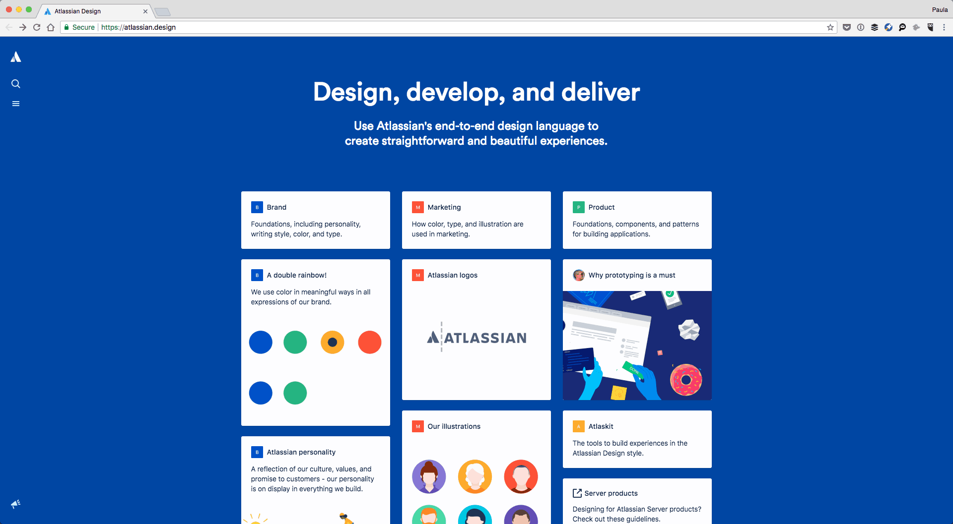
The actual structure of your design system will vary depending on the needs of your company. To give you an example, Atlassian’s design system is divided into three parts, Brand, Marketing, and Product. Under each section, you can find design elements and guidelines that are relevant to that specific area. Logos in a web app might have different requirements and restrictions than a logo on a Facebook ad or a free download file.
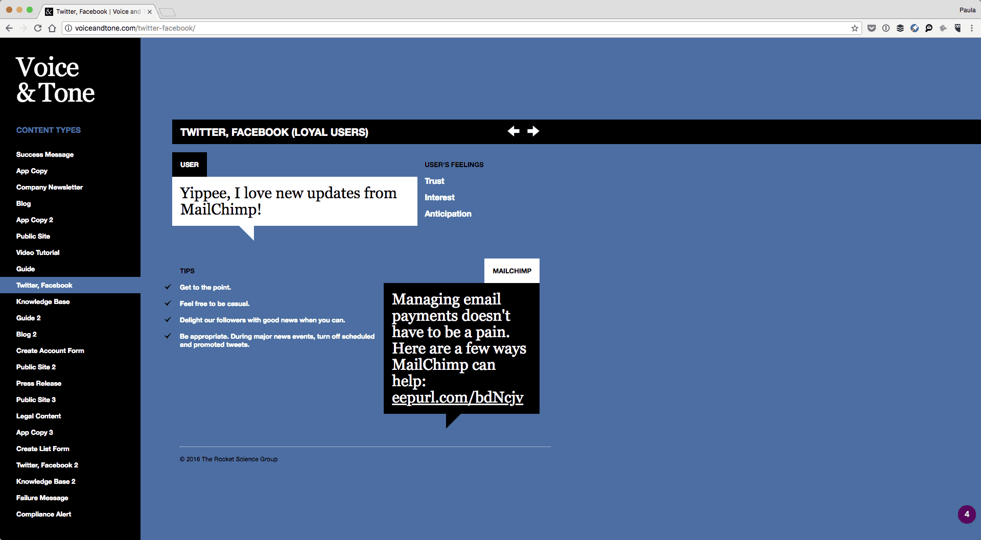
Shopify, on the other hand, has guides for their apps and for their admin designs as well as general design principles that apply to both. They have their design system include rules and instructions for Visuals, Components, Patterns, and Content. That’s right, a design system isn’t strictly visual. You should also consider including guidelines on tone, voice, and message, as the language is also part of the brand. MailChimp had a whole design system dedicated to tone and voice alone.
Basic design elements to include
Each design system will have to cover key basic design elements such as colours or typography. That’s a given. Additional elements like layout or illustrations will vary depending on your company needs. Below I am going over the most common design elements you should consider including in your design system.
Typography
For typography, you must include the typefaces in use and downloadable files. For sizes, whether you’re using pixels, pts, or rems, include the specific number and show the size of the text next to it. But, only include sizes that are allowed to be used. Include typographic treatments and design styles such as font weights. Additional properties to consider adding include line heights, line lengths, mobile breaking points if your typography is responsive, and whether or not headlines and links are sentence or title case.
At the very least, include the individual text styles starting with p, em, strong, and H1-6 to whatever else is in your designs, like subtitles. Include the relationship of padding, line height and margins between H1 and p, H1 and H2 and so on.
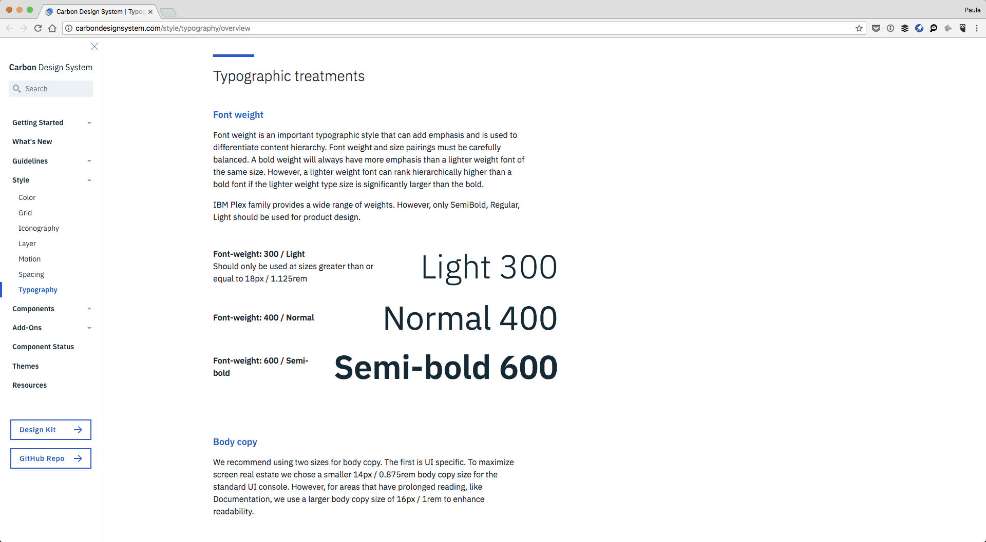
Use IBM’s Carbon design system typography section for inspiration. It’s very thorough.
Colors
When it comes to colors include every color that is allowed to be used. If ones are for special circumstances make a note. Explain how to use the colors in relationship to one another such as text on a background, and keep in mind accessibility as well. If there are specific color combinations or pallets to be used, explain them too. Provide both, HEX and RGB values as well as code variables for developers. Add CMYK if you ever print anything too.
Check out how Salesforce is handling colors in their design system documentation.
Icons, graphics, and images
When it comes to icons, graphics, and images you must include sizes such as minimum and maximum restrictions. If you’re running a blog, include specifications for author’s and commenters’ avatars. For inline images, you can include alt tag best practices, size recommendations, as well as recommendations on the image’s content. For example, you might want to use only photographs, no images with text, or to never use dark or cluttered pictures but only ones with natural light or with pink backgrounds. Provide actual examples of good and bad photographs for better clarification.
Atlassian goes into extensive detail in the marketing section of their design system for both illustrations and iconography.

Additionally, Estonia’s design system has a fantastic section for imagery where they meticulously talk about the quality of photographs and their content as well. They include information on lighting, colours, post-production, and compositions. This makes sure that the images used within their designs are the right essence for the brand. This is exactly what an outstanding design system ought to do!
Motion
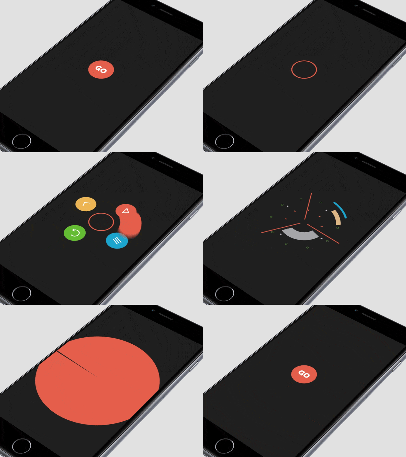
I’m using motion as an umbrella term. It can also refer to animations, transitions, mobile gestures or other movable behaviors and feedbacks. Motion can be complex to express; it’s got a lot of different but important properties. It’s a good idea to explain when it’s appropriate to use motion, what specific choreographies are okay, and how are they best to be used. Speed, sequencing and movements need to be addressed too.
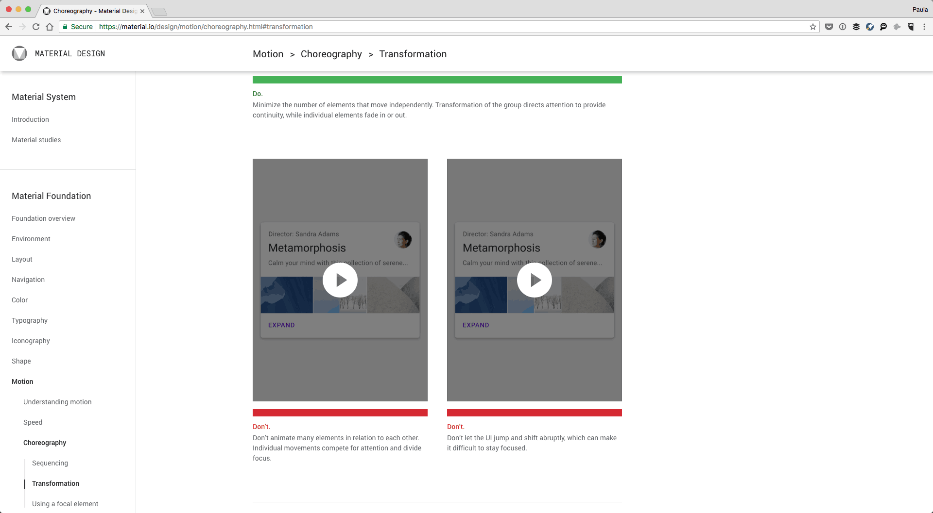
A great example of motion can be found in Google’s Material Design system. It goes into a detailed overview of how motion can and should be used within Material Design. It also provides many dos-and-don’ts, with short videos snippets to better understand the intention.
Layout and grids
Layout and grids are important for web pages, mobile apps, and responsive designs. Think of layout as common patterns to arrange the different contents within a screen. It can include information about what patterns to avoid and how to arrange the content within your layouts in an acceptable manner. You could get a little bit more specific and address how to use the larger design elements like the card designs that we especially see in web apps or mobile apps (commonly associated with Material Design). You’re welcome to provide a standard screen layout as the base.
Shopify’s design system has a great example of how they approach layout in their web app. It’s filled with recommendations, and it talks about many variables such as screen types and small-scale layouts too.
With grids, talk about the size of the columns and gutters, include pixels or % (if they are fluid), and mobile breakpoints.
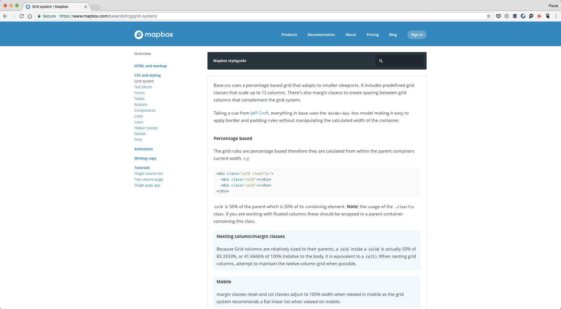
From a coding perspective, go ahead and include the different class codes for the gird, and whether or not it can only be used on divs or other elements like images too. If there is a clearfix class, explain how and when to use it or whether or not the grid uses border-box or content-box box model. Consider including a vertical grid if you have one.
Take a look at Mapbox’s grid section – it’s comprehensive. Buzzfeed’s design system includes a whole section on flexbox too.
UI elements
No design system would be complete without explaining the various UI elements out there such as inputs, button, and forms, errors, lists and tables.
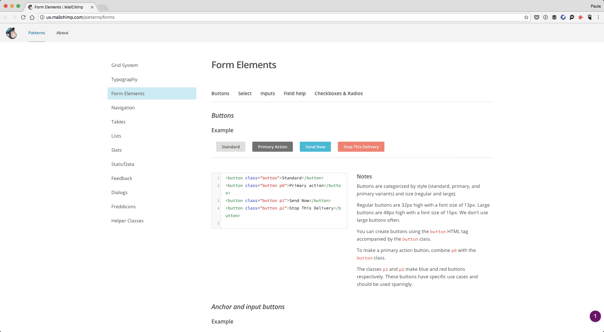
MailChimp is doing a great job with these. They have a Form Elements section in their design system that details buttons, selects, inputs, field help, radio buttons, and checkboxes. One by one, they include the styles and code for each element and their variation. For example, they have 8 different button example from a typical button to a combo button. For each, there is a description to explain how to best use it within a design. Consider including how the messages should be phrased in addition to how they should look.
Errors and feedback
MailChimp additionally has a designated Feedback section which talks about how to provide feedback to a user who is using their app. This section does include errors, but also other forms of feedback such as callout tips or small badges for inline feedback and labels.
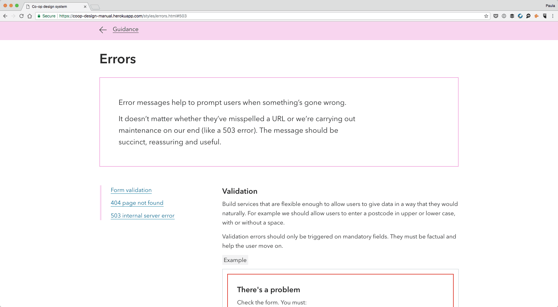
Don’t forget, an input error is not the only thing that can go wrong. Errors can also include the 404 page or the 503 page and that’s exactly what Heroku includes in their error section too.
More design elements to consider
At this point, I think you have a pretty good idea of what goes into a well-defined, outstanding and an all-inclusive design system. However, I wanted to put together a quick list of additional ideas for you to consider as there really is a lot you can do here.
Conversations
HelpScout has a section for both Conversation Lists and Conversation Threads. Their product is conversation based so it makes sense they’d detail this part of their designs as well.
Navigations
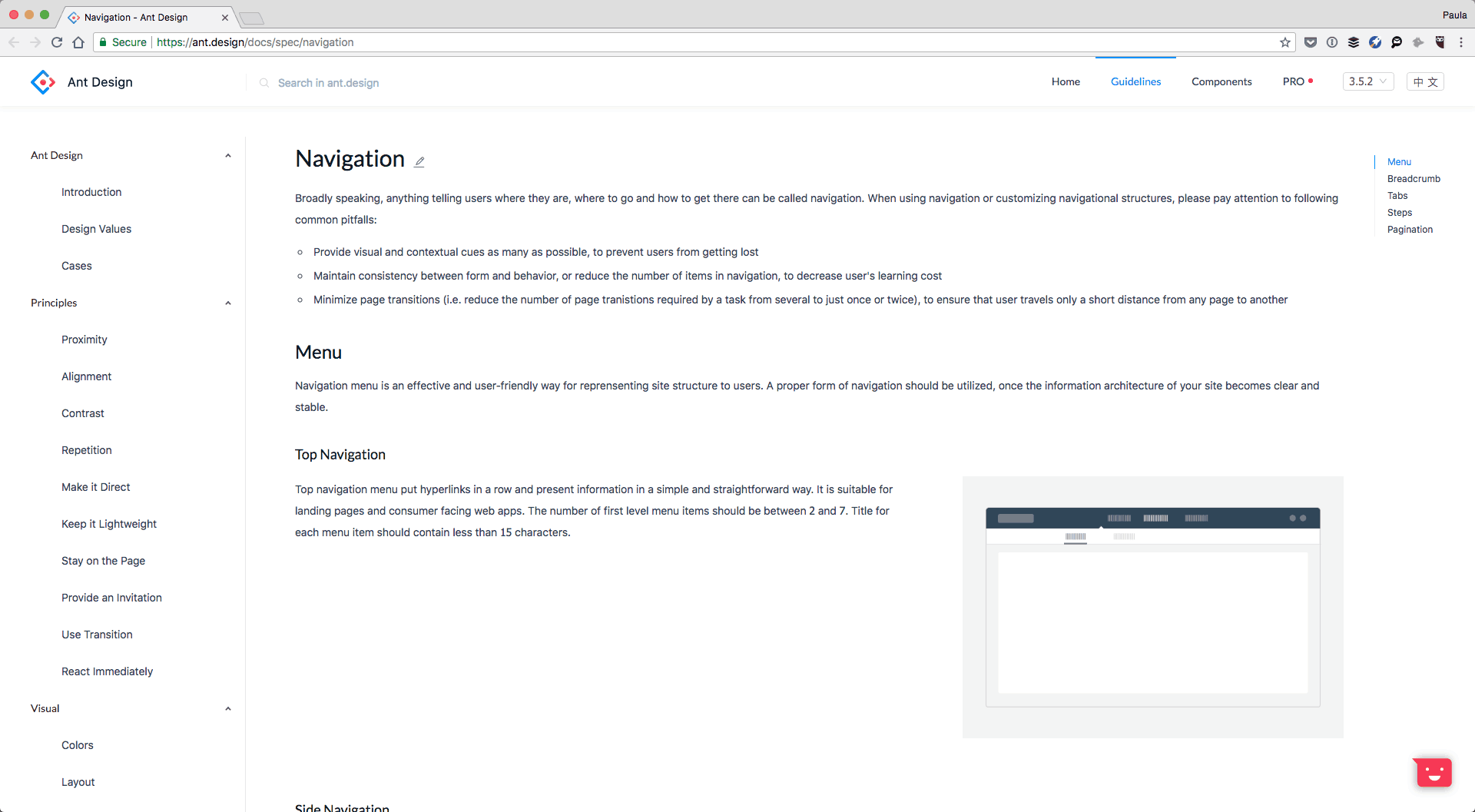
Ant Design includes a section for navigations. It contains more than just the top nav we see on every web page. Here they define navigation as anything that tells a user where they are and it includes tabs, breadcrumbs, and pagination.
Lexicon categorizes navigation in a similar way. They have sections under navigation which include the typical primary and secondary navigation. They also include breadcrumbs, nav bar, and vertical navigation there too.
Logo
No design system would be complete without the logo section either. Louder Than Ten has their logo ready to download atop the page. Next, they mention good and bad sizing and cropping, as well as padding and sample applications.
Accessibility
I’ve briefly mentioned accessibility before. But let discuss it in greater detail right now. You can have a designated Accessibility section in your design system the same way Quickbooks does. Under the Accessibility section, they cover a wide range of topics including alt texts, readability, colours, and contrasts. They also have a list of additional resources for anyone interested in learning more about the topic.
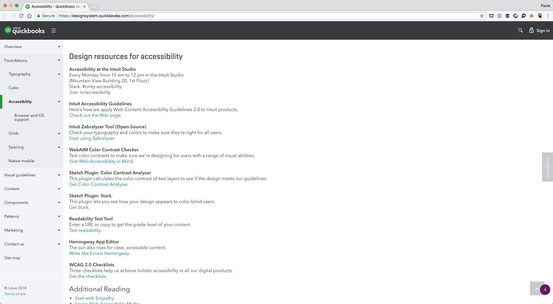
Because accessibility is so important, it wouldn’t hurt to have the content be redundant in multiple places. Include the contrast content in both typography and colour sections. But, on top of that, have a separate accessibility section as well just like Quickbooks.
Putting it all together
Now that you understand the autonomy of an outstanding design system it’s time to go and make your own. You can do them in a couple of different ways. All of the linked examples you’ve seen in this article today have been made by large teams who put time aside to create these custom design systems and publish them live. If your team has the time and the resources go ahead and make a custom one for yourself too.
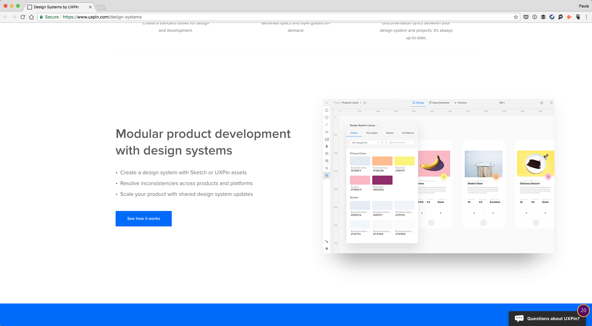
However, there are a couple of apps out there that will also help do it for you. It’s a perfect solution for smaller teams or smaller design systems. UXPin has a design system feature that you can utilize to create one of your own. It’s both designer and developer friendly. Additionally, InVision has a similar app that comes with a Sketch plugin.
Conclusion
Design systems don’t have to be complicated beasts. They are informative platforms that make sure your teammates continue to use a consistent design style within your company’s brand. Design systems don’t have to be lengthy or over complicated; they just have to let everyone know what can be used, when and how. If you have made a design system, with this article’s help or not, share a link in the comments below. We’d love to check it out!


