fbpx Skip to main content
Tag

UI

The Power of UX UI: How to Harness for SaaS Revenue cover

The Power of UX UI: How to Harness for SaaS Revenue

By Experience Design, UI, UX, Visual Design
Infographic of characters looking at a graph on a screen

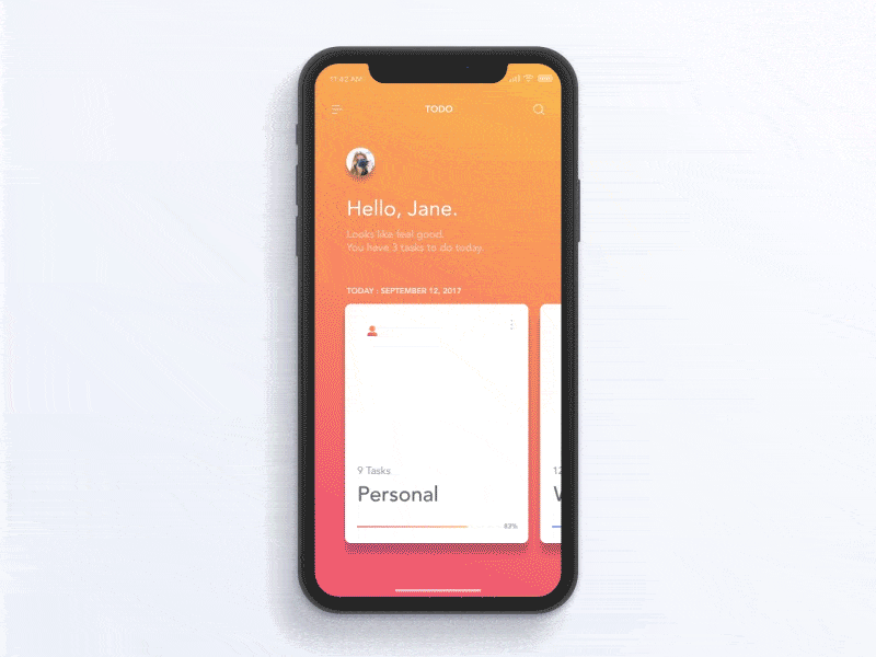
Source: https://dribbble.com/littlepinkdinosaur

Let’s face it: If your software as a service (SaaS) business wants to make money, user experience (UX) and user interface (UI) are key.

The way in which you design and present your software can be the difference between success and failure and between making a fortune and barely getting by. But few people know exactly how to use UX and UI to their advantage. That’s why I’m here: to give you the lowdown on leveraging UX UI for SaaS revenue.

We’ll start off by looking at how UX UI strategies affect conversion rates, then move onto some case studies of companies that are doing it well. With these tips, you can get on the road to success with UX UI in no time. Ready to harness its power for profitability?

What is UX UI?

Put simply, UX UI is the term used to describe the user experience and user interface design of a product. And it is more important than ever: As products move online, UX UI becomes a critical way to differentiate your product from competitors and engage users.

UX UI involves understanding how people interact with products, from the colors they use to read, to the structure of pages and content, as well as how users feel when they’re navigating your site. All these factors come together to create an experience for your users—one that is designed with their needs in mind, with an easy-to-use layout and flow.

When done right, UX UI can lead to increased user engagement and higher conversions, ultimately generating more revenue for your SaaS business. Take Dropbox, for example: Despite having a simple product offering, its intuitive design translates into high conversions and great user retention rates. This wouldn’t have been possible without its well-thought-out design.

How UX UI can unlock product-led growth

From mobile apps to SaaS products, UX UI can be a key factor in generating product-led growth and a winning product strategy. It’s not just about creating an attractive user interface, it’s about making sure customers stick around and come back for more. Whether you’re developing an app or launching a new website, UX UI is a major part of the customer experience and should be carefully designed to meet users’ needs.

Good UX UI has the potential to create a product people actually want to use, while also driving revenue. Studies have shown that companies that prioritize UX design see higher customer satisfaction and retention, which leads to higher revenues. For example, one study found that companies who invested $1 in UX results in a return of $100 (ROI = 9,900%)

UX UI can also help drive conversion rates and customer acquisition by making it easier for customers to find what they need on your platform or website. By carefully designing the user interface and user experience, you can guide your customers down the path towards making purchases or signing up for services – ultimately increasing sales and driving revenue upwards.

Examples of UX UI transforming SaaS revenue

Whether you’re a small business or Fortune 500 company, one thing is certain: you need to make sure that your users are having the best experience possible. This translates directly into increased revenue for your SaaS product. Let’s take a look at a few examples of how user experience and the user interface have influenced revenue.
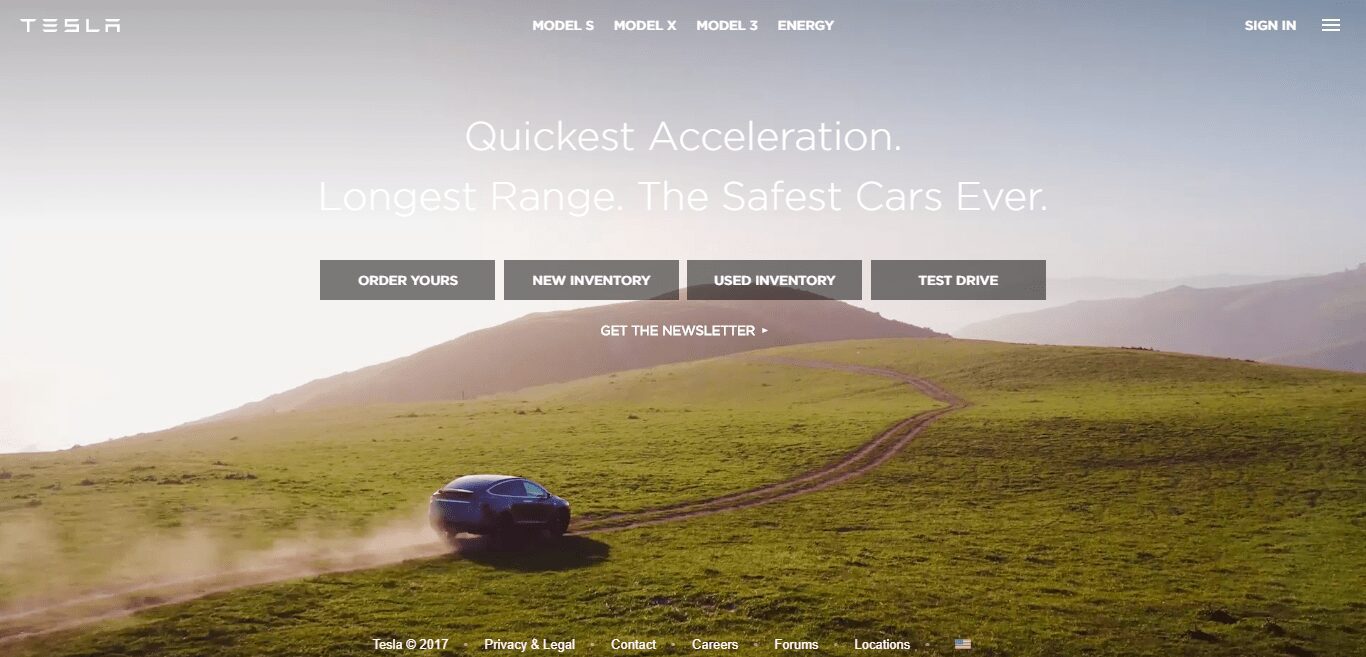
Tesla

Graphic of a Tesla logo reflecting off the rear of a Tesla vehicle
Tesla’s major success in the automotive industry is due in part to its focus on excellent user experiences, from sales and delivery to purchasing, servicing, and overall ownership. Tesla simplified the entire car-shopping process for customers and removed barriers between customers and their cars.
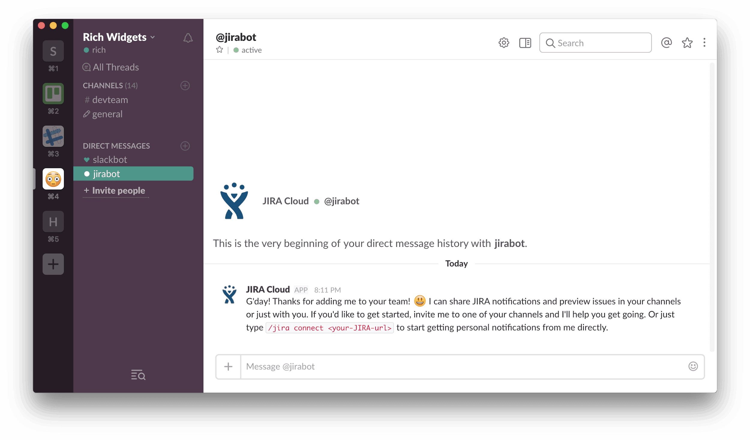
Dropbox

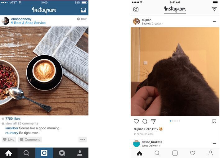
Dropbox is another great example of transformational UX UI, where the latter redefines the way SaaS products operate; it completely redesigned its desktop app interface to make it easier for users to organize their files. Because of this focus on user-oriented design, Dropbox saw an 11% increase in monthly active users within three months of the launch of its new interface.
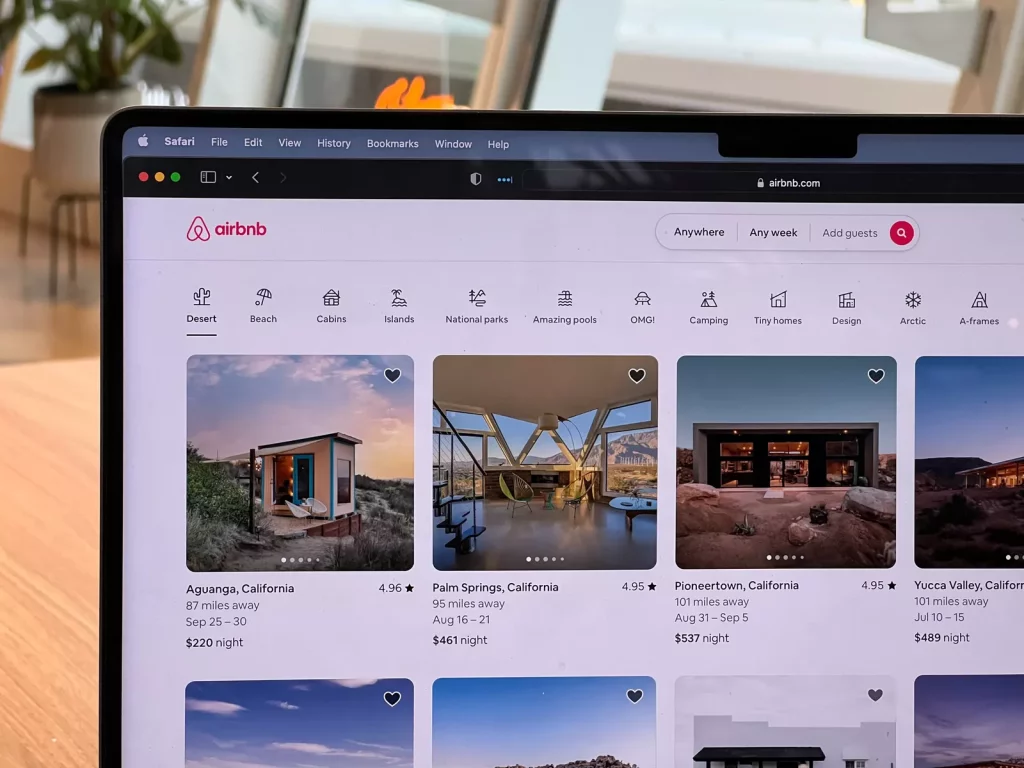
Airbnb

Another SaaS example here: Airbnb’s use of UX UI has been widely acclaimed as one of its most valuable assets. Through its unique mobile app design, Airbnb combines useful filters like price range and location with an intuitive map feature, allowing users to quickly find properties that meet their specific needs.

AirBnb listings visible on a laptop screen
These examples demonstrate how UX UI can greatly impact SaaS revenue. By taking the time to focus on user-oriented design and features, businesses can ensure that they are providing the most efficient and enjoyable product experience for their customers, leading to increased engagement and higher profits.

Benefits of investing in UX UI

You may be wondering about the benefits of investing in UX and user interface for your SaaS product. Well, there are plenty, and it’s likely to lead to an increase in your company’s revenue. Here are some of the key ones:

User satisfaction

When a user is able to find what they need quickly and easily directly from your SaaS product, they’re much more likely to be satisfied. With the right UX UI design, users will be able to navigate your product more intuitively and with less friction, leading to overall customer satisfaction.

Lower support costs

In addition to improved customer satisfaction, investing in UX UI can also lead to lower customer support costs. When you design a product that customers can use without help, you won’t need as many customer support personnel or resources. This leads to significant savings on staffing and resources in the long run.

More revenue streams

When users are able to find what they need quickly and easily by using your SaaS product, they’re much more likely to purchase additional products or services that you offer. And when customers have a great experience with your product and understand how easy it is to use, they’ll be more likely to invest in other services you offer as well.

All of these benefits lead directly back into revenue for your company — more revenue streams from satisfied customers with better engagement and lower support costs all equate to higher profits!

Tips for implementing a strong UX UI strategy

You know that investing in UX UI is key to improving your SaaS revenue, but how do you go about actually doing it? A few tips to get you started:

Define the user

Before you start implementing a UX UI strategy, the first thing to do is to define your user. This is essential in order to create an experience that’s tailored specifically to them. Understand their age, gender, location, and more — the more detailed your understanding of them, the easier it will be for you to make sure your design is as intuitive as possible.

Make a plan & set goals

Graphic of two individuals standing in front of a data graphic on a wall
Creating a roadmap of where you want to go with your UX UI strategy is critical. Make sure that you include measurable goals for each stage of the process; this will help you track progress and know when you’ve achieved success in terms of SaaS revenue.

Prioritize usability & user experience

Usability and user experience should always come first when designing a website or app. Make sure that it’s easy for people to find what they need and complete tasks quickly. Focusing on usability also means ensuring that it works on any device — mobile users are especially important these days!

Test your design

Once you have a prototype ready, test it! Ask your users for feedback and use it to refine the design until it meets their expectations. This will ultimately lead to better SaaS revenue. Additionally, testing each component of your design can help identify any issues early on before they become major problems.

Tracking the performance of your UX UI

The great thing about UX UI is that you can track its performance. The data collected from these metrics can help you make informed decisions about what works and what needs to be changed. Here are a few key performance indicators (KPIs) you should consider tracking with each UX UI change:

  1. Conversion rate: The conversion rate measures the number of website visitors who take an action, such as signing up for a newsletter or purchasing a product. This provides insight into how successful your UX UI techniques are in encouraging users to take an action.
  2. User engagement: User engagement measures how engaged users are with your website, such as how long they stay on a page and how often they interact with elements on the page. This helps you understand how effective your UX UI design is in connecting with users and engaging them in the experience.
  3. Customer satisfaction scores: Customer satisfaction surveys can help you understand how well customers like your design, as well as identify areas for improvement and fix any pain points that may be discouraging customers from taking an action or returning to your website in the future.

Image of a male with glasses excited
By tracking these metrics over time, you can identify patterns that indicate whether your new UX UI design changes have been successful in increasing customer satisfaction, user engagement, and SaaS revenue growth.

Wrapping up

Summing up, UX UI design can be a powerful driver of revenue for SaaS businesses. With the right strategy and focus on user experience, businesses can tap into product-led growth to fuel their bottom line. The case studies of Tesla, Dropbox, and Airbnb demonstrate that UX UI designs need not be complex nor expensive to address user needs, but providing an intuitive and informative UX will pay dividends in the short and long term. The success of these companies is proof that user experience design is a valuable opportunity for businesses of all sizes to unlock more revenue.

How to build Design Systems to Scale

By AI, Design, User Experience

In our ever-growing tech world, we need the design to scale as fast as other aspects of that world do. But design doesn’t scale easily since it’s a mixture of art and science, form and content. So how to achieve this?

Design Systems can be the answer.

Let’s dive deeper into this and see what they are and how they can help scale design.

Anyone who has ever played with Lego can understand what a design system is. It’s basically a Lego-like method+process that product teams need to make design and development more consistent. In fact, a lot of folks have already come to the idea that they need design systems. 69% of enterprise companies either use a design system or are currently working on one.

The core benefit of design systems is that they help establish consistency between the design and development processes and eliminate repetitive work. In a design system, everything starting with design patterns and ending with code references for each little bit of design are being documented. As a result, design and development go hand in hand.

If this still sounds unfamiliar to you and you still cannot grasp the idea of design systems, just take a look at Google, Spotify, Atlassian or any other big brand. They have got their very own design systems.

When Spotify’s Design Director Stanley Wood joined the design team in 2012, he was shocked at the lack of consistency between Spotify’s products and features from the design perspective. And since a redesign didn’t solve the problem, he decided to find a better solution. He knew that a team of distributed designers that is spread across different time zones should have a chance to work together to create a coherent experience.

So, in 2014 GLUE (a Global Language for a Unified Experience) came into life as Spotify’s Design Language System. It is available throughout the company and it has helped align design across all design teams within the company.

Spotify guidelines graphic

Version 1 of Spotify’s Guidelines | Stanley Wood

Google’s Material Design is another successful design system. Note that it evolved over the last few years to become what it is today. And it’s still evolving. Do you remember how in 2011, Gmail was redesigned with flatter buttons? Then in 2012, Google Now introduced layered “cards.” These elements are now all formalized under Material design but those design upgrades back then were a part of a larger, very purposeful and deliberate process.

What has been most impressive is Google’s ambition to unify the design across a set of varied products. Hence, Material Design can serve as proof that design is POSSIBLE to scale.

Material Design introduction graphic

https://material.io/guidelines/#introduction-principles

But how?

Well, there are a few steps you would want to take to be able to build a design system to scale. Here you go:

  1. Check if you really need a design system

There is always the possibility that you might be carried away by the trends, the hype. A lot of us often start looking for solutions for non-existent problems. Yes, this does happen. But then, it turns out that we have not checked the problem yet. So, if a simple redesign will work for you, then there is most probably no need for coming up with a design system.

The idea is that you should really do your homework and see if your company needs it or not. Building a design system or outsourcing it to a design and development company will take time and money. Estimate your needs properly before allocating resources to building a design system.

  1. Make sure your people know what to expect

Not everyone understands the value that design systems provide. So, your responsibility will be to teach your team what a design system is and how it can help make work easier. Be the influencer, the trend-maker in your company. Call it whatever you want.

If you have decided to build a design system, the company is going to pay for it. So you might want to make sure all the stakeholders are positive about the idea. With this in mind, maybe it’s worth involving someone from your team who has done this before or has helped someone earlier to build a design system? Think about it!

  1. Develop a game plan

Remember the famous quote? “By failing to plan, you are planning to fail.” It seems obvious that you need a game plan but a lot of people don’t plan the work in advance and then they get into trouble due to unexpected circumstance or force majeure. Of course, you cannot foresee a force majeure but you can at least have plan B if it happens.

So, basically, the idea is that you need to define your mission or goal or a set of values and go for them. Each company has got its own industry-specific challenges, so take your time to evaluate the situation, explore the opportunities, the pain points for your team and customer in order to build the right system for your needs. And most importantly, focus on creating a design system that is consistent and scalable.

  1. Review and adopt best practices

Don’t start from scratch, it might take too much time and resources. Review existing design systems and see which one is closer to your vision. Many companies have made their design systems publicly available. So, why not take a look at them?

  1. Conduct a UX/UI audit

You are conducting a UX/UI audit to know what you are working with. This whole thing is pretty much about documenting what exists. This can be time-consuming, but the game is worth the candle since through a UX/UI audit you will discover:

  • Why conversions are low
  • How to improve onboarding
  • Why retention rates might be low

In other words, you will get a clearer understanding of who is using your product and what problems they are facing. After the audit, you will come up with improvement strategy based on the things you have learned.

Material menu active states demonstration

  1.  Do it little by little

A design system is not a project, it’s more of a product. Hence, it needs to evolve and become more refined. It’s a living document. Make sure your design system has got a roadmap and all product-related stuff. Take it through a few iterations, talk to your team to clarify what’s coming next, and then set a new list of problems that you will be solving. Iterate as much as possible until you come up with something that makes sense.

Because even miracles take a little time animated gif

  1.  Stay organized

Creative people love the chaos but it should not be the case here. Document everything! Sounds simple, right? But it’s sometimes really hard to do things the “neat and clean” way rather than the “quick and messy” way. Staying organized reduces clutter in email or Slack and helps keep the team sane and happy. Otherwise, you might end up where you started – chaotic styles everywhere!

Most importantly, know where you will be storing all your creations and how you are going to make them accessible to your team members.

Conclusion

As soon as you feel the need to have a design system for your company, you will want to jump into building one. If you are going to do that in-house, then make sure you communicate with your peer designers and take into account the above steps to build the best possible design product ever. And if you are thinking about delegating the work to another company, then make sure to choose a team that knows how to do it right.

The State of UX for 2018

By Design

When 2017 is almost over it’s time to look ahead and predict how the digital experience will evolve over the next 12 months.

In this article, I’ll overview the most significant changes in the digital world which we saw during 2017 and the trends we should be aware of to stay ahead of the curve in design and development in 2018.

1. Simpler Navigation

Navigation experience was a hot topic among many designers during 2017. Designers strive to create an effortless experience and navigation plays a key role in that.

Linear Navigation

In the attempt to simplify navigation experience many apps and website focus on creating linear (or step-by-step) navigation experience. Apps and services which utilize this type of navigation put users in linear user flow when each next step looks like a logical continuation of the previous one. This type of navigation is especially good for goal-driven apps (such as Uber) and e-commerce websites (e.g., Amazon, Best Buy) where users have a goal they want to accomplish.

Voice User Interfaces

Voice user interfaces (VUIs) become a good alternative to graphical users interfaces. Significant improvement of natural language process made it possible to use voice commands for different purposes.

A significant percentage of young generation use voice commands to interact with interfaces

In coming year voice interfaces will be used not only in mobile devices but as a way of interaction with IoT and Smart Home systems. Soon we’ll have even more advanced speech recognition patterns that will improve our interactions with systems.

2. Decluttering and Improving Comprehension

Removing visual clutter and improving comprehension is a popular goal among many UX designers today. Designers remove irrelevant information (noise) and prioritize relevant information (signal) by putting content first and elaborating clear visual language.

Content First

Content first design approach is directly related to minimalism in design. In the attempt to create more with fewer designers remove all unnecessary elements of the interface and focus on what’s really important — content and functionality. Interfaces have more whitespace between different elements and limited numbers of decorative items. The downside of this approach is that interfaces sometimes look too neutral.

Instagram for iOS (2015 vs. 2017)

Clear Visual Language

We all know that strong visual hierarchy makes it easier for users to interact with a product. In the context of websites and mobile apps, strong visual hierarchy means clear viewing order for the visual elements on a screen. Strong visual signifiers (such as contrasting colors for call-to-action buttons) combined with minimalist layouts can create a really easy-to-use experience.

Submit button has a contrasting color. Image credits: Airbnb

Large Headlines

Large headlines is a lot more whitespace and large typography for headers. Large headlines provide two major benefits for users: they make text both easier to notice and easier to read.

Apple uses bold headlines in iOS 11.

3. Using Animation For Different Purposes

Animation is quickly becoming a natural part of user interfaces. There are two particular types of animation that play a significant role in UX design — functional and delightful animations.

Functional Animation

Functional animation is a type of animation that brings clarity to the user interface. This type of animation is used to simplify the process of interaction with products. With the release of iPhone X and it’s gesture-driven interactions animation will be used to describe complex transitions and spatial relationships.

Functional animation can make complex transitions easy to follow for users. Image credits: Jae-seong, Jeong

Delightful Animation

In the attempt to create a more human experience, many app creators incorporated delightful details into user flow. Such elements don’t have any functional purpose; they are used to create an emotional connection with users.

Using animation to rate the experience. Image credits: Andy Orsow

4. The Dominance Of Videos

2017 saw a surge in the popularity of video as a content marketing format. According to Hubspot, 78% of people watch videos online every week, and 55% watch videos online every day.

Video Content For Short Attention Span

The average human attention span had fallen from 12 seconds in 2000, or around the time the mobile revolution began, to eight seconds. Marketers are adapting all content (including videos) for short attention span — formats like 360-degree videos and Facebook Live were created as a result of such adaptation.

Video As Welcome Message On Homepage

Video has an opportunity to engage users right from the start. That’s why so many websites using video as a welcome message. Companies like Tesla not just introduce the visitors to a product, they tell a story about the product with the use of video. This will help to create a more memorable experience.

5. Emotionally Intelligent Design

The human-machine relationship was always more emotional than rational. We are happy when technology helps us achieve our goal and quickly become angry with our computers when something goes wrong.

In 2017 we saw a turn towards emotionally intelligent design. Emotional design is focussed on cultivating positive emotion by understanding how users interact with technology and what feelings they have.

Failure Mapping

For a long time, designers create experience only for the ideal user journey. In 2017 many designers realized that creating an experience for the non-ideal user journey is equally important.

Failure mapping is about finding situations when users might interact with the product in a way that causes a negative outcome. Designers try to build a better understanding of situations where a user may try to use something ‘wrong.’ By building an understanding of scenarios that can cause failure, designers attempt to design for ‘graceful failure.’ This allows to deliver a humanized response to an otherwise awkward moment for any user.

One great example of failure mapping can be found in Slack. If you’ve half-written a message in a channel and leave, you’ll get a little pencil icon telling you that you’re not quite finished.

Pencil icon means you started typing a message but left the channel before sending it.

More Microinteractions In Mobile Apps

Microinteractions on mobile devices are quickly becoming a lot more device-specific. They are used to increase simplicity in digital experiences. Paired with simple gestures and subtle, visual feedback they become part of the natural way we interact with our products and services.

Visual feedback in Instagram Stories

Conversational interfaces

Chatbots and conversational user interfaces (CUI) became trendy in 2016. The rise of chatbots and smart assistants will continue to grow. One important difference between CUI and traditional GUIs is the way users feel about interacting with product — conversational interfaces make interaction feel more human. That’s why conversational bots such as Zo and Xiaoice are so popular among users.

Image credits: EJ Hassenfratz

6. Content Is Even More Important Than Ever

Content is king. Content is the reason why people use our apps and visit our sites. During 2017 we saw two major trends that are directly related to the way we interact with content.

Facebook Become a Destination For Content

In 2017, Facebook became one of the most important services for the consumption of content. It’s no longer just a jump-off point; it’s a powerful hub for the news and information.

Big Companies Will Help Us With Content Credibility

Content credibility is a serious problem today. Millions of pieces of content are created every minute and it usually hard to tell the difference between facts and fiction. According to a study by Stanford University, a high percentage of users cannot distinguish truth from lie on their newsfeeds. The problem of content credibility was especially noticeable during the 2016 presidential election campaign in the US, which proved that lies spread faster than the truth.

Fortunately, big companies like Google and Facebook realize this problem and have already begun testing fact-checking features that help users discern fact from fiction.

7. Wearables As Replacement For Mobile Phones

With the release of Apple Watch Series 3 with Cellular, a lot of people see the beginning of the new era for connected devices. Finally, it’s possible to use smartwatch as a replacement for a mobile phone. Why would you need to carry a heavy brick in your pocket if you can have a powerful computer on your wrist? It’s clear that we see a new segment of devices that after a while will have its own target audience.

Image credits: Engaged

8. Simpler Authentication

The combination of login and password (also known as “credentials”) is de-facto standard information required by apps and devices for a sign-in procedure. We all know how outdated it is. Hopefully, we see significant progress in this field during previous years. In the coming year, we’ll have a few notable changes.

Using Smart Ways Of Authentication

When people forget passwords in most cases, they try to reset them. While reset option is a mandatory requirement for good sign in form, it still has one significant problem — users will need to do a lot of extra actions in order to log in into account (e.g. click “Reset password” link, check inbox for a message with reset link, click the link and create a new password). In the attempt to simplify the process, many apps and websites incorporated creative ways of login — such as temporary passwords ( the one-time password that will be sent to you):

Ebay texting one-time password on the phone number assigned to your account.

Or even replace the login/password combination altogether:

Medium and it’s “magic link”

Biometric Authentication

A lot of devices today use different ways of biometric authentication as a replacement for passwords. In 2018 we’ll see a more exciting way of login to our devices and apps. We’ll use one most the most protected and at the same time easy to use object — our faces. Face ID which became available for iPhone X users has the opportunity to become the most natural way of authentication in the coming year.

Craig Federighi demonstrates Face ID during WWDC 2017

Two-Factor Authentication

The rise of cyber attacks that are focussed on collecting user data force companies to think about security in their apps. 2-factor authentication (or 2FA) is quickly becoming the default way authentication for many services. It adds an extra layer of protection that can significantly reduce the probability of the data theft from user devices.

Image credit: MIT

9. More Personalization

More and more companies incorporate techniques and technologies that allow them to deliver personalized content for their uses. According to Gartner, smart personalization engines used to recognize customer intent will enable digital businesses to increase their profits by up to 15%.

Machine Learning

Significant progress in the field of machine learning made it possible for many companies to utilize the algorithms in their apps and services to deliver content tailored to the needs and wants of their users. The best examples of personalization can be found on Amazon, Spotify and Netflix services.

Netflix analyses the user’s interest to recommend the series that might be interesting for them

Netflix shares the details of machine learning technologies that it uses to provide personalized content.

Location Awareness For Mobile Apps

Since mobile devices are travel with users, the apps installed on the devices can use location data to provide a content which is relevant to user’s location. This make services more responsive to the environments around them. Some apps like Uber have already utilized this property to reduce the number of actions required from the user’s side. In 2018 we’ll see more apps use those capabilities to make the experience better.

UberEat service

10. The Rise Of Cashless Payments

Cashless payments become a trend, and the number of people who use this method of payment almost doubled in 2017. According to a report by Juniper Research, the number of Apple Pay and Android Pay users will be 86 and 24 million by the end of the year, respectively.

In comparison with credit cards, both Android Pay and Apple Pay are the much safer payment option for payment proceeding. No wonder why people prefer to use them.

Image credits: Daily Express

What does it mean for designers and developers? This means that in 2018 we’ll have to provide Apple Pay/Android Pay as a default option for our products (both offline and online).

Using Android Pay for online payment

11. Augmented Reality Is a New Big Thing

2018 will be a year of augmented reality. A lot of people will use their mobile phone or tablet as a lens into a virtual world.

Google Lens

Google Lens is an AR app that available in Google Assistant on both Pixel and Pixel 2 phones which allows users to point a camera at the world and get answers. The good news is that you no longer have to fire up Google Photos if you want to use Lens to glean information from the world around you. You can tap a camera button while using the AI helper and it’ll perform a search when you take a photo.

Google Lens is designed to bringing up relevant information using visual analysis. Image credits: Engadget

More AR Apps Which Solves Real-Life Problems

Unlike VR which still is a prerogative of enthusiast and early adopters, AR is fastly becoming a technology that delivers real value for people who use it. This year we saw a few great apps such as Ikea AR app that helps you redesign your living room:

By being able to place virtual objects next to physical objects, you open up a world of possibilities to their customers

Or AR Measure which makes it possible to measure the real-world objects without a traditional physical measurement tape:

Create Apps Will Be Easier With AR Kits from Apple and Google

2017 was a Both Apple and Google released their mobile AR platforms – AR Kit and AR Core. These platforms are high-level APIs which provide a simple interface to a robust set of features. And the great thing is that platforms are supported by millions of existing devices.

Mobile AR platforms allow seamlessly integrate virtual objects in physical reality.

12. VR Is Still a Fad

A lot of people say that VR is going to be the next big thing. Unfortunately, 2018 won’t be a year when we’ll have VR in every house. The platform should fight a lot of challenges before it is widely available for people. Despite that, in 2018 we’ll see a few significant change that will bring VR a bit closer.

VR Devices Will Be More Affordable

Making the VR devices more affordable for people is the #1 goal for many hardware developers. Just a few months ago, both Oculus Rift and HTC Vive significantly reduced the price of VR devices. The rise of low-budget devices such as Google Daydream will introduce the technology for a mass segment of users.

VR and Unity 3D

In coming year VR is still will be used primarily for entertainment. This means that creators will utilize the Unity’s 3D game development platform when crafting stimulating experience for intense gamers. We can expect the significant progress of this platform for VR developers – we can expect more tools like Unity’s VR Editor in 2018.

VR in a Browser

Mozilla’s WebVR has the opportunity to become the next big thing in the field of VR. There are some reasons for that. First, it’s the most affordable technology (uses with Google Cardboard and GearVR can use it). Second, developers can use the same programming languages to create the apps for WebVR (no need to learn a new language, you can create VR apps using JavaScript). Last but not least, WebVR to use the apps and services without installation, you simply open the link and you’re in VR.

A-Painter allows you to paint in VR in your browser

Bonus: Changes In The Way We Design Products In 2018

Today designers and developers use modern methodologies such as Agile and Lean UX design which allow them to iterate fast and create products that satisfy the needs and wants of their users. In 2018 we’ll see a few significant changes in product design.

From MVP to MLP

Today a lot of companies are focussed on creating MVP (or Minimum Viable Product) to prove the concept they work on. It’s clear that MVP won’t be enough for 2018. Tomorrow’s designs will embrace an MLP — Minimum Loveable Product — experience the combines both great usability and perfect user experience needed to convert visitors into customers. MLP allows much easier to convey stakeholders and first-time users to accept the product.

Image credits: Laurence McCahill

Merging of UX and service design

There’s a huge probability that UX Design and Service Design will finally come together in 2018. Since more and more services are delivered digitally, these two fields will start to merge.

Image credits: Satu Kyröläinen

Conclusion

As with any trends, some trends mentioned above will go, while some will stay. But to create the great user experience, it’s important to remember the global goal of designer — make people’s lives better.