The fintech space is changing progressively! It’s no longer enough to create an effective product that meets your customer needs. To stay ahead of the curve, you need to beware of the top fintech UX design trends to watch in 2023.
Stay ahead of the financial technology revolution with millermedia7’s fintech category. Explore cutting-edge solutions and industry insights for your financial endeavors.
The fintech space is changing progressively! It’s no longer enough to create an effective product that meets your customer needs. To stay ahead of the curve, you need to beware of the top fintech UX design trends to watch in 2023.
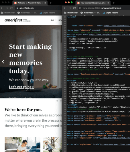
The financial sector heavily relies on complex bureaucratic procedures and the necessary abundance of strict regulations. That’s why most finance verticals traditionally have been considered stressful activities that not everyone can handle effectively. However, as the financial industry embarks on the path toward digital transformation, this status quo is changing. Now, financial technology user experience (fintech UX) is front and center.
Well-thought-out fintech UX design of apps and tools has transformed burdensome pieces of our financial routine into relatively simple and often quite enjoyable tasks. Today, we have all reason to believe that UX designers will drive further growth and continue the modernization of the fintech space.
Let’s take a look at how different fintech products with outstanding user experience design have empowered millions of users. Not to mention how they make managing money, investing, and raising funds much easier to do in a smarter way.
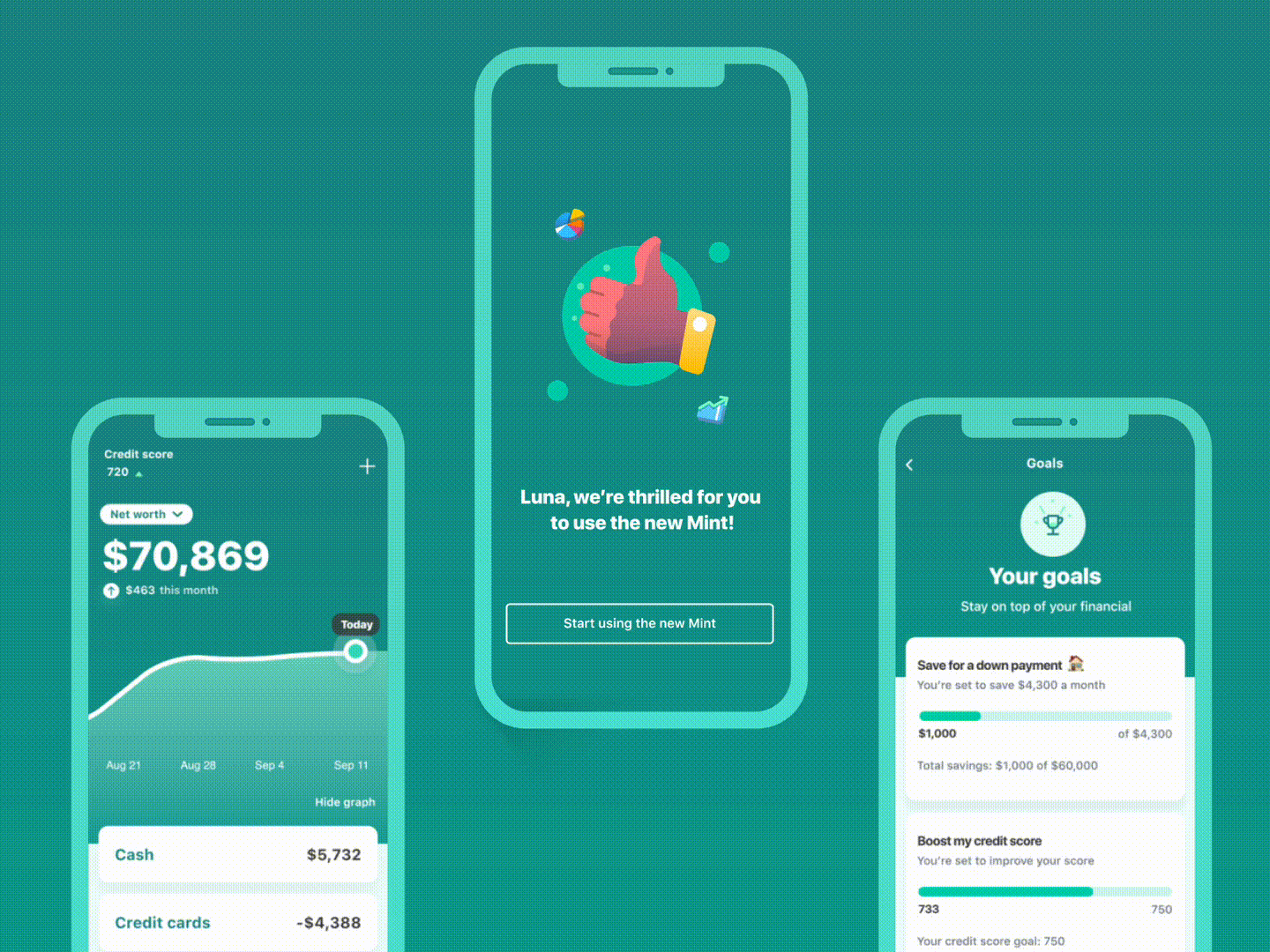
Mobile applications for tracking personal finances are extremely popular nowadays. Statistics show that about 63% of smartphone owners use at least one app that helps them keep track of individual spending. In general, these fintech apps allow users to bring all their accounts into one place and check how their balances change anytime. Consequently, people become more aware of where their money is going and, ultimately, become more financially conscious.
The main challenge of most personal finance applications is that they need to display a large amount of information without overwhelming users or sacrificing usability. A clear fintech UX with smooth virtual interactions is the way to reach this goal.
For instance, Mint, a widely-used budgeting app, provides several predefined categories of personal expenses. Users just need to link their accounts to the application and set limits for each category. The app automatically tracks all transactions and sends notifications when a person is close to the threshold.

Another great example is the Simplifi app. It was explicitly designed to decrease the navigation time required to complete various day-to-day financial tasks. Easy to comprehend dashboards let users see exactly where they stand. Users can also get more detailed info on spending in just a few clicks.

Banking and financial institution apps also belong in the group of financial products that significantly simplify our financial life. Most of them are provided by fintech companies or banks and allow clients to manage their financial matters right from their smartphones. The main goal is to make all banking services accessible at the user’s fingertips while avoiding the complexity that is often associated with financial transactions.
When building a fintech user experience design, the necessity to combine different consumer needs in one consistent user flow is the biggest issue faced by UX specialists. The app has to be functional, reliable, comprehensive, and easy-to-use at the same time.
Bank of America came up with a great solution in this regard. It included a virtual assistant, Erica, in the fintech UX design of its app. Erica guides users through different features and can complete some simple tasks itself (e.g., checking account balance) just like iOS’s Siri.
It’s also crucial to understand that the fintech UX of banking apps is one of the elements of the overall customer-centered experience. In other words, there should be no distractions, unambiguous choices, or too much creativity.
Like any other communication with a bank, interactions within the app should be straightforward, professional, and friendly. That’s why a subtle, user-friendly, and minimalistic user interface is the optimal choice for mobile banking.

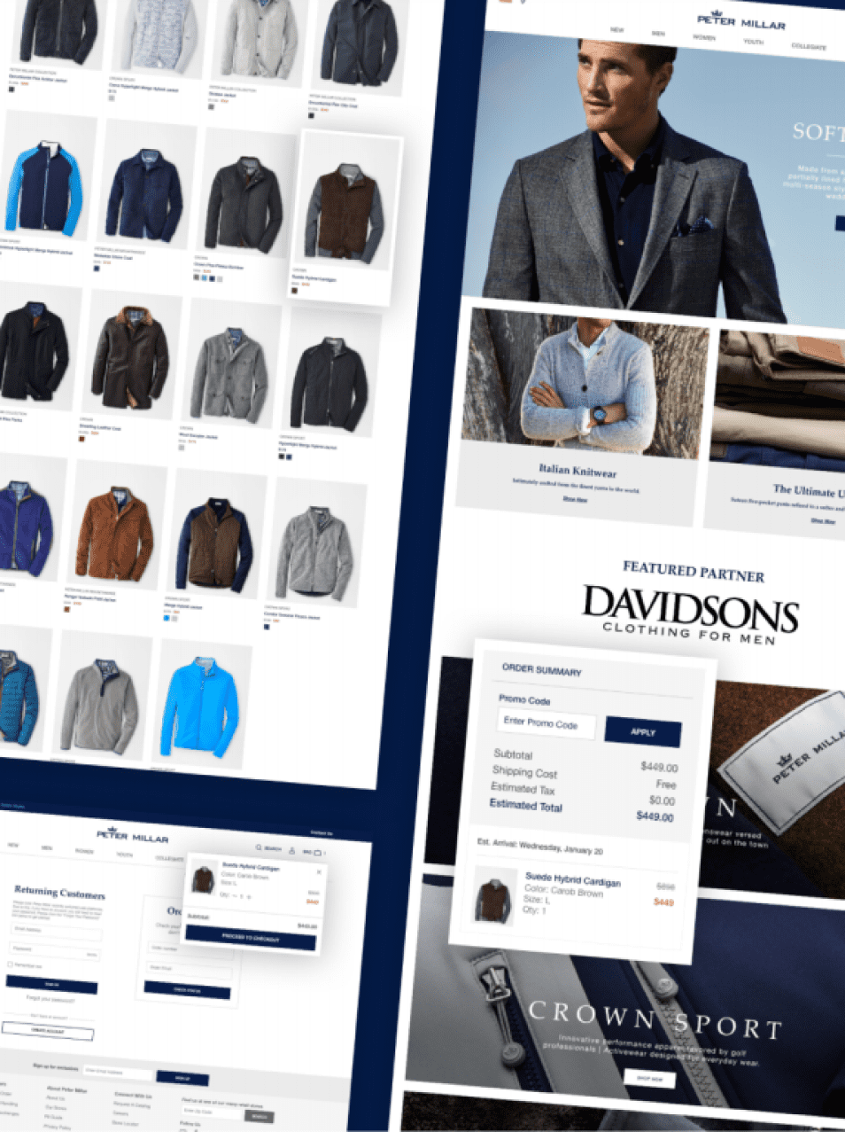
Trading apps are the fintech product group in which a user-centered design is probably valued the most. They aim to help people make trades in a simple and efficient way. But most stock trading applications offer many more features than just the capability to buy and sell stocks online.
They allow users to view analytics and statistics in real time (e.g., how the price of a stock has been changing). However, users can also read relevant news, develop their own investment strategy, automate transactions, and so on.
To create a seamless fintech design for a stock trading application, UX product designers should understand how a stock market works. Also, they need to know basic investment terminology. It should help them split the data into logical blocks and make critical information more noticeable.
If you want to get an example of how an app can lower the barrier of entry to the stock market, take a look at Robinhood. Its usability is so good that some people are joking that using Robinhood is easier than using Tinder.

There are also investment apps like Webull that are targeted at experienced investors. They provide users with more advanced trading details. And, logically, their visual design looks a little bit more overwhelming. But it’s only at first sight.
In practice, all these charts and diagrams simplify the perception of information for traders, helping them more easily make more informed decisions.

Crowdfunding platforms are a popular way to raise money for projects, especially in innovative and creative areas. They’ve become a meeting point for people who have brilliant ideas and people who are ready to invest in them.
In general, there are several different types of crowdfunding (e.g., donation-based, investment-based). Nevertheless, most of them require the platform to build trust from all sides in order for it to work as intended. Since everything happens online, this trust is largely established through great financial technology UX.
For example, fintech UX often plays an essential role in making visitors stay longer on a crowdfunding platform. It also defines how easy it is for users to discover projects and how much effort it takes to transfer money to the platform or project.
If you visit GoFundMe, a well-known crowdfunding website, you’ll see how a well-built fintech user experience creates a strong foundation for trustful and engaging crowdfunding.

In particular, all GoFundMe initiatives are divided into categories (e.g., medical, animal, business), which considerably simplifies browsing of fundraisers. The initiatives also have brief descriptions explaining the reasons why the funding is needed.
Once you open a page with an initiative, it becomes immediately clear how much money has already been raised and who made these donations. Besides, the website contains success stories that happened thanks to GoFundMe. Overall it is a great way to establish user confidence and social proof.
Mobile payment services became a popular alternative to cash and traditional money transfer methods a few years ago. But the COVID-19 pandemic caused an even greater boost in their usage. People make payments via mobile devices to buy products or services online and in person, split expenses with friends, and accept money from other users.
While an application needs to contain the necessary features to perform all these functions, convincing us that everything went well is a fintech UX design’s task. No one would use a mobile payment service if it made users feel anxious every time they purchase something with a smartphone or tablet. To create an effortless and stress-free payment experience, designers should work on its simplicity and intuitiveness. Apple Pay serves as one of the best examples of these virtues today.
Another important element of fintech UX for mobile payment services is interaction design. Simply put, UX designers must consider not only a user journey within the app but also the broader context of user behavior.
For example, it includes the way the application communicates with a user. Does it provide the right amount of information? Are all messages clear enough? If an error occurs, how easily can a user understand it? These are just some examples of potential communication pitfalls. A great example of how to approach these elements is Facebook Pay which deals with this just about perfectly.

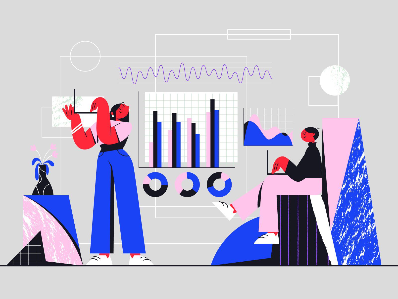
Business intelligence solutions help professionals who work in the financial services space stay on top of the most recent news and receive other important data insights. For example, these platforms can provide detailed information on investor mandates, managers, and consultants. They can also aggregate analytical content from other resources or create unique expert articles to keep users up-to-date with market changes.
Our team at m7 provides consultancy services and UX designing for fintech companies. We recently received a request from a client who needed to optimize the fintech user experience on two business intelligence platforms. Before approaching us, they had gathered user feedback and found out that the navigation was too difficult and the user journey wasn’t consistent enough.
To solve these problems, we did market and user research. Our team also identified customer (end-user) priorities by conducting contextual interviews with all user personas. The next stage was wireframing and prototyping. Based on the collected information, we developed new user journeys.
Our designers focused primarily on improving the end-users search experience. This makes it easier for the different category customer groups to use our client’s tool to find the most relevant information. Additionally, we provided suggestions for increasing the level of personalization the end-user would experience.

As a result, our team created a new platform design that helps the client’s customers to interact with platforms much more efficiently.

Strabo was designed with the global citizen in mind, allowing users to connect and access their financial accounts in different countries. The dashboard is intuitive, leveraging familiar functions that the modern professional can navigate through. Furthermore its' fully customizable, which allows the user to filter/sort their data the way they want rather than overwhelming them with too much information.
In the financial technology market, UX design often defines whether a product will become a success or not in the short and long term. The fact of the matter is that financial apps deal with huge amounts of complex data. Without seamless user journeys and clear interfaces, users can get swamped by numerous features and overwhelming data.
As a result, they won’t be able to complete their financial tasks effectively. That’s why usability (and usability testing) can never be neglected. Otherwise, there is a risk that a solution will make users’ money chores even more unbearable instead of simplifying their financial lives.
In enterprise application development projects, decision-makers pay a lot of attention to the product functionality, while the end-user experience often takes a back seat. HR portals, task management systems, CRMs, and intranet sites — we all know how cumbersome and frustrating they can be. Oftentimes, companies’ executives see the true value of a decent enterprise UX. After all, they test and examine the tools from a very different perspective than most who’ll use the software every day. Not to mention, training and experience using the corporate software will overcome any lack of intuitive design, won’t it?
This lack of appreciation for intuitive design and usability is, unfortunately, quite common. However, it’s fundamentally wrong and can have significant consequences for any organization. In this article, we’ll explain what enterprise UX design is and why it matters.

Before we jump right into the details, let’s outline the basic definitions. Customer UX (or “consumer UX”) is a user experience design that belongs to apps and other digital solutions created for consumers or the general public. Meanwhile, enterprise UX is applied to the internal software of a specific organization and used predominantly by its employees. While the definitions help categorize the different terms, there are greater differences between the two types of UX design.
When a design team creates the UX for a customer app, it usually knows only the target audience’s key characteristics such as gender, occupation, age, etc. To study the landscape, UX designers usually do extensive market research. But it doesn’t allow them to identify a specific group of individuals who will use the product. At the same time, the scalability of the software product remains largely unknown until it is put on the market. In other words, there’s quite a lot of uncertainty. That’s why the design process consists of testing and verifying assumptions at different stages.
The situation is the opposite when it comes to designing enterprise software. In this instance, the group of future users is known from the very beginning. When a team works on the enterprise UX design, know who will use a solution. The potential scaling up is also limited to the actual or projected size of one organization. This means that the designers who create enterprise UX need to make full use of the available data.
The process of building customer-oriented products is guided by user expectations, pain points, and feedback. Although the product idea might not come from those that will use the software most, it’s in the decision-makers' best interest to have a product the users will love. If users’ needs and wants aren’t considered, a product won’t become popular, and it will generate fewer sales or downloads. That’s why significant effort and investment goes into making a product user-friendly and optimizing for customers’ digital experience.
In enterprise projects, either independently commissioned software or as part of a more comprehensive digital transformation process, usability is often misinterpreted in the background. Employees (the majority of end-users) rarely have a choice about corporate business systems, and they rarely have an impact on the product development process of new systems. High-level executives make most of the decisions. And the lens they see and evaluate software is often significantly different from most users. Often skewing toward functional requirements and top-level project management requirements. As a result, corporate software performs all the required functions but are hard-to-use, clunky, sluggish, and ugly.

Companies that exclude usability for the end-user, focusing squarely on product functionality, can potentially save some money when commissioning the software. However, at the end of the day, they lose more over time as they don’t get the advantages that quality enterprise UX design brings. Here are the most important benefits an organization can expect when it factors in end-users’ preferences in the design process.
Some executives would rather cut corners to save money in development rather than invest in thought-out enterprise UX design because, for them, it’s like throwing money down the drain. This is a misconception. In practice, investments in UX produce a greater cumulative return over time. If corporate software is easy-to-use, it helps employees perform their routine tasks. Consequently, their productivity is higher, which leads to higher revenues for an organization.
Besides, enterprise users usually spend 8-10 hours a day working with the company’s business systems. When such systems have refined enterprise UX design, actions that may take employees 4 to 6 clicks to execute may be done in one click-and-drag motion or 2 clicks. As it’s saving them time every day, it’s bound to have a positive impact on performance over a year.
As a professional design and development agency, we know how the productivity benefit works in practice. After our team created a new enterprise UX design for our client’s KYC platform, its employee productivity has increased by 39 percent.
Many employees working at larger corporations have to deal with a huge amount of raw data all the time. A good enterprise UX helps them to understand and process data quickly and effectively. When designers create corporate solutions with end-user needs and the latest UX trends in mind, key insights are much easier to find and understand.
Core enterprise UX components like well-constructed user journeys, dashboards, and data visualization allow employees to grasp the information with minimum effort. Empowering them to make better informed decisions and avoid mistakes. This applies to employees regardless of position, as decision-making is simplified within each area of responsibility.
Effective cooperation is a key to the success of any group activity, and enterprise workflows are no exception. But it can be a real challenge when a development team builds corporate software without paying much attention to enterprise UX. Imagine, for example, that an enterprise product has a chat, but its user experience design is really bad. Employees can send each other messages but it takes five steps to find the message, open it, write a reply, and send it. Is such a business system going to be a help or obstacle? It’s quite obvious.
Good enterprise UX design should consider both employees’ overall behavior and micro-actions to make the teamwork barrier-free and efficient. In the post-COVID-19 era, it’s even more important due to the global shift to remote work. Essentially, designers who create enterprise UX should figure out how to make interactions within the software system resemble real-life interactions and environments as much as possible.

In general, the enterprise and consumer UX have a lot in common in terms of design approaches and stages of creation. But still, enterprise app development projects have some specifics that UX designers must be aware of. To best illustrate this, we’ll discuss one of our relevant projects.
Our enterprise UX project was related to the fintech sector. The client, a financial institution, came to us with the request to create a new user experience design for its KYC (Know Your Client/Customer) platform. A core aspect of the project is that it’s mandatory for banks to verify the identity of individuals they provide services to. The process is called “know your client,” and employees involved in it constantly process an excessive amount of data. In short, our main task was to make the complex data easier to follow for the client’s financial officers. Here is how we accomplished it.
An enterprise UX design system should be based on a deep understanding of user needs. Although the company’s executives and project managers may know for sure what a system must do, user research is still necessary to figure out how it should do it. The good news for UX designers is that a target audience is always defined and reachable. But unlike customer apps that often support a few-step process (think of Uber), enterprise solutions focus on rather complicated workflows. So, determining user roles and studying their pain points requires an all-round approach.
On our fintech project, the first thing we did was user research. We asked the employees about their working routine and the tasks they need to complete to do their part in the KYC process. Based on this information, our team divided all employees into user roles (i.e., the analyst, manager, case coordinator, KYC head, administrator, and auditor). We also determined the core user (i.e., analyst). Finally, our team listed primary responsibilities and key interactions for each role.
Building a user flow is a central stage of the enterprise UX designing process. Basically, designers should take the client’s requirements, connect them with user needs, and create wireframes. The important aspect here is to put a focus on simplicity, not creativity. There is usually much less space for experiments in enterprise UX projects than in consumer UX projects. The reason is that there is no goal to entertain or impress users, just to make their life easier.
To complete this stage of our fintech project, we created a schematic representation of a user flow. To do that, we used task analysis performed by our team after user research. Having all employees’ duties and connections laid out in front of our eyes, we created wireframes and then developed a high-fidelity prototype of the KYC platform.

When designers work on enterprise UX projects, some often skip this stage of a design process or collect feedback from the company’s executives instead of end-users. But it’s a huge mistake. Business managers usually have a bird’s eye view of the processes and operations. But they don’t know how everything looks from the inside. When it comes to product usability, the details matter a lot. That’s why gathering user feedback is critical. In most cases, designers have to perform several iterations of this step to create an enterprise user experience design that is highly tailored to the end-users’ needs.
To get a users’ perspective on the UX design that we were working on within the fintech project, our team conducted a number of user interviews. We asked interviewees to specify both positive and negative aspects that they noticed while performing tasks. We also jotted down our own observations of how a user interacts with a system. As a result, we created a truly user-centered enterprise UX design that helps the client’s employees be more efficient, and less frustrated, at work.
For corporate software, a good enterprise UX design is as important as functionality, and quite frankly should be standard. Despite some popular misconceptions, it brings much greater value than just making employees like the product. If end-user needs are taken into account, their productivity is higher, which has a positive impact on the company’s profits. Besides, a quality enterprise UX design allows employees to work with complex data more effectively and collaborate with colleagues more easily. So, the investments in enterprise UX design always pay off in the end.
Brand identity tells the story of how an organization or product owner values details. Let’s focus on these details collaboratively, using data, empathy, veteran creative experience, brand standards, and industry best practices to execute on your production needs. Utilize our team as a creative-arm to your marketing team, or compliment our development, user experience, user interface expertise, or digital advertising managed services.
Stakeholder interviews
Lead stakeholder interviews to ensure that the business objectives are understood documented and aligned.
Prototype development
Use prototyping tool to develop a clickable prototype for user testing.
Persona development
Use personas to define a list of typical user tasks/stories.
User testing
Validate current experience and create a process to user test new features prior to development.
Service map
A map visualization of the architecture of features that comprise the entire (digital) product experience.
Wireframes/Visual design
UX wireframes based on initial research and stakeholder feedback.
When it comes to software development, we follow the Scrum methodology. Our small team assembles at the beginning of each sprint cycle to plan and distribute the work they’ll undertake during that cycle in accordance with the priorities of the client. Each day the team meets to communicate progress and plan the day’s tasks. The progress of the team is visualized on the task board.
At the end of each sprint we will demo the working increment of software, taking the opportunity to gather feedback and discuss upcoming priorities.
We involve our clients heavily in the process. We believe that developing in a silo doesn’t work. Therefore, we expect that the client will assign one person to act as Product Owner, who will be available for planning sessions, manage the priority of the items in the product backlog, answer questions and provide feedback.