UX design is a dynamic field that brings us new trends every year, and the last twelve months are no exception. The global COVID-19 pandemic and national lockdowns have brought a sudden change to the way we interact with the world, both digital and real. People have not only started to spend more time online; they’ve started to think and behave differently. Naturally, the coronavirus situation has impacted the current state of UX and formed a foundation for the UX trends of 2021.
This article outlines the main 2021 user experience trends that we believe will dominate and are likely to shape the year to come. Take a look and see which trends you can make use of to outrun your competitors and stand out from the crowd.
Voice interfaces
We’ve talked about voice user interfaces (VUIs) in our State of UX for 2020 projection article. As this year has shown, voice commands remain one of the hottest trends in UX design. It’s safe to say that you shouldn’t ignore it for the coming year.
There’s no doubt that, in 2021, voice chatbots and virtual assistants will keep growing in popularity. Users continue looking for simplicity and efficiency when it comes to digital experiences. Market demand, high expectations, and the rapid development of artificial intelligence technologies have left brands no choice but to include voice-based features in their products.
Already, numerous businesses are laying the groundwork for widespread VUI implementation. For instance, Starbucks has introduced an AI-based chatbot called My Starbucks Barista. Its goal is to improve the coffee-ordering experience by allowing users to buy their favorite beverages via voice commands.
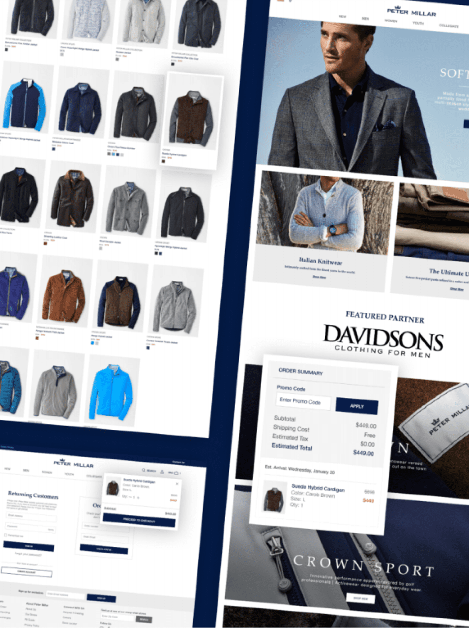
Minimalistic UI
Minimalism is probably one of the most noticeable trends in visual design these days. Users are experiencing a constantly growing number of critical messages that website owners want to deliver. Cookie popups, discount ads, and various notifications aim to engage and convert website visitors, but they also exhaust our attention. This is where minimalistic user-centric design comes to the fore.
But “minimalistic” doesn’t mean “dull” or “primitive”; it means “elegant” and “efficient.” Although a limited number of colors, design elements, and bright combinations is a must, UX designers can still play with proportions and compositions. Besides, the functionality of elements comes to the forefront, and the ability to properly highlight product features and deliver the right message requires a lot of creativity. Components with only decorative purposes, on the contrary, are gradually losing their relevance.

Clarity of content, messages, and navigation is another important aspect of the minimalistic approach to UX design. Information overload is a pain for most modern audiences – meaning that website owners should strive to make their UX writing clear and concise.
Negative space
Negative space is a big UX design trend that has grown out of the market demand for minimalistic UI. Simply put, negative space is the empty areas on page layouts either around the objects (macro space) or inside them (micro space). It has already become a separate design element that plays a vital role in visual aesthetics and user experience optimization. Google’s homepage, Apple’s official store, and some websites made in Webflow are great examples.


Leaving some space empty, adding “silence” in the design, must always be meaningful. Otherwise, users can perceive it as a lack of information. The main function of the negative space is to declutter a web page in order to draw users’ attention to crucial objects and messages. Establishing a sharp content hierarchy helps UX designers draw the user’s focus on what’s most important.

The negative space is also sometimes referred to as “empty space” or “white space.” All these terms are interchangeable. When the space is free of elements and you can also use this user experience trend in dark mode or with any other color.
Imperfect elements
Online experiences after the COVID-19 pandemic will not be the same as those we got used to. UX design reflects the imperfection in a relatable way. To make the brand’s digital presence more relatable, designers intentionally implement some “imperfections” in layouts. It may be anything, from hand-drawn objects to extraordinary elements in compositions or proportions.

In general, imperfect design can be an excellent way to demonstrate the brand’s identity and highlight its uniqueness. However, if you want to apply this UX trend, you have to remember one critical rule: there needs to be a balance. It won’t work if you overdo things.
Neumorphism
The neumorphic style is a combination of two other massive approaches in UI design, skeuomorphism and flat design, which are often considered opposite to each other. Skeuomorphism is all about mimicking real-world objects and the way we interact with them.
It was popular a few decades ago when hyperreal elements were necessary to create an intuitive and user-friendly UI. A trash bin is one of the examples. On the other hand, flat design is a more recent, simplistic concept centered around two-dimensional elements, minimalism, and bright colors.
Neumorphism takes the best of both worlds. It uses graphic-intense elements, shadows, and gradients to make buttons and cards resemble the objects in nature while not precisely recreating them. The neumorphic style doesn’t push realism to an extreme extent. Instead, it strives to achieve a “soft” look with pale colors and subtle contrast.

Neumorphism has been one of the most discussed topics among UI/UX professionals for the last year or so. While there are still not many real digital products whose user interfaces follow this approach, a lot of designers are excited about this concept. Professional platforms like Behance and Dribbble already contain a number of neumorphism examples. So we have all reasons to believe that this trend will finally find its place in our phones and laptops in 2021.

Image credit: Varsha Singh
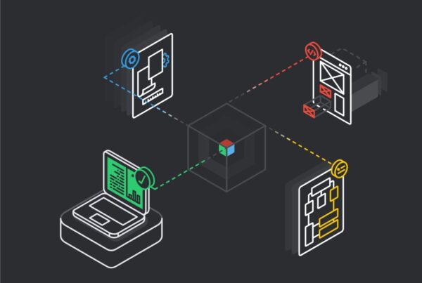
3D elements and parallax
Parallax effect and 3D elements are not something entirely new in UX design. We have already seen how they are implemented in many web design solutions. However, we still observe these user experience trends marching ahead in popularity.
First, it’s a significant increase in use. Today, 3D elements and the parallax effect are no longer fancy exotic things on the web. They’re more commonplace, especially on websites and apps representing fashion and e-commerce brands that want to stand out.

Another tendency is the attempt to combine a parallax effect and 3D graphics in one interface. When you use parallax scrolling, the background of a web page and foreground elements are moving at a different speed. It alone creates a feeling of depth. By adding 3D objects to this effect, you can create a truly immersive experience that will stay in users’ memory for a long time.

Asymmetry
As the screens of our devices become wider, it’s given rise to the asymmetrical trend in UI/UX design. In general, asymmetry is an attribute of brutalism, a style in art and web design that is opposite to minimalism. However, if used separately from other brutal design elements, it can make your website look interesting while allowing it to remain subtle and elegant.

The UI/UX trend for asymmetrical layouts is often implemented along with other creative web design techniques, such as a broken grid, overlapping elements, and split screens. You can also apply asymmetry to typography. If done right, it will make your brand messages more noticeable and memorable.

However, it’s vital to keep in mind that asymmetrical design doesn’t mean “randomly placed UI elements.” The unusual way of locating objects on layouts should guide a user’s eye in the right direction and help a brand emphasize important information.
Animations
Today, when we enter a random website on the internet, chances are we’ll see GIFs, micro animations, animated illustrations, or some other elements of motion design. Animations remain popular in user experience design, and the frequency of their use keeps growing.
Besides being visually attractive, moving objects can improve user engagement and simplify navigation. They can also breathe life into digital products or services – making them more personable.

If you want to use this software development trend in user interface design, it’s critical to do it wisely. Objects that float on a screen with no particular purpose can confuse visitors, prompting them to leave a web page even sooner than they’ve planned. Animation elements shouldn’t make user interfaces unnecessarily complicated, either. They always must be relevant, valuable, and smooth.
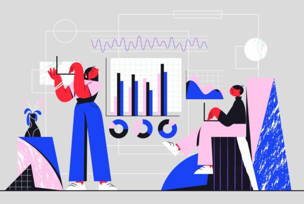
Information architecture
Information architecture is the way different pieces of content are organized and structured on a page. It’s an essential element of user-centered design (UCD) that aims to make digital environments more comfortable for users. Building an effective, useful, and coherent information architecture is a mandatory stage of the UCD process, along with user research and usability testing.

To create a decent information architecture, UX designers need to have a solid understanding of the product’s target audience, their behavior, and the reason they use a digital solution. Users should be able to achieve the desired result without it taking too much effort. That’s why the user's goals, clear navigation, and content representation (including blind-spot monitoring) must always be taken into account at the wireframes stage of the design process.
Final thoughts
We created this projection article to give you a leg up in today’s hyper-competitive digital world. All UX trends mentioned here can definitely improve the user experience of practically every software solution or website. They can also make your product more visually attractive to its target audience, even when user expectations are high.
Nevertheless, the past year showed us that it’s impossible to anticipate everything. So, we’ll keep you in the loop and provide a regular update on what’s happening in the UX area.