Motion design and interactive web design has become extremely popular in the last twelve months. More and more websites use different types of animations, videos, and 3D objects to create a truly unique user experience. Browser performance has also increased and web technologies have evolved significantly. This, coupled with the much-anticipated arrival of 5G internet, allows website owners to keep up with the current trends with no harm to the load speed. In this blog post, we’ll explain how you can make your website stand out with the help of interactive and animated elements. We’ll also share some examples of digital products that already use such elements in quite impressive fashion.
Hover states
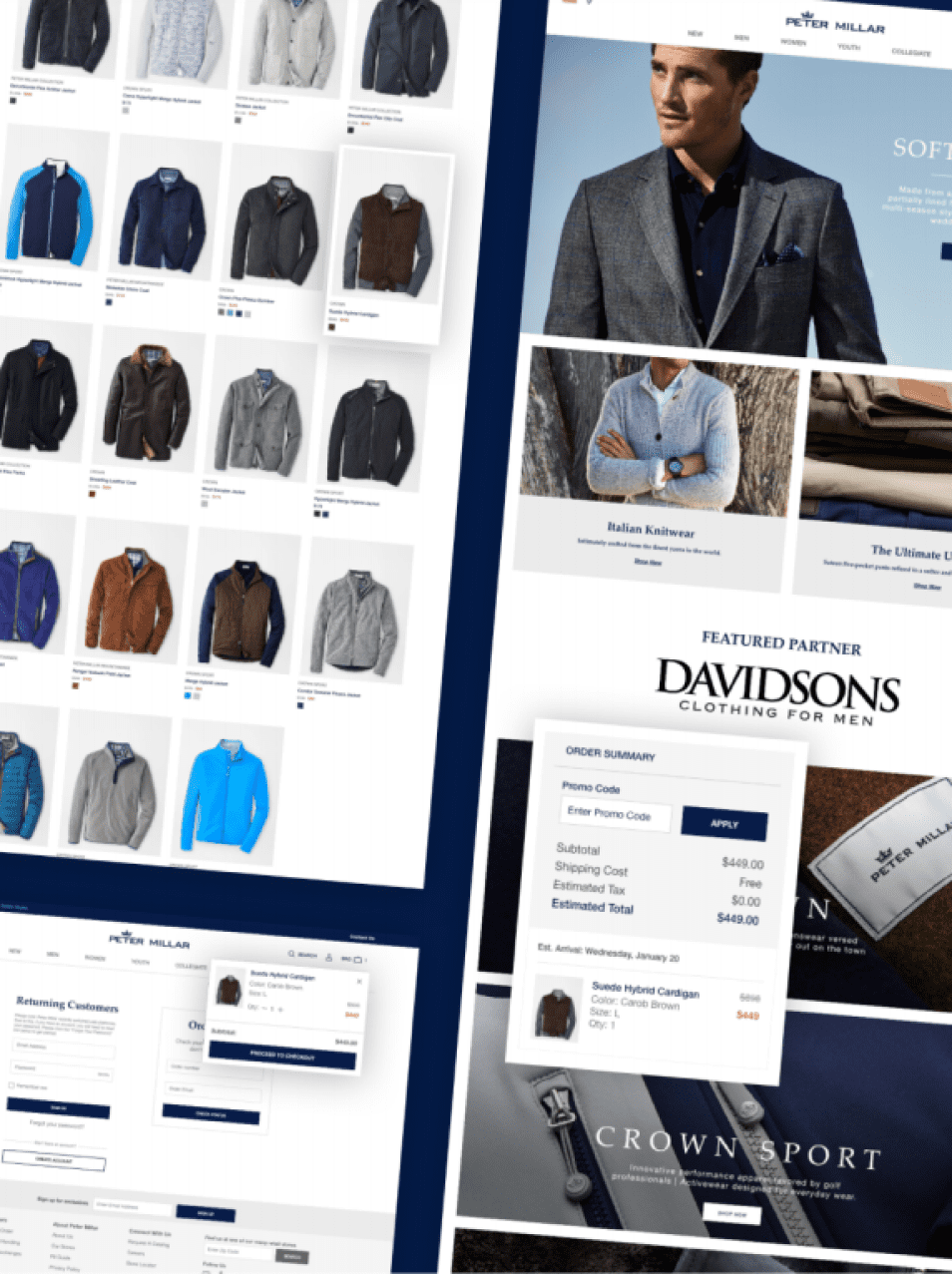
Hover states, also known as hover effects, are among the most common CSS animations on the web today. You’ve probably seen them, too. Remember the time when you placed your pointer over something and it changed or moved even though you didn’t click or drag anything? That’s a hover interaction animation you see in interactive web design. It’s used for many purposes. For instance, e-commerce stores often implement hover effects to show what an item looks like in different colors or from different angles.

There are other reasons why companies build digital products with this type of web design animation too. Sometimes, it can help users figure out what actions take them from A to B.

Alternatively, you can use hover states just to entertain your users and keep them engaged.

Parallax scrolling effect
The parallax effect, or parallax scrolling, is another interactive web design trend that can help you deliver an outstanding user experience. Simply put, it’s an effect that makes the background image or content and forefront content of web pages move at different speeds while scrolling. Combined with a full-screen interface effect, parallax scrolling creates a feeling of space and depth. Besides making a website more memorable, it helps to draw users’ attention to specific sections or content.

Loader screen
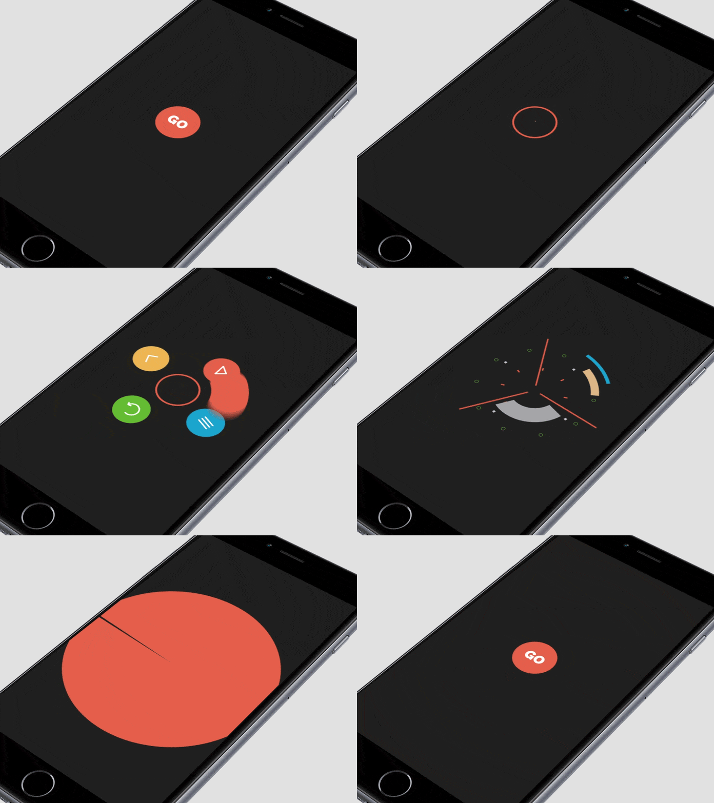
Internet speeds continue to increase, which is why website visitors can hardly tolerate bad loading times. But in some cases, delays are just unavoidable (like heavy traffic or a large amount of data that needs to be processed). Fortunately, interactive web design can help you with this task. When you use loading animations for experience optimization, you’ll be able to keep more people on a page. You’re also more likely to see users being more patient as content loads.

Animated and video backgrounds
Your interactive web design may also benefit from the dynamic layouts. Usually, when you animate elements, you create a much more immersive experience than traditional static backgrounds. Visually, it captivates users in a similar way to watching a movie or playing a video game. Additionally, dynamic backgrounds may help you instantly show what your business is about as well as convey its key messages. Basically, you can use animations or videos to add some motion to the website background.

Animated 3D elements
The use of three-dimensional, real-life objects in web design is a growing trend that is unlikely to change any time soon. Whether to add 3D web design elements to your UX design system or not is no longer a question. New technologies such as webGL allow website owners not only to include 3D objects in their web interface, but also effectively combine them with animations. The results can be breathtaking. View the video below to see the true power of animated 3D in interactive web design.
Image galleries
If you want to show several images on one screen, you may use an interactive image gallery. Selected photos will change automatically or after a user clicks on a button. At the same time, animating effects will make the user experience more pleasant. Another benefit of interactive image galleries is that they allow you to save space and avoid “cluttering” the page with photos. If you’re not sure whether you can incorporate this type of animation into your website, you can conduct a design audit first.

Kinetic typography
Different experiments with typography have become one of the most vivid UI/UX design trends in the last 2-3 years. Not only do designers play with fonts, text directions, and proportions but they also make the letters move. Since moving type provides almost endless possibilities for creativity, it can be harmoniously introduced into most styles. No matter whether you need to develop interactive web design for a FinTech company or digital agency, it’ll probably benefit from kinetic typography.

Particle animations
A few years ago, the digital industry became obsessed with minimalism. So on the one side, website owners wanted to add motion to their products. But on the other side, they didn’t want to make landing pages overwhelmed with distracting moving elements. Particle animations appeared as designers’ solution to this request. Elegant yet impressive, they do make a difference, setting the website apart from the competition and greatly enriching the user experience.

This type of web animations is often used on homepages. Depending on your needs and goals, you may choose either interactive (i.e. movements triggered by users’ actions) or non-interactive (i.e. movements are not connected to users’ actions) particle animations for your website.
Animated navigation menu
Animated navigation is one of the simplest ways to create an interactive web design. It serves two purposes: 1) it helps designers liven up a page, and 2) assists visitors navigate a website. Additionally, it makes web solutions more “compact.” In some cases, users can access a menu without even scrolling. Although animated navigation isn’t something that necessarily amazes people, you can still be creative. For instance, you can use a slider instead of a hamburger icon that is considered a traditional navigational element.

Creative combinations
If you want to take a holistic approach rather than simply adding motion to a website, you can combine several types of animations. For instance, you can make every user’s action followed by some animated effect like a hover state or micro-movements of illustrations. This will make a website interface more intuitive and aesthetically pleasant.

Animations can also help you tell your brand’s story or assist your messaging, especially when paired with other audio-visual effects/text. The Beyond Beauty project is a great example. When users enter the website, a song starts playing. Scrolling through the page makes the images and text move and change. If an image is clicked, users can listen to a story and read the transcript by the side.

Keep your business relevant with interactive web design
No matter if your company is just a local business or an established enterprise, most customers will likely judge it by your digital presence. Creating a delightful user experience isn’t something you do once and forever. Website owners must always keep up with design trends to demonstrate to customers that their businesses are modern, reliable, and relevant. Implementing motion design and interactive web design is a perfect way to improve the usability of digital products, make them more memorable, and increase engagement.


