In the last few years, we’ve witnessed an explosion in virtual reality (VR) devices and apps for them. VR is emerging as a new medium with the potential of having as strong an impact as radio or television did in the past century. According to the Heather Bellini of Goldman Sachs:
“We expect virtual and augmented reality to become an $80 billion market by 2025, roughly the size of the desktop PC market today”
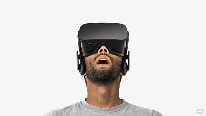
With the increasing popularity of VR, a design is evolving to incorporate its requirements and new capabilities.
Where Can We Use VR
VR is giving birth to an entirely new arena for entertainment, education, collaboration, communication and marketing. The following are some general categories that will merge with VR:
Gaming
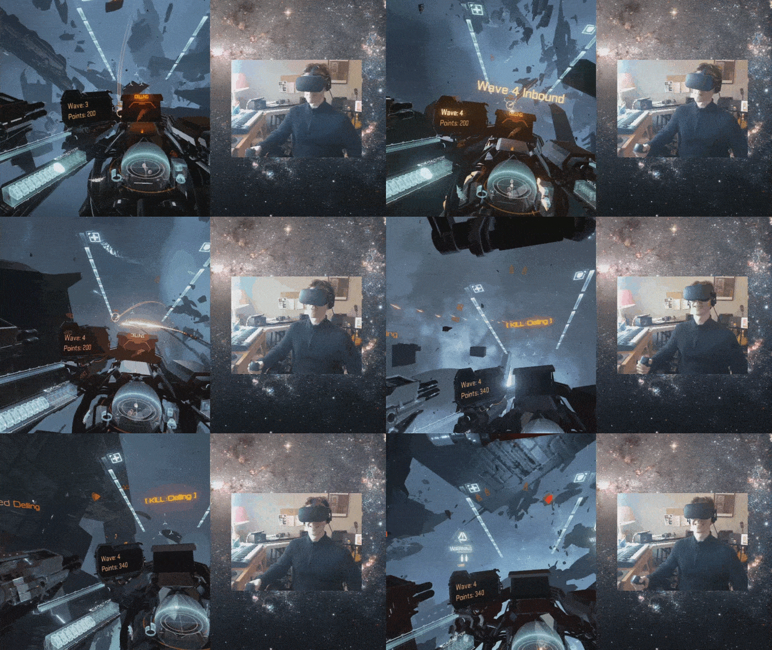
All types of entertainment activities can be amplified with the integration of VR. VR makes it possible to put your users into a 100% designed space with predetermined tasks while giving the user total control of moving, exploring and learning within this space.
Learning
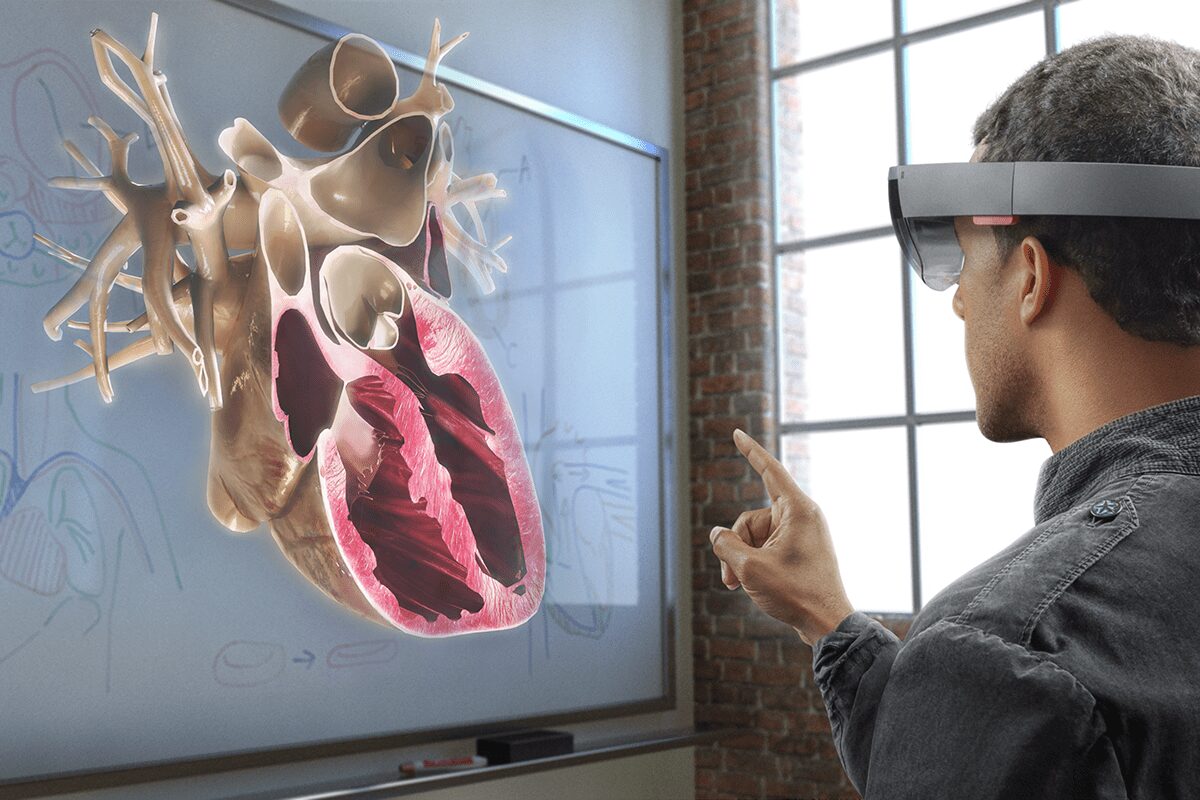
VR can have tremendous implications for education — education can be both more engaging and effective. VR can be used for educational classes, labs and demonstrations. To make education experience truly immersive, designers should consider how users may interact with objects.
Training
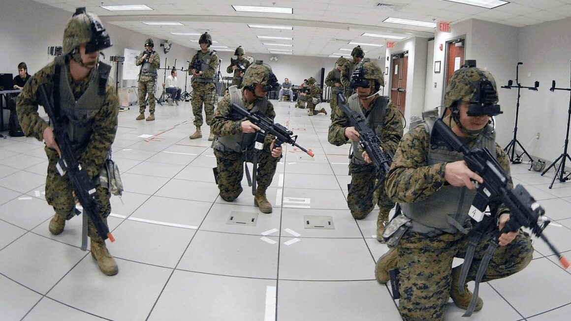
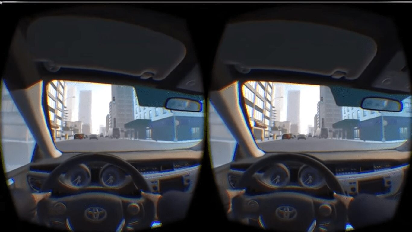
Using VR, training simulations for professionals like drivers, pilots, doctors and police officers can become more accurate, complex and cost-effective.
Big companies like Toyota see the educational potential of VR. The latest training simulator from Toyota – TeenDrive365 system – is focussed on teaching new drivers about the risks associated with distracted driving.
Prototyping
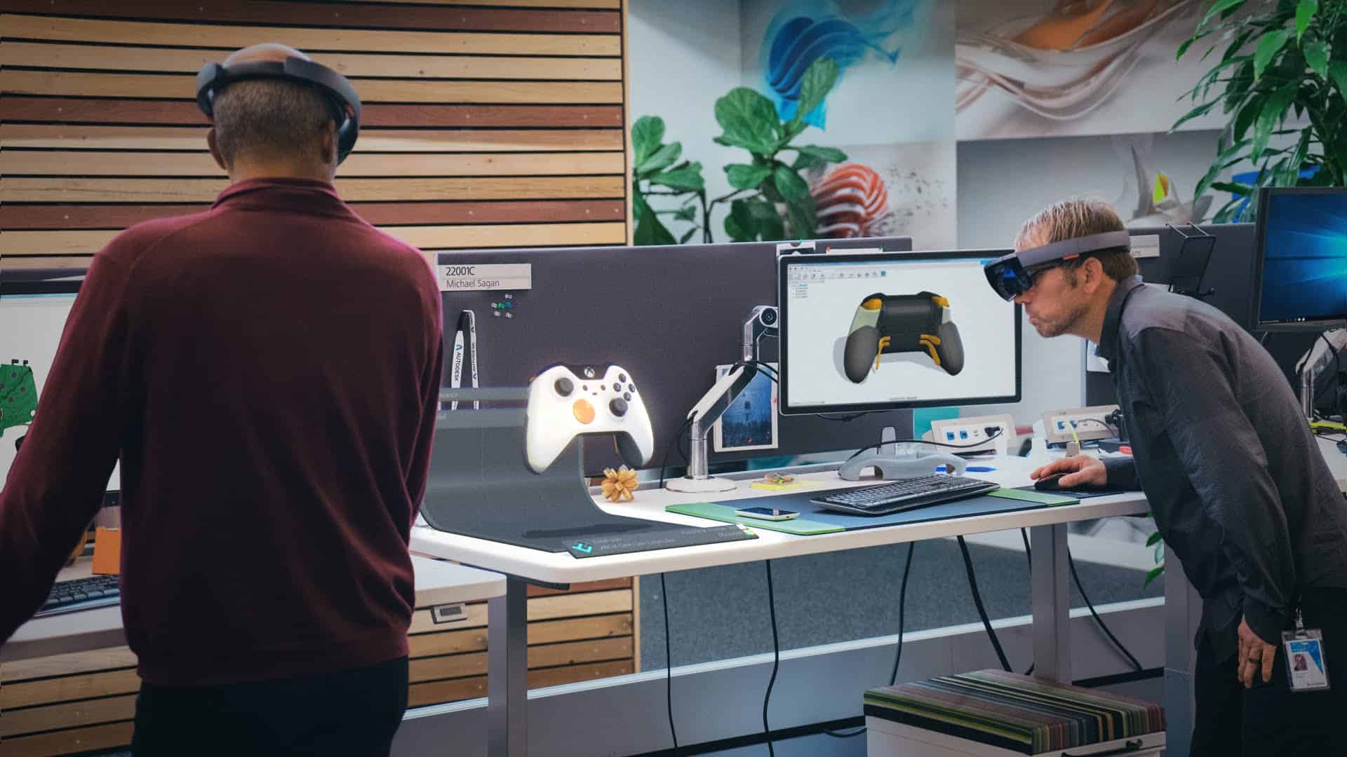
VR can greatly enhance prototyping and testing phases for engineers, with all types of projects from a handstick design to new car designs.
Communication
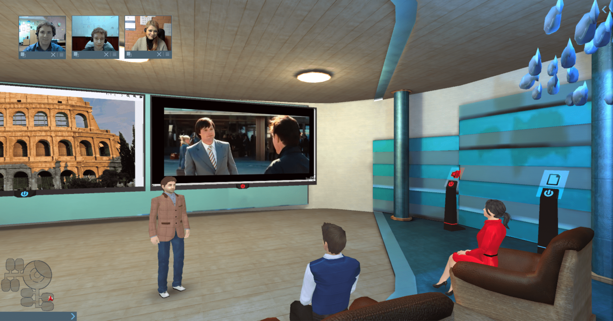
Communicating will drastically change with the help of VR. VR makes it possible to create a brand new experience for video conferencing services, such as Skype.
Shopping
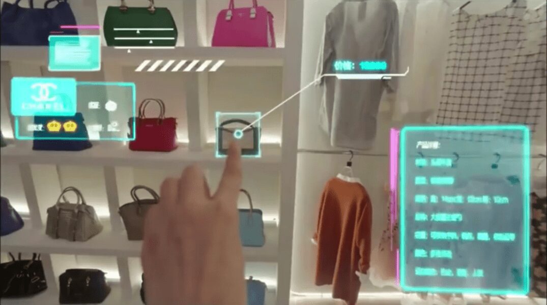
VR makes it possible to blend the online and offline shopping together. Instead of looking at a 2D image of an object online, shoppers in VR will have the ability to pick up an object and look at it in detail. Alibaba Group, Asia’s biggest e-commerce company, divided into virtual reality later last year.
Creating VR Experience
Creating a VR experience is much more complex than traditional 2D experiences, which presents designers with a whole new set of challenges. There are currently 4 core considerations for the design of virtual reality experiences:
1. Make Sure Users Don’t Get Motion Sickness
The most important quality to creating any successful UX design is ensuring that users are comfortable throughout the experience. This is especially true in the context of VR experience. Motion sickness (when physical and visual motion cues give a user adverse information) is one of the most common problems of VR experiences. Humans evolved to be very sensitive to vestibular ocular disparities (disparity between the movement and what we’re seeing). So reducing motion sickness is very important for VR systems. The keys to preventing users from getting motion sick while using VR are
- Always maintain head tracking. VR software should constantly track the user’s head and eye movements, allowing the images to change with every new perspective.
- Prevent performance degradation. If the system freezes even for a split second that’s going to trigger a lot of motion sickness.
2. Develop Easy-To-Use Controls And Menus
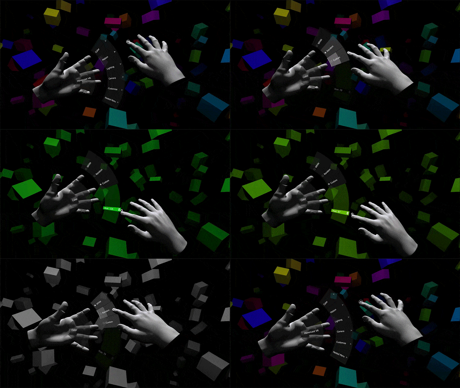
Same as for traditional UI interfaces navigational menus and other controls should be easily accessible and user-friendly. Unfortunately, there’s no universally accepted way to designing menus for VR interfaces. This is a challenge that designers are still working on. However, this doesn’t mean that we can’t transfer existing (2D) practices to 3D. It’s absolutely possible to place the menus on the user’s VR hands. One of such menu interfaces is Hovercast. All menu actions – including navigation between levels – are controlled by simple hand movements and reliable gestures.
3. Ensure Text Is Readable
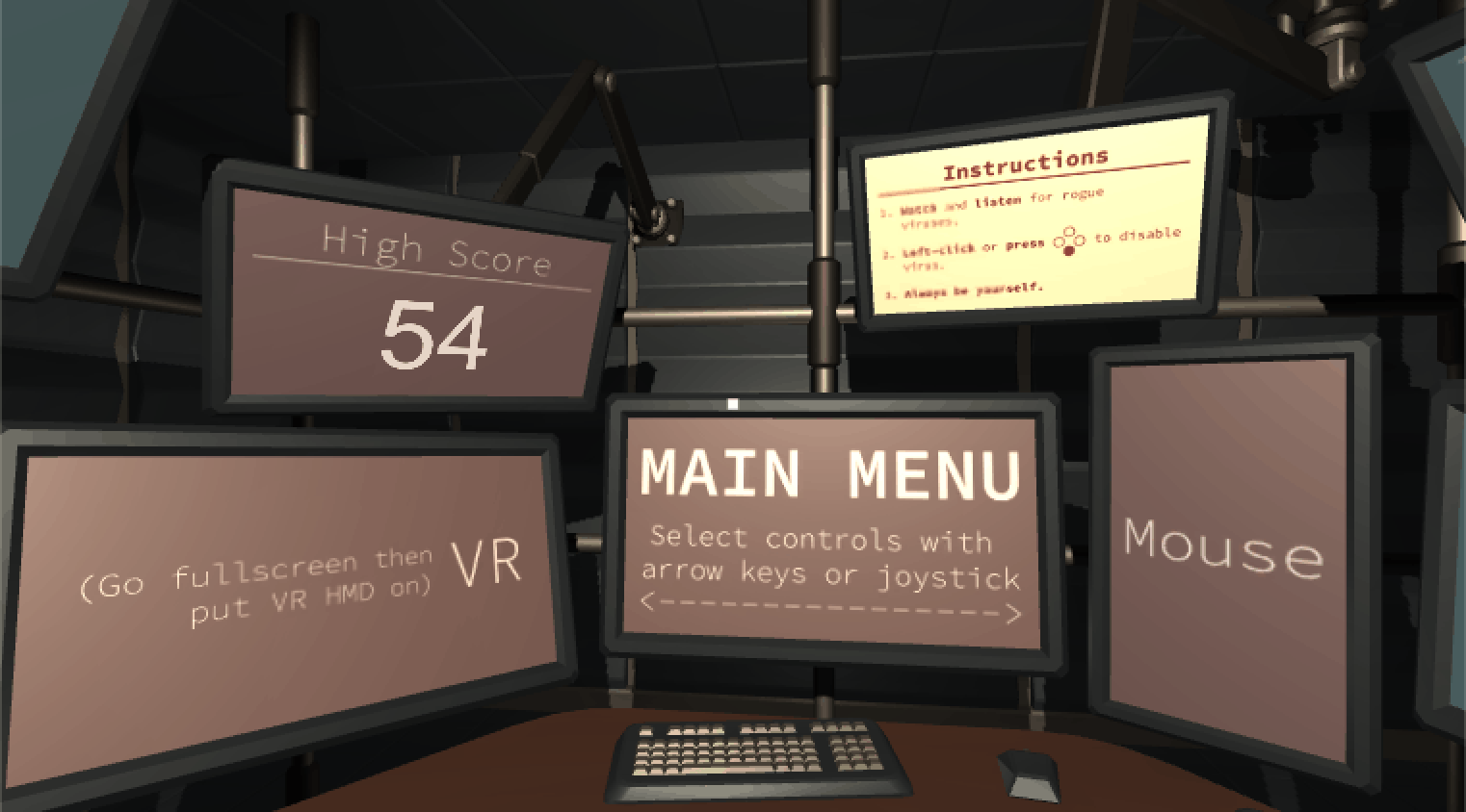
All text elements should be clear and easily legible, preventing eye strain. The resolution of the VR headset is pretty bad. Because of the display’s resolution, all UI elements in VR will look pixelated. This means that text will be difficult to read. But you can avoid this by using big text blocks.
4. Use Sound To Create Immersive Experience
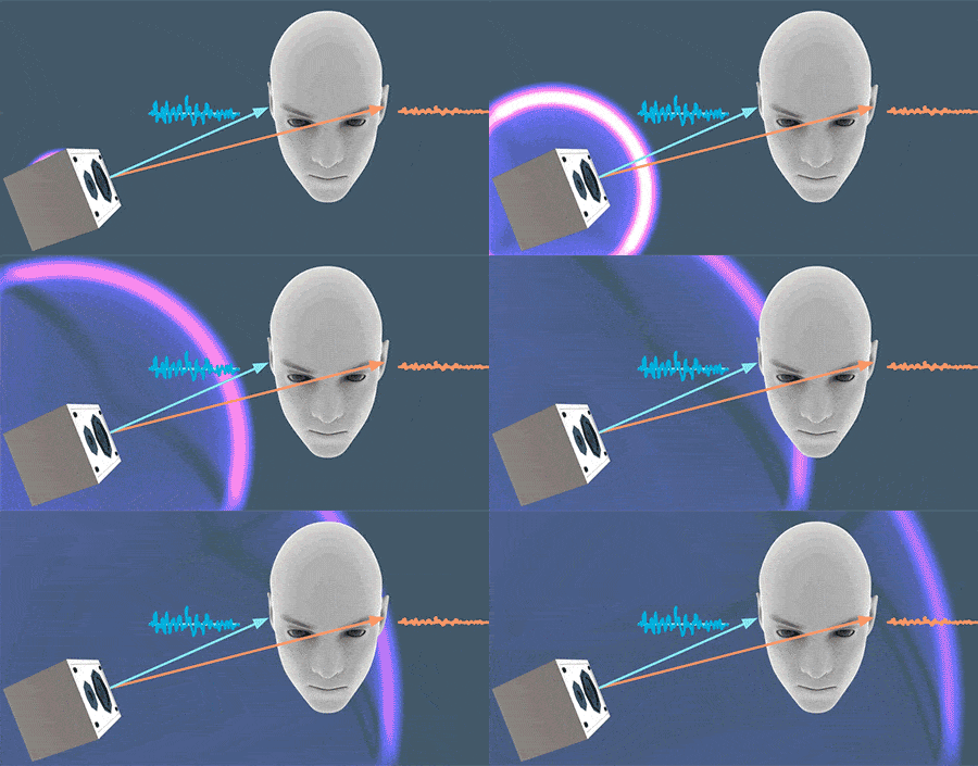
As designers, we often don’t think about sound and audio. When we do that we miss an opportunity to communicate more information through a different set of senses. When we have audio sources attached to the objects we create much more realistic environment — if you’re telling a brain that it can see the object and it can hear the object then the object must be real. Try to build a mental image of the environment via sound:
- Introducing the user to the environment via soundscapes. The audio can be used to give the user the illusion of being in the middle of a particular environment.
- Guiding the user with sound. By applying positional audio and 3D audio effects to VR, the user will know the direction in which certain sounds originated in relation to where they are.
Conclusion
The possibilities for VR are endless. Soon, all types of companies will be seeking to extend their brand presences into this space. I hope I’ve made the VR space a bit less scary with this article and inspired you to start designing for VR your project.


