fbpx Skip to main content
Category

User Experience

Deliver exceptional user experiences with expert guidance from millermedia7. Unlock insights and strategies to optimize UX and engage your audience.

What You Should Know About Internet of Things

By Design, IoT, User Experience

The “Internet of Things” (IoT) is the addition of internet connectivity and other sensors to physical objects. Broadband Internet becomes more widely available, the cost of connecting is decreasing, and more devices are being created with built-in network adapters. This movement creates a “perfect storm” for the IoT. That’s why IoT begins to move from ‘next big thing’ to something more and more of us are living with and it’s going to grow even more in coming years and eventually, most of us will use IoT technologies.

Gartner forecasts 21 billion connected things by 2020. That’s approximately four devices for every human being on the planet.

By 2020, more than half of major new business processes and systems will incorporate some element of the IoT. And we, as designers, should be ready for this moment. In this article, you’ll find everything you need to know about the increasingly connected world.

Where Can We Find IoT?

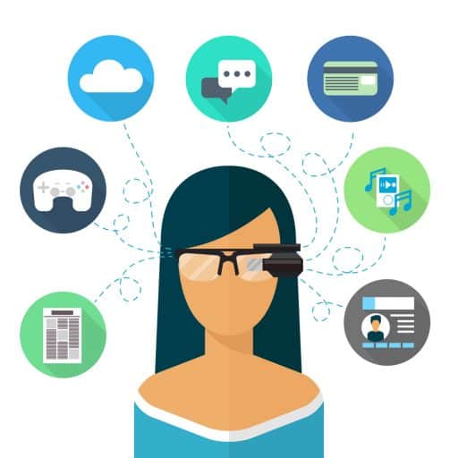
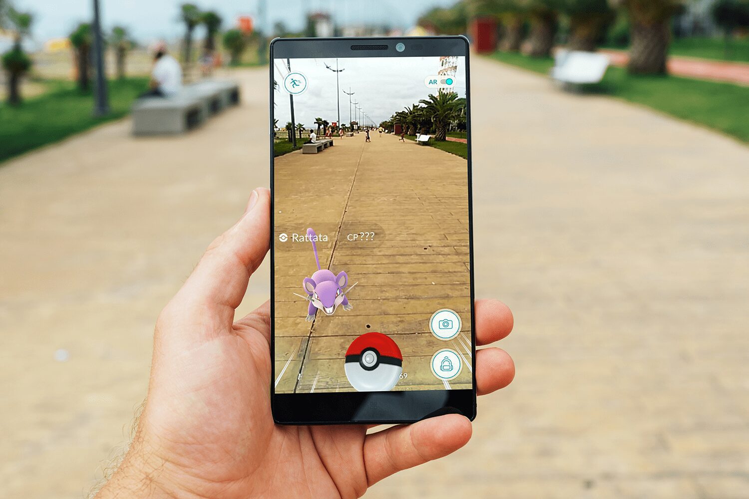
IoT isn’t just one group of devices, the term is used for a big range of connected tools, devices, and services. Technologies are infiltrating the everyday life and things around us are becoming smarter. Common categories of IoT today include:

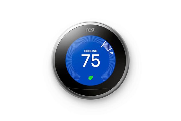
  • Connected home technology (these are products and services that make home life easier or more pleasant, such as smart thermostats, lighting, and energy monitoring)
  • Nest smart thermostat
    Nest smart thermostat
  • Wearables (such as activity/fitness trackers and smartwatches)
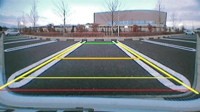
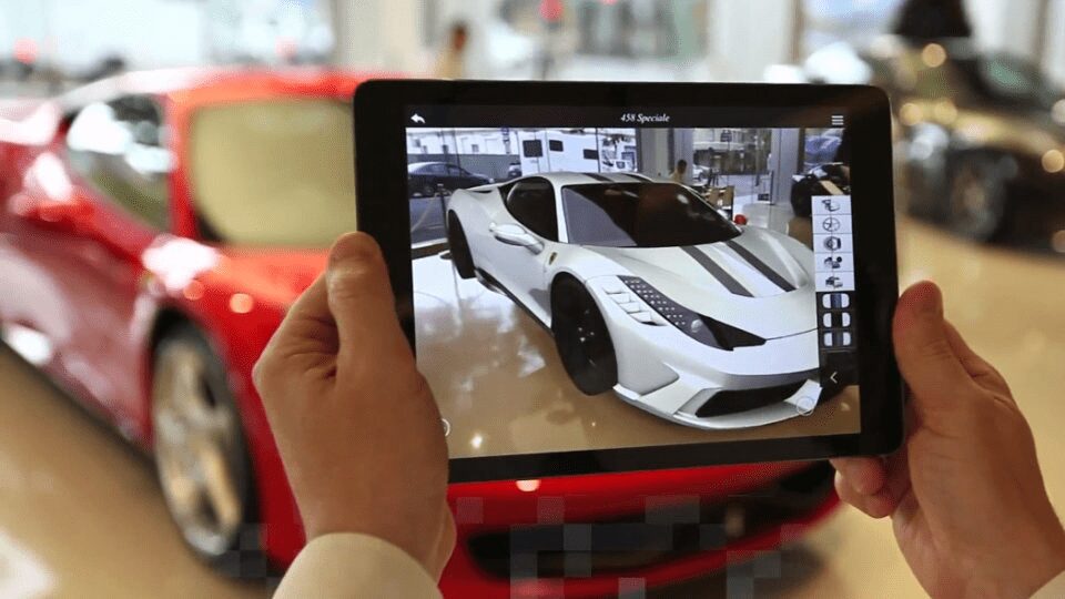
  • Apple watch
    Apple Watch
  • Connected cars
  • Tesla Model S embedded system
    Tesla embedded system
  • Urban systems (such as city rental bikes and parking meters/sensors)
  • Citibike in New York
    Citibike in New York

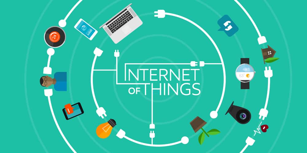
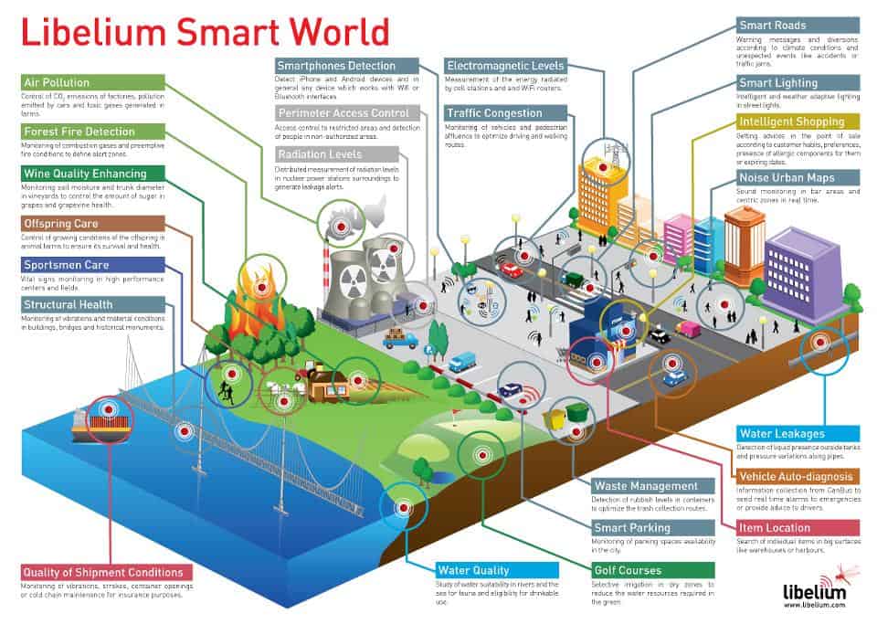
On a broader scale, the IoT can be used to create “smart cities” which can help us reduce waste and improve efficiency for our environments (e.g. energy use). Take a look at the visual below to see what something like that can look like.
Smart cities

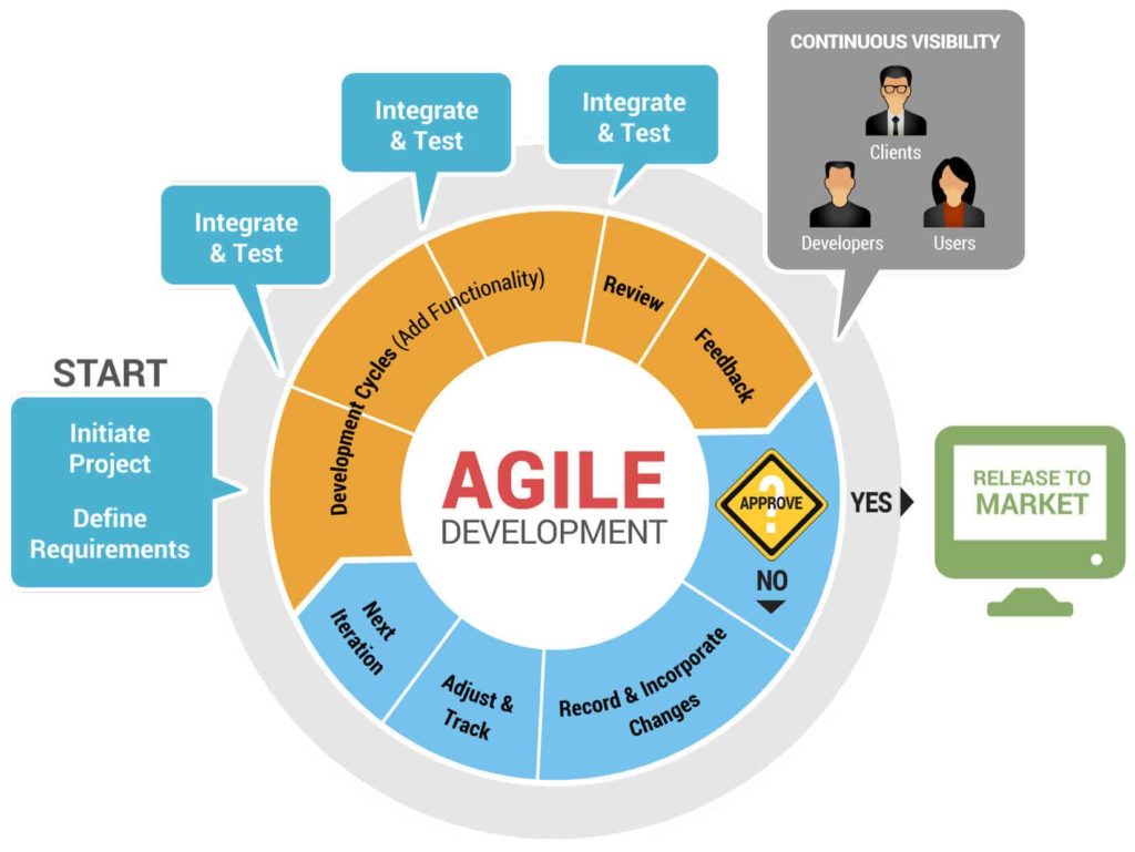
5 Principles To Remember When Designing for IoT

Design is the critical component that bridges IoT technology’s potential with meeting real human needs. And it’s not surprise that IoT is a hot topic for designers today – it opens the door to a lot of opportunities but also to many challenges. While there are a huge array of things to consider while developing a IoT product, you’ll be more likely to gain traction if you keep following 5 principles in mind:

1. Design IoT Only If It Enhance User Experience

Just because something can be connected to the internet doesn’t mean it should be. IoT design requires a sharp focus on user needs because IOT products succeed only when they solve real problems and make users’ lives easier. Thus, if you want to connect something to the internet, you should have a clear answer on the question “Why do I want to do it?” User research should be a critical early step in any solid IoT UX project. Using insights gained from your research can help you explore the interaction contexts well before your team is burning hours designing or developing.

Making the ‘thing’ an IoT make sense only if it solves a real problem for the user. If connecting a product to the internet doesn’t enhance the experience, then don’t do it.

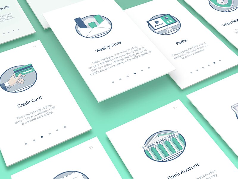
2. Create Good Onboarding

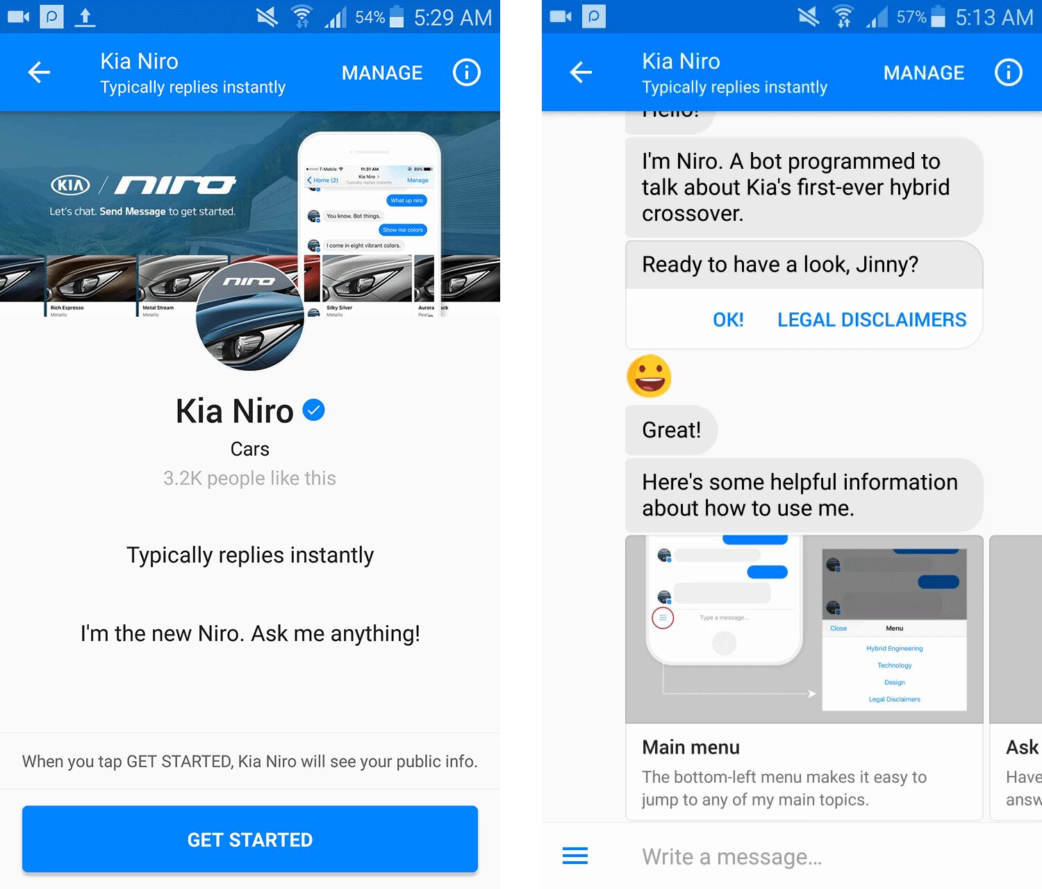
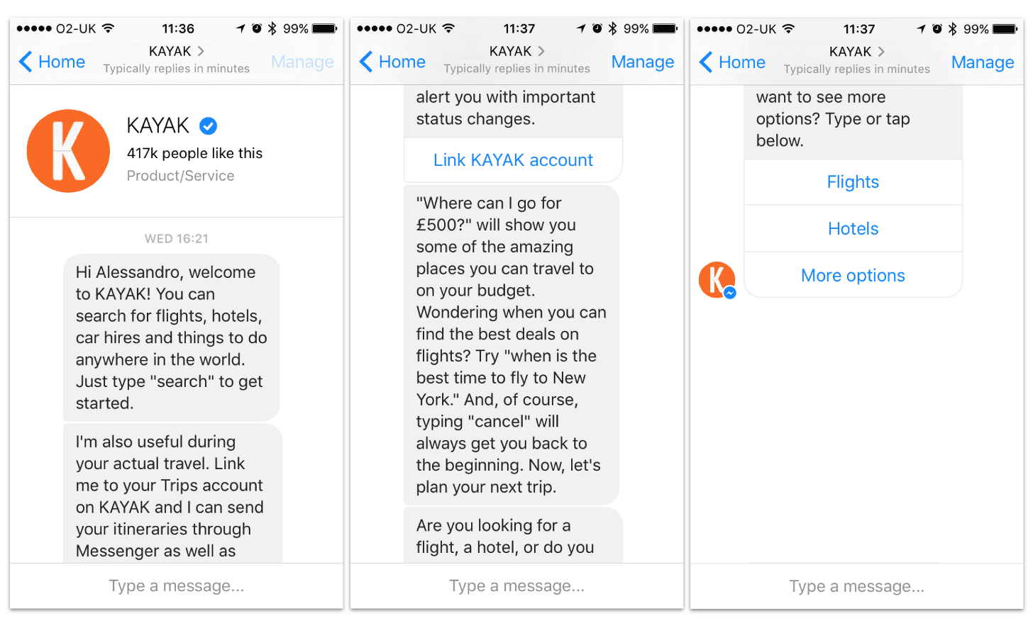
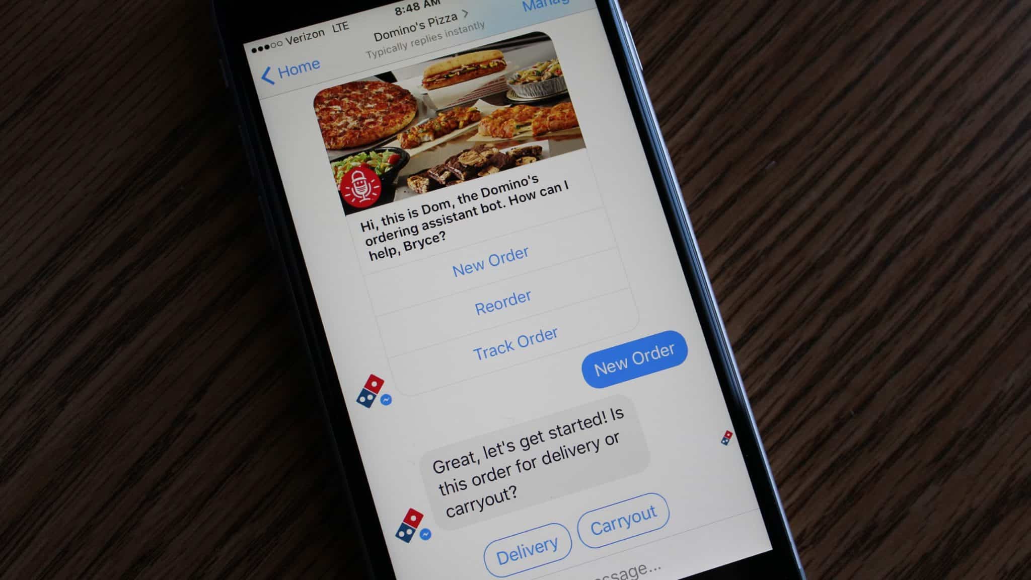
In the world of IoT getting your users up and running isn’t as simple as in a world of web or mobile apps. In addition to account creation, IoT devices usually require a proper configuration. Without a good onboarding experience, the setup phase might be really hard for the first-time users and there is a great possibility of user frustration or failure. That’s successful IoT product (like Nest) have set a relatively high bar for onboarding.

3. Prevent Glitching

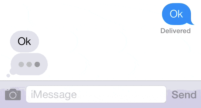
Everyone experience occasional glitches in digital products. One common example is slow loading time on websites. Of course, it’s definitely frustrating when loading takes ages, but we are used to this. By contrast, we won’t expect real-world objects respond to us with glitches. When we turn off the lights in our room, we expect an immediate response. However, when we interact with a physical device over the internet (e.g. smart lighting system), that interaction might have the same latency issues as the website. So there’s the potential for delays in response. This could make the real world start to feel broken. Just imagine if you turned your lights off and they took two minutes to respond or failed to come on at all. As a designer, you should prevent all possible situations that can lead to glitch.

4. Make Sure It Works Locally

When designing for IoT, don’t assume always-on internet connectivity. In real life, IoT devices are often intermittently connected. Thus, it’s good to design for no internet connectivity at first, and see how much functionality can be done locally. Also, UX designers have to ensure that important functions (e.g. home security alarms for IoT Smart home system) continue to work properly when some devices go offline.

5. Design For Security and Data Privacy From the Outset

Security is a big issue. Recent high-profile hacks have raised the spectre of IoT-related security risks. More and more users are examining IoT devices for information about security. These consumers may be increasingly cautious about exposing personal information, especially when it is connected to physical spaces (such a local Wifi network) in their homes. Users might have questions like “Will someone be able to hack into my fridge and thereby get access to my entire network?” It’s your job, as a designer, to alleviate such fears. Always help users understand the security of your service by providing this information upfront.

Conclusion

A new generation of IoT is going to enhance our lives dramatically. We will spend less time on monotonous, boring tasks and will have more time to do what’s really important – like spending more time with our family or friends. I really hope the principles mentioned above help get your IoT effort aimed in the right direction.

What You Should Know About VR

By User Experience, User Interface

In the last few years, we’ve witnessed an explosion in virtual reality (VR) devices and apps for them. VR is emerging as a new medium with the potential of having as strong an impact as radio or television did in the past century. According to the Heather Bellini of Goldman Sachs:
“We expect virtual and augmented reality to become an $80 billion market by 2025, roughly the size of the desktop PC market today”

Oculus Rift
Oculus Rift is the first high-end virtual reality headset sold on the retail market.

With the increasing popularity of VR, a design is evolving to incorporate its requirements and new capabilities.

Where Can We Use VR

VR is giving birth to an entirely new arena for entertainment, education, collaboration, communication and marketing. The following are some general categories that will merge with VR:

Gaming

All types of entertainment activities can be amplified with the integration of VR. VR makes it possible to put your users into a 100% designed space with predetermined tasks while giving the user total control of moving, exploring and learning within this space.
VR for gaming

Learning

VR can have tremendous implications for education — education can be both more engaging and effective. VR can be used for educational classes, labs and demonstrations. To make education experience truly immersive, designers should consider how users may interact with objects.

VR for learning
Microsoft Hololens for medical education

Training

Using VR, training simulations for professionals like drivers, pilots, doctors and police officers can become more accurate, complex and cost-effective.

VR for training
Image credit: Wareable

Big companies like Toyota see the educational potential of VR. The latest training simulator from Toyota – TeenDrive365 system – is focussed on teaching new drivers about the risks associated with distracted driving.

VR for training
Toyota driving simulator.The driver is in a fully immersive virtual environment – and that includes passengers, traffic, buildings and roadway obstacles.

Prototyping

VR can greatly enhance prototyping and testing phases for engineers, with all types of projects from a handstick design to new car designs.

VR for training
The hologram and the object on the screen are synchronized and this makes spatial application part of the production pipeline, not just an isolated island. Image credit: Solidsmack

Communication

Communicating will drastically change with the help of VR. VR makes it possible to create a brand new experience for video conferencing services, such as Skype.

VR for communication
Remote collaboration using avatars.

Shopping

VR makes it possible to blend the online and offline shopping together. Instead of looking at a 2D image of an object online, shoppers in VR will have the ability to pick up an object and look at it in detail. Alibaba Group, Asia’s biggest e-commerce company, divided into virtual reality later last year.

VR for training
Alibaba’s VR shopping. Buy+ technology allows customers to browse 3D images of products and make real-time payment in a virtual mall as if they were shopping in the real store.

Creating VR Experience

Creating a VR experience is much more complex than traditional 2D experiences, which presents designers with a whole new set of challenges. There are currently 4 core considerations for the design of virtual reality experiences:

1. Make Sure Users Don’t Get Motion Sickness

The most important quality to creating any successful UX design is ensuring that users are comfortable throughout the experience. This is especially true in the context of VR experience. Motion sickness (when physical and visual motion cues give a user adverse information) is one of the most common problems of VR experiences. Humans evolved to be very sensitive to vestibular ocular disparities (disparity between the movement and what we’re seeing). So reducing motion sickness is very important for VR systems. The keys to preventing users from getting motion sick while using VR are

  • Always maintain head tracking. VR software should constantly track the user’s head and eye movements, allowing the images to change with every new perspective.
  • Prevent performance degradation. If the system freezes even for a split second that’s going to trigger a lot of motion sickness.

2. Develop Easy-To-Use Controls And Menus

Same as for traditional UI interfaces navigational menus and other controls should be easily accessible and user-friendly. Unfortunately, there’s no universally accepted way to designing menus for VR interfaces. This is a challenge that designers are still working on. However, this doesn’t mean that we can’t transfer existing (2D) practices to 3D. It’s absolutely possible to place the menus on the user’s VR hands. One of such menu interfaces is Hovercast. All menu actions – including navigation between levels – are controlled by simple hand movements and reliable gestures.

VR navigation menu
Hovercast is 2D menu interface for VR environment. Hovercast radiates from the palm of your hand and you can interact with menu items using the index finger of your opposite hand.

3. Ensure Text Is Readable

All text elements should be clear and easily legible, preventing eye strain. The resolution of the VR headset is pretty bad. Because of the display’s resolution, all UI elements in VR will look pixelated. This means that text will be difficult to read. But you can avoid this by using big text blocks.

VR text
Consider the readability for different text section in this VR game. Instructions are almost unreadable. Image credit: Mozilla

4. Use Sound To Create Immersive Experience

As designers, we often don’t think about sound and audio. When we do that we miss an opportunity to communicate more information through a different set of senses. When we have audio sources attached to the objects we create much more realistic environment — if you’re telling a brain that it can see the object and it can hear the object then the object must be real. Try to build a mental image of the environment via sound:

  • Introducing the user to the environment via soundscapes. The audio can be used to give the user the illusion of being in the middle of a particular environment.
  • Guiding the user with sound. By applying positional audio and 3D audio effects to VR, the user will know the direction in which certain sounds originated in relation to where they are.
VR sound
Music and high-quality sound effects are a pivotal feature to encourage experience immersion. Image credit: Google

Conclusion

The possibilities for VR are endless. Soon, all types of companies will be seeking to extend their brand presences into this space. I hope I’ve made the VR space a bit less scary with this article and inspired you to start designing for VR your project.

Things To Remember When Designing For Augmented Reality

By AR, Design, User Experience, User Interface

Augmented Reality (AR) is changing how we interact with the world around us. Over the past several years, AR technology established a strong foundation in media, marketing, education, games and many other industries. This happened because computing hardware has finally advanced to the point where it’s become capable for AR platform. Today, AR prompting many brands to explore this strange new world for the first time.

What is AR?

AR technology incorporates real-time inputs from the existing world to create an output that combines both real-world data and some computer-generated elements which are based on those real-world inputs.

The concept of AR is not a new one. The term was first introduced in 1992 by researcher Tom Caudell to describe a digital display used by aircraft electricians that blended virtual graphics onto a physical reality. And AR isn’t rare. A frequently overlooked, yet widespread example of AR is the automobile parking assistance system.

Rear parking assist with the rear-facing camera.
Rear parking assist with the rear-facing camera. The vehicle’s computer calculates the vehicle’s distance from surrounding obstacles, and, based on the steering wheel’s position, determines the vehicle’s trajectory.

However, only after popular apps PokemonGO and SnapChat were released and adopted by users the term “augmented reality” got into the spotlight.

PokemonGo.
PokemonGo

How AR Will Change Brand Experiences

There is a distinct advantage for AR to be accepted sooner and on a wider basis than VR, particularly in the commercial sector. While Virtual Reality (VR) gets a lot of talk because of how cool this technology for entertainment, AR is going to truly impact the way we work and live. AR forecasted to be a $150 billion dollar industry by 2020.

[Tweet “AR creates an opportunity for brands to build new digital pathways to tell stories and engage with users”] in a way that’s never before been possible. Here are 3 ways that businesses will be able exploit AR and its associated technologies in the near future.

Guidance

Even the most capable professional can run into situations where they need a helping hand from someone, and it’s here that AR technology could come in handy. For example, AR app makes it possible for doctors to navigate the innards of the patient to effectively and efficiently complete the surgery.

The surgeons used the augmented reality app through an iPad

Design Visualization

In terms of design visualisation, AR is creating some breathtaking possibilities. It merges the virtual and the real world — adding virtual overlays directly into the view of headset-wearers, or inserting these digital add-ons into video captured on a phone screen. As AR technologies become more refined, users will be able to preview their designs and experiences in real-world spaces. One such example is this spatial AR setup used by Volkswagen, in which virtual layouts of a car interior are projected onto a full-size model of a car dashboard.

spatial AR setup used by Volkswagen
Spatial AR setup used by Volkswagen

Training and Education

When it comes to training and education, AR has a lot of promise. Unlike a real-world training scenario, a trainee can play through an AR situation as many times as they need to understand a concept or a procedure. This will create deeper learning opportunities where students are in the flow of learning.

Training using AR
Image credit: Columbia University

How to Design For AR?

Since there are no established UX best practices for AR yet, I’d like to share my own personal approach to UX in AR apps.

1. AR use-case needs to be evaluated

The concept of “measure twice, cut once” is especially important in building AR apps. Before diving in, it’s important to ask yourself why you want to pursue this type of medium and what outcome would you like to have. Keep in mind following moments:

  • AR experiences are powerful, but they should tie back to clear business objectives. AR shouldn’t be added on top of a planned app just because it’s trendy technology — that’s almost a sure way to create a poor UX. Rather, the desired functionality needs to be evaluated to fit with the experience that the AR display medium can offer.
  • If you’re going to design an AR experience, you should invest heavily in user research. Spend some time really getting your target audience and not just how that you would perform a specific task using a software, get to know how they’ll do something in real-world without any kind of devices.

2. Consider the environment in which the product will be used

Since AR apps are grounded in reality, the environment affects AR design significantly. For example, in private environment (home, work) you can count on long user sessions and complex interaction model – the whole body can be involved in the interaction, as well as specific devices (such as head mounted display) can be used for manipulation (see Microsoft Hololens example below).
Microsoft Hololens
But in public environments (e.g. outdoors), it’s important to focus on short user sessions. Because regardless of how much people might enjoy AR experience, they won’t want to walk around with their hands up, holding a device for an extended period of time.

AR using iPad
Thus, when designing augmented reality apps, you first need to research environmental conditions in which the service will be used and how it effects on the user:

  • Identify interaction scenarios upfront even before specifying technical requirements for the project.
  • Collect all the details of the physical environment to be augmented.The more environmental conditions you’ll test before building a product, the better.

3. Make the interaction with AR app simple

In order for AR to be usable, it must be quick and simple. AR is really about designing layers of added value that reduce the time to complete simple tasks. Keep in mind that people are seeking out experiences, not technologies and they’ll technology that isn’t friendly to use. No one will use AR apps or tools if they take just as long or longer than the conventional way of doing something. Thus, when design your AR solution I recommend the following approach:
Go to the context of the area that you’re going to be performing the task (e.g. a specific room, a real-world device, etc)
Think through the each step that you use to accomplish the task.
Record each of those steps down
This information will help you conduct a task analysis. This analysis will help you make things more natural for the users.

Google Translate and AR
Google Translate app uses the phone’s built-in camera to translates the captured text into another language. This example perfectly illustrates the value that AR technology can provide.

Conclusion

AR has seen massive success in recent years and as more technologies take advantage of this growing trend, AR will grow to encompass much more than it does now. The most important things to consider when designing AR experience is users’ goals and contexts of use. AR apps should be easy to use and shouldn’t hinder users.

Conversational Interfaces

By AI, Onboarding, User Experience, User Interface

You may have heard that “conversational interfaces” (interfaces that mimics chatting with a real human) are the new hot trend in digital product design. Several factors are contributing to this phenomenon:

  • With the advent of WhatsApp, Slack or Facebook Messenger the way we exchange information changed irreversibly. According to Business Insider, we are now spending more time in messaging apps than on social networks.
  • Artificial intelligence and natural language processing technology are progressing rapidly. Major technology players including Apple, Google, Microsoft and Amazon placed huge bets on this type of interfaces, leveraging big data and machine learning to get as close to human intelligence as possible.

This represents an interesting shift in how we think about user experiences and interactions, more as a text/voice based ‘conversation’ that helps us to achieve our goals. In this article, we’ll examine all major aspects of conversational interfaces in the context of chatbots.

5 Basic Principles of Conversational Interfaces

1. Be specific about chatbot purpose

Unless you develop a bot like Facebook M, it’s always better to deploy a specialized, purpose-driven bot to engage your target audience. Don’t try to design your chatbot to do everything all at once. Instead, identify the core use cases for your chatbot based on user’s goals and focus on achieving domain mastery.
Faceboom M

2. Mimic natural conversation

Keep in mind that when the conversation is the interface, experience design is all about crafting the right words: bots must use and understand natural language. A vocabulary that’s limited to only a handful of generic answers will immediately destroy an illusion of real conversation and leave users feeling frustrated. Nobody want to participate in chats muffed by pre-determined answers.
Conversation flow with Hi Poncho chatboat
An early version of the weather chatbot Hi Poncho struggled to provide any meaningful information due to a limited understanding of natural language. Image credit: Gizmodo

3. Make it clear what options are available for user

In traditional GUIs, what you see is what you get. However, with conversational interfaces, the paths that the user can take are virtually infinite. For conversational interfaces, users should know what paths are available for them. If you app is complex and has a few main routes, you can use an onboarding process to show the users what’s available.
Onboarding experience in Kia Niro
Kia Niro using the carousel to explain how to use a chatbot. Image credit: Sabre Labs

4. Avoid lengthy messages

Lengthy messages look like text paragraphs. People don’t speak in paragraphs, we speak using single sentences. You should plan for no more than 90 characters per message (around three lines on mobile). Anything more than three lines of text seemed to activate the tl;dr (too long; didn’t read) response in users.
Too long sentences in KAYAK
Kayak chatbot hits the users with 4 opening messages, totaling nearly 750 characters. Most users glazed right over when they saw the wall of opening messages.

5. Animating the conversation

Animation can take the chatbot user experience to the next level, making the interactions more natural and pleasurable for user. Simple typing indicators can be used as an equivalent to phatic expression in speaking, making the conversation flow smooth.
Chatbot and animation
Typing animation via Buzzfeed

Best of the Best

Conversational interfaces open lots of new possibilities how you can interact with users. Below are two popular apps that successfully embraced the new paradigm of conversational UX:

Domino’s Pizza

Domino’s pizza allows “conversational ordering” via Facebook Messenger. Customers add Domino’s pizza as a friend via Facebook, set up the basics of their account, and can then “reorder their favorites” or ask for the latest deals.
Domino's pizza chatbot
Domino’s Pizza via Techcrunch

Duolingo

Duolingo is a language learning platform which uses gamification and personalization to make learning a new language effective. Last year Duolingo introduced Bots. This feature allows users to practice language skills by texting with a ‘Bot,’ which takes on different topics as a way to explore a range of conversations, such as going to a restaurant, going through border checks, or ordering a taxi.
Domino's pizza chatbot

Conclusion

Whether you love them or hate them, conversational interfaces have started making a significant impact in communication. Of course, most of them today have certain limitations and they don’t have human-like conversations perfectly that’s why it’s so important to follow basic principles of conversational interfaces  mentioned above. But in the near future, continuous advancement in machine learning and artificial intelligence technologies will fill this gap and we will see AI-powered chatbots which will have human-like conversation.

Product Launch Faver!

By Fashion, Product Launch, Social, User Experience

Transforming the Social Shopping Experience

Choosing the ideal gift for a millennial is a challenging process, in particular when you’re a millennial yourself and you’ve no idea where to begin looking. Luckily, we have some top advice to help you find what you’re looking for.

Before you’ve started shopping, think of what the person could like or need. If it’s a friend who likes to read, go for the bestseller of a popular writer. If it’s a family member who needs to rest from work, buy them a travel voucher.

The ideas are endless!

Buying gifts online

Navy Web Mockup Screenshots


We can all agree that online shopping is more convenient than browsing through multiple real-word stores, but that doesn’t make it completely stress free.

In fact, inexperienced shoppers may end up wasting more time, money, and effort ordering their loved ones’ presents from home.

Why is gift-shopping so stressful?

Image of storefronts within a mall settings

Factor 1: Trustworthy sellers

On the high street, we can tell what’s popular, and which stores we can trust. However, it’s a lot harder to tell which sellers are reputable when we shop online. We rely on customer reviews to make our decisions, despite not all reviews being as genuine or impartial as they might make themselves out to be.

Factor 2: Too much choice

Online shopping puts unlimited choice at our fingertips, and this can make it difficult to know where to start. When browsing a physical store, we might stumble upon products we wouldn’t have otherwise thought of. This method of discovery has been almost completely lost in the digital age.

Factor 3: The chance that they won’t like the gift

Sometimes it can be difficult to know if the person we’re buying for will genuinely like what we’ve bought for them. Wishlists are the surefire solution, but they’re rarely public or easy to find, and that’s only if your intended recipient has put one together at all.

The social product discovery tool of the future: Faver has transformed e-commerce

What is Faver? Faver is a web application designed for desktop and mobile usage; somewhere you can ‘fave’ products that you like the look of. Once a product is faved, this information enters the Faver database, and the system automatically updates a ‘Suggestions’ page where you can browse countless personalized recommendations. Most importantly, Faver is a social application, which means you can also see everything your Facebook friends have faved, and the suggestions they’ve received based on those.

Screenshot of a phone with the Favor app visible

In addition to faving products, customers can also create wishlists and recommend products to other friends. This is how Faver can inspire people and help them pick gifts more confidently, especially when buying for close friends and family. All it takes is to log into Faver with Facebook Connect.

Why use Faver?

It’s truly a one-stop-shop for all types of products. Their database currently lists millions of products from stores ranging from local independents to the likes of Amazon, so there’s very little chance you won’t find the product you’re looking for. Faver has been designed with the user in mind and it really shows.

Faver app showing social shopping view

Faver knows that shopping is something we should enjoy, and not feel tired from. It will give you more ideas than you can possibly think of. Faver is an intelligent system that bases results on your preferences, and will relate future suggestions to what you’ve faved. Even as other users fave products, your suggestions will update as a result of what Faver has learned.

Faver app showing women's clothing suggestions

It is a universal gift list. You can create your own lists of favorite products and share them with as many people as you want.

The concept of social shopping explained

By social shopping, retail experts usually refer to services that combine e-commerce with social media, and take into account all critical aspects of online networking (friends, comments, groups, communities, voting, tags, forums, and so on) to help the shopper make the right decision.

A user profile being shown within the Faver app

On social shopping websites, users can share the product they like, and engage other users in productive discussions.

Just a few years ago, social shopping came down to the product actually being displayed on the internet (Twitter handle, Facebook fan page, or sharing buttons on e-stores), but it has advanced to a social interaction experience reminiscent of real-life shopping and communicating with the vendor.

Two side by side screenshots showing the Faver app screens

In fact, there are many buyers led by their fundamental desire to interact and reassure themselves that they are making the right decision, whom would agree that social shopping is just as rewarding as traditional shopping, and perhaps even more personalized.

The way social shopping functions nowadays, customers have access to specific product feeds designed for them, but can also participate in collective shopping to make sure they are making the best purchase decision.

Why is social shopping so popular?

Put it this way, social shopping helped solve a huge retail problem: it helped indecisive buyers find the right products for themselves or for the people they love, and did so because of enabling retailers to make the right suggestions for each of them. While this would take days in conventional shopping practices, it’s now instant and automated on the web.

Shop view and an opened menu view of the Faver app

The aspect which helps engagement the most is the fact that people share experiences, and rely on each other to appreciate the value of a product before they’ve bought it.

This isn’t new – prior to internet technology, we used to ask friends and family to exchange options about the product, however now that we’re connected with thousands of social media users, we can ask literally everyone!

Obviously, we’ll still be expected to rely on our own judgment, but we can all agree that making a purchase decision is way easier with the input of impartial people. Alongside Faver, we can consider the choices of our friends and connections, and use the vacant-eye model to get inspired.

Agile and Lean UX

By Agile, User Experience

The User Experience Design field is filled with an exciting amalgamation of key terms, buzz words, and terminologies – UX, IA, CX, UCD, IxD, agile UX, lean UX, strategic UX, guerrilla research, emotional design etc.

In fact, there are so many of these curious acronyms and phrases that it can be easy to get confused.

The reality is that some of these terms distinguish essential processes, so they are important to know. Then, on the other hand, some are just industry buzz words or phrases designed to say something about the people who invented them.

Agile UX vs. Lean UX

Agile UX

The appearance of ‘agile UX’ occurred shortly after the emergence of ‘lean UX’ and plenty of designers (even the experts) got the two mixed up for a while. The difficulty is that both phrases indicate a robust relationship of design within the overarching process of product development. Both agile and lean UX are concerned with speeding up designs. They both match the diverse perspective of contemporary UX design resources. Nevertheless, it is important to distinguish the two as well. Within common or garden tech discussions, most experts use the terms interchangeably, but are they the same thing?

The Emergence of Lean UX

Lean UX

Unlike agile UX methods, the lean counterpart is derived from start-up industries.

The lean UX definition states that the primary emphasis is on helping companies deliver products as fast as possible – sales have to mount up fast if a very young venture is to grow and prosper.

To achieve this, data has to be collected and function as the foundation for a series of iterations of the product.

The objective is to create a minimum ‘workable’ product and get it out to customers as fast as possible.

The steps involved ordinarily include pushing the earliest iteration out very quickly indeed, in order to determine whether there is a demand for it. Following this, actions are taken to move the product towards a much more rounded and comprehensive iteration.

The standard learn development framework assesses projects during the entire development operation. It emphasizes perpetual measurements and consistent learning cycles (create-measure-observe).

Following Lean Operations

Software development process

The first stage of the lean operation is always a theory – in other words, you have to state what you expect will happen.

Then, the minimum viable product is built as a way to assess the legitimacy of the theory. Thirdly, a test is carried out on this product and the theory is either confirmed or rejected.

The fourth stage is gathering feedback from users via UX research methods. After this, the stages are either carried out again or, if necessary, a new theory is generated and the stages are restarted.

Agile Development Techniques

agile

The value of user experience is broadly realized by pretty much all development sectors. However, the industry based acceptance of agile UX standards has been a little more sluggish.

It is consistently increasing though, despite the fact that the quick fire and loose perspective of agile development poses problems for development experts within large scale companies.

This is because it commonly exists in opposition to the conventional techniques already in use; including those inherent within UX design rotations.

Nevertheless, the growing acceptance of agile development is based in the very creation of software.

Historically, design has not always been as highly regarded as it is now and software suffered the most at the hands of this disregard.

In fact, very little focus was ever afforded to the end user – software creation was only concerned with providing outcomes, even if they turned out to be unattractive or impractical.

Agile methodology

The typical agile development expert believes that up front scheduling can be out to one side and, probably, just handled as the work goes on.

Yet, even for agile UX methods, it is essential to have a clear insight into the objectives and needs of a project, both in terms of imminent launch and future ambitions (though these may fluctuate over time).

Plus, UX should also be made an important aspect of functional planning. The expert has to be aware of its relationship to the market, be able to generate high level usage prospects, and fully understand the inherent corporate entity forms. If possible, they should also carry out research among prospective users.


Agile followers and standards:

– Individuals and communications before operations and resources

– Viable software before detailed documentation

– Client interactions before contract discussions

– Reacting to alterations before adhering to schedules


Ultimately, lean UX needs to be an adaptable operation. My recommendation is close in nature to the one I would offer when building a minimum workable product; implement the smallest number of resources needed to secure the pivot or persevere point.


The following are resources are useful:

– Conditional personas (correct dimensions)

– Persona map

– Presumptions (with the most hazardous marked)

– Design studio

– Written prototypes (initial phases)

– Digital prototypes (HTML is ideal)

– Guerrilla design analysis (usability tests)

– Colocation where possible

Making the Right Choice for You

Lean and Agile UX standards

Essentially, agile and lean UX are two different perspectives on the modified design process, tailored to match the way in which customers and users want their products and services to be provided. The lean agile UX process offers two sides of the same design coin, so to speak.

Whilst the words are, commonly, used interchangeably, they end in slightly different ways. For instance, agile UX creates a more refined result, but lean UX creates a series of product iterations which gradually reach a refined result.

Ultimately, agile and lean UX have the same end result, but they reach it via different processes.

To pick the right option for your internet projects, you need to work out which is the most suited to the desired final outcome.

If you have the time and resources to run through multiple iterations (for example, the project is only a side or ‘add on’ venture), opt for lean UX. If you feel like the project requires an ‘instantly’ refined outcome, opt for agile UX methods.

Designing a Great Onboarding Experience

By Onboarding, User Experience

If you’re running a new (or not so successful) business, you probably know that attracting new customers is your biggest challenge. In order to deal with it, you need to follow emerging trends; and to employ modern tools and methods which empower your users to use content in an efficient manner.

Onboarding is a process of transforming newly registered users into loyal customers. This process consists of your brand’s values, product’s features; and the guidelines you provide to your users. It is not rare for the overall success of your app to depend solemnly on great onboarding design.


UX


Well-executed onboarding can help you provide better experience; lower your maintenance costs; and increase your profit. Furthermore, onboarding is a process which helps users to familiarize with your product; and to navigate the app in an intuitive manner. It is essential to provide them clear directions and to inspire them to engage as much as possible.


Onboarding’s Ultimate Objective


AB Testing


The main purpose of the onboarding procedure is to create a wonderful first impression, providing all essential information in almost no time. Such efficiency will convince users to spend more time on the app; and to explore whatever is offered to their attention.


Best onboarding experience has the purpose of making people feel comfortable on your app. You also need to present your product in an easily acceptable way, which will use almost no time to create necessity and urgency for them to buy it.


ui


Why is this so important? Because it assures you that even if users leave without a purchase, they will eventually come back! The decision of signing up or making a purchase is a difficult decision even on the simplest apps. Trust is the most expensive gift users could give to you, so make sure to convince them you deserve it.

Many designers fail to comply with this requirement, as they consider onboarding to be just a breakthrough step for accessing the rest of the content. Sometimes, it means they are destroying the connection with the users; and they send them away even before explaining the benefits of that app.


Onboarding – Definition and Importance


4


Even if most of the brands appreciate the importance of attracting users, they make the mistake of thinking their work is done once users are on board. If you ask us, that’s just the beginning-you have to help users navigate your site; and you have to make it easy to use. At the beginning, it is essential to support users and to give them the attention they deserve.

Take a second and think about yourself as a user-wouldn’t you feel absolutely lost and confused on an app which doesn’t instruct you what to do?


5


Remember that there will be users who heard about your app; or found a link which redirected them to it, and they are arriving with faith and expectations. As a welcoming host, you have the duty of ‘shaking their hand’ and ‘walking’ them through your website/app. Consider onboarding as the first encounter with your user-you need to do your best to appear charming and interesting. Remember you’ll have nothing more than a couple of seconds to send a powerful message which can make users like you.


Why is the onboarding process even necessary?


6


Let us clarify your doubts on whether you need an onboarding process or not: Imagine you’re launching a website/app which has different performance that the ones your users experienced before. It is not an uncommon situation-you may be introducing a completely new product and you’ll need ‘hidden items’ to make it more interesting.


The Process Itself


7


Have in mind there will be no second chance to design a perfect onboard experience-the process happens only once, right after users decide to engage and to explore the content of the app. Therefore, onboarding is a designer’s unique opportunity to orchestrate an introduction which can inform users, and entertain them at the same time. With a good onboarding process, even the most complicated products can seem attractive.

Another important benefit is the temporary ‘hiding’ of the product’s real value-price comes only after a user is truly engaged, and he believes your product is absolutely necessary to satisfy his needs.


ui pattern


He will most probably look at different forums or social networks to examine quality and to compare price, but what will count is the urgency and necessity you’ve created from the very first moment. As simple as it sounds, your success will depend only upon the easiness and speed of your onboarding process.

Welcome your users into a secure environment, totally consistent with common perceptions and expectations. Failing to do that would disappoint them and you would probably never restore their confidence.


UI


In addition, make sure you replicate the success of your onboard design on all other pages and elements-you need to preserve the same trust levels until the very end of your users’ session. Examine users’ behavior in every phase of their visit and show them you’re ready to respond to all of their requests. However, don’t exaggerate because you would seem pushy or heavy-handed. Your directions could be welcomed in certain cases, but there will also be occasions where users want to explore independently, without your interference.

Decided to create a great onboarding process? Focus on the following goals:


  • Remember that you have only one chance to produce excellent onboarding experience, so make it as easy and entertaining as you can.
  • Make your product necessary and desired. It is an asset to count on in future, rather than closing every communication once the order is done.
  • Restrict the usage of text; and use actions and indications to show users how to use your products.


During onboarding, you’re enabling users to make the most of their experience on your app. We collected a list of recommendable practices you could apply, depending on the type of product/s you’re offering.


  1. Avoid tricky concepts

What may work perfectly for most apps could have detrimental effects for you. Keep things simple and apply only such concepts that match your style and your needs. If something appears complicated, or causes unnecessary delays, feel absolutely free to remove it.


  1. Stay opportunistic

Onboarding is your chance to involve users, and to make the most of your users’ first impression. Use it, and make sure you won’t miss any opportunity in future.


  1. The more entertaining, the better

What does a great first encounter mean? It means that users will be ‘in’ for a second one whenever you call them. It also means they’ll share the positive experience with their friends; and they will drive new users to your website or app. How do you achieve that? Make it as entertaining as possible!


  1. Inspire action

Even the best-executed among onboarding experiences will be incomplete if it doesn’t inspire action. Challenge your users, but make sure you’ve shown them that exploring your content and reacting to your demands is not a waste of their time.


  1. Keep it simple

The clearer, the better. Your onboarding process deserves to be cleared from any clutter and mess; so that users will not be distracted from the product and the benefits you’re trying to explain them.

Try and be creative when you require users to sign up: avoid the classic set of elements (names, last name, address or passwords) and if possible, reduce their number. Sign-up simplicity is something users appreciate, and you have to use it in order to increase your conversion rates.


Final Thoughts


10


There is no standardized rule for designing the perfect onboard process-you need to be creative, easily adaptive to all changes and modifications, and focused on the needs of your business. Looking at outstanding examples is a good idea, but replicating somebody else’s idea will never generate the same results.

The main reason why onboard processes are so important is that they take place at a very critical moment of your users’ experience-it is the very beginning, when you’re supposed to grab their attention and to expose the most important facts and benefits from your brand and your product. Therefore, forget about your own preferences and think about what users are expecting from you.

Don’t lose focus from your users-analyze their behavior and try to predict their reactions to each product/service. The more data you gather, the smoother your onboard flow will become.