fbpx Skip to main content
Category

UX

Elevate user experiences to new heights with millermedia7. Unlock expert insights and strategies to create captivating and user-centric UX designs.

User Experience and Digital Transformation : The Why, What, and How

User Experience and Digital Transformation: The Why, What, and How

By Digital Transformation, Innovation, UX

The current health crisis forced many brick and mortar businesses to move online and completely rethink the way they operate. However, successfully undergoing a digital transformation isn’t always easy. While most traditional companies are striving to remain relevant in the new reality, only some of them understand how to do digital transformation right and what changes it triggers. One of the main mistakes organizations often make is to pay too much attention to technologies while underestimating the role of user experience.

In this article, we’ll explain why focusing on the UX design is crucial for receiving positive results from digital transformation. We’ll also give you some tips on how to get on the right track with creating outstanding digital experiences for current and potential customers.

Why center digital transformation around UX

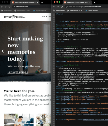
No business can remain afloat if it ignores customer needs. But that’s exactly what some companies inadvertently do while undergoing digital transition. They think the same strategies that have proven their efficiency in real life will work equally well for online interactions. However, people behave differently in the digital space. This means that most traditional methods of offline communication aren’t necessarily effective on the internet.

Purchasing decisions online are influenced to a greater extent by a number of factors; including greater competition with plenty of available alternatives, the availability of reviews, almost effortless comparison of prices, and other conditions (e.g. delivery time and cost) have significantly raised the level of customer expectations. It usually takes just a few clicks to find another online shop selling similar products. So even one episode of poor customer experience can become a deal-breaker for internet purchasers.

A good UX design can address a number of these factors. It can help a company increase audience engagement, simplify interactions with every buyer, and, ultimately, get more sales. Statistics show that a return from every dollar invested in creating a decent user experience amounts to $100. At the same time, about 88% of online shoppers say that they won’t use a website again if the UX was bad. In other words, achieving business goals while undertaking a digital transformation isn’t possible without making the entire process user-centric.

How to get started with the UX-oriented digital transformation

Creating great products isn’t necessarily enough to combat fierce competition in the overcrowded internet arena. To stand out, a company must truly delight its customers, or at the very least make the purchasing journey effortless. In order to achieve this, a deep understanding of customer needs and wants is a must. Here are a few tips on how to take a comprehensive approach to the creation of user experience within the online transition process.

Do UX research

The main goal of UX research is to help you understand how to make every interaction with a mobile application or website pleasant to users. It allows a design team to identify problems and opportunities related to the usability of functions and solutions that you have already implemented or plan to implement. All insights and valuable information gathered at this stage can be fed into the further digital transformation process.

To do the research, UX professionals use:

  • qualitative measures (e.g. interviews) to figure out why customers do certain things, and
  • quantitative measures (e.g. analytics and statistics) to discover patterns and test the assumptions made after qualitative research.
UX research
Image source: Ferpection

Companies should apply UX research methods throughout the entire digital transformation process, not just at the beginning. During the later phases, they help to make sure that implemented software is easy to use and doesn’t create bottlenecks in the key processes and workflows.

Create wireframes

whiteboard

Rushing into the development process with no wireframes and prototypes isn’t a good idea. Even if you have to execute a digital transformation strategy within strict deadlines, it’s better to review the timeline than waste resources on building custom software that won’t bring you desired outcomes.

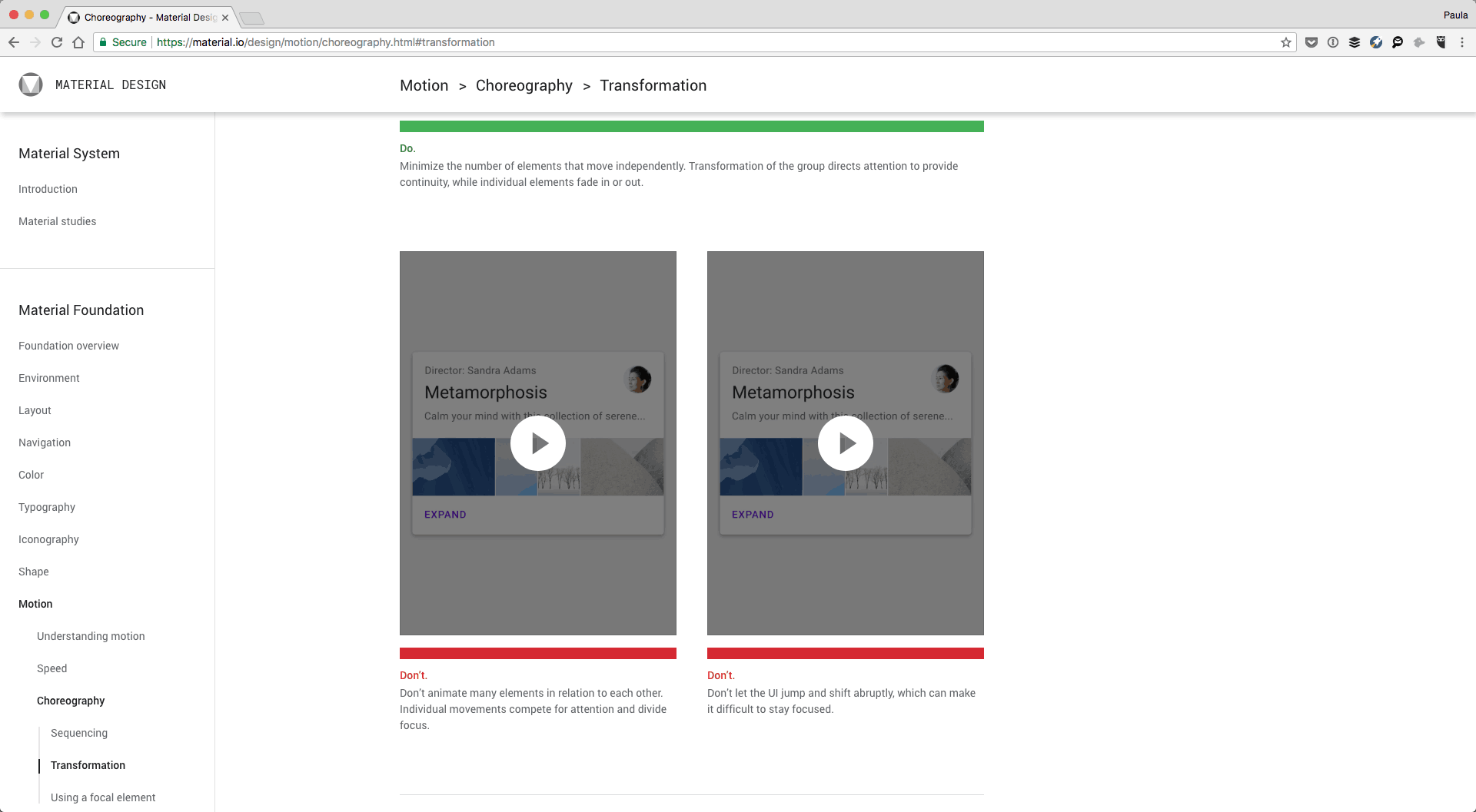
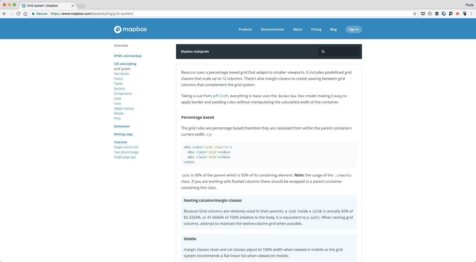
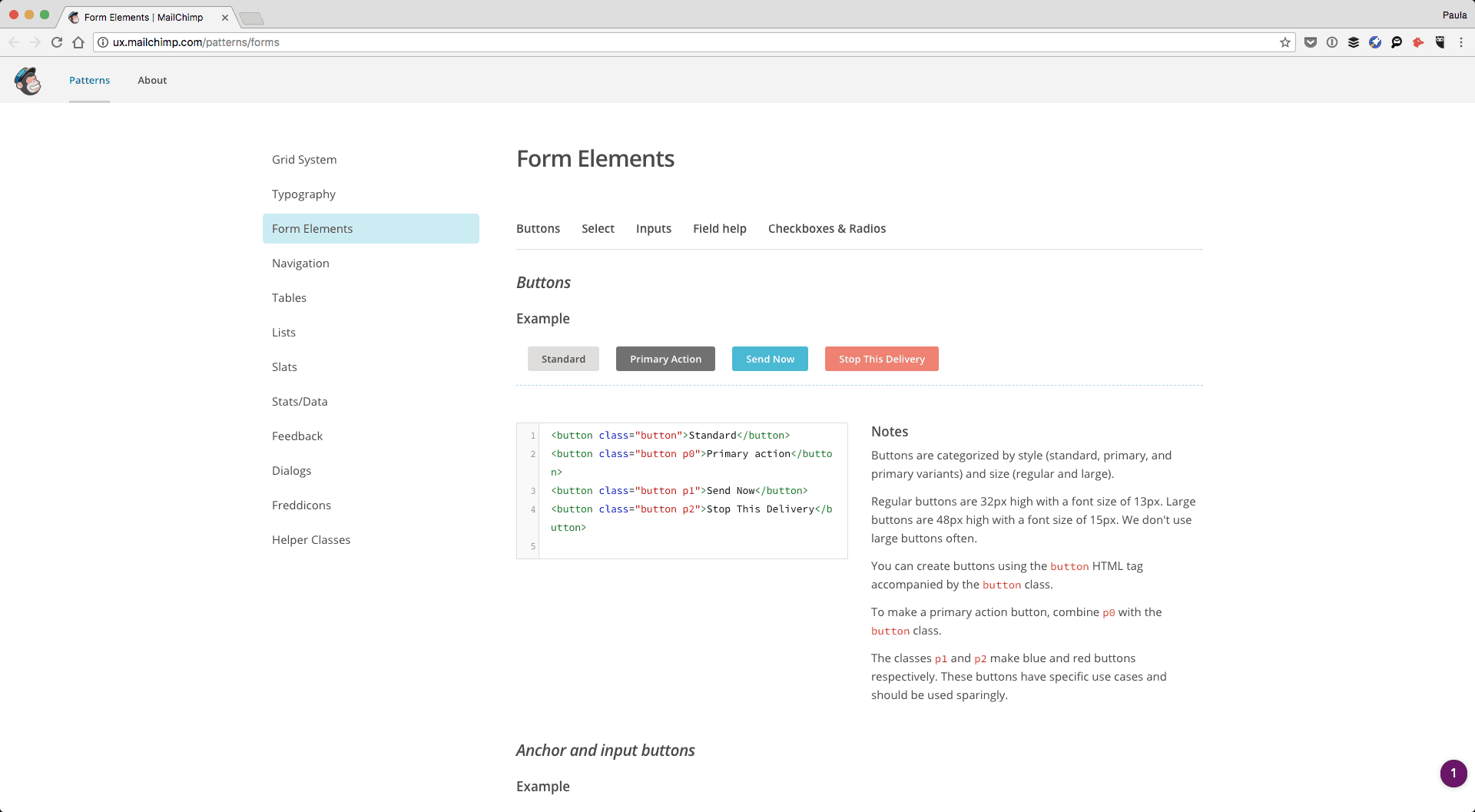
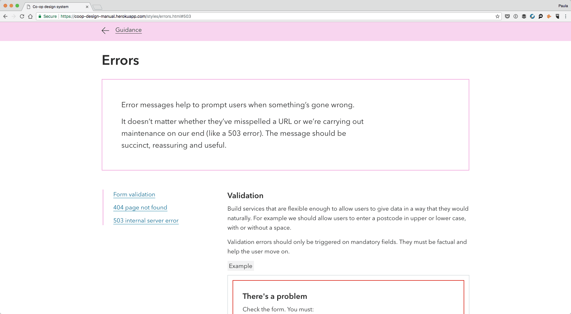
Wireframes will help you connect information architecture with a user interface. Building wireframes is the cheapest and fastest way to see if a solution has convenient navigation. Besides, wireframes will allow a design team to experiment with different ways of displaying content on screens. This will give you a chance to choose the perfect UX for your solution.

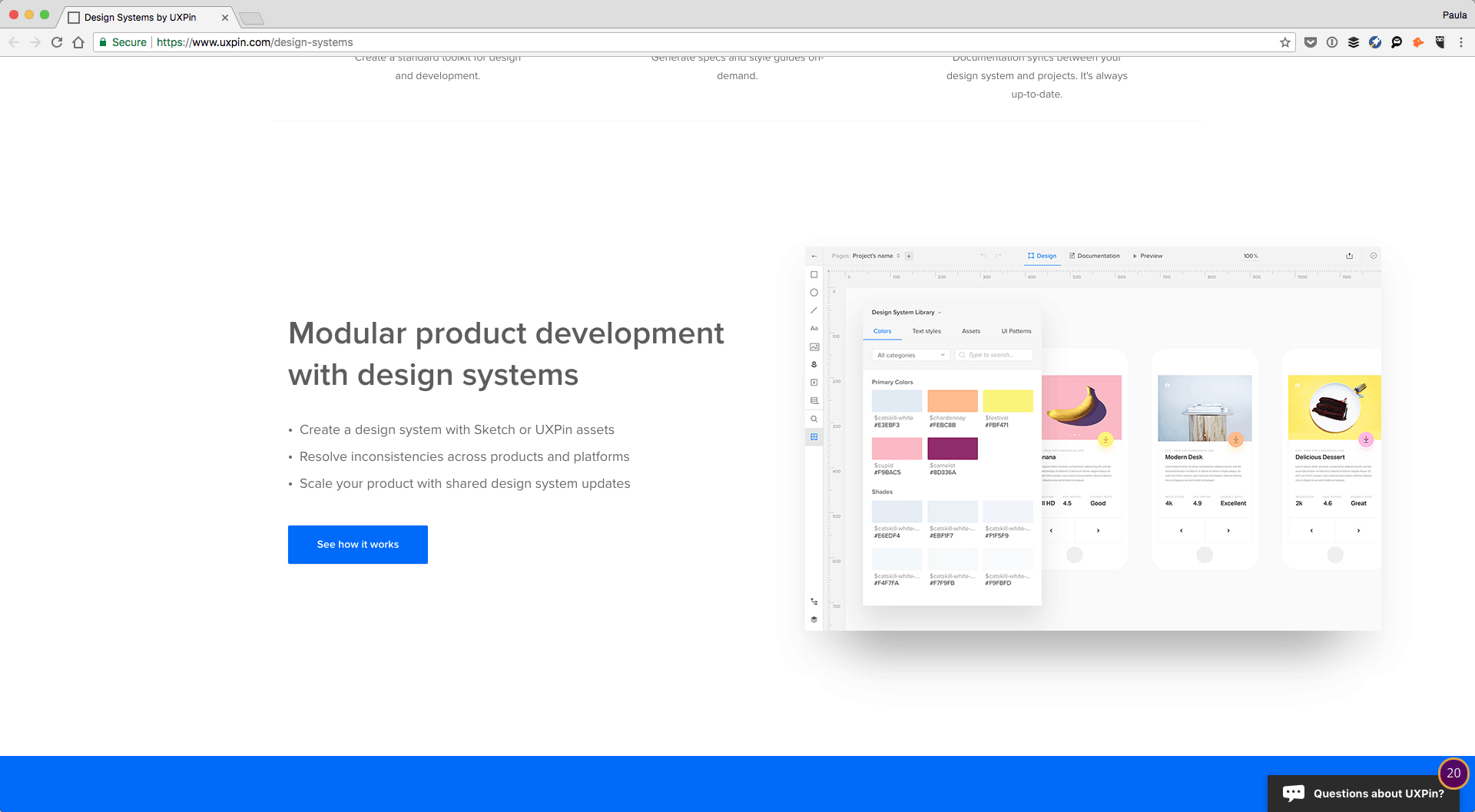
At this point, it’s important to create a holistic design system. Following the rules of such a system will make the visual representation of your brand consistent throughout different platforms.

Work on experience optimization

Digital transformation is a continuous process. Getting the IT infrastructure designed and developed won’t bring a company long-term benefits if opportunities for experience optimization are ignored later. As with any optimization process, moving to the digital space means that you always have to seek improvements and keep track of the current trends.

experience optimization
Image source: decibel.com

In this context, optimizing a digital customer experience should be a priority. Modern customers are demanding — they won’t tolerate brands that don’t show that they care for people. But digital transformation initiatives also cover the implementation of internal enterprise solutions. It means that you should provide the company’s staff with user-friendly tools as well. Such tools will help them do the work faster, increasing the company’s productivity and profitability.

Top post-COVID-19 trends in UX design

Covid-19 shopping

The coronavirus pandemic brought a lot of changes to our daily lives. Naturally, it also transformed customer service and things we expect from companies that sell us products and services online. To help you catch up with the current state of UX, here are the main post-COVID-19 trends to consider in a product development process.

Online videos

The coronavirus outbreak boosted the popularity of video content. Today, businesses use all kinds of videos to deliver their messages to customers, from live streams to online courses. In short, if you want the online transition to be successful, investing in quality video content will be the right decision. It will help you reach and engage a broader audience in a relatively short period of time.

Smooth virtual interactions

Yes, a smooth virtual interaction is something that people expected before quarantine as well. However, a stay-at-home regime moved even more of our daily tasks online. Now, people use the internet to solve literally every issue: purchasing groceries, work, talking to doctors via video call if some health concerns occur. That’s why simple and informative user flow and adjusting to the needs of users with different tech skills play a critical role in UX today.

Clarity in UX writing

The situation with COVID-19 made it hard to deal with information overload. Most of us are exposed to an enormous amount of news and thousands of messages all the time when we’re online.

It’s vital for companies that sell products or services to be clear and concise with their written content. No unnecessary distractions, ambiguity, and confusion — just plain expressions and straightforward guidelines.

The role of user experience in digital transformation

Digital transformation isn’t just about using more software tools and upgrading a company’s IT infrastructure. When an organization decides to implement technologies in its business operations, the way it engages with customers changes as well.

What this means is that if user experience doesn’t get enough attention, chances are the entire process will fail. To ensure that the digital transformation of your company will be successful, make it user-centric and take a holistic approach to building UX design.

Need a tenacious team for the digital transformation process?

Drop us a line!

AI and Telehealth: The Next Frontier in UX

AI and Telehealth: The Next Frontier in UX

By HealthCareTech, Interaction Design, Mobile, UX

The COVID-19 pandemic showed that artificial intelligence (AI) and telehealth technology aren’t just fancy trends in the medical industry. They are necessities that healthcare providers must adopt in order to remain efficient in current conditions. It’s true that discussions about the functionality of AI-driven telemedicine solutions are quite popular among developers and tech managers of medical organizations. Yet, the user experience (UX) aspect of AI in telehealth is rarely the main point and, as a result, gets far less attention.

We believe that experience optimization is invaluable regardless of industry and product type. Telehealth AI innovations can transform healthcare systems only when it both improves patient care and makes daily tasks easier for doctors.

This is why we want to take a look at how AI and telehealth are changing the way patients and clinicians interact and engage. We’ll also discuss how these technologies can potentially disrupt the UX of an entire health-tech discipline.

Accurate diagnoses

Many people still prefer traditional doctor’s visits to telemedicine appointments. They believe that long-distance communication via a video call doesn’t allow physicians to properly diagnose patients. While it may be true for some cases, the implementation of artificial intelligence in telehealth can radically change this situation. AI-powered software solutions open doors to almost infinite opportunities in health diagnostics, eliminating most concerns about the risk of incorrect diagnoses.

telehealth
Image source: bccourier.com

Machine learning algorithms embedded in telemedicine systems can analyze the patient’s health data from electronic medical records (EMR). By combining this information with other important characteristics like gender, age, and prior medical conditions, an AI-enabled telehealth application can help doctors quickly form accurate diagnoses and provide patients with relevant treatment recommendations despite the distance.

Automated collection of information

Artificial intelligence can enhance the patient journey by enabling the automated collection of information before a video call. Getting the complete and detailed data about the person’s symptoms will help doctors spend a telemedicine appointment more productively, speed up the care process, and improve medical decision-making.

health chatbot
Image source: devpost.com

In this context, designing a human-like conversational experience is critical to make patients feel cared for and forget that they are talking to a machine or chatbot. Otherwise, the solution may have the opposite effect. In particular, it’ll create an impression that a person’s health issues are not important enough to be examined by a real physician.

Enhanced personalization

When it comes to user experience trends in healthcare, we cannot ignore various personalization capabilities that can be greatly improved with the help of AI and telehealth. Different medical apps existing on the market today can provide users with some basic information about their symptoms or diseases. However, they aren’t powerful enough to augment the first line of primary care.

Image source: www.dribbble.com/dfarnold32

At the same time, AI software can focus on unique patient’s needs and offer users treatment options relevant to their specific cases. Additionally, predictive analytics can help doctors anticipate possible complications and take necessary preventive measures. This creates a solid foundation for taking the quality of care to the next level and enhancing both the patient experiences and outcomes.

Remote patient monitoring

AI telehealth solutions can reduce the need for face-to-face consultations with physicians through efficient remote health monitoring. Elderly people and people with chronic diseases have to visit doctors on a regular basis just to make sure that their health indicators remain in the normal range. While such visits are necessary, they take a lot of time and put patients at risk of catching viruses and infections in hospitals and clinics. In addition, they increase the workload for doctors, making the visits labor-intensive and exhaustive.

medical wearable
Image source: www.mime.asia

Telehealth apps can reduce the number of mandatory medical check-ups by allowing clinicians to monitor the patient’s heartbeat, blood pressure, temperature, and other vital signs at a distance. If combined with artificial intelligence, such solutions can detect dangerous health conditions early on and alert users and their doctors about possible risks. For instance,  AiCure, a New York-based company has developed a platform that enables physicians to track progress in the patient’s treatment based on their facial expressions.

telehealth app
Image source: cdn.nanalyze.com
Image credit: AiCure

Streamlined processes

Assessing symptoms and diagnosing patients via video calls are not the only tasks necessary for doctors to perform in order to provide quality telemedicine services. Along with other medical staff, they need to complete a lot of administrative tasks that have a great impact on the overall patient experience. Statistics show that physicians spend about 50 percent of their time on paperwork and processing documents.

Implementation of AI-driven solutions can help hospitals and clinics improve workflows and make administrative work less burdensome and time-consuming. For instance, voice-controlled tools that are based on natural language processing (NLP) technology can simplify the management of patients’ medical records (electronic medical records (EMR)/electronic health records (EHR)). Also, machine learning (ML) powered virtual assistance can give doctors recommendations about prescriptions they may want to consider when evaluating patients.

Matching a patient with a doctor

Many fears that people have about telemedicine are related to choosing the right medical professional. Unlike in-person visits, video calls provide limited opportunities to create an emotional connection with a doctor. As a result, the patient may have doubts about a clinician’s qualification even if everything went well during the appointment.

Image source: www.dribbble.com/sauvignon

ML algorithms can use a person’s health data to better find a doctor who has the most suitable expertise. Such AI-assisted telehealth software will help patients feel more comfortable about the fact that they’re treated remotely. In addition, it will simplify the work for hospital administrators, freeing up their time for other important tasks.

Wrapping-up

UX is invaluable for all types of digital products and telehealth isn’t an exception. Artificial intelligence can allow medical organizations to create telemedicine solutions with intentional user experience design. It will enhance the patient journey and make remote clinical services more efficient. In particular, AI-enabled software can help hospitals and clinics automate the collection of information, improve diagnostics, monitor patients’ health conditions remotely, streamline administrative processes, and pick the right medical professional based on patient’s health data.

Looking for a skillful team to create a perfect UX design for your telemedicine solution? Contact us!

Why UX in Healthcare Technology Matters and Where It’s Going | 2020

Why UX in Healthcare Technology Matters and Where It’s Going

By Branding, Interaction Design, User Experience, User Interface, UX

New challenges in the healthcare industry accelerate the development of healthcare innovation. Striving to improve patient care, hospitals and clinics seek ways to digitize medical services and internal administrative processes. But while a lot of attention is focused on functionality, the role of a user experience design in healthcare software often remains undervalued.

In this article, we’ll outline key trends in medical technologies. We’ll also explain how quality UX design can help healthcare providers deliver better patient experience.

Telemedicine

With the help of telemedicine, physicians can consult, diagnose and treat patients remotely using telecommunication technology. A typical telemedicine appointment looks like a traditional visit to a doctor’s office. The only difference is that the patient and doctor communicate online. Video conferencing solutions and remote health monitoring apps are the most popular tools that medical organizations use for delivering clinical services from a distance. But the concept is constantly evolving so there is a lot of room for new ideas.

telemedicine
Image source: dribbble
Image credit: Alexander Plyuto

Potential telemedicine solution users aren’t a homogeneous group. In other words, UX design of this software must be created with different categories of patients in mind. In particular, to build an inclusive telemedicine application, UX designers should take into account such characteristics as users’ age, mental states, and tech skills.

Ideally, a telemedicine appointment should resemble a face-to-face visit as closely as possible. So when working with this healthcare technology, designers have to recapture the feeling of real-life experience for patients and doctors. This is obviously vital with this current COVID-19 pandemic.

Health wearables

Smartwatches and fitness trackers became mainstream soon after they appeared on the market. And their popularity continues to soar. For example, one study shows that the number of wearable devices is forecast to hit 1.1 billion by 2022. But the growth isn’t just in quantity. Technological developments allow app creators to expand and enhance the functionality of wearables, turning them into useful healthcare technology tools.

health wearables
Image source: melmagazine.com

Most regular smartwatches and fitness trackers can monitor basic metrics like the person’s heart rate, steps, and sleep patterns. Medical devices are much more advanced and can also detect different deviations in users’ health conditions. For instance, they can identify atrial fibrillation by tracking the person’s heart rhythms.

To build a successful UX design for a health wearable, designers should properly prioritize information. A device must be simple and intuitive so users don’t feel confused when they need to quickly find necessary data or functions.

Healthcare chatbots

In healthcare, the chatbot technology is still in the early stage of implementation. Yet, it has the potential to become the industry standard in the next few years. Today, hospitals and clinics use chatbots mostly for experience optimization. For example, there are chatbots that help patients book appointments, connect patients with doctors, or collect feedback after a consultation.

But it’s expected that digital assistants will eventually become the first line of primary care. In particular, they’ll be able to analyze health information provided by a user and offer responses with personalized instructions.

If powered by artificial intelligence, healthcare chatbots can help medical organizations deliver patient-centric services while reducing workload for doctors. It’s important to remember that people who seek medical advice need to feel cared for even if they talk to a machine. So the main task of UX designers is to make an interaction with a bot very similar to chatting with a real person.

Medical virtual reality

Virtual reality opens doors to a variety of new opportunities for the healthcare industry. First of all, this technology improves training methods for doctors. It also allows them to master professional skills without risking the health and life of real patients. Research shows that surgeons who used the VR platform for simulating operations enhanced their performance by 230 percent compared with doctors who used traditional training techniques.

medical vr
Image source: healthiar.com

Another use case of virtual reality in healthcare is the reduction of pain and discomfort during unpleasant treatment procedures. For instance, VR healthcare technology comes in handy when a patient needs to sit for hours to undergo lengthy chemotherapy. VR can also help people with amputated limbs get accustomed to prosthetics.

Building a UX design for a VR-based healthcare solution is an extremely encompassing task. Designers working on such projects need to clearly outline the needs of a target audience and make accuracy their top priority.

Electronic health records

EHR solutions aren’t a new thing for medical organizations. Hospitals and clinics have been using this type of software for a long time. The purpose of EHR is to digitize medical charts and records while reducing the amount of paperwork needed. While this healthcare technology is widely adopted, its usability, in general, remains at a questionable level. As a result, nurses and physicians cannot fully rely on the system, as it may lead to errors and patient safety risks.

EHR system
Image source: sapristic-biion.com

Before creating a UX design for EHR software, designers need to study how medical staff will interact with a system. What is a user’s typical sequence of actions? Which fields are mandatory and which of them can be left blank? Is there something a user can forget to do after inserting information in a chart? Conducting extensive UX research will be very helpful during the early stages of development. But designers must also perform user testing and quality assurance at a later phase to ensure that a solution is user-friendly and effective.

UX and healthcare technology in a snapshot

Medical technologies aim to improve the efficiency of healthcare, enhance the patient experience, and make the doctors’ hard work a little bit easier. The UX design plays an important role in whether a particular health app meets these goals or not.

When deciding to develop a medical solution, healthcare providers must pay attention not only to its functionality but also to the user experience. At the same time, designers engaged in such projects must understand the specifics of the medical sector and be ready to deal with great responsibility that comes with tasks.

Looking for the right team of UX designers for your healthcare development project? Drop us a line!

How Animations and Interactive Web Design Make Better Digital Products

How Animations and Interactive Web Design Make Better Digital Products

By Animation, UX

Motion design and interactive web design has become extremely popular in the last twelve months. More and more websites use different types of animations, videos, and 3D objects to create a truly unique user experience. Browser performance has also increased and web technologies have evolved significantly. This, coupled with the much-anticipated arrival of 5G internet, allows website owners to keep up with the current trends with no harm to the load speed. In this blog post, we’ll explain how you can make your website stand out with the help of interactive and animated elements. We’ll also share some examples of digital products that already use such elements in quite impressive fashion.

Hover states

Hover states, also known as hover effects, are among the most common CSS animations on the web today. You’ve probably seen them, too. Remember the time when you placed your pointer over something and it changed or moved even though you didn’t click or drag anything? That’s a hover interaction animation you see in interactive web design. It’s used for many purposes. For instance, e-commerce stores often implement hover effects to show what an item looks like in different colors or from different angles.

hover states
Image source: econsultancy.com

There are other reasons why companies build digital products with this type of web design animation too. Sometimes, it can help users figure out what actions take them from A to B.

hover states
Image source: wpepitome.com

Alternatively, you can use hover states just to entertain your users and keep them engaged.

hover states
Image source: designshack.net

Parallax scrolling effect

The parallax effect, or parallax scrolling, is another interactive web design trend that can help you deliver an outstanding user experience. Simply put, it’s an effect that makes the background image or content and forefront content of web pages move at different speeds while scrolling. Combined with a full-screen interface effect, parallax scrolling creates a feeling of space and depth. Besides making a website more memorable, it helps to draw users’ attention to specific sections or content.

Parallax scrolling effect
Image source: invisionapp.com

Loader screen

Internet speeds continue to increase, which is why website visitors can hardly tolerate bad loading times. But in some cases, delays are just unavoidable (like heavy traffic or a large amount of data that needs to be processed). Fortunately, interactive web design can help you with this task. When you use loading animations for experience optimization, you’ll be able to keep more people on a page. You’re also more likely to see users being more patient as content loads.

By Sulf: https://dribbble.com/shots/10173093-Loading-screen-animation

Animated and video backgrounds

Your interactive web design may also benefit from the dynamic layouts. Usually, when you animate elements, you create a much more immersive experience than traditional static backgrounds. Visually, it captivates users in a similar way to watching a movie or playing a video game. Additionally, dynamic backgrounds may help you instantly show what your business is about as well as convey its key messages. Basically, you can use animations or videos to add some motion to the website background.

video background
Image source: optimizepress.com

Animated 3D elements

The use of three-dimensional, real-life objects in web design is a growing trend that is unlikely to change any time soon. Whether to add 3D web design elements to your UX design system or not is no longer a question. New technologies such as webGL allow website owners not only to include 3D objects in their web interface, but also effectively combine them with animations. The results can be breathtaking. View the video below to see the true power of animated 3D in interactive web design.

Image galleries

If you want to show several images on one screen, you may use an interactive image gallery. Selected photos will change automatically or after a user clicks on a button. At the same time, animating effects will make the user experience more pleasant. Another benefit of interactive image galleries is that they allow you to save space and avoid “cluttering” the page with photos. If you’re not sure whether you can incorporate this type of animation into your website, you can conduct a design audit first.

Image galleries
Image source: dribbble.com Image credit: Yurij Prokopchenko

Kinetic typography

Different experiments with typography have become one of the most vivid UI/UX design trends in the last 2-3 years. Not only do designers play with fonts, text directions, and proportions but they also make the letters move. Since moving type provides almost endless possibilities for creativity, it can be harmoniously introduced into most styles. No matter whether you need to develop interactive web design for a FinTech company or digital agency, it’ll probably benefit from kinetic typography.

Kinetic typography
Image credit: Animography

Particle animations

A few years ago, the digital industry became obsessed with minimalism. So on the one side, website owners wanted to add motion to their products. But on the other side, they didn’t want to make landing pages overwhelmed with distracting moving elements. Particle animations appeared as designers’ solution to this request. Elegant yet impressive, they do make a difference, setting the website apart from the competition and greatly enriching the user experience.

Particle animations
Image source: dataveyes

This type of web animations is often used on homepages. Depending on your needs and goals, you may choose either interactive (i.e. movements triggered by users’ actions) or non-interactive (i.e. movements are not connected to users’ actions) particle animations for your website.

Animated navigation menu

Animated navigation is one of the simplest ways to create an interactive web design. It serves two purposes: 1) it helps designers liven up a page, and 2) assists visitors navigate a website. Additionally, it makes web solutions more “compact.” In some cases, users can access a menu without even scrolling. Although animated navigation isn’t something that necessarily amazes people, you can still be creative. For instance, you can use a slider instead of a hamburger icon that is considered a traditional navigational element.

Animated navigation menu
Image source: dribbble Image credit: Tran Mau Tri Tam

Creative combinations

If you want to take a holistic approach rather than simply adding motion to a website, you can combine several types of animations. For instance, you can make every user’s action followed by some animated effect like a hover state or micro-movements of illustrations. This will make a website interface more intuitive and aesthetically pleasant.

Interactive Web Design
Image source: tubikstudio.com

Animations can also help you tell your brand’s story or assist your messaging, especially when paired with other audio-visual effects/text. The Beyond Beauty project is a great example. When users enter the website, a song starts playing. Scrolling through the page makes the images and text move and change. If an image is clicked, users can listen to a story and read the transcript by the side.

Interactive Web Design
Image credit: wazile.com

Keep your business relevant with interactive web design

No matter if your company is just a local business or an established enterprise, most customers will likely judge it by your digital presence. Creating a delightful user experience isn’t something you do once and forever. Website owners must always keep up with design trends to demonstrate to customers that their businesses are modern, reliable, and relevant. Implementing motion design and interactive web design is a perfect way to improve the usability of digital products, make them more memorable, and increase engagement.

Want to power up your website with interactive elements? Reach out!

How to Design an Outstanding and All Inclusive Design System

By Design, User Interface, UX

A design system is there to help a team keep the visual, written and even coded designs of its brand consistent throughout. A proper design system is much larger and more in-depth than a typical style guide. In this post, I’ll explain the different elements that go into creating an outstanding and all inclusive design system that will serve your team’s needs. Let’s go!

The anatomy of a design system

A design system must explain what elements can be used, when those elements can be used, and how they should be used.  The “what” is the introduction of the actual design elements, such as a button, along with its properties like size, colour, and font. , The “how” dictates the particular usage of each design element. For example, links can never be red, CTA buttons must have a specific size and colour. The “when” describes the relationship of the design elements to others, including their hierarchy. It’s when to use a CTA specific button, versus a normal button, or a link. For example, you only use a normal button with a contact form but you must use only the CTA button for all the lead magnet email forms.

The structure of a design system

The actual structure of your design system will vary depending on the needs of your company. To give you an example, Atlassian’s design system is divided into three parts, Brand, Marketing, and Product. Under each section, you can find design elements and guidelines that are relevant to that specific area. Logos in a web app might have different requirements and restrictions than a logo on a Facebook ad or a free download file.


Shopify, on the other hand, has guides for their apps and for their admin designs as well as general design principles that apply to both. They have their design system include rules and instructions for Visuals, Components, Patterns, and Content. That’s right, a design system isn’t strictly visual. You should also consider including guidelines on tone, voice, and message, as the language is also part of the brand. MailChimp had a whole design system dedicated to tone and voice alone.


Basic design elements to include

Each design system will have to cover key basic design elements such as colours or typography. That’s a given. Additional elements like layout or illustrations will vary depending on your company needs. Below I am going over the most common design elements you should consider including in your design system.

Typography

For typography, you must include the typefaces in use and downloadable files. For sizes, whether you’re using pixels, pts, or rems, include the specific number and show the size of the text next to it. But, only include sizes that are allowed to be used. Include typographic treatments and design styles such as font weights. Additional properties to consider adding include line heights, line lengths, mobile breaking points if your typography is responsive, and whether or not headlines and links are sentence or title case.

At the very least, include the individual text styles starting with p, em, strong, and H1-6 to whatever else is in your designs, like subtitles. Include the relationship of padding, line height and margins between H1 and p, H1 and H2 and so on.


Use IBM’s Carbon design system typography section for inspiration. It’s very thorough.

Colors

When it comes to colors include every color that is allowed to be used. If ones are for special circumstances make a note. Explain how to use the colors in relationship to one another such as text on a background, and keep in mind accessibility as well. If there are specific color combinations or pallets to be used, explain them too. Provide both, HEX and RGB values as well as code variables for developers. Add CMYK if you ever print anything too.

Check out how Salesforce is handling colors in their design system documentation.

Icons, graphics, and images

When it comes to icons, graphics, and images you must include sizes such as minimum and maximum restrictions. If you’re running a blog, include specifications for author’s and commenters’ avatars. For inline images, you can include alt tag best practices, size recommendations, as well as recommendations on the image’s content. For example, you might want to use only photographs, no images with text, or to never use dark or cluttered pictures but only ones with natural light or with pink backgrounds. Provide actual examples of good and bad photographs for better clarification.

Atlassian goes into extensive detail in the marketing section of their design system for both illustrations and iconography.


Additionally, Estonia’s design system has a fantastic section for imagery where they meticulously talk about the quality of photographs and their content as well. They include information on lighting, colours, post-production, and compositions. This makes sure that the images used within their designs are the right essence for the brand. This is exactly what an outstanding design system ought to do!

Motion

I’m using motion as an umbrella term. It can also refer to animations, transitions, mobile gestures or other movable behaviors and feedbacks. Motion can be complex to express; it’s got a lot of different but important properties. It’s a good idea to explain when it’s appropriate to use motion, what specific choreographies are okay, and how are they best to be used. Speed, sequencing and movements need to be addressed too.


A great example of motion can be found in Google’s Material Design system. It goes into a detailed overview of how motion can and should be used within Material Design. It also provides many dos-and-don’ts, with short videos snippets to better understand the intention.

Layout and grids

Layout and grids are important for web pages, mobile apps, and responsive designs.  Think of layout as common patterns to arrange the different contents within a screen. It can include information about what patterns to avoid and how to arrange the content within your layouts in an acceptable manner. You could get a little bit more specific and address how to use the larger design elements like the card designs that we especially see in web apps or mobile apps (commonly associated with Material Design). You’re welcome to provide a standard screen layout as the base.

Shopify’s design system has a great example of how they approach layout in their web app. It’s filled with recommendations, and it talks about many variables such as screen types and small-scale layouts too.

With grids, talk about the size of the columns and gutters, include pixels or % (if they are fluid), and mobile breakpoints.


From a coding perspective, go ahead and include the different class codes for the gird, and whether or not it can only be used on divs or other elements like images too. If there is a clearfix class, explain how and when to use it or whether or not the grid uses border-box or content-box box model. Consider including a vertical grid if you have one.

Take a look at Mapbox’s grid section – it’s comprehensive. Buzzfeed’s design system includes a whole section on flexbox too.

UI elements

No design system would be complete without explaining the various UI elements out there such as inputs, button, and forms, errors, lists and tables.


MailChimp is doing a great job with these. They have a Form Elements section in their design system that details buttons, selects, inputs, field help, radio buttons, and checkboxes. One by one, they include the styles and code for each element and their variation. For example, they have 8 different button example from a typical button to a combo button. For each, there is a description to explain how to best use it within a design. Consider including how the messages should be phrased in addition to how they should look.

Errors and feedback

MailChimp additionally has a designated Feedback section which talks about how to provide feedback to a user who is using their app. This section does include errors, but also other forms of feedback such as callout tips or small badges for inline feedback and labels.


Don’t forget, an input error is not the only thing that can go wrong. Errors can also include the 404 page or the 503 page and that’s exactly what Heroku includes in their error section too.

More design elements to consider

At this point, I think you have a pretty good idea of what goes into a well-defined, outstanding and an all-inclusive design system. However, I wanted to put together a quick list of additional ideas for you to consider as there really is a lot you can do here.

Conversations

HelpScout has a section for both Conversation Lists and Conversation Threads. Their product is conversation based so it makes sense they’d detail this part of their designs as well.

Navigations

Ant Design includes a section for navigations. It contains more than just the top nav we see on every web page. Here they define navigation as anything that tells a user where they are and it includes tabs, breadcrumbs, and pagination.


Lexicon categorizes navigation in a similar way. They have sections under navigation which include the typical primary and secondary navigation. They also include breadcrumbs, nav bar, and vertical navigation there too.

Logo

No design system would be complete without the logo section either. Louder Than Ten has their logo ready to download atop the page. Next, they mention good and bad sizing and cropping, as well as padding and sample applications.

Accessibility

I’ve briefly mentioned accessibility before. But let discuss it in greater detail right now. You can have a designated Accessibility section in your design system the same way Quickbooks does. Under the Accessibility section, they cover a wide range of topics including alt texts, readability, colours, and contrasts. They also have a list of additional resources for anyone interested in learning more about the topic.


Because accessibility is so important, it wouldn’t hurt to have the content be redundant in multiple places. Include the contrast content in both typography and colour sections. But, on top of that, have a separate accessibility section as well just like Quickbooks.

Putting it all together

Now that you understand the autonomy of an outstanding design system it’s time to go and make your own. You can do them in a couple of different ways. All of the linked examples you’ve seen in this article today have been made by large teams who put time aside to create these custom design systems and publish them live. If your team has the time and the resources go ahead and make a custom one for yourself too.


However, there are a couple of apps out there that will also help do it for you. It’s a perfect solution for smaller teams or smaller design systems. UXPin has a design system feature that you can utilize to create one of your own. It’s both designer and developer friendly. Additionally, InVision has a similar app that comes with a Sketch plugin.

Conclusion

Design systems don’t have to be complicated beasts. They are informative platforms that make sure your teammates continue to use a consistent design style within your company’s brand. Design systems don’t have to be lengthy or over complicated; they just have to let everyone know what can be used, when and how. If you have made a design system, with this article’s help or not, share a link in the comments below. We’d love to check it out!


Why Mobile is critical.

By Digital Transformation, Mobile, UX

image

Just a few things. It’s 2013!! Yes 2013 people and if you haven’t even looked at how mobile is changing and will forever change your marketing plan, then quite frankly you are operating at a disadvantage.

Mobile has been taking the world by storm. Mobile ad spending is this space has increased from 1 billion to just over 4 billion in 2012, and digital advertising has broken the 100 billion mark! Another great statistic that proves how valuable having a mobile strategy is that, 23.14% of web site visits in December 2012 came from mobile devices, an 84% increase over December 2011 and a 283% increase over January.

There are many ways to draw strategy from mobile; advertising, content, web and native apps, social. You may just want to make sure your web site is optimizing in a mobile browser and that all your email marketing programs are designed for mobile. The second screen experience is taking a backseat and our mobile devices are now riding shotgun in most cases.

Here is also a nice chart on what companies are using to increase their mobile value as brands.

image

millermedia7 is a Top Mobile App Development Companies In New York