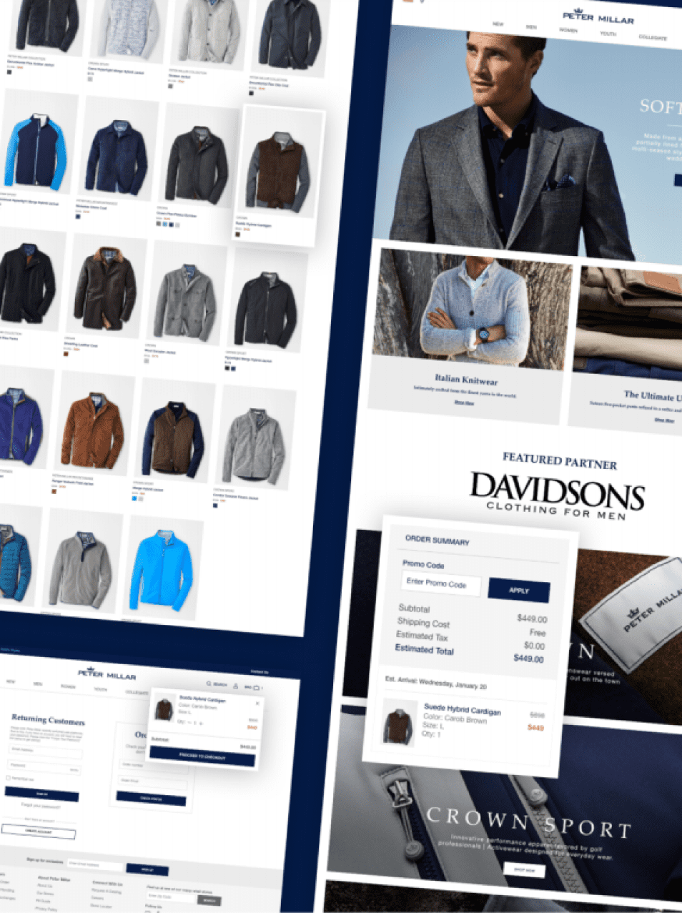
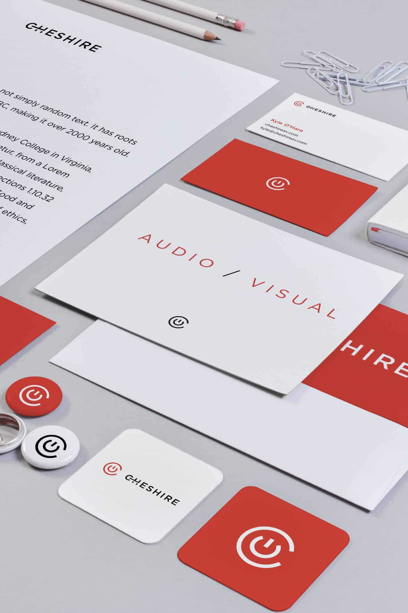
A design audit might sound a little intimidating, after all, the word audit doesn’t exactly scream fun. But, it’s actually a very beneficial exercise. A design audit is merely an analysis of the design elements and branding guidelines in use by a company. Its main purpose is to make sure that the branding is consistent across all channels and outlets. When we say branding we do mostly mean visual design elements, however, branding is also the written and verbal communication as well as the user experience.
A good design audit will also take those into consideration, to make sure that’s consistent as well. The truth is that the need for a design audit is a sign of good things. It means a company has grown a lot and now simply needs to re-align its design efforts. Briefly, let’s discuss the benefits of design audit for companies and then let’s get right into how to conduct one.
Benefits of a design audit
No matter if you run a smaller company or a large corporation, a design audit might be in order if your company is growing and evolving. It’s a great idea because it will help you manage your visual design material and written message. In turn, this will lead to a well-defined identity and brand.

When inconsistencies in either visual style or messaging start shining through, a brand is weakened. It no longer has a solid foundation, and it starts diverging into different directions. Consistency is key, and by conducting an audit you are creating a chance to once again strengthen your brand. Think of a design audit as an opportunity to check the quality of the designs, the products, the user experience, and the overall strength of your company’s brand.
The visual branding audit
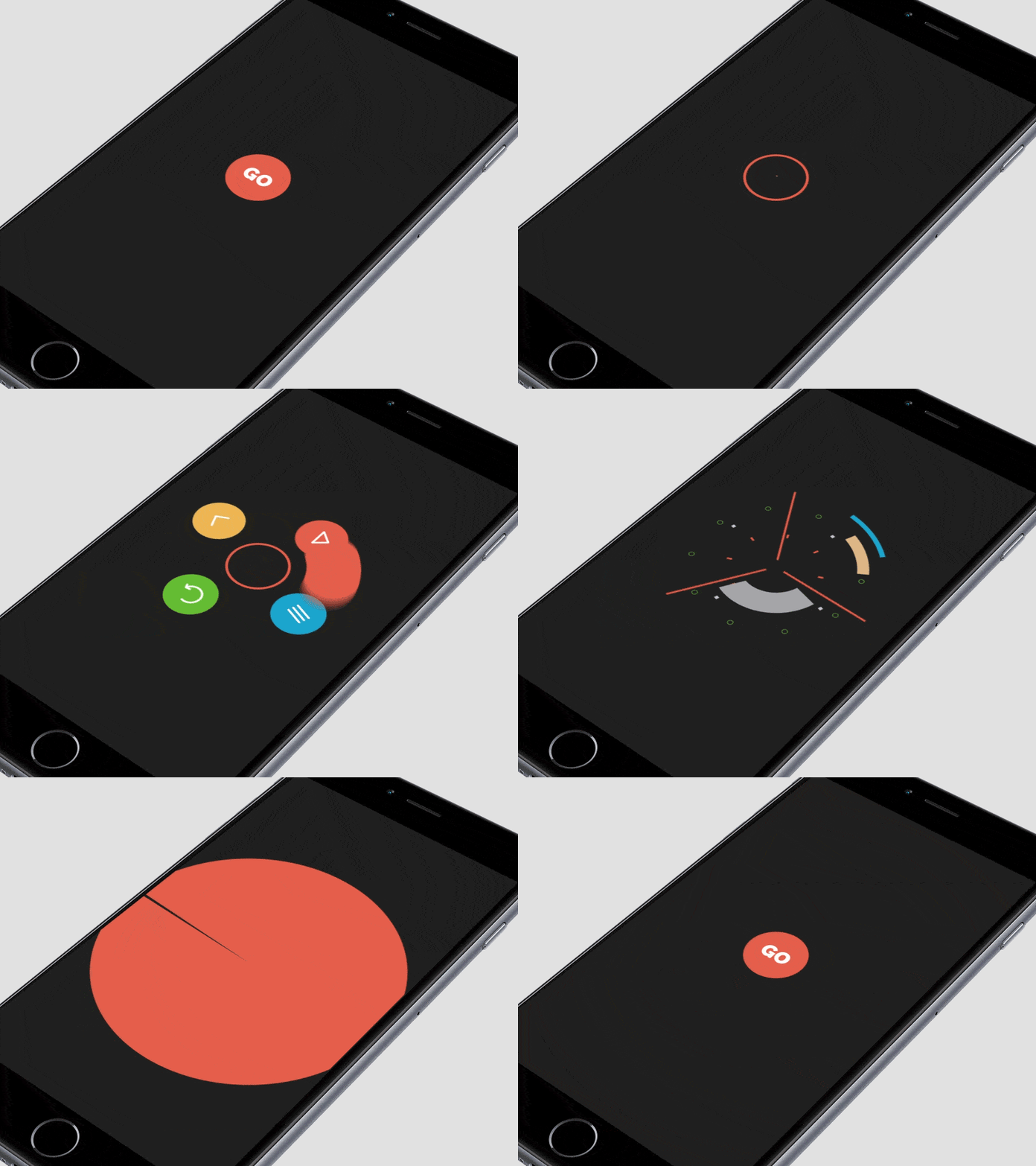
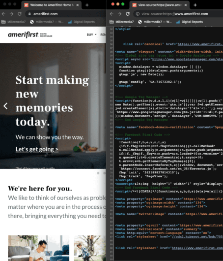
First thing first, it’s time to gather all the design assets. And we’re serious when we say all of it. Gather all the ads, the social media posts, the website and its desktop and mobile versions, the mobile apps, the letterheads, and the business cards. Include lead magnets, content upgrades, master classes or webinar slides. Include any pitch decks too. Anything that is a touchpoint for a customer. Yes, we do mean everything.
What you want to do here is to study the different collaterals to the notice patterns and their deviations. For example, you may notice that the social media ads are using the wrong logo file, or the quality of the graphics is just not what it needs to be. You may notice that you have many functionally similar sections throughout your website, but they are all designed differently.
As a result, you’re now aware of the issues. Meaning that you can now provide the people who run your Twitter and Facebook ads with the correct logo file and render final ad images in higher quality. You also now know that you will need to sit down and make sure that the footer is the same on every page, or that the custom made graphics for Leadpages use the correct brand colors.

Additionally, this might give you ideas on how you and the design team might want to update the branding going forward. Maybe you have too many or too few colors to perfectly depict the vibe your company is going for.
Tone, voice, and message branding elements
While you’re taking a look at all the visual elements, you should also consider the content itself. In the previous example, the only thing we didn’t mention was audio/radio ads because it’s the only thing that inherently doesn’t automatically come with a visual aspect too, as opposed to video.
Once again, it’s important to evaluate the actual content when performing your design audit. Read everything, listen to everything. Again notice what patterns you see, or should see but don’t. Just like with the visuals, you’re looking out to make sure that the tone, voice, and message is correct and consistent. As with all your marketing materials, it’s important to keep meticulous notes.
![]()
Pay attention to what no longer sounds like the company or any evolving patterns that just don’t seem right fit anymore. You might find that your company needs to have a more authoritative voice, be more playful, or use a softer vocabulary. Maybe you and your team realize that you can improve the overall tone, voice, and message of the company to be even stronger, better and relevant to the target audience.
The heuristics for usability and accessibility
Another thing a good design audit will include is a heuristic evaluation. This one focuses on the design process, examining usability and accessibility of a website or app. Usability and accessibility are crucial for a good user experience as these are the touch points between yourself and your customers. Those also help make your company and brand shine. Usability problems will affect people’s perception of your company too. They can be something simple, like a broken link, or complicated, like a confusing online order form. Accessibility problems, like missing alt tags, or low contrast between text and background, also mater.
Nielsen created a thorough heuristic evaluation guide – a standards manual if you like – back in 1994 that is still popular and reliable today. We recommend that you check out Nielsen’s heuristic evaluation guide here.
Next, you go through your website, web app, or mobile app, and little by little make a note of where the experience falls shorts of these heuristics.
For the best possible results of a heuristic evaluation, it’s best to have at least 10 people (ideally some of them should be web designers) who objectively evaluate your designs.
Utilize a design system
You can tie all of this together into a design audit system. Once you’re done with the audit it’s important to regroup. From there you can figure out what needs to go, what stays and what needs to be updated. When it comes to the visual design and brand messaging, consider implementing a design system. We’ve written a couple great pieces on how to build a design system to scale and what best to include in one. Keeping your styles in a design system will ensure ongoing consistency so that you don’t have to do a design audit every few months.
The value of a well-performed design audit
As you can see, a design audit can be extremely helpful. It will boost consistency for your company’s branding and improve the user experience. Don’t forget, the truth is that a design audit is a branding recalibration, which means that your company and brand are growing. With a professional design audit, you now know what you must do in order to tighten up your brand’s visuals and message.
Have you done a design audit before? Did you find it helpful for your company? Share any tips you might have for us in the comments!


