fbpx Skip to main content
Tag

Experience design

The Power of UX UI: How to Harness for SaaS Revenue cover

The Power of UX UI: How to Harness for SaaS Revenue

By Experience Design, UI, UX, Visual Design
Infographic of characters looking at a graph on a screen

Source: https://dribbble.com/littlepinkdinosaur

Let’s face it: If your software as a service (SaaS) business wants to make money, user experience (UX) and user interface (UI) are key.

The way in which you design and present your software can be the difference between success and failure and between making a fortune and barely getting by. But few people know exactly how to use UX and UI to their advantage. That’s why I’m here: to give you the lowdown on leveraging UX UI for SaaS revenue.

We’ll start off by looking at how UX UI strategies affect conversion rates, then move onto some case studies of companies that are doing it well. With these tips, you can get on the road to success with UX UI in no time. Ready to harness its power for profitability?

What is UX UI?

Put simply, UX UI is the term used to describe the user experience and user interface design of a product. And it is more important than ever: As products move online, UX UI becomes a critical way to differentiate your product from competitors and engage users.

UX UI involves understanding how people interact with products, from the colors they use to read, to the structure of pages and content, as well as how users feel when they’re navigating your site. All these factors come together to create an experience for your users—one that is designed with their needs in mind, with an easy-to-use layout and flow.

When done right, UX UI can lead to increased user engagement and higher conversions, ultimately generating more revenue for your SaaS business. Take Dropbox, for example: Despite having a simple product offering, its intuitive design translates into high conversions and great user retention rates. This wouldn’t have been possible without its well-thought-out design.

How UX UI can unlock product-led growth

From mobile apps to SaaS products, UX UI can be a key factor in generating product-led growth and a winning product strategy. It’s not just about creating an attractive user interface, it’s about making sure customers stick around and come back for more. Whether you’re developing an app or launching a new website, UX UI is a major part of the customer experience and should be carefully designed to meet users’ needs.

Good UX UI has the potential to create a product people actually want to use, while also driving revenue. Studies have shown that companies that prioritize UX design see higher customer satisfaction and retention, which leads to higher revenues. For example, one study found that companies who invested $1 in UX results in a return of $100 (ROI = 9,900%)

UX UI can also help drive conversion rates and customer acquisition by making it easier for customers to find what they need on your platform or website. By carefully designing the user interface and user experience, you can guide your customers down the path towards making purchases or signing up for services – ultimately increasing sales and driving revenue upwards.

Examples of UX UI transforming SaaS revenue

Whether you’re a small business or Fortune 500 company, one thing is certain: you need to make sure that your users are having the best experience possible. This translates directly into increased revenue for your SaaS product. Let’s take a look at a few examples of how user experience and the user interface have influenced revenue.

Tesla

Graphic of a Tesla logo reflecting off the rear of a Tesla vehicle
Tesla’s major success in the automotive industry is due in part to its focus on excellent user experiences, from sales and delivery to purchasing, servicing, and overall ownership. Tesla simplified the entire car-shopping process for customers and removed barriers between customers and their cars.

Dropbox

Dropbox is another great example of transformational UX UI, where the latter redefines the way SaaS products operate; it completely redesigned its desktop app interface to make it easier for users to organize their files. Because of this focus on user-oriented design, Dropbox saw an 11% increase in monthly active users within three months of the launch of its new interface.

Airbnb

Another SaaS example here: Airbnb’s use of UX UI has been widely acclaimed as one of its most valuable assets. Through its unique mobile app design, Airbnb combines useful filters like price range and location with an intuitive map feature, allowing users to quickly find properties that meet their specific needs.
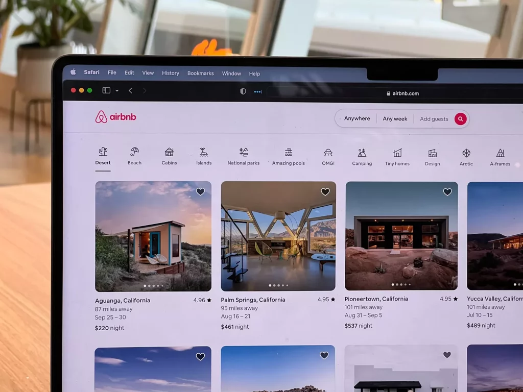
AirBnb listings visible on a laptop screen
These examples demonstrate how UX UI can greatly impact SaaS revenue. By taking the time to focus on user-oriented design and features, businesses can ensure that they are providing the most efficient and enjoyable product experience for their customers, leading to increased engagement and higher profits.

Benefits of investing in UX UI

You may be wondering about the benefits of investing in UX and user interface for your SaaS product. Well, there are plenty, and it’s likely to lead to an increase in your company’s revenue. Here are some of the key ones:

User satisfaction

When a user is able to find what they need quickly and easily directly from your SaaS product, they’re much more likely to be satisfied. With the right UX UI design, users will be able to navigate your product more intuitively and with less friction, leading to overall customer satisfaction.

Lower support costs

In addition to improved customer satisfaction, investing in UX UI can also lead to lower customer support costs. When you design a product that customers can use without help, you won’t need as many customer support personnel or resources. This leads to significant savings on staffing and resources in the long run.

More revenue streams

When users are able to find what they need quickly and easily by using your SaaS product, they’re much more likely to purchase additional products or services that you offer. And when customers have a great experience with your product and understand how easy it is to use, they’ll be more likely to invest in other services you offer as well.

All of these benefits lead directly back into revenue for your company — more revenue streams from satisfied customers with better engagement and lower support costs all equate to higher profits!

Tips for implementing a strong UX UI strategy

You know that investing in UX UI is key to improving your SaaS revenue, but how do you go about actually doing it? A few tips to get you started:

Define the user

Before you start implementing a UX UI strategy, the first thing to do is to define your user. This is essential in order to create an experience that’s tailored specifically to them. Understand their age, gender, location, and more — the more detailed your understanding of them, the easier it will be for you to make sure your design is as intuitive as possible.

Make a plan & set goals

Graphic of two individuals standing in front of a data graphic on a wall
Creating a roadmap of where you want to go with your UX UI strategy is critical. Make sure that you include measurable goals for each stage of the process; this will help you track progress and know when you’ve achieved success in terms of SaaS revenue.

Prioritize usability & user experience

Usability and user experience should always come first when designing a website or app. Make sure that it’s easy for people to find what they need and complete tasks quickly. Focusing on usability also means ensuring that it works on any device — mobile users are especially important these days!

Test your design

Once you have a prototype ready, test it! Ask your users for feedback and use it to refine the design until it meets their expectations. This will ultimately lead to better SaaS revenue. Additionally, testing each component of your design can help identify any issues early on before they become major problems.

Tracking the performance of your UX UI

The great thing about UX UI is that you can track its performance. The data collected from these metrics can help you make informed decisions about what works and what needs to be changed. Here are a few key performance indicators (KPIs) you should consider tracking with each UX UI change:

  1. Conversion rate: The conversion rate measures the number of website visitors who take an action, such as signing up for a newsletter or purchasing a product. This provides insight into how successful your UX UI techniques are in encouraging users to take an action.
  2. User engagement: User engagement measures how engaged users are with your website, such as how long they stay on a page and how often they interact with elements on the page. This helps you understand how effective your UX UI design is in connecting with users and engaging them in the experience.
  3. Customer satisfaction scores: Customer satisfaction surveys can help you understand how well customers like your design, as well as identify areas for improvement and fix any pain points that may be discouraging customers from taking an action or returning to your website in the future.

Image of a male with glasses excited
By tracking these metrics over time, you can identify patterns that indicate whether your new UX UI design changes have been successful in increasing customer satisfaction, user engagement, and SaaS revenue growth.

Wrapping up

Summing up, UX UI design can be a powerful driver of revenue for SaaS businesses. With the right strategy and focus on user experience, businesses can tap into product-led growth to fuel their bottom line. The case studies of Tesla, Dropbox, and Airbnb demonstrate that UX UI designs need not be complex nor expensive to address user needs, but providing an intuitive and informative UX will pay dividends in the short and long term. The success of these companies is proof that user experience design is a valuable opportunity for businesses of all sizes to unlock more revenue.

Enterprise UX: the Value of Usability for Enterprise Software

Enterprise UX: the Value of Usability for Enterprise Software

By Fintech, UX

In enterprise application development projects, decision-makers pay a lot of attention to the product functionality, while the end-user experience often takes a back seat. HR portals, task management systems, CRMs, and intranet sites — we all know how cumbersome and frustrating they can be. Oftentimes, companies’ executives see the true value of a decent enterprise UX. After all, they test and examine the tools from a very different perspective than most who’ll use the software every day. Not to mention, training and experience using the corporate software will overcome any lack of intuitive design, won’t it?

This lack of appreciation for intuitive design and usability is, unfortunately, quite common. However, it’s fundamentally wrong and can have significant consequences for any organization. In this article, we’ll explain what enterprise UX design is and why it matters.

The difference between customer UX and enterprise UX

lapton and mobile phone

Before we jump right into the details, let’s outline the basic definitions. Customer UX (or “consumer UX”) is a user experience design that belongs to apps and other digital solutions created for consumers or the general public. Meanwhile, enterprise UX is applied to the internal software of a specific organization and used predominantly by its employees. While the definitions help categorize the different terms, there are greater differences between the two types of UX design.

Scale and landscape

When a design team creates the UX for a customer app, it usually knows only the target audience’s key characteristics such as gender, occupation, age, etc. To study the landscape, UX designers usually do extensive market research. But it doesn’t allow them to identify a specific group of individuals who will use the product. At the same time, the scalability of the software product remains largely unknown until it is put on the market. In other words, there’s quite a lot of uncertainty. That’s why the design process consists of testing and verifying assumptions at different stages.

The situation is the opposite when it comes to designing enterprise software. In this instance, the group of future users is known from the very beginning. When a team works on the enterprise UX design, know who will use a solution. The potential scaling up is also limited to the actual or projected size of one organization. This means that the designers who create enterprise UX need to make full use of the available data.

The role of end-users

The process of building customer-oriented products is guided by user expectations, pain points, and feedback. Although the product idea might not come from those that will use the software most, it’s in the decision-makers' best interest to have a product the users will love. If users’ needs and wants aren’t considered, a product won’t become popular, and it will generate fewer sales or downloads. That’s why significant effort and investment goes into making a product user-friendly and optimizing for customers’ digital experience.

In enterprise projects, either independently commissioned software or as part of a more comprehensive digital transformation process, usability is often misinterpreted in the background. Employees (the majority of end-users) rarely have a choice about corporate business systems, and they rarely have an impact on the product development process of new systems. High-level executives make most of the decisions. And the lens they see and evaluate software is often significantly different from most users. Often skewing toward functional requirements and top-level project management requirements. As a result, corporate software performs all the required functions but are hard-to-use, clunky, sluggish, and ugly.

Why UX is key to enterprise software

teamwork

Companies that exclude usability for the end-user, focusing squarely on product functionality, can potentially save some money when commissioning the software. However, at the end of the day, they lose more over time as they don’t get the advantages that quality enterprise UX design brings. Here are the most important benefits an organization can expect when it factors in end-users’ preferences in the design process.

Improved productivity

Some executives would rather cut corners to save money in development rather than invest in thought-out enterprise UX design because, for them, it’s like throwing money down the drain. This is a misconception. In practice, investments in UX produce a greater cumulative return over time. If corporate software is easy-to-use, it helps employees perform their routine tasks. Consequently, their productivity is higher, which leads to higher revenues for an organization.

Besides, enterprise users usually spend 8-10 hours a day working with the company’s business systems. When such systems have refined enterprise UX design, actions that may take employees 4 to 6 clicks to execute may be done in one click-and-drag motion or 2 clicks. As it’s saving them time every day, it’s bound to have a positive impact on performance over a year.

As a professional design and development agency, we know how the productivity benefit works in practice. After our team created a new enterprise UX design for our client’s KYC platform, its employee productivity has increased by 39 percent.

A better understanding of data

Many employees working at larger corporations have to deal with a huge amount of raw data all the time. A good enterprise UX helps them to understand and process data quickly and effectively. When designers create corporate solutions with end-user needs and the latest UX trends in mind, key insights are much easier to find and understand.

Core enterprise UX components like well-constructed user journeys, dashboards, and data visualization allow employees to grasp the information with minimum effort. Empowering them to make better informed decisions and avoid mistakes. This applies to employees regardless of position, as decision-making is simplified within each area of responsibility.

Simplified internal cooperation

Effective cooperation is a key to the success of any group activity, and enterprise workflows are no exception. But it can be a real challenge when a development team builds corporate software without paying much attention to enterprise UX. Imagine, for example, that an enterprise product has a chat, but its user experience design is really bad. Employees can send each other messages but it takes five steps to find the message, open it, write a reply, and send it. Is such a business system going to be a help or obstacle? It’s quite obvious.

Good enterprise UX design should consider both employees’ overall behavior and micro-actions to make the teamwork barrier-free and efficient. In the post-COVID-19 era, it’s even more important due to the global shift to remote work. Essentially, designers who create enterprise UX should figure out how to make interactions within the software system resemble real-life interactions and environments as much as possible.

What to keep in mind when designing an enterprise application

In general, the enterprise and consumer UX have a lot in common in terms of design approaches and stages of creation. But still, enterprise app development projects have some specifics that UX designers must be aware of. To best illustrate this, we’ll discuss one of our relevant projects.

Our enterprise UX project was related to the fintech sector. The client, a financial institution, came to us with the request to create a new user experience design for its KYC (Know Your Client/Customer) platform. A core aspect of the project is that it’s mandatory for banks to verify the identity of individuals they provide services to. The process is called “know your client,” and employees involved in it constantly process an excessive amount of data. In short, our main task was to make the complex data easier to follow for the client’s financial officers. Here is how we accomplished it.

User research

An enterprise UX design system should be based on a deep understanding of user needs. Although the company’s executives and project managers may know for sure what a system must do, user research is still necessary to figure out how it should do it. The good news for UX designers is that a target audience is always defined and reachable. But unlike customer apps that often support a few-step process (think of Uber), enterprise solutions focus on rather complicated workflows. So, determining user roles and studying their pain points requires an all-round approach.

On our fintech project, the first thing we did was user research. We asked the employees about their working routine and the tasks they need to complete to do their part in the KYC process. Based on this information, our team divided all employees into user roles (i.e., the analyst, manager, case coordinator, KYC head, administrator, and auditor). We also determined the core user (i.e., analyst). Finally, our team listed primary responsibilities and key interactions for each role.

Building a user journey and prototyping

Building a user flow is a central stage of the enterprise UX designing process. Basically, designers should take the client’s requirements, connect them with user needs, and create wireframes. The important aspect here is to put a focus on simplicity, not creativity. There is usually much less space for experiments in enterprise UX projects than in consumer UX projects. The reason is that there is no goal to entertain or impress users, just to make their life easier.

To complete this stage of our fintech project, we created a schematic representation of a user flow. To do that, we used task analysis performed by our team after user research. Having all employees’ duties and connections laid out in front of our eyes, we created wireframes and then developed a high-fidelity prototype of the KYC platform.

millermedia7 product design

User feedback and iterations

When designers work on enterprise UX projects, some often skip this stage of a design process or collect feedback from the company’s executives instead of end-users. But it’s a huge mistake. Business managers usually have a bird’s eye view of the processes and operations. But they don’t know how everything looks from the inside. When it comes to product usability, the details matter a lot. That’s why gathering user feedback is critical. In most cases, designers have to perform several iterations of this step to create an enterprise user experience design that is highly tailored to the end-users’ needs.

To get a users’ perspective on the UX design that we were working on within the fintech project, our team conducted a number of user interviews. We asked interviewees to specify both positive and negative aspects that they noticed while performing tasks. We also jotted down our own observations of how a user interacts with a system. As a result, we created a truly user-centered enterprise UX design that helps the client’s employees be more efficient, and less frustrated, at work.

2021 is the time for user-centered enterprise UX design

For corporate software, a good enterprise UX design is as important as functionality, and quite frankly should be standard. Despite some popular misconceptions, it brings much greater value than just making employees like the product. If end-user needs are taken into account, their productivity is higher, which has a positive impact on the company’s profits. Besides, a quality enterprise UX design allows employees to work with complex data more effectively and collaborate with colleagues more easily. So, the investments in enterprise UX design always pay off in the end.

Need a thought-out enterprise UX design approach for your business system? Reach out!

Video UX Trends in 2020: Online Experience after COVID-19

Video UX Trends in 2020: Online Experience after COVID-19

By Experience Design, Mobile, UX, Video

Actively making use of online videos is a clear trend in 2020 as it better improves the user experience. Of course, using quality video content has always been one of the most effective ways to make a website stand out. But after the coronavirus outbreak, the role of online videos in delivering delightful user experience has become even more crucial.

Across the board, during the early peaks of COVID-19 in March in the US and Western Europe, media consumption sky-rocketed. Social distancing and an increase in largely stay-at-home lifestyles have also facilitated the popularity of video chats, video games, and video creation.

For business owners, it means that customers will expect to see more videos in the digital space in both the mid- and post-COVID era. There is a greater need to adjust to the new market demands. In this post, we will discuss how video content impacts the UX and give you some tips on creating engaging online videos.

How videos can improve UX design

Incorporating videos into websites isn’t a passing design trend. By making the user experience more immersive, videos help businesses create a stronger connection with their target audience.

Videos also demonstrate more clearly how products and services meet customer needs and, as a result, help sell products and services more effectively. Let us look at the main benefits companies get when they decide to embed online videos on their websites.

Tone of voice & atmosphere

While background videos make landing pages look more compelling, there is more to it. Videos allow UX designers to create a particular atmosphere on a website and tap into specific emotions and intent in users. With the right UX design and video, it’s easier for a business to convey brand messages and convert leads into customers.

The Cadigal site below is a great example. The company offers property for lease, so the video on a homepage shows beautiful city views.

city view
Website address: www.cadigal.com.au

Higher SEO ranking

Using videos in web design enhances search engine optimization (SEO) efforts and help companies drive more visitors to their websites. Search engines ( most notably Google) rank sites that contain quality video content higher in the search results. Research shows that videos published on a web page can increase the site’s traffic by up to 157 percent.

Besides, online videos increase conversion rates by piquing people’s interest and encouraging them to stay longer on a website. It’s especially useful for businesses that undergo digital transformation and strive to build a solid online presence.

Storytelling video experience

Videos are a great content marketing tool that helps organizations tell the story of a product or brand. Our brains can process and interpret visual content faster than texts. It means that companies can convey more information via online videos in a shorter period of time.

Not to mention that people simply love videos. If video content is available on a web page, it will naturally grab users’ attention. Watch the ad below to get a better sense of how videos can tell a brand story.

Video as customer support

Sometimes people have questions about a product or service that a company offers, but contacting a support center seems like too much effort.

Using explainer videos on self-service portals is a UX design trend that allows businesses to optimize digital customer experience and make a website more user-friendly. It’s also beneficial for companies since they can save costs by hiring a smaller customer support team.

Top video trends for better UX

Online videos have been a dominant form of content for the last 5-7 years. We’ve seen changing video and UX trends during this time period.

As new tools for video recording and editing become increasingly available to a broader audience, new trends start to emerge. If you want to make your website more engaging, here are a few things that may help.

Vlog content

Creating a business vlog is an excellent idea for any company searching for a convenient way to deliver messages and ideas to customers. Informative and compelling online videos help capture the audience’s attention.

Videos are also more memorable than text and more effective in terms of building brand trust. Besides improving UX, a business vlog can be a working tool for implementing a video marketing strategy and increasing brand awareness.

Product videos

Ecommerce businesses use product videos to give potential buyers a close-up look of an item, explain its main features and benefits, or demonstrate a product in use. Statistics show that 72 percent of buyers prefer watching a video to reading a product description if both options are available.

The reasons are obvious. Videos provide more information about a product in an easier way. As a consequence, it speeds up and simplifies the decision-making process. Additionally, videos give more confidence that a product is real. Solo Stove serves as an example of quality product videos.

Live streams

Today, many social media platforms allow users to stream live videos. Instagram Stories, TikTok, Facebook Live, and Youtube Live are just the most popular platforms, but there are literally hundreds of them.

Advancements in technologies have also enabled adding live-streaming videos to corporate websites. So if you decide to start broadcasting business-related videos in real-time, you’ll easily find all the necessary tools.

Personalized videos

The personalized video is a very noticeable trend in video marketing these days. Such videos contain some personal elements, for example, a recipient name and give a feeling that a company speaks directly to each customer.

Of course, you don’t have to create a separate original video from scratch for all people on your email list. Modern video personalization platforms allow companies to customize videos automatically.

screenshot personalized video
Screenshot. Video source: vidyard.com

How to create a stunning online video

Most of today’s customers view videos all the time, and their expectations are rather high. In other words, if you want to create a positive user experience on your website you have to follow trends and apply best practices. Unfortunately, producing some video content now and again won’t be enough.

  • Don’t ignore a vertical video format. Videos in portrait mode are more mobile-oriented and are a perfect fit for social media. But you can also use them on your website and YouTube. See how Adidas did this.
  • Get inspiration from outside of your niche. Even if you need to create a simple ad or explainer, it shouldn’t be dull. In most cases, people enjoy videos when they are entertaining. Take inspiration from films or music videos — they’ll give you some new insights.
  • Make it simple. People choose videos instead of texts because they are simpler to perceive and process. So don’t try to tell everything in one video. Focus only on the important stuff and keep it short.
  • Invest in quality. Will you watch a video ad if the sound quality is so poor that you can barely hear the words? Good quality videos show that your company cares about your products and customers. In short, quality should never be underestimated.
  • Add in-person feel. Although the digital world offers limited opportunities for face-to-face interactions, users want to see more human beings when they are online. To make your video content more influential and engaging, create videos containing real people whenever it’s possible.

Wrapping-up

COVID-19 has changed our online habits and needs. People spend more time in the digital space and are exposed to a vast amount of information. It’s only natural that we want to get quality content but in a simple form, so understanding the ideas doesn’t require much effort. Online videos suit this market demand just perfectly.

No matter what message your business aims to deliver, you have a higher chance of being heard if you use a video format. Are you unsure whether your online videos and user experience design is up to scruff? Then it’s high time to review the UX design of your website, app experience, and add more videos to it.

Want to improve the UX of your website or digital product?

We’re ready to help!

How Visual Identity Impacts Branding & UX and Why It Matters

How Visual Identity Impacts Branding & UX and Why It Matters

By Branding

Visual content, brand positioning and outstanding user experience (UX) are main things that help businesses stand out from the competition. Combined, they constitute your visual identity. This visual identity makes you different in the eyes of existing and potential customers. Both brand positioning and UX center around a company's interaction with its target audience. Brand messaging constitutes the foundation of any business-customer relationship. However, your visual identity and the form in which your company communicates with its buyers play a pivotal role – and ultimately determines the overall success of your customer engagement.

That’s why a properly designed visual identity can not only make a company’s digital presence beautiful. But it is also an effective tool for demonstrating a brand “personality” and improving the overall user experience (UX).

In this article, we will provide some visual design examples. We’ll explain how elements of graphic design and visual content constitute content marketing 101. Additionally, we’ll explain how it can strengthen your bond with customers.

We’ll also provide you with some useful tips for creating an outstanding brand image with the help of visuals and user interface (UI) design. But before we dive into the practical stuff, let’s briefly outline the basics.

What is a "visual identity"? 

Visual identity and branding are often used interchangeably. But, they are not the same thing. Branding is a broad term and is about how a business wants to be perceived by consumers or clients.

For instance, a coffee shop that uses only recyclable coffee cups may identify itself as an eco-friendly place. They can demonstrate this through design as well as visual and text content. This position would be a distinctive feature differentiating it from many other cafes which also offer good coffee.

brand vs identity
Image credit: justcreative.com

At the same time, a visual identity is a set of visible elements that would help the coffee shop convey its brand message. In general, it may include anything from interior design, graphic design principles and elements, to a logo. But if we narrow it down only to the digital presence, then visual identity would consist of the following two blocks: 

  • elements of basic design (i.e. typography, colors, layouts, grids, etc.)
  • visual content (i.e. images, infographics, screenshots, videos used mainly for marketing purpose)

So, for example, a green color palette might be a great choice for a website or mobile app of the eco-friendly coffee shop. See the example below. At the same time, an infographic showing what happens with coffee cups after they’ve been used would be a nice supplement to its blog posts or marketing emails. They could also feature as pamphlets or posters.

The Pear Tree Kitchen
Example of a website for the eco-friendly cafe
Image credit: The Pear Tree Kitchen

The above case is oversimplified, but it perfectly explains the main idea. When website visitors know what you and your offers are about, their trust and engagement levels increase. This naturally leads to better experience optimization, business growth, and higher profits. 

Why establishing effective visual communication is a must 

As human beings, we perceive visual information easier and process it faster than plain text. That’s why internet users in most cases prefer images and infographics to other types of content. In fact, visual content statistics really underline this: 

  • People are really good at remembering images. One study found that people remember 55 percent more information they heard three days ago – if there was a picture added to it.  
  • Infographics can drive the increase in website traffic by 12 percent. On top of that, internet users spend more time on a web page if it contains informative visuals. See what type of visuals draws perform best in the image below.
visual content performance
Image credit: venngage.com
  • Interestingly, Twitter users retweet 150 percent more tweets that contain images as compared to tweets without photos, memes or infographics.
  • It’s three times easier for people to follow visual instructions than written guidelines. This is why you should focus on illustrations, icons, and color hierarchy which guide users to their goal when creating UX design for a digital product.
  • More than 63 percent of digital buyers believe that the quality product image is more important than a detailed product description or reviews.
  • Internet articles that contain images have 6.5 times higher engagement than text-only blog posts.

So how design works, creating engaging visuals and building a decent design system, is not only about drawing customer attention. It's also about communicating and conveying information in an efficient way.

It’s worth mentioning that there is no visual content vs text confrontation. Both types of content are important elements of any good content marketing strategy and brand positioning. That’s why they should complement rather than replace each other. 

The role of design and visual content in branding

As we’ve outlined above, visual appearance is a crucial component of a company’s online presence. But how exactly does it benefit businesses’ self-presentation and the customer perception of a brand? Let’s discuss this in greater detail.

Setting the right tone 

Website design and visual content marketing are the focal points and tools of visual communication. They determine the tone the brand use to “speak” to its target audience. Once visitors enter a web page, they form their first impression about the business behind it. If that impression meets visitors’ expectations they stay on the website. If not, they leave in the first few seconds without even reading the text.

For instance, if a bank’s website was designed like a digital platform for kids it would probably have a high bounce rate. So make sure that the visual appearance of your web design and brand corresponds with your brand identity and cannot be misinterpreted. But don't forget about the aesthetics — it plays a crucial role as well. That's why you should try to create a visually pleasant and relevant UI design without compromising on any of these aspects. 

Building brand recognition

The long-term success of any commercial organization heavily depends on brand awareness and recognition. To build them, a company needs to develop a comprehensive brand strategy. This includes visual identity, among other elements such as a story, messaging, and personality. For most customers, the visual identity is the key differentiator since visuals are in general more memorable than text or audio.

Judge for yourself. When someone mentions Coca-Cola, what is the first thing that pops up in your mind? Chances are it’s the logo or brand colors. In most cases, it works in reverse equally well even if some element of graphic design is taken out of context.

For example, the combination of yellow and red is often associated with Mcdonald’s. Generally speaking, you should avoid any divergences between your offline and online core visual elements.

McDonald’s screenshot
Image credit: McDonald’s

Delivering brand messages

There is a saying that a picture is worth a thousand words. And that’s exactly what visual identity is all about. Because while it may seem that we communicate mostly with words, studies show that nearly 90 percent of the information that is processed by our brains is visual. That’s why visual content and identity should not only describe what the business stands for – but also demonstrate it visually.

The question becomes; how do we do this successfully? Since every brand is unique, there is no one-size-fits-all recipe. However, different colors evoke different emotions (see below). Similarly, typography, layouts, and icons may tell a lot about the company's style, while color hierarchy shows what exactly a business wants to emphasize, and so on.

Colors and emotions
Image credit: bigmouthdesign.co.uk

The same applies to the visuals used in marketing campaigns. For instance, even the high-level review of visual content on social media may give you a clear idea of what values a brand has and whether you want to buy from it.  

The role of design and visual content in UX

An awful user experience can break even the most thoroughly built brand identity. That’s why when designers and marketers are working on a visual identity for a company, they should also think about the usability of a website or app.

The bottom line is that all elements and principles of basic design, as well as any pieces of visual content, must enhance the UX. In short, a decent visual identity and brand positioning should not come at the cost of user convenience. But let’s take a closer look at how visual identity impacts the UX.

Capturing attention and telling a story 

According to Forbes, Google performs around 3.5 billion searches per day. Additionally, a study by the New York Times shows that modern people are on average exposed to 5,000 ads every day.

For businesses, this means that older marketing strategies likely struggle to grab customer attention. Or, in other words, they should use other means to help internet users notice them. Unique UI design, overall design, and high-quality visual content are the best tools to do that.

Besides, visual storytelling is often perceived by website visitors more easily and can, therefore, be considered more convenient. Look at the image below. 

Fitbit screenshot
Image credit: Fitbit

Instead of describing a potential use case, site creators just showed a photo of a busy man who checks his work messages on the go. As a consequence, users can understand how the product may help them while they’re scrolling a web page. They don’t need to read long product characteristics to figure out if they need this item.

Guiding a customer through a site or app

People use websites and applications for a reason. For instance, they may search for information, want to buy a product, order a service, watch a movie, play a game, or text to friends. Ideally, the design of a software solution should be straightforward enough for users to reach their goals without putting too much effort into figuring out how to do this. 

A great example is the Uber app. It’s built according to the basic principles of linear UX design which is a minimalistic approach aimed at creating goal-oriented experiences.

Simply put, this means that the app “guides” users to their goals through a number of steps and users clearly know what to do next at every phase of their journey. The UI design is also in line with this idea since it’s rather simple: black and white colors for buttons and notifications, straight lines, plain layout, and no distractions. 

Uber confirmation
Image credit: Uber

How to create an awesome visual identity for your brand

Creating a visual identity that would properly present a brand and resonate with its customers is a complex process that doesn’t happen overnight. But here are a few recommendations that would help you do everything right.

Perform a website design audit

Before you start working on something new, you need to review what you already have. A comprehensive visual audit will allow you to understand if the visual identity of your business complies with its brand positioning. When a design audit process covers the evaluation of all design assets, its results will help your marketing team create more engaging visual content for social media, blog, and future marketing campaigns.

visual brand assets
Image credit: infographicworld.com

Develop a design system

Once a design inventory is ready, you may proceed to the next stage and develop a design system. In short, a design system is a set of guidelines and standards defining common rules for building different components of visual identity. For example, a design system will determine a color palette and brand fonts. Not only will it allow you to set a single vision of the outward expression of your brand, but it will also help designers avoid so-called design debt in the future. 

Components of a design system
Image credit: Ines Serizer

Consider basic design principles 

When it comes to creating visuals for a brand, applying graphic design principles is always beneficial. They will help you develop a comprehensive visual language and make your brand “personality” look both consistent and attractive. Some things like visual weight, the level of white space, and visual texture might seem unessential to non-designers but they play a critical role in creating a holistic visual identity.

Avoid visual noise

Sometimes less is more. You should remember that every element of your design, as well as every visual, should serve a particular purpose, not just be mere decoration.

For example, there is no point in using five bright colors on a web page if three of them will just distract users and impair user experience. The same is with images. Instead of choosing a photo because it looks beautiful to you, pick a picture that tells a story or explains the benefits of your product. 

Hire professionals!

Luckily, you don’t have to do everything yourself. Although there are some tools that can help you create simple template-based visuals, more complex tasks need to be performed by professionals. Otherwise, there is a risk your efforts won’t bring the expected results.

Looking for experienced designers who can help your brand stand out with an impressive visual identity? Reach out now!