Unlock the power of exceptional user experiences with millermedia7’s expertise in experience design. Elevate your digital presence with our insightful category.
The fintech space is changing progressively! It’s no longer enough to create an effective product that meets your customer needs. To stay ahead of the curve, you need to beware of the top fintech UX design trends to watch in 2023.
Remember how just a couple of years ago we were frequently discouraged by SIRI not being able to understand what we were saying and constantly answering the wrong question? Our cars had trouble with voice recognition and more often than not were calling the wrong person. Those of us who have accents had an even harder time talking to our devices and hoping to be understood. How many jokes have you heard about autocorrect? It is amazing to see how quickly technology improved in just a few years. Clearly, AI is already being used in a variety of ways to improve UX today.
AI applications in our daily lives
Every one of us experiences the effects of artificial intelligence in our everyday life.
Companies like Netflix use AI to recommend movies and TV shows based on your viewing history.
Amazon Alexa, Siri, and Google Assistant are using AI to control smart devices, send messages, set reminders, and provide information, creating a more seamless user experience.
A lot of companies use AI-powered chatbots to provide customer support, answer questions, and provide personalized recommendations, enhancing the user experience and reducing the workload on human support teams.
UserTesting uses AI to analyze user feedback and provide insights to UX designers.
We all can agree that as technology continues to advance, AI will revolutionize UX design in a number of ways. Here are some of the most obvious changes we can expect to see:
Improved personalization.
Better automation
Enhanced predictive analytics
Increased variety and quality of conversational interfaces
Enhanced accessibility
Improved testing and feedback
But like with everything in life, it is important to know not only the strengths and benefits of the new technology but also the potential dangers.
Let’s take a deeper look at each one of those items.
Personalization
Advanced data analysis can help UX researchers to analyze user data more effectively and accurately. It can provide insights that can lead to more personalized experiences. However, just like in market research, collecting more data doesn’t necessarily help with understanding its meaning. Designers and researchers may be tempted to rely too heavily on data instead of considering user feedback and intuition.
AI can help navigate the complexity of real-time personalization by quickly analyzing user behavior and preferences. The latter will allow to better adapt to the needs of individual users. Personalization, in its turn, can help to further improve chatbots and voice assistants. However, some users may be uncomfortable with the level of personalization that AI can provide. Hence, designers should be ready to face reluctance to accept the new technology solutions on the customer side.
Automation
There is a number of daunting and tedious tasks that UX designers do on an everyday basis. AI can help speed up design processes. By generating design variations such as layout, typography, and color selection, designers will be able to quickly test different assumptions. On top of that, design areas that can benefit from AI extend to design systems and much beyond.
At the same time, designers relying too much on automation can cause a loss of creativity. It can also shift expectations on how long the design process should take and promote the so-common “anyone can do it” attitude.
We also should not forget that automated systems require upkeep and maintenance. So designers must invest time and resources into maintaining and improving their automation tools. Always keep in mind, automation should be something that complements, rather than replaces creativity and thought.
Enhanced accessibility
One of the interesting areas where AI can make a significant difference is accessibility. Accessibility refers to the practice of designing products and services that can be used by people with disabilities, such as visual or hearing impairments. Companies should start looking into AI to help them with 508 compliance.
AI-powered voice assistants, automatic captioning, image recognition, and natural language processing (NLP) are critical elements of enabling people with disabilities to work seamlessly and productively. Voice commands can provide an accessible experience for people with visual or motor impairments. Automatically generated captions for videos and other media can make them accessible for people with hearing impairments. Besides, image analysis and description can provide users with visual impairments with the much-needed ability to understand visual content. And finally, chatbots and other conversational interfaces help people who need assistance with cognitive or language processing.
The use of AI can help developers of those systems generate code to provide much-needed features. In this case, we can view developers as users of intelligence-powered tools that increase their productivity.
Improved testing and feedback
It is hard to overestimate the importance of testing and feedback in any design process. AI can improve designers’ efficiency and effectiveness by automating testing processes, analyzing user feedback, identifying patterns and trends, and A/B testing.
Predictive analytics and NLP can be used to anticipate user behavior, extract important insights, and better understand user needs.
However, it is critical for designers to understand the limitations of AI and incorporate human feedback and intuition into the design process, balancing the insights provided by AI with the creativity and empathy of human designers.
Predictive analytics
Predictive analytics uses machine learning algorithms to analyze user data and predict future user behavior. Everything we’ve talked about in this article heavily relies on predictive analytics. AI helps with the analysis of large volumes of user data, making real-time predictions, optimization of user experiences, and testing multiple design variations.
Integration of AI tools into existing applications
Yes, AI can help designers do their work, but let’s not forget about the enormous help that AI can provide for our users in their day-to-day work.
Incorporating generative AI into email applications and text editors can help people to communicate more effectively by providing them with initial structures of emails, PowerPoint presentations, and documentation.
Bringing AI into internal corporate portals can save time for thousands of employees during the onboarding process, or when seeking for right people or procedures within the organization.
Thousands of existing applications currently heavily rely on people using other applications or search engines (Google, YouTube, etc.) to provide additional assistance with their products. Imagine how powerful and productive those products could become if by using AI they could seamlessly bring this external content into their products.
Dangers of AI
We spoke a lot about the multiple positive effects that AI can have on design processes, but let’s not forget that there are multiple areas in which using AI (especially in its current state) can be rather dangerous.
AI algorithms are not perfect, and designers as well as their managers must be aware of the limitations of the technology they are using. The correct interpretation of user feedback is pivotal for a designer. However, the use of AI does not always guarantee accuracy.
The accuracy and reliability of predictive analytics depend not only on the data quantity used to train the AI model but also on the data quality. Designers may start relying too heavily on data from AI-powered testing and feedback tools, potentially overlooking important subjective experiences and feedback.
In addition, AI algorithms may reinforce existing biases in data, leading to biased feedback and potentially misleading design decisions. AI also doesn’t have empathy which is necessary to truly understand user needs and preferences.
When using AI tools, designers need to verify that data is collected in an ethical and responsible way, protecting user privacy and ensuring that the system doesn’t have negative impacts on users or society.
Final thoughts on AI in UX
Overall, there is a lot of complexity associated with the use of AI in the design process, and it is important to find the right balance between possibilities and practicality. Designers should also beware of the limitations of emerging tools and take precautions to prevent misleading design outcomes.
Let’s face it: If your software as a service (SaaS) business wants to make money, user experience (UX) and user interface (UI) are key.
The way in which you design and present your software can be the difference between success and failure and between making a fortune and barely getting by. But few people know exactly how to use UX and UI to their advantage. That’s why I’m here: to give you the lowdown on leveraging UX UI for SaaS revenue.
We’ll start off by looking at how UX UI strategies affect conversion rates, then move onto some case studies of companies that are doing it well. With these tips, you can get on the road to success with UX UI in no time. Ready to harness its power for profitability?
What is UX UI?
Put simply, UX UI is the term used to describe the user experience and user interface design of a product. And it is more important than ever: As products move online, UX UI becomes a critical way to differentiate your product from competitors and engage users.
UX UI involves understanding how people interact with products, from the colors they use to read, to the structure of pages and content, as well as how users feel when they’re navigating your site. All these factors come together to create an experience for your users—one that is designed with their needs in mind, with an easy-to-use layout and flow.
When done right, UX UI can lead to increased user engagement and higher conversions, ultimately generating more revenue for your SaaS business. Take Dropbox, for example: Despite having a simple product offering, its intuitive design translates into high conversions and great user retention rates. This wouldn’t have been possible without its well-thought-out design.
How UX UI can unlock product-led growth
From mobile apps to SaaS products, UX UI can be a key factor in generating product-led growth and a winning product strategy. It’s not just about creating an attractive user interface, it’s about making sure customers stick around and come back for more. Whether you’re developing an app or launching a new website, UX UI is a major part of the customer experience and should be carefully designed to meet users’ needs.
Good UX UI has the potential to create a product people actually want to use, while also driving revenue. Studies have shown that companies that prioritize UX design see higher customer satisfaction and retention, which leads to higher revenues. For example, one study found that companies who invested $1 in UX results in a return of $100 (ROI = 9,900%)
UX UI can also help drive conversion rates and customer acquisition by making it easier for customers to find what they need on your platform or website. By carefully designing the user interface and user experience, you can guide your customers down the path towards making purchases or signing up for services – ultimately increasing sales and driving revenue upwards.
Examples of UX UI transforming SaaS revenue
Whether you’re a small business or Fortune 500 company, one thing is certain: you need to make sure that your users are having the best experience possible. This translates directly into increased revenue for your SaaS product. Let’s take a look at a few examples of how user experience and the user interface have influenced revenue.
Tesla
Tesla’s major success in the automotive industry is due in part to its focus on excellent user experiences, from sales and delivery to purchasing, servicing, and overall ownership. Tesla simplified the entire car-shopping process for customers and removed barriers between customers and their cars.
Dropbox
Dropbox is another great example of transformational UX UI, where the latter redefines the way SaaS products operate; it completely redesigned its desktop app interface to make it easier for users to organize their files. Because of this focus on user-oriented design, Dropbox saw an 11% increase in monthly active users within three months of the launch of its new interface.
Airbnb
Another SaaS example here: Airbnb’s use of UX UI has been widely acclaimed as one of its most valuable assets. Through its unique mobile app design, Airbnb combines useful filters like price range and location with an intuitive map feature, allowing users to quickly find properties that meet their specific needs.
These examples demonstrate how UX UI can greatly impact SaaS revenue. By taking the time to focus on user-oriented design and features, businesses can ensure that they are providing the most efficient and enjoyable product experience for their customers, leading to increased engagement and higher profits.
Benefits of investing in UX UI
You may be wondering about the benefits of investing in UX and user interface for your SaaS product. Well, there are plenty, and it’s likely to lead to an increase in your company’s revenue. Here are some of the key ones:
User satisfaction
When a user is able to find what they need quickly and easily directly from your SaaS product, they’re much more likely to be satisfied. With the right UX UI design, users will be able to navigate your product more intuitively and with less friction, leading to overall customer satisfaction.
Lower support costs
In addition to improved customer satisfaction, investing in UX UI can also lead to lower customer support costs. When you design a product that customers can use without help, you won’t need as many customer support personnel or resources. This leads to significant savings on staffing and resources in the long run.
More revenue streams
When users are able to find what they need quickly and easily by using your SaaS product, they’re much more likely to purchase additional products or services that you offer. And when customers have a great experience with your product and understand how easy it is to use, they’ll be more likely to invest in other services you offer as well.
All of these benefits lead directly back into revenue for your company — more revenue streams from satisfied customers with better engagement and lower support costs all equate to higher profits!
Tips for implementing a strong UX UI strategy
You know that investing in UX UI is key to improving your SaaS revenue, but how do you go about actually doing it? A few tips to get you started:
Define the user
Before you start implementing a UX UI strategy, the first thing to do is to define your user. This is essential in order to create an experience that’s tailored specifically to them. Understand their age, gender, location, and more — the more detailed your understanding of them, the easier it will be for you to make sure your design is as intuitive as possible.
Make a plan & set goals
Creating a roadmap of where you want to go with your UX UI strategy is critical. Make sure that you include measurable goals for each stage of the process; this will help you track progress and know when you’ve achieved success in terms of SaaS revenue.
Prioritize usability & user experience
Usability and user experience should always come first when designing a website or app. Make sure that it’s easy for people to find what they need and complete tasks quickly. Focusing on usability also means ensuring that it works on any device — mobile users are especially important these days!
Test your design
Once you have a prototype ready, test it! Ask your users for feedback and use it to refine the design until it meets their expectations. This will ultimately lead to better SaaS revenue. Additionally, testing each component of your design can help identify any issues early on before they become major problems.
Tracking the performance of your UX UI
The great thing about UX UI is that you can track its performance. The data collected from these metrics can help you make informed decisions about what works and what needs to be changed. Here are a few key performance indicators (KPIs) you should consider tracking with each UX UI change:
Conversion rate: The conversion rate measures the number of website visitors who take an action, such as signing up for a newsletter or purchasing a product. This provides insight into how successful your UX UI techniques are in encouraging users to take an action.
User engagement: User engagement measures how engaged users are with your website, such as how long they stay on a page and how often they interact with elements on the page. This helps you understand how effective your UX UI design is in connecting with users and engaging them in the experience.
Customer satisfaction scores: Customer satisfaction surveys can help you understand how well customers like your design, as well as identify areas for improvement and fix any pain points that may be discouraging customers from taking an action or returning to your website in the future.
By tracking these metrics over time, you can identify patterns that indicate whether your new UX UI design changes have been successful in increasing customer satisfaction, user engagement, and SaaS revenue growth.
Wrapping up
Summing up, UX UI design can be a powerful driver of revenue for SaaS businesses. With the right strategy and focus on user experience, businesses can tap into product-led growth to fuel their bottom line. The case studies of Tesla, Dropbox, and Airbnb demonstrate that UX UI designs need not be complex nor expensive to address user needs, but providing an intuitive and informative UX will pay dividends in the short and long term. The success of these companies is proof that user experience design is a valuable opportunity for businesses of all sizes to unlock more revenue.
The financial sector heavily relies on complex bureaucratic procedures and the necessary abundance of strict regulations. That’s why most finance verticals traditionally have been considered stressful activities that not everyone can handle effectively. However, as the financial industry embarks on the path toward digital transformation, this status quo is changing. Now, financial technology user experience (fintech UX) is front and center.
Well-thought-out fintech UX design of apps and tools has transformed burdensome pieces of our financial routine into relatively simple and often quite enjoyable tasks. Today, we have all reason to believe that UX designers will drive further growth and continue the modernization of the fintech space.
Let’s take a look at how different fintech products with outstanding user experience design have empowered millions of users. Not to mention how they make managing money, investing, and raising funds much easier to do in a smarter way.
Personal finance apps
Mobile applications for tracking personal finances are extremely popular nowadays. Statistics show that about 63% of smartphone owners use at least one app that helps them keep track of individual spending. In general, these fintech apps allow users to bring all their accounts into one place and check how their balances change anytime. Consequently, people become more aware of where their money is going and, ultimately, become more financially conscious.
The main challenge of most personal finance applications is that they need to display a large amount of information without overwhelming users or sacrificing usability. A clear fintech UX with smooth virtual interactions is the way to reach this goal.
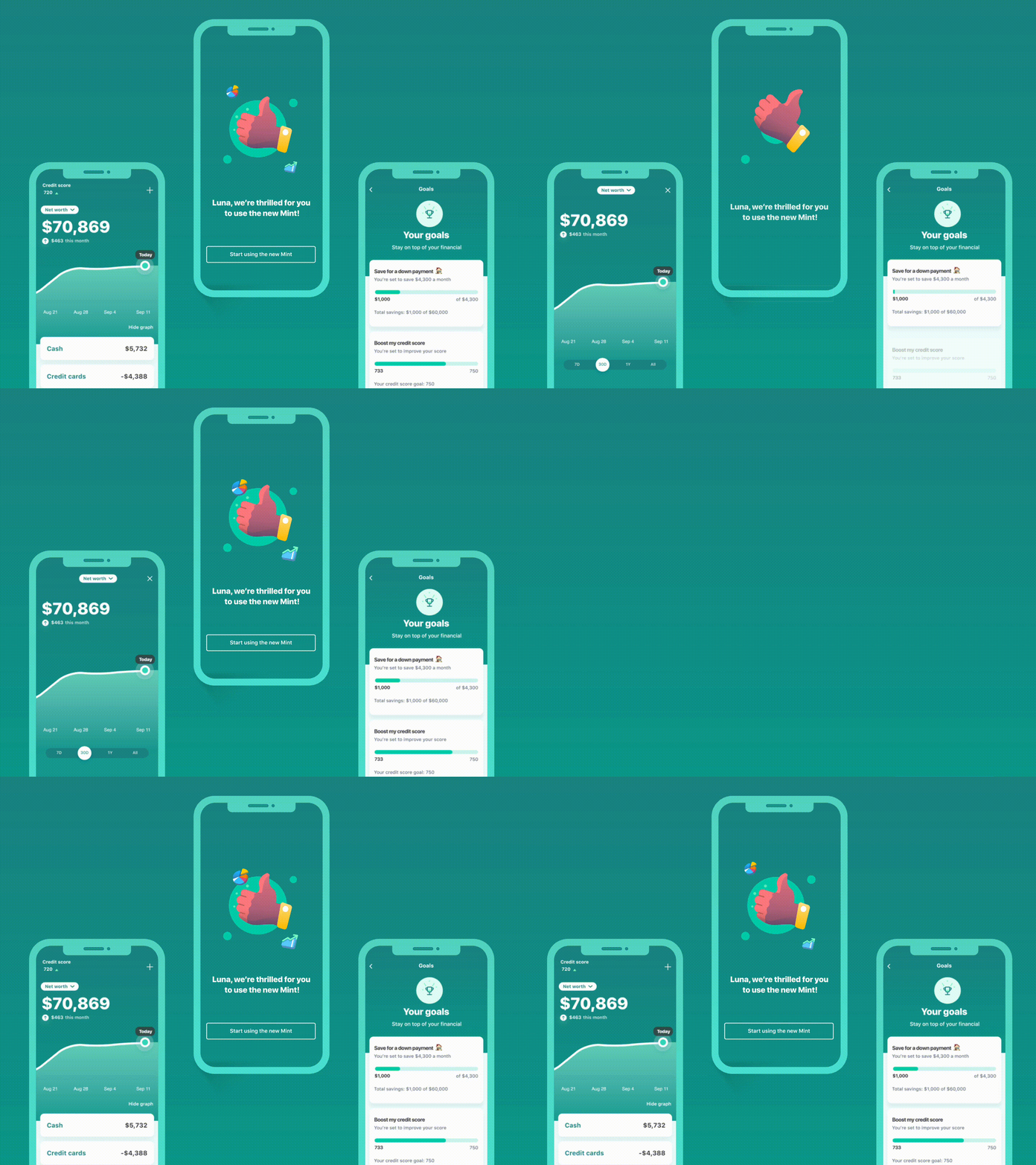
For instance, Mint, a widely-used budgeting app, provides several predefined categories of personal expenses. Users just need to link their accounts to the application and set limits for each category. The app automatically tracks all transactions and sends notifications when a person is close to the threshold.
Another great example is the Simplifi app. It was explicitly designed to decrease the navigation time required to complete various day-to-day financial tasks. Easy to comprehend dashboards let users see exactly where they stand. Users can also get more detailed info on spending in just a few clicks.
Mobile banking and FinTech UX
Banking and financial institution apps also belong in the group of financial products that significantly simplify our financial life. Most of them are provided by fintech companies or banks and allow clients to manage their financial matters right from their smartphones. The main goal is to make all banking services accessible at the user’s fingertips while avoiding the complexity that is often associated with financial transactions.
When building a fintech user experience design, the necessity to combine different consumer needs in one consistent user flow is the biggest issue faced by UX specialists. The app has to be functional, reliable, comprehensive, and easy-to-use at the same time.
Bank of America came up with a great solution in this regard. It included a virtual assistant, Erica, in the fintech UX design of its app. Erica guides users through different features and can complete some simple tasks itself (e.g., checking account balance) just like iOS’s Siri.
It’s also crucial to understand that the fintech UX of banking apps is one of the elements of the overall customer-centered experience. In other words, there should be no distractions, unambiguous choices, or too much creativity.
Like any other communication with a bank, interactions within the app should be straightforward, professional, and friendly. That’s why a subtle, user-friendly, and minimalistic user interface is the optimal choice for mobile banking.
UX overhauls stock trading apps
Trading apps are the fintech product group in which a user-centered design is probably valued the most. They aim to help people make trades in a simple and efficient way. But most stock trading applications offer many more features than just the capability to buy and sell stocks online.
They allow users to view analytics and statistics in real time (e.g., how the price of a stock has been changing). However, users can also read relevant news, develop their own investment strategy, automate transactions, and so on.
To create a seamless fintech design for a stock trading application, UX product designers should understand how a stock market works. Also, they need to know basic investment terminology. It should help them split the data into logical blocks and make critical information more noticeable.
If you want to get an example of how an app can lower the barrier of entry to the stock market, take a look at Robinhood. Its usability is so good that some people are joking that using Robinhood is easier than using Tinder.
There are also investment apps like Webull that are targeted at experienced investors. They provide users with more advanced trading details. And, logically, their visual design looks a little bit more overwhelming. But it’s only at first sight.
In practice, all these charts and diagrams simplify the perception of information for traders, helping them more easily make more informed decisions.
Crowdfunding platforms
Crowdfunding platforms are a popular way to raise money for projects, especially in innovative and creative areas. They’ve become a meeting point for people who have brilliant ideas and people who are ready to invest in them.
In general, there are several different types of crowdfunding (e.g., donation-based, investment-based). Nevertheless, most of them require the platform to build trust from all sides in order for it to work as intended. Since everything happens online, this trust is largely established through great financial technology UX.
For example, fintech UX often plays an essential role in making visitors stay longer on a crowdfunding platform. It also defines how easy it is for users to discover projects and how much effort it takes to transfer money to the platform or project.
If you visit GoFundMe, a well-known crowdfunding website, you’ll see how a well-built fintech user experience creates a strong foundation for trustful and engaging crowdfunding.
In particular, all GoFundMe initiatives are divided into categories (e.g., medical, animal, business), which considerably simplifies browsing of fundraisers. The initiatives also have brief descriptions explaining the reasons why the funding is needed.
Once you open a page with an initiative, it becomes immediately clear how much money has already been raised and who made these donations. Besides, the website contains success stories that happened thanks to GoFundMe. Overall it is a great way to establish user confidence and social proof.
FinTech UX and mobile payments
Mobile payment services became a popular alternative to cash and traditional money transfer methods a few years ago. But the COVID-19 pandemic caused an even greater boost in their usage. People make payments via mobile devices to buy products or services online and in person, split expenses with friends, and accept money from other users.
While an application needs to contain the necessary features to perform all these functions, convincing us that everything went well is a fintech UX design’s task. No one would use a mobile payment service if it made users feel anxious every time they purchase something with a smartphone or tablet. To create an effortless and stress-free payment experience, designers should work on its simplicity and intuitiveness. Apple Pay serves as one of the best examples of these virtues today.
Another important element of fintech UX for mobile payment services is interaction design. Simply put, UX designers must consider not only a user journey within the app but also the broader context of user behavior.
For example, it includes the way the application communicates with a user. Does it provide the right amount of information? Are all messages clear enough? If an error occurs, how easily can a user understand it? These are just some examples of potential communication pitfalls. A great example of how to approach these elements is Facebook Pay which deals with this just about perfectly.
Business intelligence solutions
Business intelligence solutions help professionals who work in the financial services space stay on top of the most recent news and receive other important data insights. For example, these platforms can provide detailed information on investor mandates, managers, and consultants. They can also aggregate analytical content from other resources or create unique expert articles to keep users up-to-date with market changes.
Our team at m7 provides consultancy services and UX designing for fintech companies. We recently received a request from a client who needed to optimize the fintech user experience on two business intelligence platforms. Before approaching us, they had gathered user feedback and found out that the navigation was too difficult and the user journey wasn’t consistent enough.
To solve these problems, we did market and user research. Our team also identified customer (end-user) priorities by conducting contextual interviews with all user personas. The next stage was wireframing and prototyping. Based on the collected information, we developed new user journeys.
Our designers focused primarily on improving the end-users search experience. This makes it easier for the different category customer groups to use our client’s tool to find the most relevant information. Additionally, we provided suggestions for increasing the level of personalization the end-user would experience.
As a result, our team created a new platform design that helps the client’s customers to interact with platforms much more efficiently.
Strabo was designed with the global citizen in mind, allowing users to connect and access their financial accounts in different countries. The dashboard is intuitive, leveraging familiar functions that the modern professional can navigate through. Furthermore its' fully customizable, which allows the user to filter/sort their data the way they want rather than overwhelming them with too much information.
A final word on FinTech UX
In the financial technology market, UX design often defines whether a product will become a success or not in the short and long term. The fact of the matter is that financial apps deal with huge amounts of complex data. Without seamless user journeys and clear interfaces, users can get swamped by numerous features and overwhelming data.
As a result, they won’t be able to complete their financial tasks effectively. That’s why usability (and usability testing) can never be neglected. Otherwise, there is a risk that a solution will make users’ money chores even more unbearable instead of simplifying their financial lives.
Looking for a team to create an impeccable fintech UX for your app? We’re always happy to help. Contact us!
UX design is a dynamic field that brings us new trends every year, and the last twelve months are no exception. The global COVID-19 pandemic and national lockdowns have brought a sudden change to the way we interact with the world, both digital and real. People have not only started to spend more time online; they’ve started to think and behave differently. Naturally, the coronavirus situation has impacted the current state of UX and formed a foundation for the UX trends of 2021.
This article outlines the main 2021 user experience trends that we believe will dominate and are likely to shape the year to come. Take a look and see which trends you can make use of to outrun your competitors and stand out from the crowd.
Voice interfaces
We’ve talked about voice user interfaces (VUIs) in our State of UX for 2020 projection article. As this year has shown, voice commands remain one of the hottest trends in UX design. It’s safe to say that you shouldn’t ignore it for the coming year.
There’s no doubt that, in 2021, voice chatbots and virtual assistants will keep growing in popularity. Users continue looking for simplicity and efficiency when it comes to digital experiences. Market demand, high expectations, and the rapid development of artificial intelligence technologies have left brands no choice but to include voice-based features in their products.
Already, numerous businesses are laying the groundwork for widespread VUI implementation. For instance, Starbucks has introduced an AI-based chatbot called My Starbucks Barista. Its goal is to improve the coffee-ordering experience by allowing users to buy their favorite beverages via voice commands.
Minimalistic UI
Minimalism is probably one of the most noticeable trends in visual design these days. Users are experiencing a constantly growing number of critical messages that website owners want to deliver. Cookie popups, discount ads, and various notifications aim to engage and convert website visitors, but they also exhaust our attention. This is where minimalistic user-centric design comes to the fore.
But “minimalistic” doesn’t mean “dull” or “primitive”; it means “elegant” and “efficient.” Although a limited number of colors, design elements, and bright combinations is a must, UX designers can still play with proportions and compositions. Besides, the functionality of elements comes to the forefront, and the ability to properly highlight product features and deliver the right message requires a lot of creativity. Components with only decorative purposes, on the contrary, are gradually losing their relevance.
Clarity of content, messages, and navigation is another important aspect of the minimalistic approach to UX design. Information overload is a pain for most modern audiences – meaning that website owners should strive to make their UX writing clear and concise.
Negative space
Negative space is a big UX design trend that has grown out of the market demand for minimalistic UI. Simply put, negative space is the empty areas on page layouts either around the objects (macro space) or inside them (micro space). It has already become a separate design element that plays a vital role in visual aesthetics and user experience optimization. Google’s homepage, Apple’s official store, and some websites made in Webflow are great examples.
Leaving some space empty, adding “silence” in the design, must always be meaningful. Otherwise, users can perceive it as a lack of information. The main function of the negative space is to declutter a web page in order to draw users’ attention to crucial objects and messages. Establishing a sharp content hierarchy helps UX designers draw the user’s focus on what’s most important.
The negative space is also sometimes referred to as “empty space” or “white space.” All these terms are interchangeable. When the space is free of elements and you can also use this user experience trend in dark mode or with any other color.
Imperfect elements
Online experiences after the COVID-19 pandemic will not be the same as those we got used to. UX design reflects the imperfection in a relatable way. To make the brand’s digital presence more relatable, designers intentionally implement some “imperfections” in layouts. It may be anything, from hand-drawn objects to extraordinary elements in compositions or proportions.
In general, imperfect design can be an excellent way to demonstrate the brand’s identity and highlight its uniqueness. However, if you want to apply this UX trend, you have to remember one critical rule: there needs to be a balance. It won’t work if you overdo things.
Neumorphism
The neumorphic style is a combination of two other massive approaches in UI design, skeuomorphism and flat design, which are often considered opposite to each other. Skeuomorphism is all about mimicking real-world objects and the way we interact with them.
It was popular a few decades ago when hyperreal elements were necessary to create an intuitive and user-friendly UI. A trash bin is one of the examples. On the other hand, flat design is a more recent, simplistic concept centered around two-dimensional elements, minimalism, and bright colors.
Neumorphism takes the best of both worlds. It uses graphic-intense elements, shadows, and gradients to make buttons and cards resemble the objects in nature while not precisely recreating them. The neumorphic style doesn’t push realism to an extreme extent. Instead, it strives to achieve a “soft” look with pale colors and subtle contrast.
Neumorphism has been one of the most discussed topics among UI/UX professionals for the last year or so. While there are still not many real digital products whose user interfaces follow this approach, a lot of designers are excited about this concept. Professional platforms like Behance and Dribbble already contain a number of neumorphism examples. So we have all reasons to believe that this trend will finally find its place in our phones and laptops in 2021.
3D elements and parallax
Parallax effect and 3D elements are not something entirely new in UX design. We have already seen how they are implemented in many web design solutions. However, we still observe these user experience trends marching ahead in popularity.
First, it’s a significant increase in use. Today, 3D elements and the parallax effect are no longer fancy exotic things on the web. They’re more commonplace, especially on websites and apps representing fashion and e-commerce brands that want to stand out.
Another tendency is the attempt to combine a parallax effect and 3D graphics in one interface. When you use parallax scrolling, the background of a web page and foreground elements are moving at a different speed. It alone creates a feeling of depth. By adding 3D objects to this effect, you can create a truly immersive experience that will stay in users’ memory for a long time.
Asymmetry
As the screens of our devices become wider, it’s given rise to the asymmetrical trend in UI/UX design. In general, asymmetry is an attribute of brutalism, a style in art and web design that is opposite to minimalism. However, if used separately from other brutal design elements, it can make your website look interesting while allowing it to remain subtle and elegant.
The UI/UX trend for asymmetrical layouts is often implemented along with other creative web design techniques, such as a broken grid, overlapping elements, and split screens. You can also apply asymmetry to typography. If done right, it will make your brand messages more noticeable and memorable.
However, it’s vital to keep in mind that asymmetrical design doesn’t mean “randomly placed UI elements.” The unusual way of locating objects on layouts should guide a user’s eye in the right direction and help a brand emphasize important information.
Animations
Today, when we enter a random website on the internet, chances are we’ll see GIFs, micro animations, animated illustrations, or some other elements of motion design. Animations remain popular in user experience design, and the frequency of their use keeps growing.
Besides being visually attractive, moving objects can improve user engagement and simplify navigation. They can also breathe life into digital products or services – making them more personable.
If you want to use this software development trend in user interface design, it’s critical to do it wisely. Objects that float on a screen with no particular purpose can confuse visitors, prompting them to leave a web page even sooner than they’ve planned. Animation elements shouldn’t make user interfaces unnecessarily complicated, either. They always must be relevant, valuable, and smooth.
Information architecture
Information architecture is the way different pieces of content are organized and structured on a page. It’s an essential element of user-centered design (UCD) that aims to make digital environments more comfortable for users. Building an effective, useful, and coherent information architecture is a mandatory stage of the UCD process, along with user research and usability testing.
To create a decent information architecture, UX designers need to have a solid understanding of the product’s target audience, their behavior, and the reason they use a digital solution. Users should be able to achieve the desired result without it taking too much effort. That’s why the user's goals, clear navigation, and content representation (including blind-spot monitoring) must always be taken into account at the wireframes stage of the design process.
Final thoughts
We created this projection article to give you a leg up in today’s hyper-competitive digital world. All UX trends mentioned here can definitely improve the user experience of practically every software solution or website. They can also make your product more visually attractive to its target audience, even when user expectations are high.
Nevertheless, the past year showed us that it’s impossible to anticipate everything. So, we’ll keep you in the loop and provide a regular update on what’s happening in the UX area.
Looking for a professional team to build your next digital product? We are ready to help!
Actively making use of online videos is a clear trend in 2020 as it better improves the user experience. Of course, using quality video content has always been one of the most effective ways to make a website stand out. But after the coronavirus outbreak, the role of online videos in delivering delightful user experience has become even more crucial.
Across the board, during the early peaks of COVID-19 in March in the US and Western Europe, media consumption sky-rocketed. Social distancing and an increase in largely stay-at-home lifestyles have also facilitated the popularity of video chats, video games, and video creation.
For business owners, it means that customers will expect to see more videos in the digital space in both the mid- and post-COVID era. There is a greater need to adjust to the new market demands. In this post, we will discuss how video content impacts the UX and give you some tips on creating engaging online videos.
How videos can improve UX design
Incorporating videos into websites isn’t a passing design trend. By making the user experience more immersive, videos help businesses create a stronger connection with their target audience.
Videos also demonstrate more clearly how products and services meet customer needs and, as a result, help sell products and services more effectively. Let us look at the main benefits companies get when they decide to embed online videos on their websites.
Tone of voice & atmosphere
While background videos make landing pages look more compelling, there is more to it. Videos allow UX designers to create a particular atmosphere on a website and tap into specific emotions and intent in users. With the right UX design and video, it’s easier for a business to convey brand messages and convert leads into customers.
The Cadigal site below is a great example. The company offers property for lease, so the video on a homepage shows beautiful city views.
Higher SEO ranking
Using videos in web design enhances search engine optimization (SEO) efforts and help companies drive more visitors to their websites. Search engines ( most notably Google) rank sites that contain quality video content higher in the search results. Research shows that videos published on a web page can increase the site’s traffic by up to 157 percent.
Besides, online videos increase conversion rates by piquing people’s interest and encouraging them to stay longer on a website. It’s especially useful for businesses that undergo digital transformation and strive to build a solid online presence.
Storytelling video experience
Videos are a great content marketing tool that helps organizations tell the story of a product or brand. Our brains can process and interpret visual content faster than texts. It means that companies can convey more information via online videos in a shorter period of time.
Not to mention that people simply love videos. If video content is available on a web page, it will naturally grab users’ attention. Watch the ad below to get a better sense of how videos can tell a brand story.
Video as customer support
Sometimes people have questions about a product or service that a company offers, but contacting a support center seems like too much effort.
Using explainer videos on self-service portals is a UX design trend that allows businesses to optimize digital customer experience and make a website more user-friendly. It’s also beneficial for companies since they can save costs by hiring a smaller customer support team.
Top video trends for better UX
Online videos have been a dominant form of content for the last 5-7 years. We’ve seen changing video and UX trends during this time period.
As new tools for video recording and editing become increasingly available to a broader audience, new trends start to emerge. If you want to make your website more engaging, here are a few things that may help.
Vlog content
Creating a business vlog is an excellent idea for any company searching for a convenient way to deliver messages and ideas to customers. Informative and compelling online videos help capture the audience’s attention.
Videos are also more memorable than text and more effective in terms of building brand trust. Besides improving UX, a business vlog can be a working tool for implementing a video marketing strategy and increasing brand awareness.
Product videos
Ecommerce businesses use product videos to give potential buyers a close-up look of an item, explain its main features and benefits, or demonstrate a product in use. Statistics show that 72 percent of buyers prefer watching a video to reading a product description if both options are available.
The reasons are obvious. Videos provide more information about a product in an easier way. As a consequence, it speeds up and simplifies the decision-making process. Additionally, videos give more confidence that a product is real. Solo Stove serves as an example of quality product videos.
Live streams
Today, many social media platforms allow users to stream live videos. Instagram Stories, TikTok, Facebook Live, and Youtube Live are just the most popular platforms, but there are literally hundreds of them.
Advancements in technologies have also enabled adding live-streaming videos to corporate websites. So if you decide to start broadcasting business-related videos in real-time, you’ll easily find all the necessary tools.
Personalized videos
The personalized video is a very noticeable trend in video marketing these days. Such videos contain some personal elements, for example, a recipient name and give a feeling that a company speaks directly to each customer.
Of course, you don’t have to create a separate original video from scratch for all people on your email list. Modern video personalization platforms allow companies to customize videos automatically.
How to create a stunning online video
Most of today’s customers view videos all the time, and their expectations are rather high. In other words, if you want to create a positive user experience on your website you have to follow trends and apply best practices. Unfortunately, producing some video content now and again won’t be enough.
Don’t ignore a vertical video format. Videos in portrait mode are more mobile-oriented and are a perfect fit for social media. But you can also use them on your website and YouTube. See how Adidas did this.
Get inspiration from outside of your niche. Even if you need to create a simple ad or explainer, it shouldn’t be dull. In most cases, people enjoy videos when they are entertaining. Take inspiration from films or music videos — they’ll give you some new insights.
Make it simple. People choose videos instead of texts because they are simpler to perceive and process. So don’t try to tell everything in one video. Focus only on the important stuff and keep it short.
Invest in quality. Will you watch a video ad if the sound quality is so poor that you can barely hear the words? Good quality videos show that your company cares about your products and customers. In short, quality should never be underestimated.
Add in-person feel. Although the digital world offers limited opportunities for face-to-face interactions, users want to see more human beings when they are online. To make your video content more influential and engaging, create videos containing real people whenever it’s possible.
Wrapping-up
COVID-19 has changed our online habits and needs. People spend more time in the digital space and are exposed to a vast amount of information. It’s only natural that we want to get quality content but in a simple form, so understanding the ideas doesn’t require much effort. Online videos suit this market demand just perfectly.
No matter what message your business aims to deliver, you have a higher chance of being heard if you use a video format. Are you unsure whether your online videos and user experience design is up to scruff? Then it’s high time to review the UX design of your website, app experience, and add more videos to it.
Want to improve the UX of your website or digital product?
Communicating your brand visually, with strategic design and creative execution.
From interactive experiences to traditional print design, our creative services team utilizes the most advanced and efficient technologies available today.
Brand identity tells the story of how an organization or product owner values details. Let’s focus on these details collaboratively, using data, empathy, veteran creative experience, brand standards, and industry best practices to execute on your production needs. Utilize our team as a creative-arm to your marketing team, or compliment our development, user experience, user interface expertise, or digital advertising managed services.
Brand Identity
Messaging
Positioning
Brand Strategy
eCommerce
If you want to create or extend your digital storefront, we’ve got you covered.
We’ve worked on most of the platforms out there, including:
WooCommerce
Shopify
Webflow eCommerce
Venkit
User Experience Design
We leverage industry standard UX best practices.
When your project has unique challenges, we custom tailor the team and our processes and workflows to fit your needs.
Stakeholder interviews
Lead stakeholder interviews to ensure that the business objectives are understood documented and aligned.
Prototype development Use prototyping tool to develop a clickable prototype for user testing.
Persona development
Use personas to define a list of typical user tasks/stories.
User testing
Validate current experience and create a process to user test new features prior to development.
Service map A map visualization of the architecture of features that comprise the entire (digital) product experience.
Wireframes/Visual design
UX wireframes based on initial research and stakeholder feedback.
Development
Let's imagine, build, tinker, and iterate until status quo is obsolete.
We're fully committed to iterative development and the concept of continuous improvement known as kaizen.
When it comes to software development, we follow the Scrum methodology. Our small team assembles at the beginning of each sprint cycle to plan and distribute the work they’ll undertake during that cycle in accordance with the priorities of the client. Each day the team meets to communicate progress and plan the day’s tasks. The progress of the team is visualized on the task board.
At the end of each sprint we will demo the working increment of software, taking the opportunity to gather feedback and discuss upcoming priorities.
We involve our clients heavily in the process. We believe that developing in a silo doesn’t work. Therefore, we expect that the client will assign one person to act as Product Owner, who will be available for planning sessions, manage the priority of the items in the product backlog, answer questions and provide feedback.