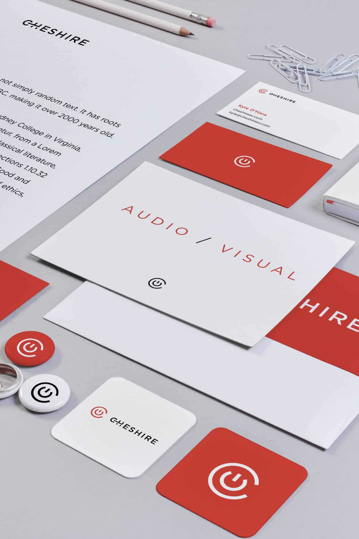
Brand identity tells the story of how an organization or product owner values details. Let’s focus on these details collaboratively, using data, empathy, veteran creative experience, brand standards, and industry best practices to execute on your production needs. Utilize our team as a creative-arm to your marketing team, or compliment our development, user experience, user interface expertise, or digital advertising managed services.
Stakeholder interviews
Lead stakeholder interviews to ensure that the business objectives are understood documented and aligned.
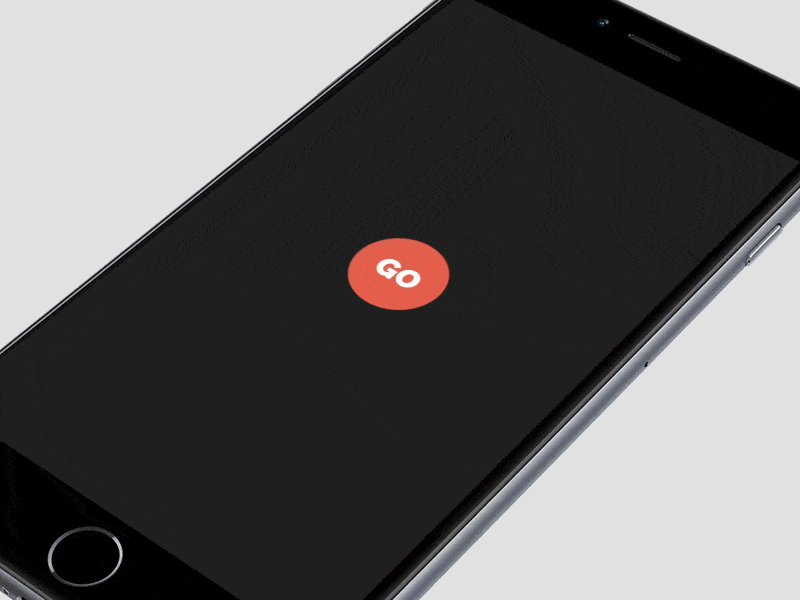
Prototype development
Use prototyping tool to develop a clickable prototype for user testing.
Persona development
Use personas to define a list of typical user tasks/stories.
User testing
Validate current experience and create a process to user test new features prior to development.
Service map
A map visualization of the architecture of features that comprise the entire (digital) product experience.
Wireframes/Visual design
UX wireframes based on initial research and stakeholder feedback.
When it comes to software development, we follow the Scrum methodology. Our small team assembles at the beginning of each sprint cycle to plan and distribute the work they’ll undertake during that cycle in accordance with the priorities of the client. Each day the team meets to communicate progress and plan the day’s tasks. The progress of the team is visualized on the task board.
At the end of each sprint we will demo the working increment of software, taking the opportunity to gather feedback and discuss upcoming priorities.
We involve our clients heavily in the process. We believe that developing in a silo doesn’t work. Therefore, we expect that the client will assign one person to act as Product Owner, who will be available for planning sessions, manage the priority of the items in the product backlog, answer questions and provide feedback.