
Your product conversion rate has stalled. Your sales deck feels disconnected from your website, and your app doesn’t match either. Prospects keep asking what you actually do—even after they’ve landed on your homepage.
These aren’t just design hiccups. They’re brand problems, and they quietly eat into your pipeline every quarter. When your market presence feels scattered, every dollar spent on ads or outreach just doesn’t stretch as far as it could.
This is the moment when a branding agency can make a real difference—especially when the team understands UX, engineering, and marketing as a whole. A branding agency defines how your company looks, sounds, and acts across every touchpoint, not just the logo on your business card. It’s about more than visuals; it’s about coherence.
So, what actually separates true brand development from a surface-level refresh? What groundwork needs to happen before any design work starts? When do most companies look for outside help, and how do you tell if a branding partner fits your needs? Let’s break it down so you can figure out if it’s time to bring in external brand strategy expertise—and what that process actually involves.
What a Branding Partner Actually Does
A branding agency builds the strategy and creative framework that shapes how your market sees you. This job goes way beyond picking a logo or a color scheme.
The Difference Between Brand Development and Campaign Execution
Brand development sets the rules. Campaign execution follows them. A branding agency defines your value proposition, your visual and verbal identity, and the system that ties it all together across channels. Marketing teams and ad agencies then use those assets to run campaigns.
Think of it like this: brand development figures out who you are in the market; campaign execution decides where and when people hear from you. Without the first, the second just feels scattered. As McKinsey’s research on better branding points out, marketers often lean on gut feeling, but strong brands combine smart segmentation with a clear sense of identity.
How Branding Services Shape Long-Term Market Perception
Branding services take the long view. Your positioning, messaging, and visual identity build value over time. Every consistent touchpoint with a prospect builds trust and recognition.
When branding services are grounded in research, they don’t just look good—they work. People start to link your company to a specific promise, and that makes every sales call, demo, and ad click a little easier.
Where Brand Management Connects to Customer Experience
Brand management isn’t a one-and-done project. It’s an ongoing commitment to making sure every customer interaction—from your homepage to your onboarding emails—delivers on the same promise. For teams working across UX, engineering, and marketing, this is where your brand starts to show measurable impact.
| Brand Development | Campaign Execution |
|---|---|
| Defines positioning and messaging | Deploys messaging in specific channels |
| Creates visual and verbal identity systems | Uses those systems in ads, emails, and content |
| Sets long-term market perception | Optimizes for short-term performance metrics |
| Informs product and UX decisions | Informs media buying and targeting |
So, if branding shapes everything downstream, what actually needs to happen before design even starts?
The Strategic Foundations Built Before Design Starts
Every lasting brand stands on decisions made long before anyone opens Figma or Photoshop. These are strategic moves, not just aesthetic ones.
Brand Strategy, Business Strategy, and Value Proposition Alignment
Your brand strategy should reflect your business strategy. If you’re aiming for enterprise clients but your brand still feels like a scrappy startup, you’ve got a disconnect that no visual refresh can solve. A branding agency works to align your value proposition with your go-to-market direction so your messaging attracts the right buyers.
This alignment usually means running workshops with leadership, digging into the competition, and clearly spelling out why your offer matters to your target audience. It’s this kind of upfront work that makes a brand foundation stick.
Target Audience Research and Brand Positioning Decisions
Brand positioning isn’t just about writing a catchy tagline. It starts with figuring out who you want to reach, what matters to them, and where your competitors fall short. Teams use interviews, surveys, analytics, and search data to get real answers.
From there, you get a positioning statement that tells your team how to talk about your company in a way that actually resonates. For VPs of Marketing and Product, this helps keep everyone rowing in the same direction.
Brand Audit, Messaging Framework, and Messaging Platform Work
A brand audit digs into every corner—your website, sales materials, social profiles, product UI—and spots where your messaging falls flat or gets muddled. Teams that run design audits often find gaps they didn’t realize were there.
The messaging framework that comes next gives your organization a shared language. It lays out your key messages, proof points, and tone for each audience. A messaging platform maps those messages to specific channels and situations.
Brand Architecture and Brand Foundation for Growth
If your company offers multiple products or services, brand architecture sorts out how they relate. Does each product need its own identity, or do they all live under one umbrella? These choices affect everything from your URLs to your ad budgets.
When you’ve got a solid brand foundation, your identity can grow with you. Launch a new product line or enter a new market? You don’t have to start over—you just build on what’s already working. So, what does that system actually look like?
How Visual and Verbal Identity Come Together
The visual and verbal sides of your brand aren’t separate. They’re two halves of the same coin, and they need to be developed together.
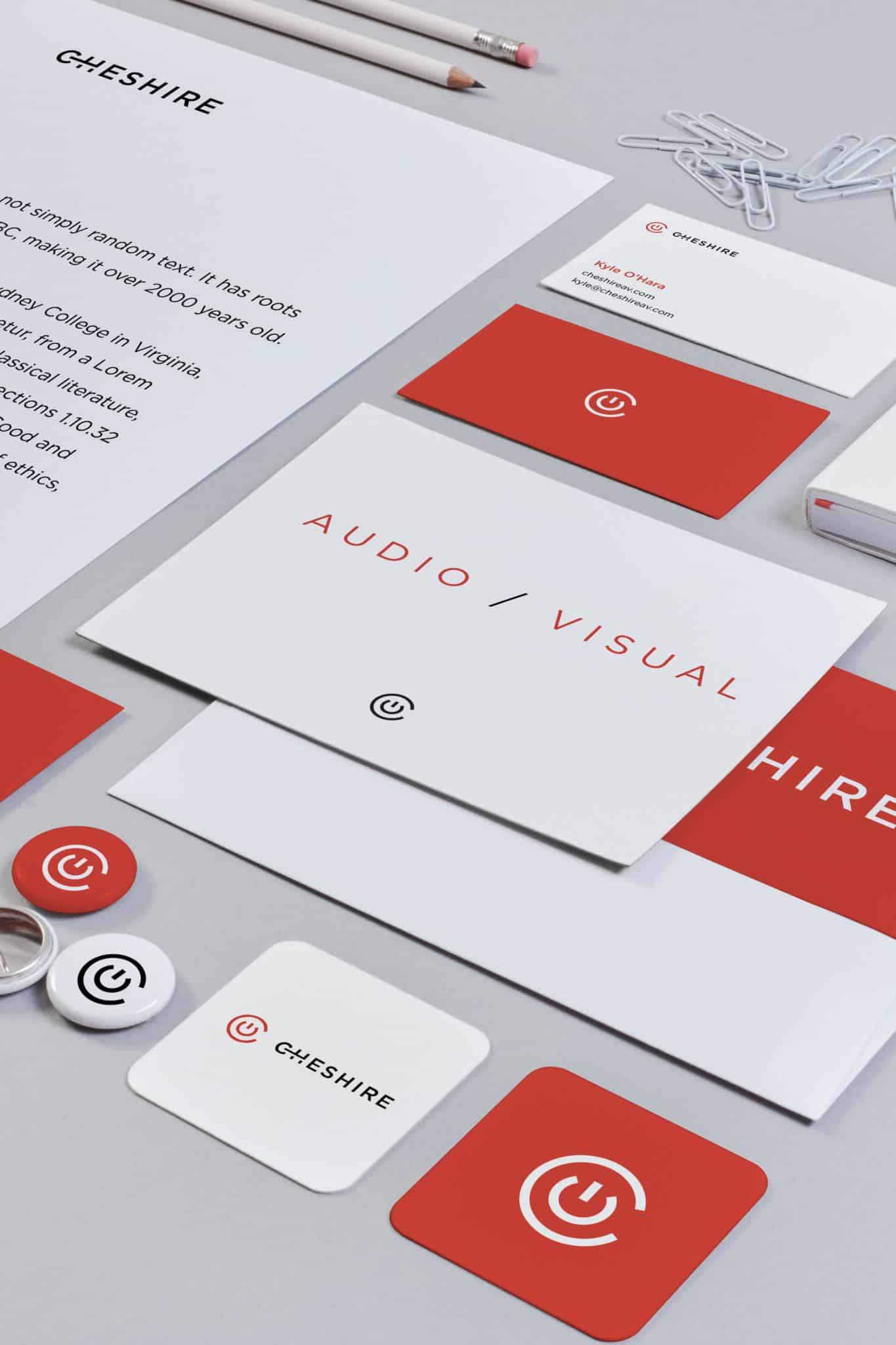
Logo Design, Typography, and Color Palette Choices
Your logo, typography, and color palette are the most visible parts of your brand. They’re also easy to get wrong. A logo with no real strategy behind it usually gets replaced in a year or two. Typography and colors should be chosen for readability, accessibility, and how they hold up across web, mobile, and print.
Good design considers how these elements show up on a phone, inside your app, or on a tradeshow banner. If your company is product-led, your UI and UX design should directly influence these choices.
Visual Identity, Visual Language, and Brand Assets
Visual identity is more than a logo. It covers illustration style, photography, iconography, and layout. As Smashing Magazine’s work on brand illustration systems shows, a strong visual language gives your brand depth and flexibility.
Brand assets are the building blocks your team uses every day—templates, icon sets, image treatments, decks. Without clear assets, teams start improvising, and your brand starts to drift.
Tone of Voice, Brand Narrative, and Brand Messaging Consistency
Your tone of voice shapes how your brand sounds. Document it with real examples—what to say, what to skip. Your brand narrative ties your origin, mission, and customer outcomes into a single story.
Consistent messaging means your homepage, sales emails, and customer success scripts all sound like they come from the same place. When teams share a common story, customers can tell.
Brand Guidelines and Brand System Documentation
Brand guidelines spell out how to use all these elements. A brand system goes further, including component libraries, design tokens, and usage rules that plug right into your product design system.
- Brand guidelines cover logo use, color codes, typography specs, and tone rules.
- Brand systems include design tokens, component standards, and developer handoff specs.
- Living documentation keeps up as your brand evolves—no more outdated PDFs.
The real test? Engineering and marketing teams should be able to use the system without needing a meeting. So, when does it actually make sense to bring in outside help?
When Businesses Usually Bring in Outside Expertise
Most companies don’t call a branding agency just because they feel like it. There’s usually a trigger—a growth milestone, a painful inconsistency, or a market shakeup that makes the gap impossible to ignore.
Early-Stage Launches and Brand Development Gaps
Startups often launch with a placeholder brand—maybe a logo from a freelancer, a color picked by the founder, and no real messaging. That’s fine until you need to raise a round, hire senior people, or land enterprise deals. Suddenly, a weak brand becomes a trust issue.
Early-stage brand work doesn’t have to be costly or exhaustive. It just needs to be intentional. A focused engagement covering positioning, identity, and messaging can set you up for years of growth.
Rebranding After Growth, Mergers, or Market Shifts
Rebranding is a common reason to bring in a branding agency. After a merger, a pivot, or a big growth spurt, your old brand often doesn’t fit anymore. Clarifying your brand strategy before a rebrand helps you avoid expensive missteps.
The rebranding process usually includes a brand audit, competitor analysis, stakeholder interviews, and a phased rollout. Rushing through it leads to confusion—both inside and out.
Fixing Weak Brand Experience Across Digital Touchpoints
If your website says one thing, your product says another, and your ads go in a different direction, you’ve got a brand experience problem. This often happens in companies that have grown through acquisition or have siloed teams running different channels.
A UX audit will surface these disconnects with specifics: mismatched button styles, conflicting value props, or onboarding flows that don’t match your marketing.
Employer Brand and Internal Alignment Needs
Your employer brand shapes recruiting, retention, and company culture. If your external brand promises one thing and your internal experience delivers another, people notice. Brand coherence matters just as much inside as it does outside.
Aligning your employer brand with your customer-facing brand means getting input from HR, marketing, product, and leadership. Usually, a spike in turnover or trouble closing senior hires is the wake-up call. So, once you know you need help, how do you pick the right partner?
How to Evaluate the Right Fit for Your Business
Not all branding agencies work the same way, and the wrong fit can waste months and budget without much to show for it.
How to Choose the Right Branding Agency
Start by asking if the agency’s process is research-driven or just portfolio-driven. A research-driven agency will dig into your customers, your data, and your business goals before showing you any visuals. Portfolio-driven shops usually lead with aesthetics. Both approaches have their place, but research-driven work tends to last longer. According to Gartner’s review of brand strategy agencies, the strongest agencies focus on market dynamics, consumer perception, and messaging evaluation.
What a Strong Branding Process Looks Like
A solid branding process moves through a few clear stages: discovery, strategy, creative development, refinement, and delivery. Each step has its own inputs and outputs. During discovery, you’ll talk to stakeholders and dig into the competition. Strategy shapes your positioning and messaging. Then, creative development turns that strategy into your visual and verbal identity.
Ask agencies to walk you through their process before they start showing off their portfolio. If they do that, it usually means they know what they’re doing and don’t just improvise every time.
Questions to Ask About Research, Collaboration, and Deliverables
Before you sign anything, ask these:
- How do you run audience research? What tools do you actually use?
- What’s included in your discovery phase, and how long does it usually take?
- How do you deal with internal stakeholders who disagree on creative direction?
- What deliverables will I get at the end?
- Are you giving us just brand guidelines, or a whole brand system with specs for developers?
These questions help you tell apart agencies that just execute tasks from those that actually collaborate with you.
How Pricing Power and ROI Show Up Over Time
When your brand is strong, your audience trusts you and understands your value—so you stop competing on price alone. Loyal customers stick around, acquiring new ones gets easier, and your marketing works better because it all supports a clear identity.
Branding doesn’t pay off overnight, but the benefits stack up. The real question: can you afford to keep winging it without a strong brand?
How Brand Strategy Turns Into Measurable Growth
A brand system that just sits in a PDF won’t move the needle. You see the real value when you apply your brand everywhere your audience interacts with you.
Applying Brand Systems Across Websites, Products, and Sales Materials
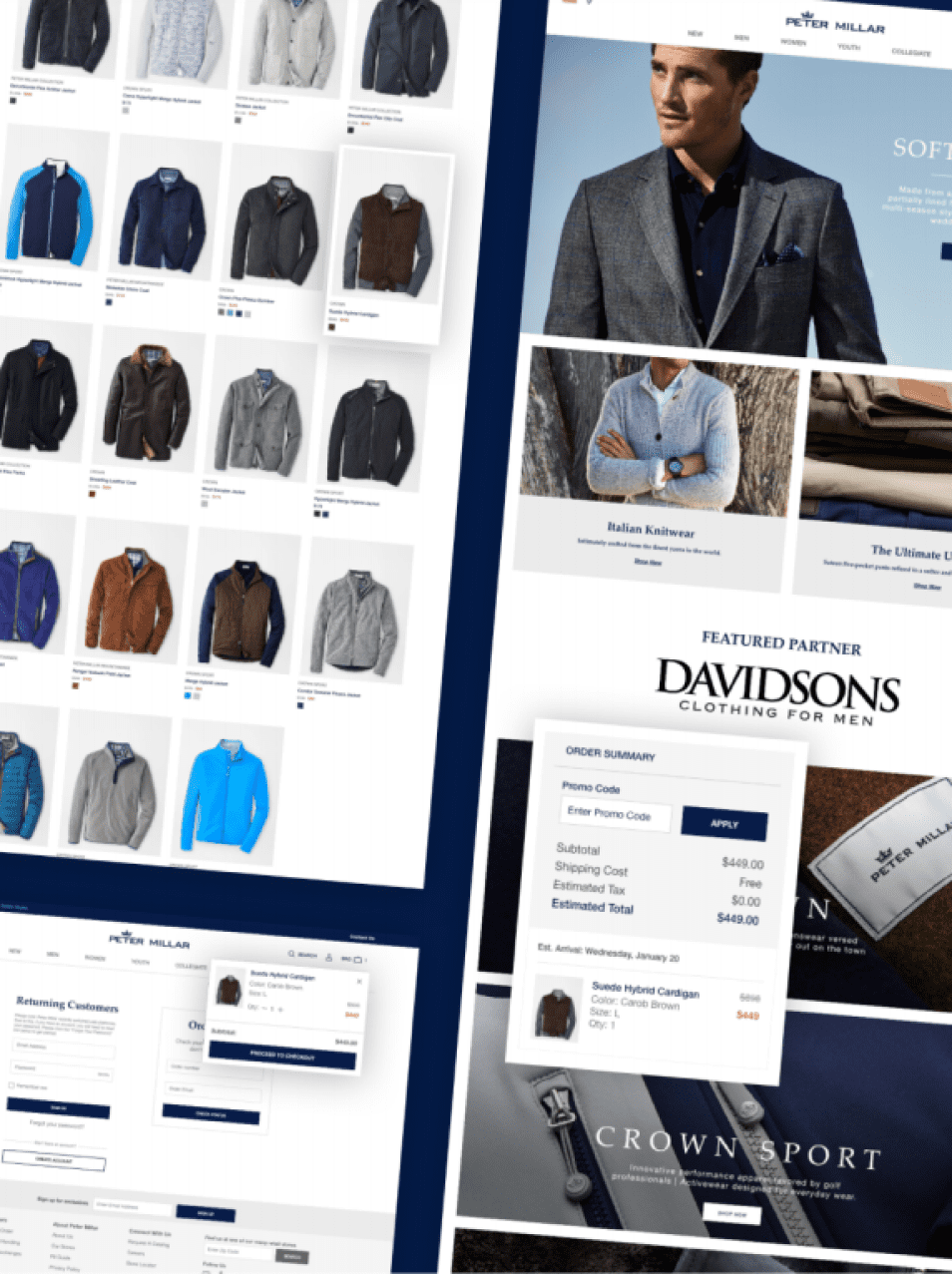
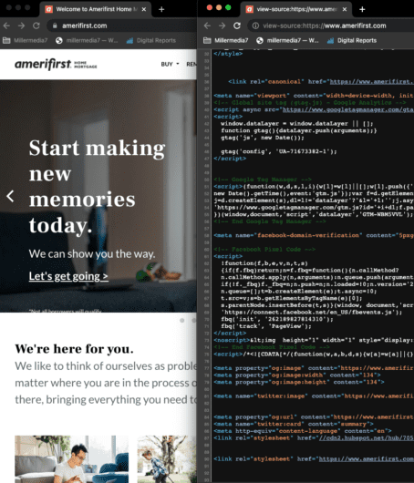
Your brand system should live inside your website templates, product UI, and sales materials. When millermedia7 delivers full-service digital work, the brand system plugs right into design systems and front-end code, so design and engineering can stay on the same page—without chasing down rogue assets.
Design tokens, shared component libraries, and clear usage rules make this scale. The teams driving design systems and product-led growth get how much this integration matters.
Connecting Brand Positioning to Marketing Campaigns and Google Visibility
Your brand positioning should shape your keyword strategy, ad copy, and what kind of content you create. When your messaging and your data-driven marketing strategy line up, your Google visibility improves because your language matches what people are searching for.
Branded search volume is a solid way to track brand awareness growth. Watch it alongside organic traffic and conversion rates to see how your brand work actually impacts your pipeline.
Why Consistency Strengthens Conversion and Loyalty
Every off-brand detail creates a tiny moment of doubt. If your homepage, product, onboarding emails, and support all feel like they belong together, trust builds faster and loyalty grows.
Forrester’s 2026 Total Experience research backs this up: growth stalls when experiences feel disjointed. The brands that pull ahead make sure their brand, customer, and employee experiences all work together in one system.
Consistency doesn’t mean you can’t evolve. It just means every part of your business tells the same story, even as you launch new things or expand into new markets.
Frequently Asked Questions
When Should a Company Bring in External Brand Strategy Support Instead of Keeping It In-House?
Bring in outside help if your team doesn’t have the time, tools, or objectivity to define your positioning from scratch. External partners matter most during launches, mergers, or rebrands—especially if internal debates are going in circles.
Which Deliverables Separate a Real Brand Build from a Quick Logo Refresh?
A real brand build gives you a positioning statement, messaging framework, visual identity system, tone of voice guide, brand guidelines, and often a brand architecture map. A logo refresh? That’s usually just a new mark and a color palette. The difference is whether you leave with a full system or just a file.
How Does a Branding Partner Run Research-Backed Positioning Work That Actually Improves Conversion and Trust?
Good partners start with audience interviews, competitive analysis, and search data. They use those insights to write messaging that speaks right to your buyers. When positioning is based on real data, it lowers friction at every step and builds trust way faster than just guessing.
What Is the Practical Difference Between Brand Work and Digital Marketing Execution When You Are Trying to Drive Measurable Growth?
Brand work sets the identity, messaging, and creative system. Digital marketing puts that system to work in paid ads, content, email, social—you name it. Both matter, but running campaigns without a brand foundation is like furnishing a house before you even have a floor plan.
How Do You Evaluate Brand Partners Based on Process, Tooling, and Decision Criteria Before You Sign a Contract?
Ask to see their process deck, not just a highlight reel. Look for structured discovery, real research methods, and clear checkpoints. Ask how they resolve stakeholder disagreements, what tools they actually use for research, and whether their deliverables include specs for developers along with the creative assets.
What Budget Ranges and Timelines Are Realistic for an Identity and Messaging Rollout Across Product, Web, and Go-to-Market?
For a mid-size company, a full brand identity and messaging project usually runs between $30,000 and $150,000, depending on scope and rollout complexity. Timelines range from 8 to 20 weeks. Smaller projects—just positioning and visual identity—can land in the $15,000 to $40,000 range with a 6- to 10-week turnaround.
The Right Brand Partner Changes How Your Market Sees You
Your brand isn’t just a logo or a tagline. It’s the total impression your company leaves, from the first Google result to the last onboarding email. When that impression is intentional, research-backed, and consistent, you build trust, shorten sales cycles, and gain pricing power that’s tough for others to match.
If you’re seeing the gaps described here—maybe your messaging feels scattered, your visual identity doesn’t scale, or there’s a disconnect between your product and marketing—it’s all fixable with the right approach.
Check out how millermedia7 tackles brand strategy, UX, and digital growth for teams like yours. Reach out.


